W3C Working Group Note
- This version:
- https://www.w3.org/TR/2020/NOTE-jlreq-20200811/
- Latest published version:
- https://www.w3.org/TR/jlreq/
- Latest editor's draft:
- https://w3c.github.io/jlreq/
- Previous version:
- https://www.w3.org/TR/2012/NOTE-jlreq-20120403/
- Editors:
- 枝本 順三郎 (Junsaburo Edamoto) (Invited Expert)
- Richard Ishida (W3C)
- 石野 恵一郎 (Keiichiro Ishino) (Antenna House)
- 加藤 誠一 (Seiichi Kato), (第2版 2nd edition) (Microsoft)
- 小林 龍生 (Tatsuo Kobayashi) (1st edition, JustSystems; 2nd edition, Invited Expert)
- 小林 敏 (Toshi Kobayashi) (Invited Expert)
- Nathaniel McCully, (第2版 2nd edition) (Adobe)
- 小野澤 賢三 (Kenzou Onozawa) (Invited Expert)
- Felix Sasaki (1st edition, University of Applied Sciences Potsdam; 2nd edition, DFKI GmbH)
- 下農 淳司 (Atsushi Shimono), (第2版 2nd edition) (W3C)
- 塩澤 元 (Hajime Shiozawa), (第2版 2nd edition) (Invited Expert)
- 薛 富僑 (Fuqiao Xue), (第2版 2nd edition) (W3C)
- Former editor:
- 阿南 康宏 (Yasuhiro Anan), (第1版 1st edition) (Microsoft)
- Participate:
- GitHub w3c/jlreq
- File a bug
- Commit history
- Pull requests
Copyright © 2020 W3C® (MIT, ERCIM, Keio, Beihang). W3C liability, trademark and permissive document license rules apply.
Abstract
This document describes requirements for general Japanese layout realized with technologies like CSS, SVG and XSL-FO. The document is mainly based on a standard for Japanese layout, JIS X 4051, however, it also addresses areas which are not covered by JIS X 4051. This version integrates errata and links to related materials.
この文書は,CSS,SVGおよびXSL-FOなどの技術で実現が求められる一般的な日本語組版の要件を記述したものです.この文書は,主としてJIS X 4051(日本語組版規則)に基づいていますが,一部,JIS X 4051に記載されていない事項にも言及しています.この版では,誤りの訂正や関連情報へのリンク追加などが行われています.
Status of This Document
This section describes the status of this document at the time of its publication. Other documents may supersede this document. A list of current W3C publications and the latest revision of this technical report can be found in the W3C technical reports index at https://www.w3.org/TR/.
この節はこの文書の公開時点での状況を述べています.他の文書によりこの文書が更新されていることがあります.現在の W3C の文書と最新版の技術報告のリストは,https://www.w3.org/TR/ にあるW3C 技術報告一覧から入手できます.
This is a maintenance version of a document that describes requirements for general Japanese layout realized with technologies like CSS, SVG, XSL-FO and eBook standards. The document is mainly based on a standard for Japanese layout, JIS X 4051, however, it also addresses areas which are not covered by JIS X 4051. The second version of the document added a significant amount of additional information related to hanmen design, such as handling headings, placement of illustrations and tables, handling of notes and reference marks, etc. This version integrates errata and links to related materials.
この文書は,CSS,SVG,XSL-FOおよびeBookなどの技術で実現が求められる一般的な日本語組版の要件を記述した文書の訂正版です.この文書は,主としてJIS X 4051(日本語組版規則)に基づいていますが,一部,JIS X 4051に記載されていない事項にも言及しています.この第2版では版面デザインに関する説明を大幅に増やしました.例えば,見出しの扱い,図版や表の配置,注や合印などです.
This document was developed by participants in the Japanese Layout Task Force. It will be published by the Internationalization Working Group. Previous versions of the document were developed by participants in the previous Japanese Layout Task Force, with input from four W3C Working Groups, CSS, Internationalization Core, SVG and XSL.
この文書は JLReq 日本語組版タスクフォース の参加者により作成されており,国際化委員会において公開されます.以前のバージョンのこの文書は JLReq 日本語組版タスクフォース の参加者により,CSS,Internationalization Core,SVG,XSL の4つの W3C ワーキンググループからの情報を参考に作成されています.
The document was originally authored in Japanese, then translated to English under the guidance of the Japanese authors. In order to reach the largest international audience, the W3C works in English, so the English version of the document is the authoritative version. However, the Japanese version of this document is also available.
この文書は日本語で記述されたものを,日本語版作成者の監修のもとに英語に翻訳したものです.最大の国際的な利用者に届けるため,W3C は英語を標準としているため,この文書は英語版が公式となります.なお,日本語版も提供しています.
Note
To make it easier to track comments, please raise separate issues or emails for each comment, and point to the section you are commenting on.
指摘を追跡しやすくするため,それぞれの指摘点について対象となるセクションを明記のうえ,個別の issue もしくはメールを送ってください.
この文書は国際化ワーキンググループによりワーキンググループノートとして公開されています.
この文書に関する議論には GitHub Issues の利用が望まれます.
ワーキンググループノートとしての公開は W3C 会員による支持を意味しません.この文書は草案であり,更新やほかの文書により置き換えられる可能性が常にあります.作業版以外としての参照は推奨されません.
この文書はW3C 特許ポリシーに従って運営されているグループにより作成されました.このグループはこの文書を W3C 勧告とすることを想定していません.
この文書は2019年3月1日版のW3C プロセス文書に従っています.
This document was published by the Internationalization Working Group as a Working Group Note.
GitHub Issues are preferred for discussion of this specification.
Publication as a Working Group Note does not imply endorsement by the W3C Membership. This is a draft document and may be updated, replaced or obsoleted by other documents at any time. It is inappropriate to cite this document as other than work in progress.
This document was produced by a group operating under the W3C Patent Policy. The group does not expect this document to become a W3C Recommendation.
This document is governed by the 1 March 2019 W3C Process Document.
Table of Contents
- 1. Introduction 序論
- 2.
Basics of Japanese Composition
日本語組版の基本
- 2.1 Characters and the Principles of Setting them for Japanese Composition 日本語組版に使用する文字と配置の原則
- 2.2 Page Formats for Japanese Documents 日本語文書の基本となる組体裁
- 2.3 Vertical Writing Mode and Horizontal Writing Mode 組方向(縦組と横組)
- 2.4 Specifying the Kihon-hanmen 基本版面の設計
- 2.5 Page wise Arrangement of Kihon-hanmen Elements 基本版面の設計要素の各ページに対する適用
- 2.6 Running Heads and Page Numbers 柱とノンブル
- 3.
Line Composition
行の組版処理
- 3.1
Line Composition Rules for Punctuation Marks
約物などの組版処理
- 3.1.1 Differences in Vertical and Horizontal Composition in Use of Punctuation Marks 縦組と横組で異なる約物など
- 3.1.2 Positioning of Punctuation Marks (Commas, Periods and Brackets) 句読点や,括弧類などの基本的な配置方法
- 3.1.3 Exceptional Positioning of Ideographic Comma and Katakana Middle Dot 読点及び中点の例外的な配置方法
- 3.1.4 Positioning of Consecutive Opening Brackets, Closing Brackets, Commas, Full Stops and Middle Dots 始め括弧類,終わり括弧類,読点類,句点類及び中点類が連続する場合の配置方法
- 3.1.5 Positioning of Opening Brackets at Line Head 行頭の始め括弧類の配置方法
- 3.1.6 Positioning of Dividing Punctuation Marks (Question Mark and Exclamation Mark) and Hyphens 区切り約物及びハイフン類の配置方法
- 3.1.7 Characters Not Starting a Line 行頭禁則
- 3.1.8 Characters Not Ending a Line 行末禁則
- 3.1.9 Positioning of Closing Brackets, Full Stops, Commas and Middle Dots at Line End 行末に配置する終わり括弧類,句点類,読点類及び中点類の配置方法
- 3.1.10 Unbreakable Character Sequences 分割禁止
- 3.1.11 Character Sequences which Do Not Allow Increase of Spacing as Part of Line Adjustment Processing 行の調整処理で字間を空ける処理に使用しない箇所
- 3.1.12 Examples of Line Adjustment 行の調整処理例
- 3.2
Japanese and Western Mixed Text Composition (including Horizontal-in-Vertical Text Composition)
和欧文混植処理(縦中横処理を含む)
- 3.2.1 Composition of Japanese and Western Mixed Texts 和文と欧文との混植
- 3.2.2 Mixed Text Composition in Horizontal Writing Mode 横組の和欧文混植に用いる文字
- 3.2.3 Mixed Text Composition in Vertical Writing Mode 縦組の和欧文混植に用いる文字
- 3.2.4 Method for Setting Full-width Latin Letters and European Numerals 全角のモノスペースの欧字及び全角のモノスペースのアラビア数字の配置方法
- 3.2.5 Handling of Tate-chu-yoko (Horizontal-in-Vertical Settings) 縦中横の処理
- 3.2.6 Handling of Western Text in Japanese Text using Proportional Western Fonts プロポーショナルな欧字を用いた和欧文混植処理
- 3.3
Ruby and Emphasis Dots
ルビと圏点処理
- 3.3.1 Usage of Ruby ルビの使用
- 3.3.2 Choice of Base Characters to be Annotated by Ruby ルビの付け方
- 3.3.3 Choice of Size for Ruby Characters ルビの文字サイズ
- 3.3.4 Choice of Sides for Ruby with Respect to Base Characters 親文字のどちら側にルビを付けるか
- 3.3.5 Positioning of Mono-ruby with Respect to Base Characters モノルビの親文字に対する配置位置
- 3.3.6 Positioning of Group-ruby with Respect to Base Characters グループルビの親文字に対する配置位置
- 3.3.7 Positioning of Jukugo-ruby with Respect to Base Characters 熟語ルビの親文字に対する配置位置
- 3.3.8 Adjustments of Ruby with Length Longer than that of the Base Characters ルビが親文字よりはみ出した場合の処理
- 3.3.9 Composition of Emphasis Dots 圏点の処理
- 3.4 Inline Cutting Note (Warichu) 割注処理
- 3.5 Paragraph Adjustment Rules 段落整形,そろえ及び段落末尾処理
- 3.6 Tab Setting タブ処理
- 3.7 Other Rules of Japanese Typesetting その他の行組版処理
- 3.8 Line Adjustment 行の調整処理
- 3.9 About Character Classes 文字クラスについて
- 3.1
Line Composition Rules for Punctuation Marks
約物などの組版処理
- 4.
Positioning of Headings, Notes, Illustrations, Tables and Paragraphs
見出し・注・図版・表・段落の配置処理
- 4.1
Handling of Headings (including Page Breaks)
見出し処理(改ページ処理も含む)
- 4.1.1 Types of Headings 見出しの種類
- 4.1.2 Elements of Block Heading 別行見出しの構成
- 4.1.3 Font Selection and Heading Font Size 見出しにアクセントを付ける
- 4.1.4 How to Handle Headings with New Recto, Page Break and New Column 改丁・改ページ・改段処理
- 4.1.5 Handling of Space just before the New Recto, Page Breaks and New Edges 改ページ等の直前ページの処理
- 4.1.6 Processing of Gyou-dori 行取りの処理例
- 4.1.7 Processing of Gyou-dori Heading Set at the bottom of the Page 行取り処理した見出しがページ末にきた場合の処理
- 4.1.8 Processing when a One Line Space is Set Before a Low Level Heading 小見出しの前を1行アキにした場合の処理
- 4.1.9 Processing of Run-in Headings 同行見出しの処理
- 4.1.10 Processing of Cut-in Headings 窓見出しの処理
- 4.1.11 Processing of Column Spanning Headings 段抜きの見出しの処理
- 4.2
Processing of Notes
注の処理
- 4.2.1 Kinds of Notes 注の種類
- 4.2.2 Note Numbers 注の番号
- 4.2.3 The Processing of the Reference Mark 合印の処理
- 4.2.4 Processing of Endnotes in Vertical Writing Mode or Horizontal Writing Mode 縦組又は横組の後注処理
- 4.2.5 Processing of Footnotes in Horizontal Writing Mode 横組の脚注処理
- 4.2.6 Processing of Sidenotes in Vertical Writing Mode 縦組の傍注処理
- 4.2.7 Processing of Headnotes (in Vertical Writing Mode), Footnotes (in Vertical Writing Mode) and Sidenotes (in Horizontal Writing Mode) 頭注(縦組)・脚注(縦組)・傍注(横組)の処理
- 4.3
Positioning of Illustrations
図版の配置処理
- 4.3.1 Specification of the Position of Illustrations 図版配置の指定方法
- 4.3.2 Basic Concepts about Illustration Positioning 図版配置の基本的な考え方
- 4.3.3 Requirements for Illustration Positioning in Vertical Layout 縦組における図版配置の条件
- 4.3.4 Requirements for Illustration Positioning in Horizontal Layout 横組における図版配置の条件
- 4.3.5 Basic Ideas about Illustration Positioning in JIS X 4051 JIS X 4051における図版配置の基本的な考え方
- 4.4
Processing of Tables
表の処理
- 4.4.1 Elements of Tables 表の構成
- 4.4.2 Direction of Tables Themselves 表の全体の組方向
- 4.4.3 An Example of Layout with a Table 表を配置した例
- 4.4.4 Kinds of Tables from Allocation to Page Position ページへの配置からみた表の種類
- 4.4.5 Processing of Tables Allocated in a Spread 見開きに配置する表の処理
- 4.4.6 Processing of Dividable Tables 分割を可とする表の処理
- 4.5 Block Direction Setting Process of Lines, Paragraphs etc. 行・段落などの行送り方向の配置処理
- 4.1
Handling of Headings (including Page Breaks)
見出し処理(改ページ処理も含む)
- A.
Character Classes
文字クラス一覧
- A.1 Opening brackets (cl-01) 始め括弧類(cl-01)
- A.2 Closing brackets (cl-02) 終わり括弧類(cl-02)
- A.3 Hyphens (cl-03) ハイフン類(cl-03)
- A.4 Dividing punctuation marks (cl-04) 区切り約物(cl-04)
- A.5 Middle dots (cl-05) 中点類(cl-05)
- A.6 Full stops (cl-06) 句点類(cl-06)
- A.7 Commas (cl-07) 読点類(cl-07)
- A.8 Inseparable characters (cl-08) 分離禁止文字(cl-08)
- A.9 Iteration marks (cl-09) 繰返し記号(cl-09)
- A.10 Prolonged sound mark (cl-10) 長音記号(cl-10)
- A.11 Small kana (cl-11) 小書きの仮名(cl-11)
- A.12 Prefixed abbreviations (cl-12) 前置省略記号(cl-12)
- A.13 Postfixed abbreviations (cl-13) 後置省略記号(cl-13)
- A.14 Full-width ideographic space (cl-14) 和字間隔(cl-14)
- A.15 Hiragana (cl-15) 平仮名(cl-15)
- A.16 Katakana (cl-16) 片仮名(cl-16)
- A.17 Math symbols (cl-17) 等号類(cl-17)
- A.18 Math operators (cl-18) 演算記号(cl-18)
- A.19 Ideographic characters (cl-19) 漢字等(漢字以外の例)(cl-19)
- A.20 Characters as reference marks (cl-20) 合印中の文字(cl-20)
- A.21 Ornamented character complexes (cl-21) 親文字群中の文字(添え字付き)(cl-21)
- A.22 Simple-ruby character complexes (cl-22) 親文字群中の文字(熟語ルビ以外のルビ付き)(cl-22)
- A.23 Jukugo-ruby character complexes (cl-23) 親文字群中の文字(熟語ルビ付き)(cl-23)
- A.24 Grouped numerals (cl-24) 連数字中の文字(cl-24)
- A.25 Unit symbols (cl-25) 単位記号中の文字(cl-25)
- A.26 Western word space (cl-26) 欧文間隔(cl-26)
- A.27 Western characters (cl-27) 欧文用文字(cl-27)
- A.28 Warichu opening brackets (cl-28) 割注始め括弧類(cl-28)
- A.29 Warichu closing brackets (cl-29) 割注終わり括弧類(cl-29)
- A.30 Characters in tate-chu-yoko (cl-30) 縦中横中の文字(cl-30)
- B. Spacing between Characters 文字間の空き量
- C. Possibilities for Line-breaking between Characters 文字間での分割の可否
- D. Opportunities for Inter-character Space Reduction during Line Adjustment 行の調整処理で詰める処理が可能な箇所
- E. Opportunities for Inter-character Space Expansion during Line Adjustment 行の調整処理で空ける処理が可能な箇所
- F.
Positioning of Jukugo-ruby
熟語ルビの配置方法
- F.1 Principles of Jukugo-Ruby Distribution: Part 1 熟語ルビの配置方法の原則その1
- F.2 Principles of Jukugo-Ruby Distribution: Part 2 熟語ルビの配置方法の原則その2
- F.3 Principles of Jukugo-Ruby Distribution with Inter-Character Space Expansion 熟語ルビの親文字の字間を空ける処理の原則
- F.4 Examples of Jukugo-Ruby Distribution with Inter-Character Space Expansion 熟語ルビの親文字の字間を空ける処理例
- G. Terminology 用語集
- H. References 参考文献
- I. Acknowledgements 謝辞
- J. Revision Log 変更記録
1. Introduction 序論
1.1 Purpose of This Document この文書の目的
Each cultural community has its own language, script and writing system. In that sense, the transfer of each writing system into cyberspace is a task with very high importance for information and communication technology.
すべての文化集団は,独自の言語,文字,書記システムを持つ.それゆえ,個々の書記システムをサイバースペースに移転することは,文化的資産の継承という意味で,情報通信技術にとって非常に重要な責務といえよう.
As one of the basic work items of this task force, this document describes issues of text composition in the Japanese writing system. The goal of the task force is not to propose actual solutions but describe important issues as basic information for actual implementations.
この責務を実現するための基礎的な作業として,この文書では,日本語という書記システムにおける組版上の問題点をまとめた.具体的な解決策を提示することではなく,要望事項の説明をすることにした.それは,実装レベルの問題を考える前提条件をまず明確にすることが重要であると考えたからである.
1.2 How This Document was Created この文書の作成方法
This document was created by the W3C Japanese Layout Task Force. The Task Force has discussed many issues and harmonized the requirements from user communities and solutions from technological experts. It includes the following participants:
この文書の作成は,W3C Japanese Layout Task Forceが行った.このタスクフォースは,次のようなメンバーで構成され,ユーザーコミュニティーからの要望と専門家による解決策を調和させるために様々な議論を行ってきた.
-
Japanese text composition experts (The editors of "JIS X 4051 : Formatting rules for Japanese documents").
日本語組版の専門家(“JIS X 4051:日本語文書の組版方法”のエディターたち)
-
Internationalization and standardization experts in Japan (from Microsoft, Antenna House, JustSystems).
日本における国際化,標準化活動の専門家(マイクロソフト,アンテナハウス,ジャストシステムの社員)
-
Members of the W3C CSS, SVG, XSL and i18n Core, Working Groups.
This task force also constitutes an important innovation due to its bilingual work-flow. Discussion is mainly conducted in Japanese, because of the Japanese composition issues, but minutes and one mailing list were in English. To support development, the task force held face-to-face meetings with participating Working Groups.
また,このタスクフォースは,バイリンガルによるものとしても,画期的なものといえよう.ディスカッションは,日本語の組版を問題とすることから,主として日本語で行った.しかし,議事録とメーリングリストは英語のものを用意した.また,W3CのCSS,SVG,XSL,国際化コアなどのワーキンググループメンバーとの英語及び日本語によるフェイス・ツウ・フェイスの会議も開催した.
The document itself was also developed bilingually, and is published bilingually. We carefully avoided using jargon for technical terms. Even if there were English words corresponding to the Japanese, we carefully studied any potential differences in the nuances of meaning, and if there were differences between corresponding concepts, we provided the Japanese jargon in romaji (Latin transliteration) for future discussion. Moreover, we prepared as many figures as possible, with clear and understandable English, to help non-Japanese readers.
文書も日本語で準備し,これを英訳し,2つの文書を公開することにした.用語についても,特殊な用語は極力避けるように努めた.英語の用語との対応についても,用語の定義内容を検討し,概念に対応できない部分を持つ場合は,日本語の用語はローマ字で表現し,今後の課題として残した.さらに,日本語組版を見慣れていない読者のために,要望事項の説明をわかりやすい英語と図表で行うように努力した.
1.3 Basic Principles for Development of This Document この文書の執筆方針
Japanese composition exhibits several differences from Western composition. Major differences include:
日本語組版は,欧文組版と異なる事項がある.主に次の点で異なる.
-
The use of not only horizontal writing mode but also vertical writing mode.
-
In principle, all character frames of ideographic (cl-19), hiragana (cl-15) and katakana (cl-16) characters used in Japanese composition are designed in a square box, and these characters are composed without intervening spacing (i.e. set solid). In this document, notations such as ideographic (cl-19) and hiragana (cl-15) characters indicate character classes (see § 3.9 About Character Classes 文字クラスについて ).
原則として,日本語組版で使用する漢字等(cl-19),平仮名(cl-15),片仮名(cl-16)の文字の外枠は,正方形にデザインされており,これを,隙間なく詰めて組んでいく.なお,“漢字等(cl-19)”,“平仮名(cl-15)”などと示すものは,文字クラス名である(文字クラスの詳細は§ 3.9 About Character Classes 文字クラスについて を参照).
This document mainly explains the characteristics of Japanese composition along the lines of the following policy.
この文書では,このことを前提にして,主に日本語組版の特徴を次の方針で解説する.
-
It does not fully cover all issues of the Japanese composition system, but mainly discusses the differences from Western composition systems.
日本語組版のあらゆる事項を対象とするのではなく,欧文組版と異なる事項を主に取り上げた.
-
It focuses on the requirements for the Japanese visual presentation form of text composition. Technology-specific interpretations of the requirements and/or how to implement them are out of scope for this document.
日本語組版の表現された結果又は表現されるべき結果だけを問題とする.あくまで日本語組版として要求される事項を取り上げ,具体的にどのように処理するかは別の次元の問題と考えるからである.
-
It explicitly refers to JIS X 4051 "Formatting rules for Japanese documents" as much as possible. This document focuses on fundamental and important issues of Japanese layout as much as possible, and for more detail references the corresponding clause of JIS X 4051. The JIS X 4051 topics that are not described in this document, are only for exceptional, corner cases or to provide some specific line composition algorithms. On the other hand, some topics that are not described in JIS X 4051 are described in detail. Accordingly, this document is sufficient to implement Japanese layout processing for most parts of the Japanese market.
日本語組版に関する日本工業規格(JIS)に“JIS X 4051(日本語文書の組版方法)”がある.これとの参照関係をできるだけ示すことを心掛けた.本文書では,記述をできる限り本質的で重要な事項に限定した.そのため,詳細な処理内容はJIS X 4051にゆずり,参照だけで示した箇所がある.JIS X 4051の記述のうち,本文書に記述がない部分は,特別な例外的な場合や,行組版についての具体的なアルゴリズム記述に限られる.なお,本文書では,JIS X 4051で規定されている内容だけではなく,それ以外で重要と思われる事項についても解説するようにした.したがって,本文書の内容を実装することで,日本の大部分の市場要求に応えることができる.
In accordance with the stated policy, this document provides tutorial- or summary-like, supplementary explanations, related background, and additional descriptions for JIS X 4051 information. This document covers all the fundamental issues of Japanese text layout, but the reader will need to refer to JIS X 4051 for advanced discussion of exceptional topics.
また,この文書とJIS X 4051との関係でいえば,JIS X 4051の要点の解説あるいは要約,補足説明,それに関わる周辺情報の追加,JIS X 4051で規定していない事項の解説ということになる.したがって,基本的な事項を理解するためであれば,この文書で十分であるが,細部にわたる例外的な内容を知るためにはJIS X 4051を参照する必要がある.
-
It provides typical examples of actual use for key composition features, to enable better understanding of their usage.
ある組版処理が,どのような局面で使用されるかをできるだけ示すように心掛けた.
-
For non-Japanese readers, frequency of use is indicated for each requirement. These frequencies are not the outcome of any accurate research, but arise from the long experience of the authors. They are intuitive for ordinary Japanese text readers; however, for non-Japanese readers it may be difficult to imagine without explicit information. These frequencies are only rough information to prioritize the importance of issues.
日本語組版に日常的に接していない読者のために,説明している事項の使用頻度について簡単に解説した.これは実際に調査した結果ではなく,執筆者の読書経験による判断である.これは日常的に日本語組版に接している読者にはある程度判断できることであるが,そうでない読者のために,ある程度の使用頻度情報を伝えるためである.したがって,組版処理事項の重要さをある程度判断できるようにすることを主な目的とするので,情報の正確性を意図しているものではない.
For example: "warichu (inline cutting note) is not frequently used, but is useful to simply annotate persons, things, and so on, at the place where the text appears, especially in classic texts or translations.", or "ruby is frequently used in modern documents, including newspapers."
例えば,“割注の使用頻度は多くないが,その該当用語が出てきた箇所に直接補足説明できることから,古典や翻訳書において人物・用語等の簡単な紹介に重要な役割を果たしている”のように説明し,これに対し,“ルビは,最近では新聞でも採用しており,多くの文書で利用されている”のように示すことにする.
-
In consideration of non-Japanese readers of this document, figures are used for explanations wherever possible.
日本語組版に接していない読者を考慮し,できるだけ図解して示すようにした.また,例示も多くするように心掛けた.
-
Text layout rules and recommendations for readable design are different things, however these two issues are difficult to discuss independently. In this document, these two aspects are carefully separated. The aesthetic design recommendations are mainly described using notes.
組版処理と読みやすい組版設計の関係は別問題である.しかし,両者は不可分の関係があり,解説でも両者を同時に説明する事項も出てくる.しかし,できるだけ両者を区別して記述することを心掛けた.具体的な方法としては,読みやすい組版設計の解説は,できるだけ注記で述べるようにした.
-
The main target of this document is common books. The authors' experiences are mainly related to common books, and the quality required for common books is the highest in the market. There are many kinds of books in the market, and the requirements are quite diverse. The task force has a lot of accumulated experience in requirements and solutions for Japanese text composition. Nonetheless, many issues, which have been discussed over a long period of time, are applicable for other kinds of publication.
この文書の解説では,組版処理の対象を主に書籍とする.執筆者の経験がその点に最も深いこともあるが,日本語組版処理において質の面から書籍の組版が重要と考えるからである.量が多いというだけでなく,質の面から見ると,書籍組版は多くの問題点を持っている.書籍組版は,その処理内容が多様であり,これらについて最も古くから多くの人々により問題点が考えられ,かつ指摘されてきた経緯がある.処理そのものについては,書籍の組版処理はむずかしく,また要求のレベルが高かったという点もある.また,書籍で考えられてきた事項の多くが,その他の文書でも応用できる点が多いといえよう.
In terms of frequency of use, the importance of magazines, technical manuals, and Web documents rates alongside common books. However, there are several characteristics in these publications, which are different from common books. These issues should be treated more fully in future documents.
しかし,使用頻度という点でいえば,雑誌,マニュアル,Web上の文書等の重要性は,書籍と変わらない.また,これらの文書の組版処理では,書籍とは異なる事項も含んでいる.これらにおける問題点は,次の課題としたい.
1.4 The Structure of This Document この文書の構成
This document consists of four parts:
この文書は,次の4つの部分で構成されている.
§ 2. Basics of Japanese Composition 日本語組版の基本 explains the characteristics of letters and symbols which are used in Japanese composition, their differences in vertical writing mode and horizontal writing mode, and the design and adaptation of the kihon-hanmen.
§ 2. Basics of Japanese Composition 日本語組版の基本 では,日本語組版で使用される文字の特徴,縦組と横組の相違点,基本版面の設計方法及びその適用方法などについて解説する.
§ 3. Line Composition 行の組版処理 explains line composition methods for ideographic (cl-19), hiragana (cl-15), katakana (cl-16) characters and punctuation marks, together with ruby (inter-line pronunciation information and annotation) and Japanese and Western mixed text composition, i.e. mixtures of Japanese characters and Western characters (cl-27).
§ 3. Line Composition 行の組版処理 では,漢字等(cl-19),平仮名(cl-15),片仮名(cl-16)及び約物だけでなく文字に添えて行間に配置されるルビ処理及び欧文用文字(cl-27)を含む和欧文混植などの行の組版処理並びに行内での文字配置方法を解説する.
§ 4. Positioning of Headings, Notes, Illustrations, Tables and Paragraphs 見出し・注・図版・表・段落の配置処理 describes construction methods and composition methods for headings, notes, illustrations and tables.
§ 4. Positioning of Headings, Notes, Illustrations, Tables and Paragraphs 見出し・注・図版・表・段落の配置処理 では,見出し,注,図版,表などの構成方法及び配置方法を解説する.
In principle, characters in Japanese composition are designed in a square box and positioned without extra spacing, i.e. solid setting. This is taken as a basic premise for the design of the kihon-hanmen, the basis of book layout. Furthermore, to understand Japanese layout, it is important to understand the design of the kihon-hanmen and how to position illustrations, characters, symbols etc. in relation to it. Hence, § 2. Basics of Japanese Composition 日本語組版の基本 describes in detail the design of the kihon-hanmen and its dependencies. In particular, § 2.5 Page wise Arrangement of Kihon-hanmen Elements 基本版面の設計要素の各ページに対する適用 provides prototypical patterns for the three guidelines listed after this paragraph: what recommendations need to be strictly taken into account, and what exceptions are possible. (The goal of these explanations is an understanding of Japanese composition. Since detailed explanations of the various elements of the kihon-hanmen are given in § 3. Line Composition 行の組版処理 and § 4. Positioning of Headings, Notes, Illustrations, Tables and Paragraphs 見出し・注・図版・表・段落の配置処理 , some explanations are repeated.)
なお,日本語組版は,原則として全角のモノスペースの文字・記号を字間を空けずに(ベタ組にして)配置する.このことを前提にして本の基本となる版面(基本版面)を設計する.そのうえで実際のページでは,基本版面の設計に従い図版や文字・記号などを配置する.この基本版面の設計と,それに従いどのように図版や文字・記号などを配置するかを理解することは,日本語組版を理解する重要なポイントである.そこで,§ 2. Basics of Japanese Composition 日本語組版の基本 では,基本版面の設計とその適用方法について,詳細に解説した.特に,§ 2.5 Page wise Arrangement of Kihon-hanmen Elements 基本版面の設計要素の各ページに対する適用 では,次の3点について,基本版面で設計した事項のどこを厳守し,どのような例外が出るかについて,典型的な例を解説した.ここでの説明の目的は,日本語組版を理解してもらうためのものであり,各要素の詳細な解説は,§ 3. Line Composition 行の組版処理 と§ 4. Positioning of Headings, Notes, Illustrations, Tables and Paragraphs 見出し・注・図版・表・段落の配置処理 で行うので,説明が一部では重なる部分も出てくる.
-
Keep to the basic size and column numbers of multi-column format that were decided upon in setting up the kihon-hanmen, with some exceptions.
基本版面で決定した版面の全体のサイズ又は段組などその構造をできるだけ維持する.ただし,例外がある.
-
Keep to the line positions that were decided upon in setting up the kihon-hanmen, with some exceptions.
基本版面で決定した行の位置をできるだけ維持する.ただし,例外がある.
-
Keep to the letter positions that were decided upon in setting up the kihon-hanmen, with some exceptions.
基本版面で決定した文字位置をできるだけ維持する.ただし,例外がある.
1.5 Reference of Definition and Others 用語の参照その他
The definitions of technical terms are described in the § G. Terminology 用語集 appendix. Terms are linked to corresponding places in the Terminology appendix only at first appearance and in important places. If there is no appropriate English terminology for Japanese terminology, or the English terminology may possibly cause misunderstanding, the Japanese terminology is only transliterated to Hepburn style romaji notation (except that "m", not "n", is used before "b", "m" and "p").
この文書で使用している用語の定義は,§ G. Terminology 用語集 に掲げる.用語の表記,参照等は,次のように行った.“用語集”に掲げる用語への参照は,節項目の初出の箇所以外は,特に関連が深い箇所に限って行った.なお,英語版の対応用語については,対応する英語の用語がない,あるいは意味の近い用語があっても,その用語の使用により誤解を生む恐れがある用語は,ヘボン式のローマ字表記とした(ただし,b,m,pの前では“m”としないで,“n”とした).
Also, the definitions of terminology in the Terminology appendix are basically the same as the definitions of JIS Z 8125 or JIS X 4051, with respect to common Japanese usage of terminology.
また,“用語集”に掲げる用語については,日本における標準的な定義を示すことを考慮し,JIS Z 8125 又は JIS X 4051 に定義されている用語で,かつ,この文書で使用する用語の意味と差異のないものは,そこに示されている定義を掲げた.
Each character class has its own character class number in parentheses. Members of each character class are listed in § A. Character Classes 文字クラス一覧 , except for CJK Ideographs. Each character in this document is named and referred to using the character names of ISO/IEC 10646 (UCS).
文字クラス名には,その後ろの括弧内に文字クラス番号を掲げた.それぞれの文字クラスに含まれる非漢字の一覧は,§ A. Character Classes 文字クラス一覧 に掲げた.個々の文字については,その後ろにISO/IEC 10646(UCS)の名称を掲げた.
The formal title of the frequently mentioned Japanese Industrial Standard JIS X 4051 is as follows:
この文書でよく参照しているJIS X 4051の名称は,以下である.
JIS X 4051 : 2004 Formatting rules for Japanese documents
JIS X 4051 : 2004 日本語文書の組版方法(Formatting rules for Japanese documents)
JIS X 4051 is available from the Japan Standards Association (http://www.jsa.or.jp/), but a PDF version is not available from JSA. The PDF version is accessible from the Japanese Industrial Standards Committee site (http://www.jisc.go.jp/), however it is not possible to download it.
JIS X 4051 は,日本規格協会(http://www.jsa.or.jp/)から入手できる(PDFデータの頒布はしていない).ただし,日本産業標準調査会(http://www.jisc.go.jp/)で,この規格を検索することにより,PDFの閲覧が可能である(閲覧のみに限られる).
2. Basics of Japanese Composition 日本語組版の基本
2.1 Characters and the Principles of Setting them for Japanese Composition 日本語組版に使用する文字と配置の原則
2.1.1 Characters Used for Japanese Composition 日本語組版に使用する文字
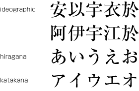
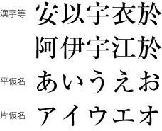
Japanese letters used for composing Japanese text mainly consist of ideographic (cl-19), hiragana (cl-15) and katakana (cl-16) characters (see Figure 1 ).
日本語組版に使用する和文文字では,主に漢字等(cl-19),平仮名(cl-15)及び片仮名(cl-16)を使用する(Figure 1 ).
Note
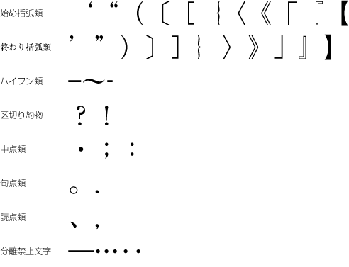
In addition to ideographic (cl-19), hiragana (cl-15) and katakana (cl-16) characters, various punctuation marks (see Figure 2 ) as well as Western characters (cl-27), such as European numerals, Latin letters and/or Greek letters, may be used in Japanese text. In this document these characters are classified into character classes, for which explanations are given describing their behavior in type-setting.
日本語組版には,漢字等(cl-19),平仮名(cl-15)及び片仮名(cl-16)以外に,多くの約物類を使用する(Figure 2 ).その他に,アラビア数字,ラテン文字,ギリシャ文字などの欧文用文字(cl-27)を混用する場合がある.この文書では,日本語組版で使用する文字について組版上の振る舞いから文字クラスとして分類し,解説する.

Note
2.1.2 Kanji, Hiragana and Katakana 漢字等,平仮名,片仮名
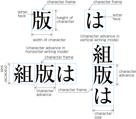
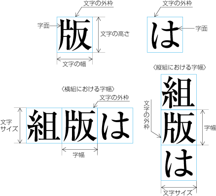
Ideographic (cl-19), hiragana (cl-15) and katakana (cl-16) characters are the same size, and have square character frames of equal dimensions. Aligned with the vertical and horizontal center of the character frame, there is a smaller box called the letter face, which contains the actual symbol. Character size is measured by the size of the character frame (see Figure 3 ). "Character advance" is a term used to describe the advance width of the character frame of a character. By definition, it is equal to the "width" of a character in horizontal writing mode, whereas it is the height of a character in vertical writing mode (see Figure 3 ).
漢字等(cl-19),平仮名(cl-15)及び片仮名(cl-16)は,正方形の文字の外枠を持っており,その文字の外枠の天地左右中央に,文字の外枠よりやや小さくした字面を持っている(逆にいえば,字面の上下左右と文字の外枠との間には,字面により大きさは異なるが,若干の空白を持っている).文字サイズは,この文字の外枠のサイズで示す(Figure 3 ).なお,字幅は,文字を配列する方向(字詰め方向)の文字の外枠の大きさをいい,横組では文字の幅となるが,縦組では文字の高さとなる(Figure 3 ).漢字等(cl-19),平仮名(cl-15)及び片仮名(cl-16)の外枠は正方形なので,その字幅は全角となる.
Note
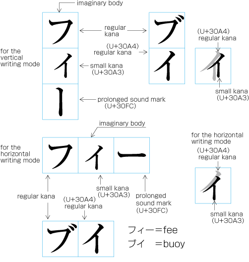
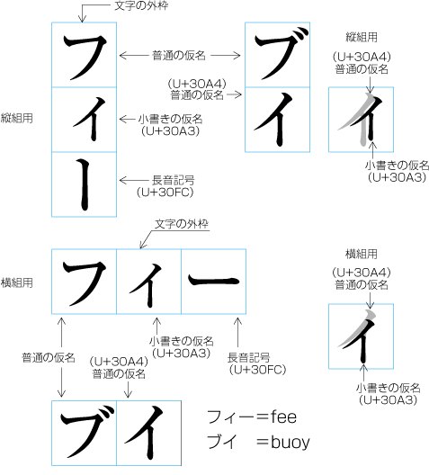
In vertical writing mode, the letter face of small kana (cl-11) characters (ぁぃぅァィゥ etc.) is placed at the vertical center and to the right of the horizontal center of the character frame; in horizontal writing mode, it is placed at the horizontal center and below the vertical center (see Figure 4 ). Also there are punctuation marks with letter faces that are not placed at the vertical and horizontal center of the character frame.
小書きの仮名(cl-11)(ぁぃぅァィゥなど)は,縦組では文字の外枠の天地中央で右寄り,横組では文字の外枠の左右中央で下寄りに字面を配置する(Figure 4 ).また,約物などでは,文字の外枠の天地左右中央に配置しない例がある.
2.1.3 Principles of Arrangement of Kanji and Kana Characters 漢字及び仮名の配置の原則
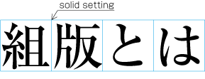
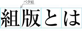
In principle, when composing a line with ideographic (cl-19), hiragana (cl-15) and katakana (cl-16) characters no extra spacing appears between their character frame. This is called solid setting (see Figure 5 ).
漢字等(cl-19),平仮名(cl-15)及び片仮名(cl-16)は,行に文字を配置していく際には,原則として,文字の外枠を密着させて配置するベタ組にする(Figure 5 ).
Note
In the letterpress printing era ideographic (cl-19), hiragana (cl-15) and katakana (cl-16) characters were designed so that they were easy to read in solid setting, regardless of text direction. However, unlike the letterpress printing era, when several sizes of the original pattern of a letter were required to create matrices, in today's digital era the same original pattern is used for any size simply by enlargement or reduction. Because of this, it might be necessary to adjust the inter-character spacing when composing lines at large character sizes. When composing lines at small character sizes, hinting data is used to ensure that the width of the strokes that make up a character look correct.
活字組版の時代から漢字等(cl-19),平仮名(cl-15)及び片仮名(cl-16)の設計は,縦組でも横組でも読みやすく,かつ,ベタ組とした場合に読みやすいように設計されていた.ただし,活字組版では,文字サイズ別に何段階かに分けて原図(母型の元になるもの)を作成していた.しかし,今日では,同一の原図から単純に拡大・縮小して使用するので,大きな文字サイズにした際には,字間の調整が必要になる場合も出てきた.(なお,小さい文字サイズにする場合,そのまま縮小すると,解像度によっては文字の線幅にバラツキが出る.そこで各文字ごとに線幅の補正情報(ヒントデータ)を持たせ,出力品質の維持がはかられている.)
Note
Depending on the context, there are several setting methods used in addition to solid setting, as shown below.
次のようにベタ組にしない方法も,印刷物の内容によっては採用されている.
-
Fixed inter-character spacing: Text set with a fixed size spacing between each character frame (see Figure 6 ).
アキ組:字間に一定の空き量を入れて文字を配置する方法(Figure 6 ).
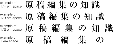
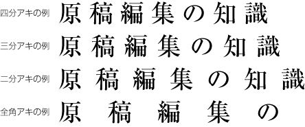
Figure 6 Examples of fixed inter-character spacing in horizontal writing mode. アキ組の例(横組の場合) Fixed inter-character spacing is used in books for the following cases: (Fixed inter-character spacing, including also even tsumegumi, is defined in JIS X 4051, sec. 4.18.1 b.)
書籍におけるアキ組は,次のような場合に利用されている.(アキ組については,均等詰めを含めてJIS X 4051の4.18.1のb)に規定されている.)
-
To achieve a balance between running heads with few and with many characters. Fixed inter-character spacing is used for the running heads with few characters. Examples of fixed inter-character spacing for running heads are given in JIS X 4051, annex 5.
字数の少ない柱と字数の多い柱とのバランスをとるために,字数の少ない柱をアキ組にする.柱のアキ組の例は,JIS X 4051の附属書5に掲げられている.
-
To achieve a balance between headings with few and with many characters. Fixed inter-character spacing is used for the headings with few characters. Examples of fixed inter-character spacing for headings are given in JIS X 4051, annex 6.
字数の少ない見出しと字数の多い見出しとのバランスをとるために,字数の少ない見出しをアキ組にする.見出しのアキ組の例は,JIS X 4051の附属書6に掲げられている.
-
For captions of illustrations and tables, which only have a few characters. Fixed inter-character spacing is used to balance with the size of the illustration or table.
-
In some cases, fixed inter-character spacing is used for Chinese and Japanese poetry where one line has only a few characters.
1行の字数が少ない漢詩や日本語の詩歌でアキ組にする場合がある.
-
-
Even inter-character spacing: Text set with equal inter-character spacing between characters on a given line, so that each line is aligned to the same line head and line end (see Figure 7 ).
均等割り:字間を均等に空け,文字列の両端を行頭及び行末にそろえる方法(Figure 7 ).
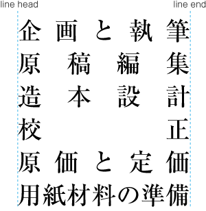
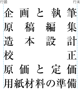
Figure 7 Example of even inter-character spacing setting in horizontal writing mode. 均等割りの例(横組の場合) Even inter-character spacing setting is used in books for unifying the length of table headings with Japanese text (see Figure 8 ). There are also examples (e.g. lists of names) in which parts of a person names receive inter-character spacing. (Even inter-character spacing, including processing of jidori, is defined in JIS X 4051, sec. 4.18.1.)
書籍における均等割りは,表の和文の項目見出しの長さをそろえる場合に利用されている(Figure 8 ).また,名簿などで人名の部分で均等割りにする例がある.(均等割りについては,字取り処理を含めてJIS X 4051の4.18.1に規定されている.)
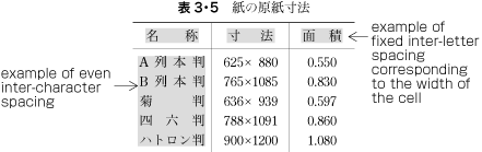
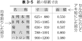
Figure 8 Example of a table with inter-character spacing. 表の均等割りの例 -
Tsumegumi (kerning / tracking): Text is set with negative inter-character spacing by arranging characters so that a portion of two character frames overlap each other. This is divided further into two types, depending on the methods used for inter-character spacing reduction. One method involves reducing by the same amount of inter-character spacing (even tsumegumi or tracking, see Figure 9 ) and the other involves determining the amount of spacing to reduce based on the distance between the two letter faces of adjacent characters (face tsumegumi or letter face kerning, see Figure 10 ).
詰め組:ベタ組より字間を詰めて,文字の外枠の一部が重なるように文字を配置する方法.この場合,重なる量を同一にする方法(均等詰め,Figure 9 )と,仮名や約物等の字面に応じて,字面が重ならない程度まで詰めて文字を配置する方法(字面詰め,Figure 10 )がある.


Figure 9 Example of even tsumegumi in horizontal writing mode. (The 1st line is the same text with solid setting, for comparison.) 均等詰めの例(横組の場合,上側はベタ組,下側が均等詰めの例) 

Figure 10 Example of face tsumegumi in horizontal writing mode. (The 1st line is the same text with solid setting, for comparison.) 字面詰めの例(横組の場合,上側はベタ組,下側が字面詰めの例) In the main text of books, the most reader-friendly approach is to use solid setting. However, if the character size is larger, the distance between characters may become unbalanced, and tsumegumi will be applied. For example, there are books where tsumegumi is used with headings set in large character sizes. These methods are rarely used in books, since ease of reading is very important, but in magazines or advertisements there are many more examples of tsumegumi. Magazines tend to use type to differentiate themselves from others, and so devices like this are sometimes used for that purpose.
詰め組は,書籍では大きな文字サイズの見出し等で採用されている例がある.字と字との間隔について,本文ではベタ組が最も読みやすい.しかし,そのまま拡大した場合には,大きな文字サイズになった場合,字と字との間隔の見え方について,ややバランスを欠く例もあり,採用されている.また,読みやすさを重視する書籍の本文で採用している例は少ないが,雑誌の本文や広告のコピー等では,詰め組を採用している例がある.誌面構成のデザインを重視,文字部分をまとまったものとして演出したいということであろう.
2.2 Page Formats for Japanese Documents 日本語文書の基本となる組体裁
2.2.1 Specification of Page Formats 組体裁の設計
The page format of a Japanese document is specified by:
日本語文書の組体裁は,以下の順序で設計する.
2.2.2 Basic Templates of Page Formats 基本となる組体裁
Generally, books use only one template for page format, whereas magazines often use several templates.
基本となる組体裁は,書籍では1パターンであることが多いが,雑誌では一般に数パターンを作成する.
Although in books, as will be mentioned in c of § 2.2.5 Kihon-hanmen and Examples of Real Page Format 基本版面と実際のページの設計例 , there tends to be one template for the page format, the basic pattern is typically adapted. For example, the table of contents may contain small modifications. Furthermore, there are many examples of indexes with a different page format than the basic page format, and vertically set books often have indexes in horizontal writing mode and sometimes multiple columns. This still holds true where the goal is to make the size of the hanmen for indexes close to the size of hanmen in the basic page format.
書籍では,1パターンといっても,§ 2.2.5 Kihon-hanmen and Examples of Real Page Format 基本版面と実際のページの設計例 のcで解説するように,目次などは基本となる組体裁を元に設計をしなおす.また,索引は,基本となる組体裁とは異なる設計になる例が多く,縦組の書籍でも,索引は横組とし,段組とする例が多い.この場合でも,基本となる組体裁で設計した版面サイズと索引の版面サイズが近似するように設計する.
Magazines gather articles of different kinds. Often the page format will differ depending on the content of the article. For example, one part may have 9 point character size and 3 columns, and another part 8 point character size and 4 columns.
雑誌は,性格の異なる記事の集合である.そこで記事内容により,ある部分は9ポイントの3段組,ある部分は8ポイントの4段組と,記事内容により組体裁を変えている例が多い.
2.2.3 Elements of Page Formats 基本となる組体裁の主な設計要素
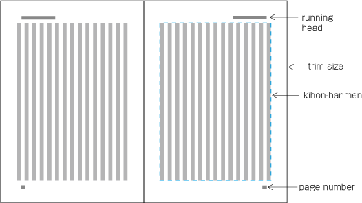
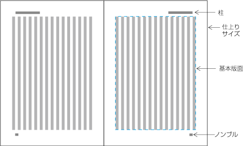
The following are the basic elements of a page format. Figure 11 illustrates an example of a page format in vertical writing mode.
基本となる組体裁の主な設計要素としては,次がある(縦組の例をFigure 11 に示す).
-
Trim size and binding side (vertically set Japanese documents are bound on the right-hand side, and horizontally set documents are bound on the left-hand side. See Figure 12 .)
-
Principal text direction (vertical writing mode or horizontal writing mode).
基本となる組方向(縦組又は横組)
-
Appearance of the kihon-hanmen and its position relative to the trim size.
基本版面の体裁及びその仕上りサイズに対する位置
-
Appearance of running heads and page numbers, and their positions relative to the trim size and kihon-hanmen.
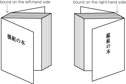
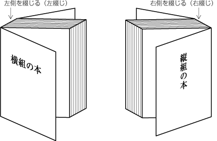
Note
2.2.4 Elements of Kihon-hanmen 基本版面の設計要素
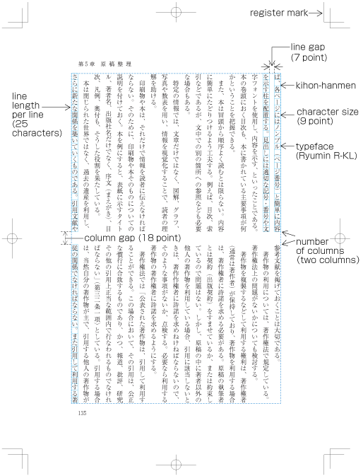
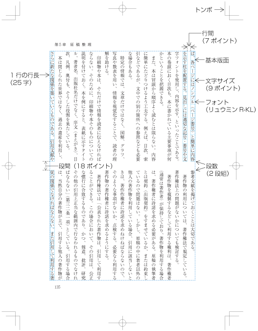
The kihon-hanmen is the hanmen style designed as the basis of a book. The following are the basic elements of the kihon-hanmen (see Figure 13 ).
本の基本として設計される版面体裁が基本版面である.基本版面の設計要素としては,次がある(Figure 13 ).
-
Character size and typeface name
使用する文字サイズ及びフォント名
-
Text direction (vertical writing mode or horizontal writing mode)
組方向(縦組又は横組)
-
Number of columns and column gap when using multi-column format
-
1行の行長
-
Number of lines per page (number of lines per column when using multi-column format)
1ページに配置する行数(段組の場合は1段に配置する行数)
Note
To understand the characteristics of Japanese composition, it is important to understand how the various elements of the kihon-hanmen are applied to a real page. The details will be explained in § 2.5 Page wise Arrangement of Kihon-hanmen Elements 基本版面の設計要素の各ページに対する適用 .
基本版面で設計した各要素が,実際のページでどのように適用されるかは日本語組版の特徴を理解するための重要なポイントである.そこで,その詳細は§ 2.5 Page wise Arrangement of Kihon-hanmen Elements 基本版面の設計要素の各ページに対する適用 で解説する.
Note
The normative definition of kihon-hanmen is provided in JIS X 4051, sec. 7.5.
基本版面の指定等については,JIS X 4051の7.5に規定されている.
Note
Format examples (including running heads and page numbers) and composition examples for kihon-hanmen in different trim sizes are available in JIS X 4051, annexes 3 and 4.
仕上りサイズ別の基本版面の設計例(柱及びノンブルの設計例も含く)及び組版例が,JIS X 4051の附属書3及び附属書4に掲げられているので参考になる.
Note
Depending on the application, character sizes can be specified in multiple ways. For books, character size is mainly specified using points or Q/q. Points are used for letterpress printing. In JIS Z 8305 (size units of printing type), one point is determined to be 0.3514mm. This is the size that is usually used. However, some commonly used applications adopt one point as 1/72 inch, ca. 0.3528mm. Q was used for photo typesetting. One Q is 0.25mm. It is very difficult to unify the unit sizes for character size specifications, because actual users prefer the unit to which they are accustomed. In some companies, multiple types of unit are used together.
処理系にもよるが,文字サイズの指示には複数の単位が使用できる.書籍において,文字サイズの指示に使用されている単位としては,主にポイントと級(Q,q)がある.ポイントは,活字組版で使用されていた単位で,JIS Z 8305(活字の基準寸法)では,1ポイントは0.3514mmと規定しており,このサイズが現在でも使用されている.ただし,1ポイントを1/72インチ(約0.3528mm)とすることができる処理系も多く,このサイズを採用しているものもある.級は写真植字で使用されていた単位で,1Qは0.25mmである.文字サイズの指示では,慣れているものが使いやすいということもあり,どれか1つに整理するのは困難であり,同じ出版社内でも複数の単位が使用されている例がある.
2.2.5 Kihon-hanmen and Examples of Real Page Format 基本版面と実際のページの設計例
Below are several examples of how the basic page format is created, and how then various elements are placed on a real text page. (This and other aspects of how the various elements of the kihon-hanmen are arranged on each page are explained in § 2.5 Page wise Arrangement of Kihon-hanmen Elements 基本版面の設計要素の各ページに対する適用 .)
基本となる組体裁を設計し,それを基準に文書の実際のページにおける各要素の配置設計を行うが,その例をいくつか示しておく(なお,この点を含め,基本版面の設計要素が各ページでどのように適用されるかについては§ 2.5 Page wise Arrangement of Kihon-hanmen Elements 基本版面の設計要素の各ページに対する適用 で解説する).
-
Realm and position of headings
見出しを配置する領域と位置
To set a heading, first establish a rectangular space based on a number of lines in the kihon-hanmen. For example, a '3 line space' means (3 * the size of the character frame used for the kihon-hanmen + 2 * the line gap in the kihon-hanmen). (Details of this processing are defined in JIS X 4051, sec. 8.3.3.d). The heading text is usually set in the centre of the rectangular space in the block direction, and indented from the line head. The size of the indent is usually specified as a number of characters in the kihon-hanmen. For example, a '4 character indent' means (4 * the size of the character frames used for establishing the kihon-hanmen). (See the example at Figure 14 .)
見出しを配置する領域の行送り方向のサイズは,基本版面で設定した行の位置を元に,それの何行分を用いるかという方法で設計する(この処理方法については,JIS X 4051の8.3.3のd)に規定されている).見出しの字詰め方向の字下げは,基本版面で設定した文字位置を基準に,その何字分を下げるかという方法で一般に設計する.Figure 14 の例は,見出しを基本版面で設定した行の位置の3行分の中央に配置し,基本版面で設定した文字サイズの4字分下がった位置に配置している.
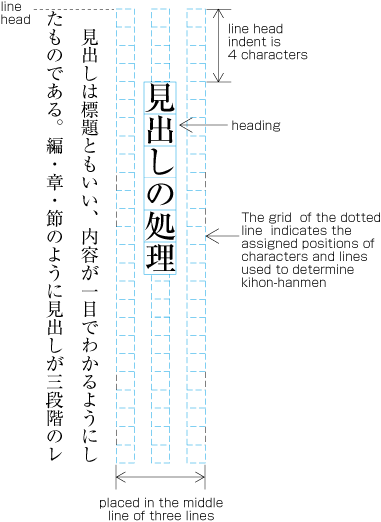
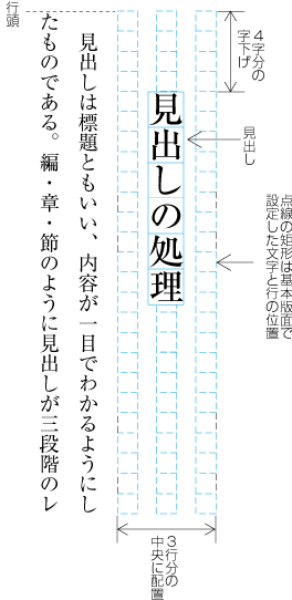
Figure 14 Layout example of a heading based on the line positions established by the kihon-hanmen. 基本版面で設計した行の位置を基準とした見出しの設計例 Note
Details of the different types of heading, creation of headings, methods for placing headings, etc. is explained in § 4.1 Handling of Headings (including Page Breaks) 見出し処理(改ページ処理も含む) .
見出しの種類や構成,その配置方法等についての詳細は,§ 4.1 Handling of Headings (including Page Breaks) 見出し処理(改ページ処理も含む) で解説する.
-
Size of illustrations
図版のサイズ
In horizontal writing mode with two columns, for example, the width of illustrations should, if at all possible, be either the width of one kihon-hanmen column or the width of the kihon-hanmen (see Figure 15 ). The illustrations are usually set at the head or the foot of the page (see Figure 15 ).
横組の段組,例えば2段組に図版を配置する場合,図版の左右サイズは,できるだけ基本版面で設計した1段の左右サイズ又は基本版面の左右サイズを基準に設計し,そのいずれかのサイズで配置できるときは,そのように決める(Figure 15 ).また,その位置は,多くは版面の天又は地にそろえて配置する(Figure 15 ).
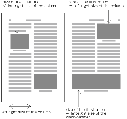
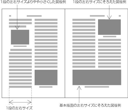
Figure 15 Example of illustrations in two columns, horizontal writing mode. 横組の2段組における図版の設計例 Also, in vertical writing mode, for example with three columns, the height of illustrations should, if at all possible, be either the height of one kihon-hanmen column or the height of the kihon-hanmen (see Figure 16 ). The illustrations are usually set at the right side or left side of the kihon-hanmen (see Figure 16 ).
縦組でも,段組にする場合は,例えば,3段組の図版の天地サイズは,できるだけ基本版面で設計した1段若しくは2段の天地サイズ,又は基本版面の天地サイズを基準に設計し,そのいずれかのサイズで配置できるときは,そのように決める(Figure 16 ).また,その位置は,多くは版面の天又は地にそろえて配置する(Figure 16 ).
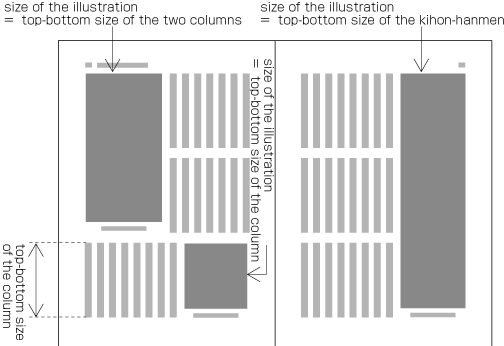
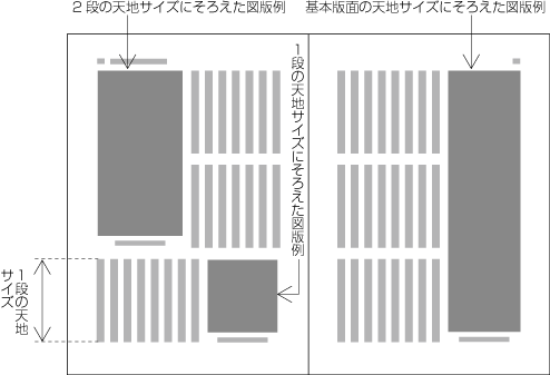
Figure 16 Example of illustrations in three columns, vertical writing mode. 縦組の3段組における図版の設計例 Note
Details of illustration positioning is explained in § 4.3 Positioning of Illustrations 図版の配置処理 .
-
Hanmen size for the table of contents
目次の版面サイズ
The hanmen size for the table of contents of books is based on the size of the kihon-hanmen. There are many examples of tables of contents in vertical writing mode where the left-to-right size is identical to that of the kihon-hanmen, but the top-to-bottom size is a little bit smaller (see Figure 17 ).
書籍の目次の版面サイズは,基本版面のサイズを基準に設計する.例えば,縦組の目次では,左右の行送り方向のサイズは基本版面のサイズと同じにし,天地の字詰め方向のサイズは,やや小さくする例が多い(Figure 17 ).
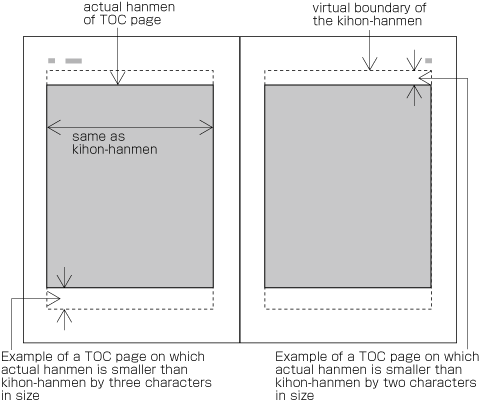
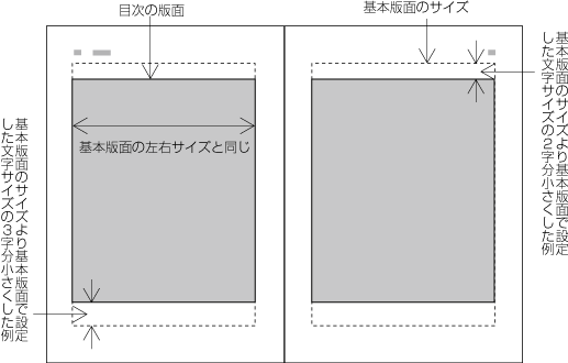
Figure 17 Example of the design of the table of contents (TOC) in vertical writing mode. 縦組の目次版面の設計例 Note
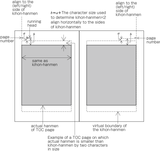
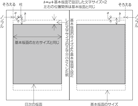
There are cases when a different hanmen than the kihon-hanmen is used for positioning of running heads and page numbers. This will be discussed in § 2.6.2 Principles of Arrangement of Running Heads and Page Numbers 柱及びノンブルの配置の原則 (see Figure 51 ).
基本版面と異なる版面にした場合の柱及びノンブルの位置については,§ 2.6.2 Principles of Arrangement of Running Heads and Page Numbers 柱及びノンブルの配置の原則 で解説する(Figure 51 ).
2.3 Vertical Writing Mode and Horizontal Writing Mode 組方向(縦組と横組)
2.3.1 Directional Factors in Japanese Composition 日本語組版における組方向
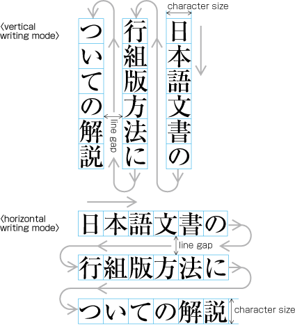
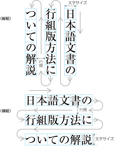
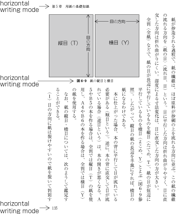
Japanese composition has two text directions. One is vertical direction (vertical writing mode), the other is horizontal direction (horizontal writing mode).
日本語組版における組方向は,縦組(縦書き)と横組(横書き)がある.
Note
Note
Note
Note
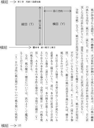
2.3.2 Major Differences between Vertical Writing Mode and Horizontal Writing Mode 縦組と横組の主な相違点
The following are major differences between vertical writing mode and horizontal writing mode.
縦組と横組の主な相違点としては,次がある.
-
Arrangement of characters, lines, columns and pages; direction of page progression.
文字,行,段及びページの配置,並びに綴じの方向は,次のようになる.
Note
-
Vertical writing mode. See Figure 20 for an example of vertical writing mode with two columns per page.
縦組の場合(2段組の例であるFigure 20 )
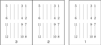
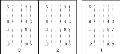
Figure 20 Direction of arrangement of characters in vertical writing mode. 縦組における文字などの配置方向 -
Characters are arranged from top to bottom, lines are arranged from right to left.
文字は上から下に,行は右から左に配置する.
-
Columns are arranged from top to bottom. A book starts with the left (recto) side and progresses from right to left (see Figure 21 ).
段は上から下に,ページは表面から開始,右から左に配置する(左方向から右方向に本は開いていく,Figure 21 ).
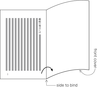
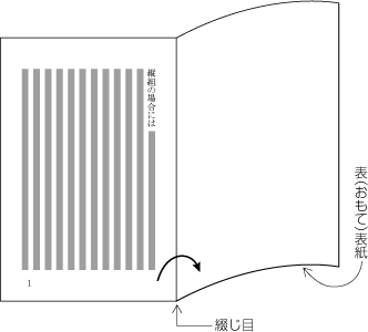
Figure 21 Progression of pages for a vertically set books. 縦組における本の開いていく方向
-
-
Horizontal composition. See Figure 22 for an example of horizontal text layout with two-columns per page.
横組の場合(2段組の例であるFigure 22 )
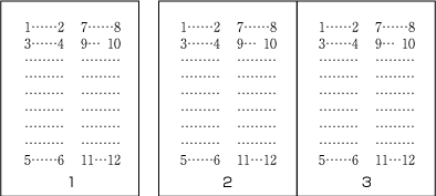
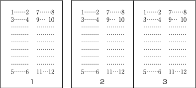
Figure 22 Direction of arrangement of characters in horizontal writing mode. 横組における文字などの配置方向 -
Characters are arranged from left to right, and lines are arranged from top to bottom.
文字は左から右に,行は上から下に配置する.
-
Columns are arranged from left to right. A book starts with the right (recto) side and progresses from left to right (see Figure 23 ).
段は左から右に,ページは表面から開始,左から右に配置する(右方向から左方向に本は開いていく,Figure 23 ).
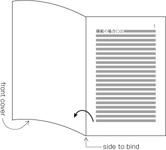
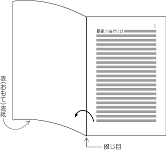
Figure 23 Progression of pages for a horizontally set book. 横組における本の開いていく方向
-
-
-
Orientation of Latin alphanumeric characters in a line.
文中に挿入される英数字の向きは,次のようになる.
-
There are three ways to arrange Latin alphanumerics in vertical writing mode:
縦組の場合は,次の3つの配置方法がある.
-
One by one with the same normal orientation as that of Japanese characters. This is usually applied to one-letter alphanumerics or capitalized abbreviations (see Figure 24 ).
和文文字と同じように正常な向きで,1字1字配置する.主に1文字の英数字,大文字の頭字語(Figure 24 )など.
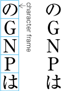
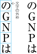
Figure 24 Arrangement of alphanumerics in vertical writing mode - normal orientation. 縦組における英数字の配置例1 Note
-
Rotated 90 degrees clockwise. This is usually applied to English words or sentences (see Figure 25 ).
文字を時計回りに90度回転し,配置する.主に英字の単語,文など(Figure 25 ).
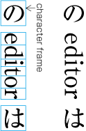
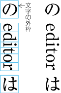
Figure 25 Arrangement of alphanumerics in vertical writing mode - rotated 90 degrees clockwise. 縦組における英数字の配置例2 Note
-
Set horizontally without changing orientation (called tate-chu-yoko, which means horizontal-in-vertical composition) (see Figure 26 ). This is usually applied to two-digit numbers (see JIS X 4051, sec. 4.8 for the definition).
正常な向きのまま,横組にする(縦中横,Figure 26 ).主に2桁の数字の場合などで利用されている(縦中横の処理は,JIS X 4051の4.8に規定されている).
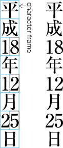
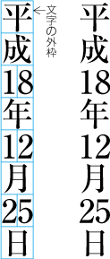
Figure 26 Arrangement of alphanumerics in vertical writing mode - tate-chu-yoko. 縦組における英数字の配置例3(縦中横)
-
-
In horizontal writing mode there is only one way of arranging alphanumerics, i.e. normal orientation.
横組の場合は,正常な向きで配置する.
-
-
Arrangement of tables and/or illustrations rotated 90 degrees clockwise or counter-clockwise for reasons of size. (This processing is defined in JIS X 4051, sec. 7.3.).
表,図版などを,サイズの関係から時計回り又は反時計回りに90度回転して配置する場合,次のようにする(この処理は,JIS X 4051の7.3に規定されている).
-
In vertical writing mode, align the top of tables/illustrations to the right of the page (see Figure 27 ).
縦組の場合は,表,図版などの上側を右側にする(Figure 27 ).
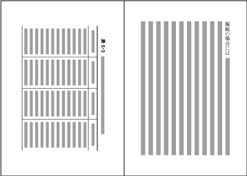
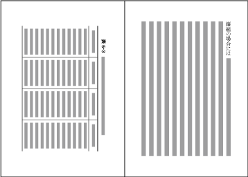
Figure 27 Example of arrangement of a table rotated 90 degrees clockwise in vertical writing mode. 縦組において表を時計回りに90度回転して配置した例 -
In horizontal writing mode, align the top of tables/illustrations to the left of the page (see Figure 28 ).
横組の場合は,表,図版などの上側を左側にする(Figure 28 ).
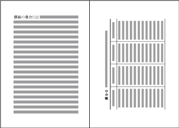
Figure 28 Example of arrangement of a table rotated 90 degrees counterclockwise in horizontal writing mode. 横組において表を反時計回りに90度回転して配置した例 Note
-
-
Arrangement of an incomplete number of lines on a multi-column format page due to new recto, page break or other reasons. (The processing of new recto and page break is defined in JIS X 4051, sec. 8.1.1.).
改丁・改ページなどの直前ページにおいて,段組の行がページの途中で終わる場合は,次のようにする(改丁・改ページの処理は,JIS X 4051の8.1.1に規定されている).
-
In vertical writing mode, just finish the line where it ends ("nariyuki"). The number of lines in each column is not uniform (see Figure 29 ).
縦組の場合は,“なりゆき”とし,各段の左右行数は不ぞろいになる(Figure 29 ).
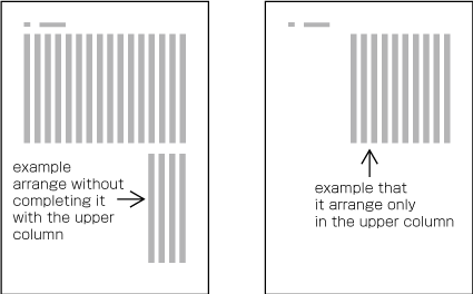
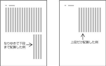
Figure 29 How to process incomplete number of lines on a multi-column format page (vertically set book). 縦組の段組における改丁・改ページの直前ページの処理例 -
In horizontal writing mode, re-arrange columns so that each column has the same number of lines. In case the number of lines is not divisible by the number of columns, add the smallest number to make it divisible and re-arrange columns using the quotient as the number of lines so that only the last column shall have the incomplete number of lines (see Figure 30 ).
横組の場合は,各段の行数を平均にする.ただし,行数が段数で割り切れない場合,その不足する行数は,最終段の末尾を空けるようにする(Figure 30 ).
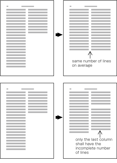
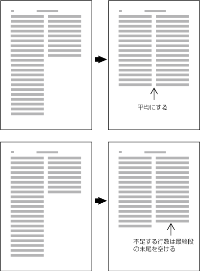
Figure 30 How to process incomplete number of lines on a multi-column format page (horizontally set book). 横組の段組における改丁・改ページの直前ページの処理例 Note
-
2.4 Specifying the Kihon-hanmen 基本版面の設計
2.4.1 Procedure for Defining the Kihon-hanmen 基本版面の設計手順
In Japanese composition, first the size of the kihon-hanmen is defined, using the square character frames of characters in solid setting. Taking this as a base, the position of the kihon-hanmen with regards to the trim size is then specified. The following are procedures for determining the size and position of the kihon-hanmen (see Figure 31 ).
日本語組版では,正方形の文字の外枠をベタ組にすることから,まず基本版面のサイズを設計し,そのうえで,仕上りサイズに対する基本版面の位置を決めている.そこで,基本版面は,次の手順で設定する(Figure 31 ).
-
Specifying the dimensions of the kihon-hanmen.
基本版面のサイズを決める.
-
For a document with a single column per page, specify the character size, the line length (the number of characters per line), the number of lines per page, and the line gap.
-
For a document with multiple columns per page, specify the character size, the line length (the number of characters per line), the number of lines per column, the line-gap, and the number of columns and the column gap.
多段組の場合は,文字サイズ,1行の行長(字詰め数),1段の行数,行間,段数及び段間を決める.
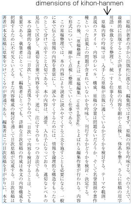
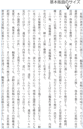
Figure 31 Procedures to determine the size and position of the kihon-hanmen, step 1. 基本版面の設定手順の1
-
-
Determining the position of the kihon-hanmen relative to the trim size.
仕上りサイズに対する基本版面の配置位置を決める.
There are various alternative methods for specifying the position of the kihon-hanmen relative to the trim size:
基本版面の配置位置の指定方法には,次がある.
-
Position vertically by centering the kihon-hanmen. Position horizontally by centering the kihon-hanmen.
天地位置:中央,左右位置:中央
-
Position vertically by specifying the spacing size at the head (for horizontal writing mode) or the spacing at the foot (for vertical writing mode). Position horizontally by centering the kihon-hanmen.
-
Position vertically by centering the kihon-hanmen. Position horizontally by specifying the spacing size of the gutter.
天地位置:中央,左右位置:のどの空き量を指定
-
Position vertically by specifying the spacing at the head (for horizontal writing mode) or the spacing at the foot (for vertical writing mode). Position horizontally by specifying the spacing size of the gutter.
天地位置:天の空き量(横組の場合)又は地の空き量(縦組の場合)を指定,左右位置:のどの空き量を指定
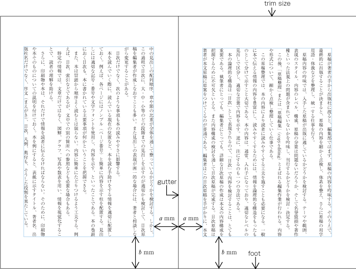
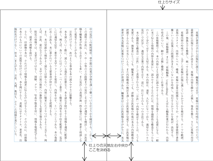
Figure 32 Procedures to determine the size and position of the kihon-hanmen, step 2. 基本版面の設定手順の2 Note
Note
-
2.4.2 Considerations in Designing the Kihon-hanmen 基本版面の設計の注意点
The following are considerations to take into account when designing the kihon-hanmen. (This topic is not about processing, but rather an explanation of design preferences. The definition of kihon-hanmen is given in JIS X 4051, sec. 7.4.1.)
基本版面は,次のような事項を考慮し設計する(以下の説明は処理内容というよりは,どのように設計するかという問題についての解説である.なお,基本版面の指定については,JIS X 4051の7.4.1に規定がある).
-
Trim size and margins. It would be best if the shape of the kihon-hanmen could be made similar to that of the trim size.
仕上りサイズ及び余白を考慮して決定する.一般には,仕上りサイズと基本版面のサイズがほぼ相似形になるように決める.
-
Character size. Generally 9 point (about 3.2mm) type is common. Except for specialized publications such as dictionaries, the minimum size of type is 8 point (about 2.8mm).
大人を読者対象とした本の場合の文字サイズは,一般に9ポイント(≒3.2mm)が多い.辞書など特別な本を除き,最低でも8ポイント(≒2.8mm)である.
Note
-
Line length should be multiples of the character size (see Figure 33 ).
1行の行長は,文字サイズの整数倍に設定する(Figure 33 ).
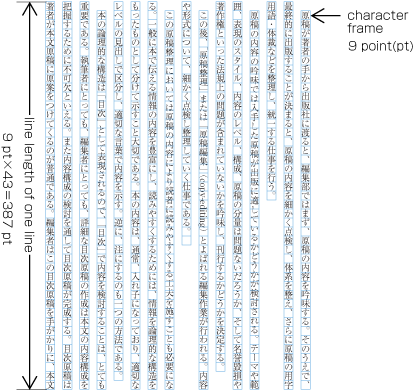
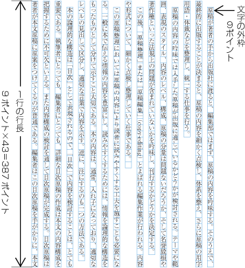
Figure 33 Line length should be multiples of the character size. 1行の行長は文字サイズの整数倍 Note
Note
-
Use the same amount of line gap throughout the book, except for special cases. The size of the kihon-hanmen in the block direction is specified using the number of lines and the size of the line-gap.
行と行の間の空き量(行間)は,特別な場合を除き,一定の値を確保する.また,各行の行の位置は,できるだけそろえるようにする.そこで,一般に基本版面の行送り方向のサイズは,行数と行間で設定する.
Note
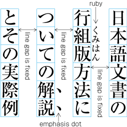
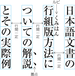
Figure 34 Inserting ruby or other items between lines. 行間にルビなどを配置した例 Note
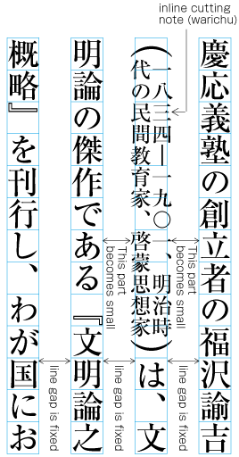
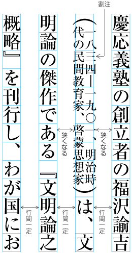
Figure 35 Example of inter-line processing with warichu between lines. 割注が入った場合の行間の処理例 Note
Note
Note
Note
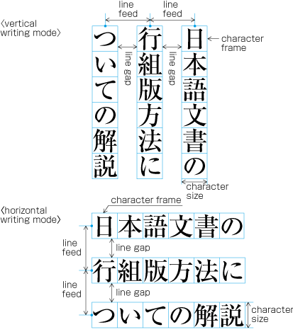
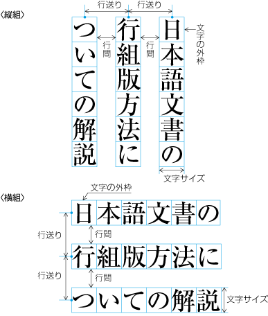
Figure 36 Specifying kihon-hanmen with line feed. 基本版面を行送りで指定する方法
The size of the kihon-hanmen in this case can be calculated by following method:
以上のように設定した基本版面のサイズは,次のように計算できる.
-
Vertical writing mode with one column
縦組の1段の場合
Width of kihon-hanmen = character size × number of lines per page + line gap × (number of lines per page − 1)
左右サイズ=使用する文字サイズ×1ページの行数+行間×(1ページの行数-1)
298 point = 9 point × 18 lines + 8 point × (18 lines − 1)
298ポイント=9ポイント×18行+8ポイント×(18行-1)
Height of kihon-hanmen = character size × number of characters per line
天地サイズ=使用する文字サイズ×1行の行長
468 point = 9 point × 52 characters
468ポイント=9ポイント×52字
-
Vertical writing mode with multi columns
縦組の多段の場合
Width of kihon-hanmen = character size × number of lines per column + line gap × (number of lines per column − 1)
左右サイズ=使用する文字サイズ×1段の行数+行間×(1段の行数-1)
309 point = 9 point × 21 lines + 6 point × (21 lines − 1)
309ポイント=9ポイント×21行+6ポイント×(21行-1)
Height of kihon-hanmen = character size × number of characters per line × number of columns + column gap × (number of columns − 1)
天地サイズ=使用する文字サイズ×1行の行長×段数+段間×(段数-1)
468 point = 9 point × 25 characters × 2 columns + 18 point × (2 columns − 1)
468ポイント=9ポイント×25字×2段+18ポイント×(2段-1)
-
Horizontal writing mode with one column
横組の1段の場合
Width of kihon-hanmen = character size × number of characters per line
左右サイズ=使用する文字サイズ×1行の行長
315 point = 9 point × 35 characters
315ポイント=9ポイント×35字
Height of kihon-hanmen = character size × number of lines per page + line gap × (number of lines per page − 1)
天地サイズ=使用する文字サイズ×1ページの行数+行間×(1ページの行数-1)
468 point = 9 point × 28 lines + 8 point × (28 lines − 1)
468ポイント=9ポイント×28行+8ポイント×(28行-1)
-
Horizontal writing mode with multi columns
横組の多段の場合
Width of kihon-hanmen = character size × number of characters per line × number of columns + column gap × (number of columns − 1)
左右サイズ=使用する文字サイズ×1行の行長×段数+段間×(段数-1)
320 point = 8 point × 19 characters × 2 columns + 16 point × (2 columns − 1)
320ポイント=8ポイント×19字×2段+16ポイント×(2段-1)
Height of kihon-hanmen = character size × number of lines per column + line gap × (number of lines per column − 1)
天地サイズ=使用する文字サイズ×1段の行数+行間×(1段の行数-1)
476 point = 8 point × 40 lines + 4 point × (40 lines − 1)
476ポイント=8ポイント×40行+4ポイント×(40行-1)
2.5 Page wise Arrangement of Kihon-hanmen Elements 基本版面の設計要素の各ページに対する適用
2.5.1 Examples of Items Jutting Out of the Kihon-hanmen 基本版面からはみ出す例
The various elements of a page should remain inside the boundaries of the kihon-hanmen. However, there are exceptions such as the following:
それぞれのページに配置する各要素は,基本版面で設定した版面の内側に配置する.しかし,次のような例外がある.
-
Ruby or emphasis marks (bousen, emphasis dots, etc.) at the before edge of the hanmen, are placed outside the hanmen (see Figure 37 ). The same applies in cases where ruby, underline, etc. appear beyond the after edge of the hanmen. Like the handling of exceptions mentioned below, the purpose here is to preserve the line positions established for the kihon-hanmen. This technique can also be used for reference marks associated with lines of text.
版面又は段の先頭に配置する行の右側(縦組)又は上側(横組)にルビ,傍線,圏点などを付ける場合は,版面の領域の外側に接して配置する(Figure 37 ).版面の末尾に配置する行の左側(縦組)又は下側(横組)にルビ,下線などを付ける場合は,版面の領域の外側に接して配置する.次項を含め,このことは基本版面で設定した行の位置を確保するためである.本文中に注と参照するための合印を行間に配置する方法があるが,この場合も同様に扱う.
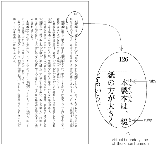
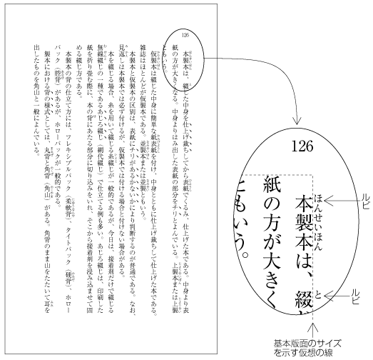
Figure 37 Example of ruby annotation placed outside of the kihon-hanmen. 版面の外側に配置したルビの例 -
When there are inline elements whose dimensions extend beyond the before edge and the after edge of a line of characters as determined by the kihon-hanmen, and when those elements appear in the first or last line of the hanmen, the parts that jut out beyond the regular line of characters also jut out of the hanmen area. For example, this is the case when the width of a sequence of characters which are set to tate-chu-yoko is wider than the characters set for the kihon-hanmen. In addition, warichu (inline cutting note) or subscript and superscript (ornament characters) are handled in the same way. (The processing rules for this item and the previous item are defined in JIS X 4051, sec. 12.1.1.)
版面の先頭又は末尾に配置する行に基本版面で設定した行送り方向の行の幅(基本版面で設定した文字サイズ)よりはみ出して配置する要素がある場合は,基本版面で設定した行送り方向の行の幅よりはみ出して配置する部分を,版面の領域の外側にはみ出して配置する(前項とこの項の処理は,JIS X 4051の12.1.1に規定されている).例えば,縦中横の設定を行った文字列の横幅が基本版面で設定した文字サイズより大きくなる場合などである.この他に,割注,上付き・下付きの添え字なども同様な扱いとする.
-
Line adjustment by hanging punctuation is only necessary for full stops (cl-06) and commas (cl-07) when they would otherwise need to be wrapped to the line head. The character is placed so that it touches the hanmen at the line end (see Figure 38 ). (Hanging punctuation is not defined in JIS X 4051, but there is an explanation in sec. 8.1, c.)
ぶら下げ組とよばれる処理をした場合は,行頭禁則の処理を必要とする句点類(cl-06)及び読点類(cl-07)に限り,行末の版面の領域の外側に接して配置する(Figure 38 ).なお,ぶら下げ組についてはJIS X 4051に規定されていないが,同規格の解説8.1)c)に説明がある.
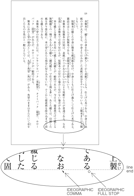
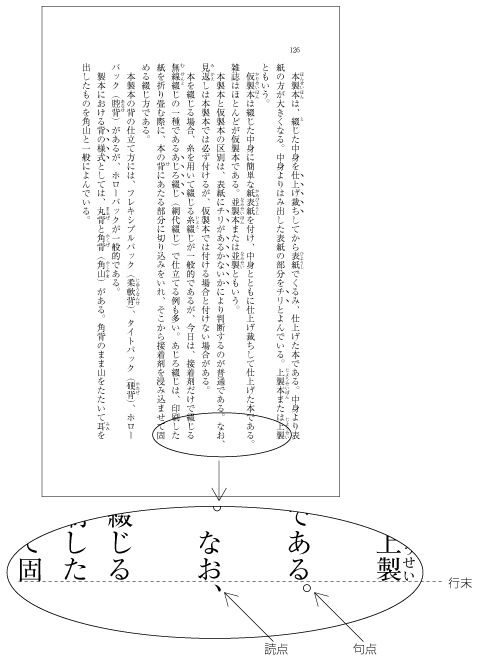
Figure 38 Example of IDEOGRAPHIC COMMA and IDEOGRAPHIC FULL STOP placed below the kihon-hanmen. ぶら下げ組により版面の外側に配置した句点と読点の例 Note
Note
-
Illustrations and tables are normally placed inside the area defined by the kihon-hanmen. However, there may also be cases in which a particular illustration or table juts outside the kihon-hanmen.
図版や表を各ページに配置する場合,一般に基本版面で設定した範囲内に配置する.しかし,配置する図版や表によっては,基本版面で設定した範囲をはみ出して配置する場合もある.
-
Cases in which it is necessary to make the illustration or table larger than the kihon-hanmen, because reducing its size would make it unreadable.
配置する図版や表を基本版面に収めると文字が読みにくくなるため,サイズを基本版面より大きくせざるを得ない場合.
-
For the sake of visual effect, the illustration may bleed into the complete paper area. This is not often used in books, but is often used in magazines (see Figure 39 ).
視覚的効果を出すために基本版面で設定した範囲をはみ出して配置する.特に紙面いっぱいに配置する“裁切り”とよばれる方法は,書籍では多くないが,雑誌などではよく行われている(Figure 39 ).
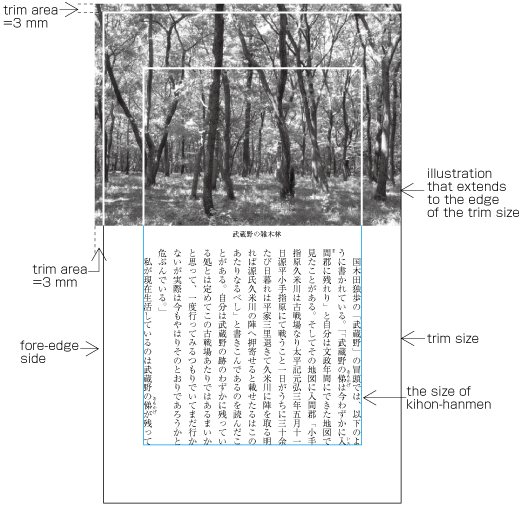
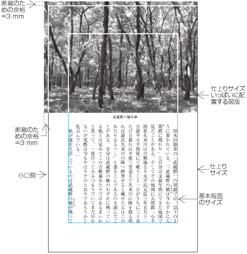
Figure 39 Example of bleeds. 裁切りの例
-
-
Magazines may place the captions of illustrations outside the column area or in the column gap. (Some people regard this as bad style.)
その他,図版のキャプションを段の領域の外側,段間に配置する方法も雑誌などでは行われている(この配置方法は体裁がよくないという意見もある).
2.5.2 Line Positioning based on the Kihon-hanmen Design 基本版面で設定した行位置の適用
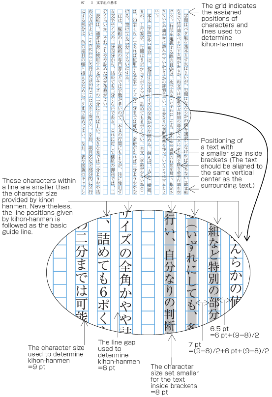
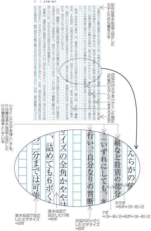
In principle, pagewise positioning of lines relies on the line positions established for the kihon-hanmen. This holds for lines with ruby or emphasis dots as shown in Figure 34 . Even when lines contain characters that are smaller than the character size used for the kihon-hanmen (as shown in Figure 40 ), the line positions used for the kihon-hanmen continue to be used as the basic guide lines. This is so that following lines with normal-sized characters still naturally fall into the line positions established for the kihon-hanmen.
各ページにおける行の配置位置は,基本版面で設定した行の位置に従うのが原則である.前掲した図(Figure 34 )のようにルビや圏点が付いた場合だけでなく,例えば,次のFigure 40 に示したように,行中の一部として基本版面で設定した文字サイズより小さな文字が入る場合でも,基本版面で設定した行の位置を基準に配置し,それに後続する行も基本版面で設定した行の位置にくるようにする.
Note
The following are exceptions when handling line position:
ただし,行の配置位置については,次のような例外がある.
-
When inserting more than one illustration or table item in horizontal writing mode, assuming that there is no text to the left or right of the items, the items may either slip off the grid established for the kihon-hanmen (see Figure 41 ), or stick to the grid (see Figure 42 ). The former approach is used, whenever possible, to achieve an equal amount of space before and after illustrations or tables. (This method is often used in books.) (This processing method is defined in JIS X 4051, sec. 10.3.2., d.)
横組で,図版や表の左右にテキストを配置しない方法とした場合,1ページに2つ以上のや表が挿入されたときは,基本版面で設定した行の位置からずれることがある(Figure 41 ).ただし,基本版面で設定した行の位置に配置する方法もある(Figure 42 ).前者の方法は,図版や表の前後の空き量をできるだけ均一にするという考え方による(この方法を採用している書籍が多い).この処理方法については,JIS X 4051の10.3.2のd)に規定がある.
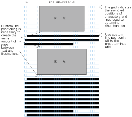
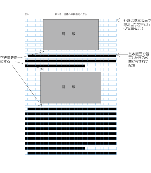
Figure 41 Positioning of lines with multiple illustrations - 1. 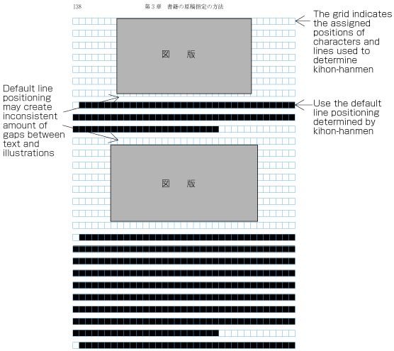
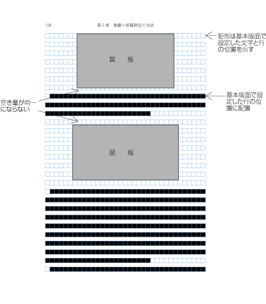
Figure 42 Positioning of lines with multiple illustrations - 2. -
The size of characters in endnotes inserted between paragraphs or those in footnotes at the bottom of the page (in horizontal writing mode) is smaller than the character size established for the kihon-hanmen. As a result, the character size and line gap are also smaller, and so the line positions are no longer identical to those established for the kihon-hanmen. As an example, Figure 43 shows the position of an endnote between paragraphs in vertical writing mode. (The processing of endnotes is defined in JIS X 4051, sec. 9.3, and the processing of footnotes in sec. 9.4.)
段落間に挿入される後注及び横組でページの下端に挿入される脚注は,基本版面で設定した文字サイズよりは小さくする.これに伴い行間も狭くするので,基本版面で設定した行の位置とはそろわない.例えば,縦組において,段落の間に入る後注の配置位置の例をFigure 43 に示す.なお,後注の組版処理については,JIS X 4051の9.3,脚注は9.4に規定されている.
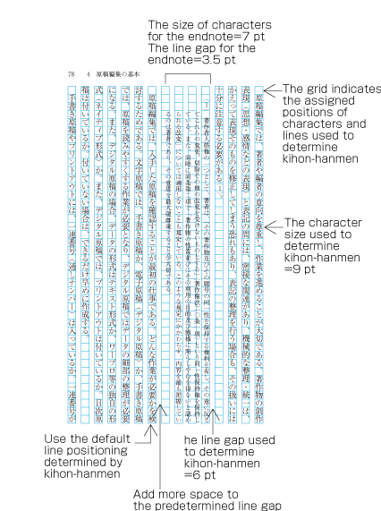
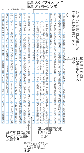
Figure 43 Positioning of an endnote in vertical writing mode. 縦組の後注の配置例 -
As mentioned above, the position of a heading may not be identical to the lines established for the kihon-hanmen. Nevertheless, in the block direction, headings base their alignment on the line positions established for the kihon-hanmen (see Figure 14 ).
見出しは,前述したように必ずしも基本版面で設定した行の位置とはそろわないことがある.しかし,その行送り方向に占める領域は,基本版面で設定した行を基準に設計する(Figure 14 ).
2.5.3 Character Positioning based on Kihon-hanmen Design 基本版面で設定した文字位置の適用
In principle, the characters in each line follow the solid setting positions of characters established for the kihon-hanmen. However, as already shown in some of the previous figures, there are examples where this is not the case. Such cases are rather common, and here we will show some prototypical examples (details will be given in § 3. Line Composition 行の組版処理 ).
各行に配置する文字の位置は,基本版面で設定したベタ組とした文字の配置位置に従うのが原則である.しかし,前掲したいくつかの図でも基本版面で設定した文字の位置に従っていない例がある.こうした事例は多いが,以下では,典型的な例をいくつか示す(詳細は§ 3. Line Composition 行の組版処理 で解説する).
Note
-
When 9pt is the character size used to establish the kihon-hanmen, characters smaller than 9pt may be inserted in part of a line (see Figure 40 ). In such cases, the parts set at 9pt and any parts set at a smaller, say, 8pt size both use solid setting, with character frames at the respective sizes for each part.
行中の一部として基本版面で設定した9ポより小さな文字が挿入されるFigure 40 の場合である.この場合は,原則として,基本版面で設定した9ポの部分は9ポの文字の外枠に従いベタ組にするとともに,小さくした8ポの部分は,小さくした8ポの文字の外枠に従いベタ組にする.
-
In cases where proportional Latin letters are rotated 90 degrees clockwise (see Figure 25 ), the proportional letters are placed according to their proportional widths. Hence, they do not fit to the character positions established for the kihon-hanmen (see Figure 44 ). Japanese letters following the Latin letters consequently slip away from the default positions as well.
行中にプロポーショナルの欧字をFigure 25 のように,文字を時計回りに90度回転して配置する場合は,プロポーショナルの欧字は,その字幅に応じて配置するので,基本版面で設定した文字位置とはそろわなくなる(Figure 44 ).欧字の後ろに連続する和文の配置位置もずれてくる.
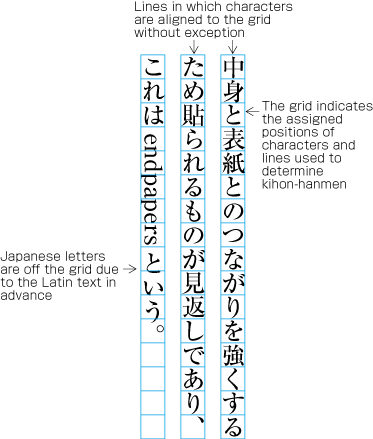
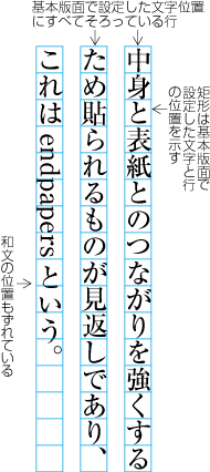
Figure 44 Positioning of a mixture of Western and Japanese letters in a line. 行中に欧字を配置した例 -
There are several methods for positioning opening brackets (cl-01) at the beginning of a line (details are explained in § 3.1.5 Positioning of Opening Brackets at Line Head 行頭の始め括弧類の配置方法 ). In cases where the indentation of the first line of a paragraph is a one em space, or if the tentsuki position is used for the bracket (that is, there is no space at the line head), the character following the bracket will be in a position which does not fit to the character positions established for the kihon-hanmen, due to the bracket being first reduced in width by half an em by default (see Figure 45 ). However, the adaptations made during the alignment of line ends will ensure that the character at the end of a line is at a position that fits with the kihon-hanmen.
改行した行の先頭(改行行頭)や段落の2行目以下の行頭(折返し行頭)に配置する始め括弧類(cl-01)の配置方法は,いくつかある(詳細は§ 3.1.5 Positioning of Opening Brackets at Line Head 行頭の始め括弧類の配置方法 で解説する).改行行頭の字下げを全角アキとする場合,又は折返し行頭に空き量をとらない配置法である天付きとする場合は,Figure 45 のように2字目以下の文字は,基本版面で設定した文字位置とはそろわなくなる.しかし,行長をそろえる調整処理を行っているので,行末の文字は,基本版面で設定した文字位置にそろっている.
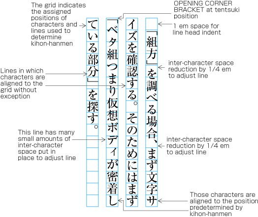
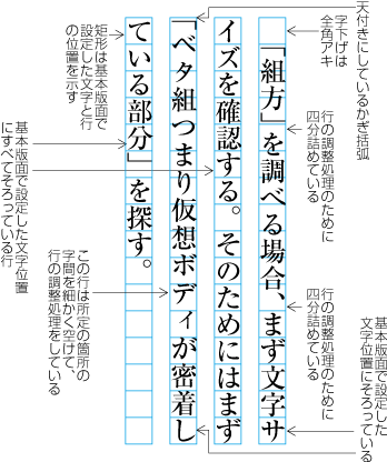
Figure 45 Example of positioning of characters off the kihon-hanmen position due to opening brackets at the line head. 行頭の始め括弧類の配置方法により文字位置がずれた例 -
§ 3. Line Composition 行の組版処理 explains that full stops (cl-06), commas (cl-07), opening brackets (cl-01) and closing brackets (cl-02) are half-width. If these punctuation marks and brackets are adjacent to ideographic (cl-19), katakana (cl-16) or hiragana (cl-15) characters, in principle there should be half em spacing before or after the punctuation mark or brackets, so that these occupy in effect a full-width size. However, if they are adjacent to other punctuation marks or brackets, the half em spacing is not added. This is done to improve the visual appearance. In such cases, the character positions are different than the positions established when defining the kihon-hanmen (see Figure 46 ).
§ 3. Line Composition 行の組版処理 で解説するように句点類(cl-06),読点類(cl-07),始め括弧類(cl-01)及び終わり括弧類(cl-02)の字幅は半角であるが,これらの約物が漢字等(cl-19),片仮名(cl-16)又は平仮名(cl-15)と連続する場合は,原則として,それぞれの約物の前又は後ろに二分アキをとることで,結果として全角というサイズにする.しかし,句点類(cl-06),読点類(cl-07),始め括弧類(cl-01)及び/又は終わり括弧類(cl-02)が連続する場合は,二分アキをとらない箇所があり,このケースでは基本版面で設定した文字位置にそろわないことになる(Figure 46 ).これは,見た目の体裁をよくするためである.
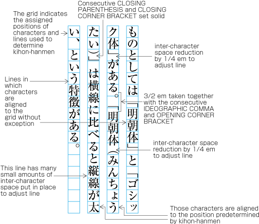
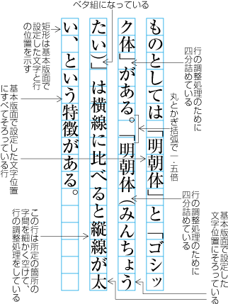
Figure 46 Example of lines with consecutive punctuation marks. 句点類と始め括弧類が連続,及び終わり括弧類が連続する例 -
§ 3. Line Composition 行の組版処理 explains the principle that closing brackets (cl-02), full stops (cl-06) and commas (cl-07) should not be placed at the line head. If by simple sequential placement these characters would appear at the line head or at the line end, some kind of adjustment becomes necessary. A similar adjustment is required for characters that should not be placed at the end of a line, such as opening brackets (cl-01). As a result of such adjustment, it may happen that other characters are placed at positions which are different from those established for the kihon-hanmen.
§ 3. Line Composition 行の組版処理 で解説するように終わり括弧類(cl-02),句点類(cl-06)及び読点類(cl-07)を行頭に配置してはならないという規則(行頭禁則という),並びに始め括弧類(cl-01)を行末に配置してはならないという規則(行末禁則)がある.これらが行頭又は行末にくる場合は,なんらかの調整が必要になる.その調整処理のために基本版面で設定した文字位置にそろわない場合が出てくる.
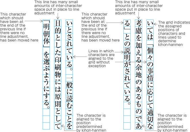
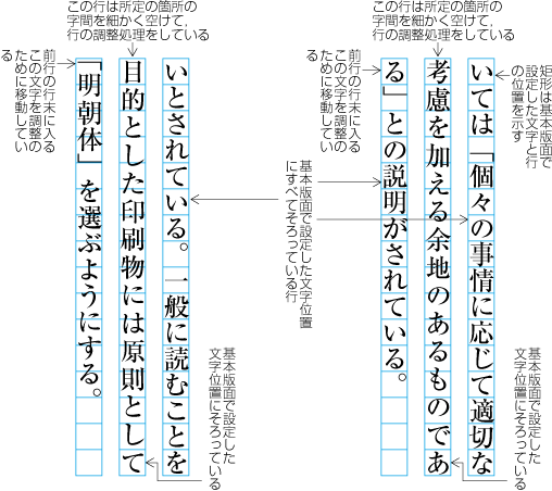
Figure 47 Example of line adjustment to avoid those characters which shall not start and end a line. 行頭禁則又は行末禁則を避ける調整をした例
2.6 Running Heads and Page Numbers 柱とノンブル
2.6.1 Positioning of Running Heads and Page Numbers 柱及びノンブルの位置
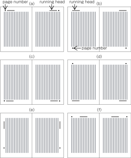
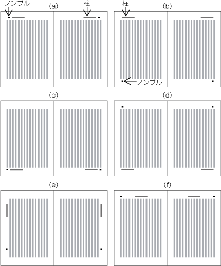
Typical positions of running heads and page numbers for vertically set books with double running heads (see § 2.6.3 Ways of Arranging Running Heads and Page Numbers 柱及びノンブルの配置方式 ) are as shown in Figure 48 .
縦組の書籍における両柱方式(§ 2.6.3 Ways of Arranging Running Heads and Page Numbers 柱及びノンブルの配置方式 )による柱及びノンブルの代表的配置位置例をFigure 48 に示す.
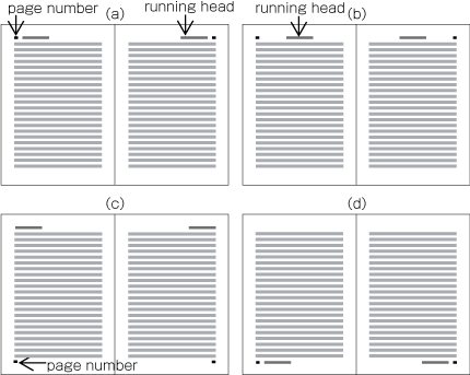
Typical positions of running heads and page numbers for horizontally set books with double running heads (see § 2.6.3 Ways of Arranging Running Heads and Page Numbers 柱及びノンブルの配置方式 ) are as shown in Figure 49 .
横組の書籍における両柱方式(§ 2.6.3 Ways of Arranging Running Heads and Page Numbers 柱及びノンブルの配置方式 )による柱及びノンブルの代表的な配置位置例をFigure 49 に示す.
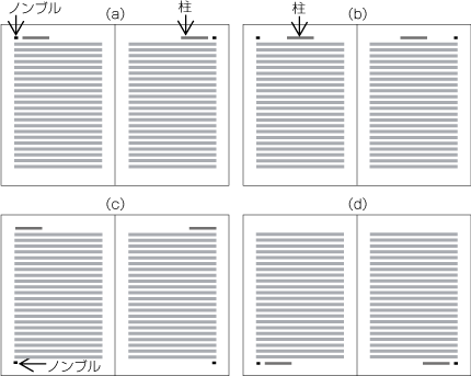
In principle, positions of running heads and page numbers should be specified relative to the kihon-hanmen, not with absolute coordinates in the trim size. (Positioning of running heads is defined in JIS X 4051, sec. 7.6.4. Positioning of page numbers is defined in JIS X 4051, sec. 7.5.4.)
柱及びノンブルの位置は,一般に仕上りサイズに対する絶対的な位置関係ではなく,基本版面との相対的な位置関係で設定する(柱の配置については,JIS X 4051の7.6.4に,ノンブルの配置については,JIS X 4051の7.5.4に規定がある).
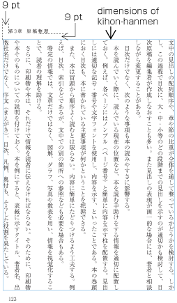
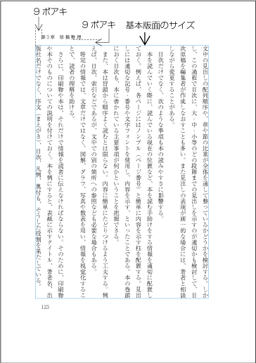
Positioning a horizontal running head above the top left corner (to head and fore-edge) of the kihon-hanmen in a typical vertically set book (see Figure 50 ).
縦組の書籍で天・小口寄りに柱を横組にして配置した場合の例(Figure 50 )
-
9 points above the kihon-hanmen (vertical space)
基本版面との上下方向の空き量は9ポイント(9ポアキ)
-
9 points from the left edge of the kihon-hanmen (horizontal space)
基本版面との左右方向の空き量(入りともいう)は9ポイント(9ポアキ)
The following recommendations should be taken into account when positioning running heads and page numbers with reference to the kihon-hanmen.
柱及びノンブルの基本版面との位置関係では,次のような点に注意する.
-
When positioning horizontal running heads and page numbers with reference to the kihon-hanmen in vertically set books, the amount of vertical space between the edge of the kihon-hanmen and the running head is a one em space as established for the kihon-hanmen. If the kihon-hanmen of the book is horizontally set, take more vertical space than the character size in the kihon-hanmen.
縦組の書籍においてノンブル又は柱を横組にして配置する場合は,基本版面との上下方向の最低の空き量を,基本版面の文字サイズの全角アキとする.横組の書籍の場合は,同じ組方向となるので,基本版面の文字サイズよりやや大きくする.
-
Regardless of the direction of text in the kihon-hanmen of a book, horizontal running heads and page numbers on the left page should be aligned either at the left edge of the kihon-hanmen or one em space to the right of the left edge. On the right page, the tail of the running heads or page numbers should be aligned either at the right edge of the kihon-hanmen or one full-width space to left of the right edge.
縦組の書籍又は横組の書籍において,ノンブル又は柱を横組にして配置する場合は,左ページでは,基本版面の左端の延長線にノンブル又は柱の先頭をそろえて配置するか,基本版面の左端の延長線から基本版面の文字サイズの全角アキだけ右に寄せた位置に配置する.右ページでは,基本版面の右端の延長線にノンブル又は柱の末尾をそろえて配置するか,基本版面の右端の延長線から基本版面の文字サイズの全角アキだけ左に寄せた位置にノンブル又は柱の末尾をそろえて配置する.
-
Regardless of the writing direction of the text in a book, when arranging running heads and page numbers together on the same horizontal line (such as positioning the running head immediately adjacent to the page number at the left side on left pages), the space between the running head and the page number should either be double or one and a half times the character size (embox size) of the running head. On left-hand pages, the page number should be set on the left side, and the running head should be set on the right side. On right-hand pages, the page number should be set on the right side and the running head should be set on the left side. The exact positions of the page numbers are given in the instructions above (see b).
縦組の書籍又は横組の書籍において,同一位置にノンブル及び柱を横組にして並べて配置する(例えば,左ページで左寄せして,ノンブルに続けて柱を配置する)場合は,ノンブルと柱との空き量を柱に使用する文字サイズの2倍アキ又は1.5倍アキとする.また,柱とノンブルの位置は,左ページではノンブルを左側に,柱を右側に配置し,右ページではノンブルを右側に,柱を左側に配置する.この場合のノンブルの左右位置は,上記bに従う.
-
When positioning running heads and page numbers vertically to the fore-edge of the kihon-hanmen in a vertically set book (see spread (e) in Figure 48 , for example), the minimum horizontal distance from the kihon-hanmen should be the same as that of the line gap of the kihon-hanmen. The top of the running head should be positioned approximately four kihon-hanmen characters below the head, and the bottom of the page numbers should be positioned approximately five kihon-hanmen characters above the foot.
縦組の書籍において,ノンブル及び柱を小口側に縦組にして配置する場合(Figure 48 の(e))は,基本版面との左右方向の最低の空き量を,基本版面の行間とする.天から基本版面の文字サイズで4倍くらい下げた位置に柱の先頭をそろえて配置し,地から基本版面の文字サイズで5倍くらい上げた位置にノンブルの末尾をそろえて配置する.
Note
2.6.2 Principles of Arrangement of Running Heads and Page Numbers 柱及びノンブルの配置の原則
Positioning of all running heads and page numbers in the same book should be consistent.
柱及びノンブルは,1冊の本の中では,同じ位置に配置する.
Note
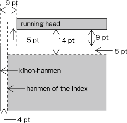
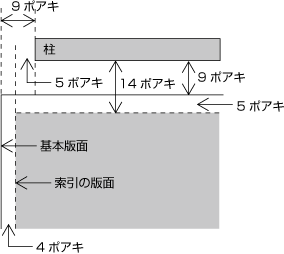
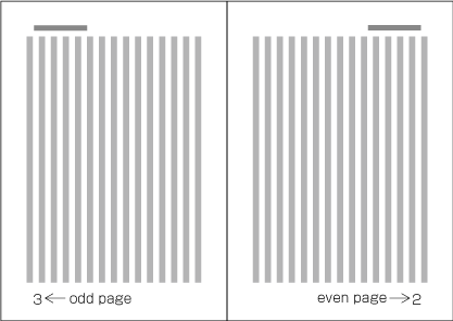
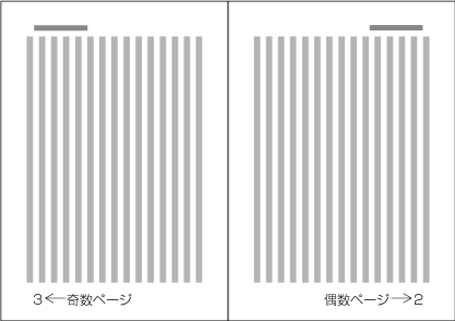
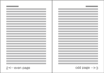
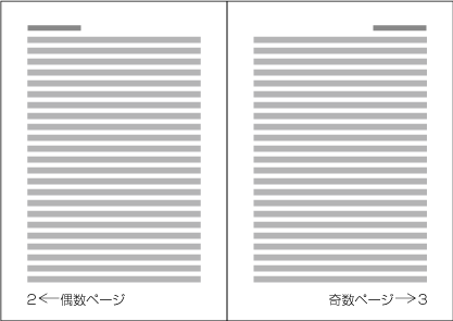
Because the start of a page will be on the recto side, the right-hand page of a spread in a vertically set book is always an even page and the left-hand page is always an odd page (see Figure 53 ). Likewise, the left-hand page of a spread in a horizontally set book is always an even page and the right-hand page is always an odd page (see Figure 54 ).
ノンブルは,紙葉の表面を“1”として開始するので,縦組の書籍の見開きにおいては,右ページは偶数ページ,左ページは奇数ページとなり(Figure 53 ),横組の書籍の見開きにおいては,左ページは偶数ページ,右ページは奇数ページとなる(Figure 54 ).
2.6.3 Ways of Arranging Running Heads and Page Numbers 柱及びノンブルの配置方式
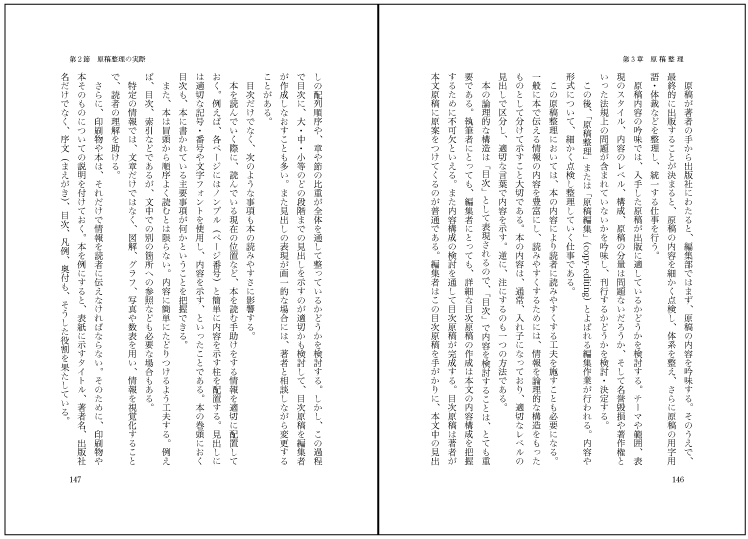
There are two ways to arrange running heads. One is the single running head method and the other is the double running head method. (Arrangement of running heads is defined in JIS X 4051, sec. 7.6.2. Page Numbers are defined in sec. 7.5.2.).
柱には,両柱方式(Figure 55 )と片柱方式(Figure 56 )とがある(柱の掲げ方についてはJIS X 4051の7.6.2に,ノンブルの掲げ方については7.5.2に規定がある).
-
Double running head method: Place running heads on both even pages and odd pages (see Figure 55 ).
-
Single running head method: Place running heads only on odd pages (see Figure 56 ).
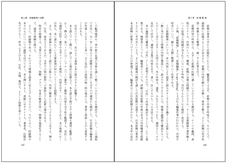
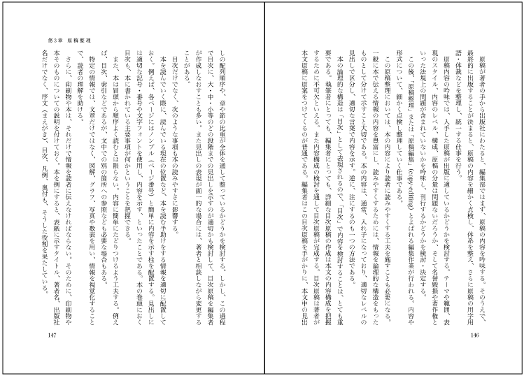
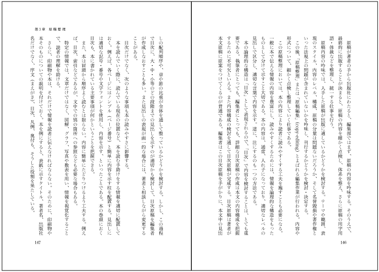
Note
Note
-
In the double running head method, a higher-level title, such as that of the chapter or book, is used for the running heads on the even pages, and a lower-level title, such as that for a section, on the odd pages. Where there are no differing levels of titles, such as on the page containing the table of contents, the same running head is used on both even and odd pages.
両柱方式では,偶数ページに章などのアウトラインレベルの高い見出し又は書名を掲げ,奇数ページには,偶数ページに掲げた書名又は見出しよりアウトラインレベルの低い節などの見出しを掲げる.ただし,目次などアウトラインレベルの異なる見出しのない部分では,偶数ページと奇数ページに同じ柱を掲げる.
Note
-
In the single running head method, one of heading levels is used.
片柱方式では,いずれかのレベルの見出しを掲げる.
-
In principle, the contents of running heads will be the same as those of headings with the following differences:
柱は,原則として見出しと同じ内容を掲げるが,次のような例外がある.
-
Numbers and words in Latin alphanumeric characters in vertically set headings in vertically set books should be changed to horizontal notation for horizontally set running heads (see § 2.3.2 Major Differences between Vertical Writing Mode and Horizontal Writing Mode 縦組と横組の主な相違点 ).
縦組の書籍において見出しを横組の柱にして掲げる場合,数字表記などを横組の表記法に変更する(§ 2.3.2 Major Differences between Vertical Writing Mode and Horizontal Writing Mode 縦組と横組の主な相違点 ).
-
If headings are too long, they should be made shorter by paraphrasing them in fewer characters. Running heads with too many characters will not look good.
見出しの字数が多い場合,文章を修正し,字数を少なくする.あまり字数の多い柱を掲げるのは体裁がよくないからである.
-
For certain publications, such as a collection of monographs, the names of authors may be added in parentheses at the end of the running head.
論文集などでは,著者名を見出しの後ろに括弧類などでくくって示す.
-
-
In principle, the text direction of running heads and page numbers should be the same as that of the kihon-hanmen. For vertically set books, however, it is more common to set running heads and page numbers horizontally.
柱及びノンブルの組方向は,原則として基本版面の組方向と同じにするが,縦組の書籍における柱・ノンブルの組方向は,横組とする場合が多い.
-
In principle, for the single running head method running heads are printed on all odd pages, and for the double running head method on all even and odd pages. However, for the sake of appearance, running heads may be omitted as follows:
柱は,原則として片柱方式の場合はすべての奇数ページ,両柱方式の場合は全ページに掲げるが,次のようなページでは表示しない.これは体裁の問題からである.
-
Pages on which running heads should be hidden:
柱を表示しないページ
-
Naka-tobira and han-tobira.
-
Pages where a running head overlaps with other elements such as illustrations.
柱の配置領域が,図版などと重なったページ
-
-
Pages on which running heads may be hidden:
柱を表示しなくてもよいページ
-
-
In principle, page numbers are printed on all pages. However, for the sake of appearance, they may be omitted as follows:
ノンブルは,原則として全ページに掲げるが,次のようなページでは表示しない.これは体裁の問題からである.
-
Pages on which page numbers should be hidden:
ノンブルを表示しないページ
-
Pages on which a illustration or a table is positioned adjacent to the page number.
ノンブルの配置領域が,図版などと重なったページ
-
-
Pages on which page numbers may be hidden:
ノンブルを表示しなくてもよいページ
-
Divisional title and simplified divisional title pages.
中扉及び半扉
-
Pages in horizontally set books with a page number placed in the margin at the top of the page, and with a heading at the beginning of a new recto or new page. (In this case, it is also possible to move the page numbers to the center of the margin at the foot of the page.)
横書きの書籍においてノンブルを横組にして天側の余白に配置した場合で,改丁・改ページなどで見出しが始まるページ(この場合,ノンブルを地の中央に移動して表示する方法もある)
-
Note
-
-
There are two types of page numbering. "Continuous pagination" means that page numbers continue throughout the whole book. "Independent pagination" means that page numbers start from "1" separately at beginning of the front matter and back matter. There is also, for example in manuals, the method of starting each chapter from page number "1". (In such cases, it is common that the name of the chapter is added as a prefix before the page number.)
ノンブルは,1冊の本を通して数字を連続させる方法(通しノンブルという)と,前付や後付部分を別に1から数字を開始してノンブルを付ける方法(別ノンブルという)とがある.また,マニュアル等では,章別に1から数字を開始する方法もある(この場合は,1から開始した数字の前に章名を示す接頭辞を付けることが多い).
Note
Note
3. Line Composition 行の組版処理
3.1 Line Composition Rules for Punctuation Marks 約物などの組版処理
3.1.1 Differences in Vertical and Horizontal Composition in Use of Punctuation Marks 縦組と横組で異なる約物など
There are some punctuation marks that are used uniquely in either vertical writing mode or horizontal writing mode. In this document, characters and symbols are treated as members of a character class, classified by their behavior for composition. Each class name is followed by class id, such as opening brackets (cl-01). Details are explained in § 3.9 About Character Classes 文字クラスについて . The following are some typical examples:
縦組と横組で異なる約物などを使用する例がある.主な例を次に示す.(なお,以下の文書では,約物を含む文字・記号について,その組版上の振る舞いで分類し,文字クラスとしてグループに分けて扱う.用語の後ろの括弧内に“(cl-01)”などと示すものは,その文字クラスの番号である.文字クラスの詳細は§ 3.9 About Character Classes 文字クラスについて で解説する.)
-
Full stops (cl-06) and commas (cl-07)
-
In vertical writing mode, IDEOGRAPHIC FULL STOP "。" and IDEOGRAPHIC COMMA "、" are used for full stops (cl-06) and commas (cl-07).
縦組では,句点類(cl-06)には,句点[。] (IDEOGRAPHIC FULL STOP)を,読点類(cl-07)には読点[、] (IDEOGRAPHIC COMMA)を使用する.
-
In horizontal writing mode, there are three conventions in choice of symbols for full stops (cl-06) and commas (cl-07):
横組で使用する句点類(cl-06)と読点類(cl-07)の組合せには,次の3つの方式がある.
-
Using COMMA "," and FULL STOP "." (see Figure 57 ).
コンマ[,] (COMMA)とピリオド[.] (FULL STOP)を使用する(Figure 57 ).

Figure 57 Example text using COMMA and FULL STOP. コンマとピリオドを使用した例 -
Using COMMA "," and IDEOGRAPHIC FULL STOP "。" (see Figure 58 ).
コンマ[,] (COMMA)と句点[。] (IDEOGRAPHIC FULL STOP)を使用する(Figure 58 ).
Figure 58 Example text using COMMA and IDEOGRAPHIC FULL STOP. コンマと句点を使用した例 -
Using IDEOGRAPHIC COMMA "、" and IDEOGRAPHIC FULL STOP "。" (see Figure 59 ).
読点[、] (IDEOGRAPHIC COMMA)と句点[。] (IDEOGRAPHIC FULL STOP)を使用する(Figure 59 ).
Figure 59 Example text using IDEOGRAPHIC COMMA and IDEOGRAPHIC FULL STOP. 読点と句点を使用した例
Note
-
-
-
LEFT CORNER BRACKET "「", RIGHT CORNER BRACKET "」", LEFT DOUBLE QUOTATION MARK "“" and RIGHT DOUBLE QUOTATION MARK "”"
かぎ括弧(始めかぎ括弧[「] (LEFT CORNER BRACKET)及び終わりかぎ括弧[」] (RIGHT CORNER BRACKET))とクォーテーションマーク(左ダブルクォーテーションマーク[“] (LEFT DOUBLE QUOTATION MARK)及び右ダブルクォーテーションマーク[”] (RIGHT DOUBLE QUOTATION MARK)並びに左シングルクォーテーションマーク[‘] (LEFT SINGLE QUOTATION MARK)及び右シングルクォーテーションマーク[’] (RIGHT SINGLE QUOTATION MARK))
-
In vertical writing mode, LEFT CORNER BRACKET "「" and RIGHT CORNER BRACKET "」" are used for quotations (see Figure 60 ).
縦組では,始めかぎ括弧[「] (LEFT CORNER BRACKET)及び終わりかぎ括弧[」] (RIGHT CORNER BRACKET)を用いる(Figure 60 ).
Figure 60 Examples of quoted text using LEFT CORNER BRACKET and RIGHT CORNER BRACKET. 始めかぎ括弧及び終わりかぎ括弧を使用した例 -
In horizontal writing mode, pairs of LEFT DOUBLE QUOTATION MARK "“" and RIGHT DOUBLE QUOTATION MARK "”" or pairs of LEFT SINGLE QUOTATION MARK "‘" and RIGHT SINGLE QUOTATION MARK "’" may be used in place of LEFT CORNER BRACKET "「" and RIGHT CORNER BRACKET "」" (see Figure 61 ).
横組では,始めかぎ括弧[「] (LEFT CORNER BRACKET)及び終わりかぎ括弧[」] (RIGHT CORNER BRACKET)に替えて左ダブルクォーテーションマーク[“] (LEFT DOUBLE QUOTATION MARK)及び右ダブルクォーテーションマーク[”] (RIGHT DOUBLE QUOTATION MARK),又は左シングルクォーテーションマーク[‘] (LEFT SINGLE QUOTATION MARK)及び右シングルクォーテーションマーク[’] (RIGHT SINGLE QUOTATION MARK)を用いる方法がある(Figure 61 ).
Figure 61 Examples of quoted text using LEFT DOUBLE QUOTATION MARK and RIGHT DOUBLE QUOTATION MARK. 左ダブルクォーテーションマーク及び右ダブルクォーテーションマークを使用した例 Note
Note


Figure 62 Examples of quoted text using REVERSED DOUBLE PRIME QUOTATION MARK and LOW DOUBLE PRIME QUOTATION MARK. 始めダブルミニュート及び終わりダブルミニュートを使用した例 Note
-
-
LEFT SQUARE BRACKET "[", RIGHT SQUARE BRACKET "]", LEFT TORTOISE SHELL BRACKET "〔" and RIGHT TORTOISE SHELL BRACKET "〕"
ブラケット(始め大括弧[[] (LEFT SQUARE BRACKET)及び終わり大括弧[]] (RIGHT SQUARE BRACKET))と,きっこう(始めきっこう括弧[〔] (LEFT TORTOISE SHELL BRACKET)及び終わりきっこう括弧[〕] (RIGHT TORTOISE SHELL BRACKET))
LEFT TORTOISE SHELL BRACKET "〔" and RIGHT TORTOISE SHELL BRACKET "〕" are vertical variants of LEFT SQUARE BRACKET "[" and RIGHT SQUARE BRACKET "]", which are used in horizontal writing mode. Square brackets should be used in horizontal writing mode except for special cases.
ブラケット([ ])を縦組用に変形したものが,きっこう(〔 〕)である.したがって,特別な場合を除き,横組ではブラケットを使用する.
Note
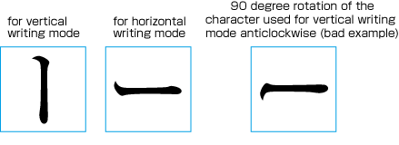

3.1.2 Positioning of Punctuation Marks (Commas, Periods and Brackets) 句読点や,括弧類などの基本的な配置方法
The positioning of punctuation marks (commas, periods and brackets) in a line proceeds as follows.
約物などを行に配置する場合の基本的な配置は,次のようにする.
Note
The character advance of commas (cl-07), full stops (cl-06), opening brackets (cl-01), closing brackets (cl-02) and middle dots (cl-05) is half-width (half em). But when those punctuation marks are placed side-by-side with ideographic (cl-19), hiragana (cl-15), or katakana (cl-16) characters, in principle, a given amount of spacing will be inserted before or after the symbols, which makes them appear as if they were intrinsically full-width (one em) (see Figure 64 ). Spacing is inserted before and after middle dots (cl-05). This principle makes the symbols consistent with ideographic (cl-19), hiragana (cl-15) and katakana (cl-16) characters in character width, and at the same time the spacing for punctuation helps to make the organization of text clearer. The spacing added before or after punctuation marks is subject, in principle, to line adjustment and may eventually be removed, except for that added after full stops (cl-06). (Details of line adjustment are discussed in § 3.8 Line Adjustment 行の調整処理 ).
読点類(cl-07),句点類(cl-06),始め括弧類(cl-01),終わり括弧類(cl-02)及び中点類(cl-05)の字幅は,半角であるが,これらの約物が漢字等(cl-19),平仮名(cl-15)又は片仮名(cl-16)と連続する場合は,原則として,それぞれの約物の前又は後ろ(中点類(cl-05)は,その前及び後ろ)に一定の空き量をとることで,結果として全角というサイズになる(Figure 64 ).漢字等(cl-19),平仮名(cl-15),及び片仮名(cl-16)の全角というサイズとそろえるとともに,これらの約物の前及び/又は後ろに空き量をとることにより,文章の区切りを示すためである.行中での句点類(cl-06)の後ろの空き量を除いて,原則とした空き量は,行の調整処理における詰める場合の対象とし,結果的に0となることもある(行の調整処理については§ 3.8 Line Adjustment 行の調整処理 を参照).
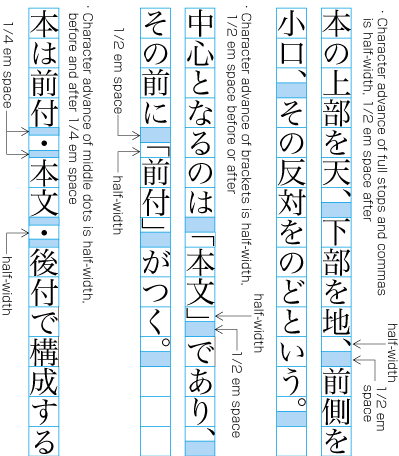
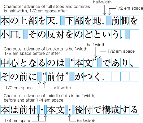
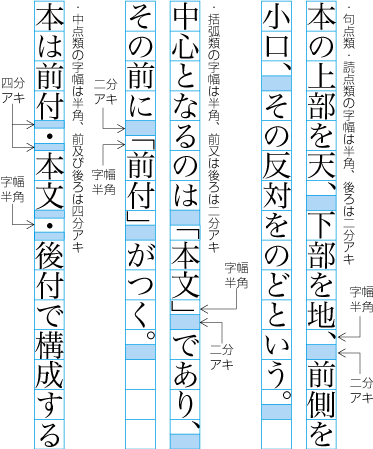
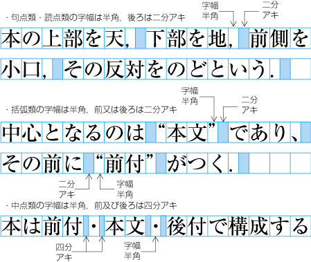
-
After commas (cl-07), half em spacing is added, in principle.
読点類(cl-07)では,原則として後ろを二分アキにする.
-
After full stops (cl-06), in the middle of a line, half em spacing is added. At the end of a line, half em spacing is added, in principle.
句点類(cl-06)では,行中では後ろを二分アキにし,行末では後ろを原則として二分アキにする.
-
Before opening brackets (cl-01), half em spacing is added, in principle.
始め括弧類(cl-01)では,原則として前を二分アキにする.
-
After closing brackets (cl-02), half em spacing is added, in principle.
終わり括弧類(cl-02)では,原則として後ろを二分アキにする.
-
Before and after middle dots (cl-05), quarter em spacing is added, in principle.
中点類(cl-05)では,原則として前及び後ろを四分アキにする.
Note
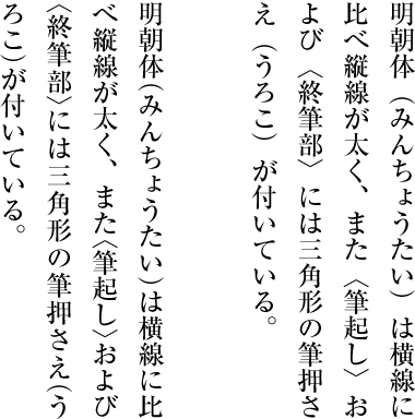
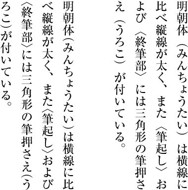
Note
3.1.3 Exceptional Positioning of Ideographic Comma and Katakana Middle Dot 読点及び中点の例外的な配置方法
The spacing usually added after IDEOGRAPHIC COMMA "、" and the spacing before and after KATAKANA MIDDLE DOT "・" are omitted, in principle, for cosmetic reasons in the following cases.
次のような場合においては,読点[、] (IDEOGRAPHIC COMMA)の後ろ及び中点[・] (KATAKANA MIDDLE DOT)の前後の空き量をとらないことを原則とする.これは体裁上からの処理である.
-
In vertical writing mode, ideographic numerals and IDEOGRAPHIC COMMA "、" used as a decimal separator are set solid (as in the right line in Figure 66 ).
縦組において漢数字の位取りを示す読点[、] (IDEOGRAPHIC COMMA)の後ろはベタ組にする(Figure 66 の右側).
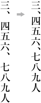
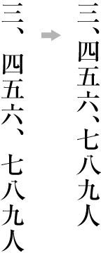
Figure 66 Example of exceptional positioning of the IDEOGRAPHIC COMMA. 読点の例外的な配置例 Note
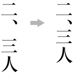
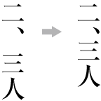
Figure 67 Example of the positioning of IDEOGRAPHIC COMMA with ideographic digits to represent an approximate number. 漢数字で概略の数を示す読点の配置例 -
In vertical writing mode, ideographic digits and KATAKANA MIDDLE DOT "・" representing a decimal point are set solid (as in the right line in Figure 68 ).
縦組において漢数字の小数点を示す中点[・] (KATAKANA MIDDLE DOT)の前後はベタ組にする(Figure 68 の右側).
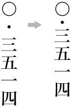
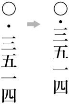
Figure 68 Example of the exceptional positioning of KATAKANA MIDDLE DOT. 中点の例外の配置例 Note
3.1.4 Positioning of Consecutive Opening Brackets, Closing Brackets, Commas, Full Stops and Middle Dots 始め括弧類,終わり括弧類,読点類,句点類及び中点類が連続する場合の配置方法
In cases where multiple punctuation marks, such as opening brackets (cl-01), closing brackets (cl-02), commas (cl-07), full stops (cl-06) and middle dots (cl-05), come one after the other, the following spacing adjustments are made for aesthetic reasons (see Figure 69 ). Note also that the half em and quarter em spacing added before or after punctuation marks, including the half em spacing after full stops (cl-06) appearing in the middle of a line, are subject, in principle, to line adjustment and may eventually be removed, except for those added after full stops (cl-06). (See § 3.8 Line Adjustment 行の調整処理 for more about line adjustment.) For more information about the positioning of closing brackets (cl-02), full stops (cl-06), commas (cl-07) and middle dots (cl-05) at line end, see § 3.1.9 Positioning of Closing Brackets, Full Stops, Commas and Middle Dots at Line End 行末に配置する終わり括弧類,句点類,読点類及び中点類の配置方法 .
始め括弧類(cl-01),終わり括弧類(cl-02),読点類(cl-07),句点類(cl-06)及び中点類(cl-05)が連続する場合は,次のようにする(Figure 69 ).これは体裁上からの処理である.なお,行中における句点類(cl-06)の後ろの二分アキを除いて,行末における句点類(cl-06)の後ろの二分アキを含めて原則として二分アキ又は四分アキとする箇所は,行の調整処理の詰める場合の対象にしてよい(行の調整処理については,§ 3.8 Line Adjustment 行の調整処理 を参照).なお,行末に配置する終わり括弧類(cl-02),句点類(cl-06),読点類(cl-07)及び中点類(cl-05)の配置方法については§ 3.1.9 Positioning of Closing Brackets, Full Stops, Commas and Middle Dots at Line End 行末に配置する終わり括弧類,句点類,読点類及び中点類の配置方法 を参照.
-
When closing brackets (cl-02) come immediately after commas (cl-07) or full stops (cl-06), remove the default half em spacing between them and, in principle, add half em spacing after the closing brackets (see Figure 69 ①).
読点類(cl-07)又は句点類(cl-06)の後ろに終わり括弧類(cl-02)が連続する場合は,読点類(cl-07)又は句点類(cl-06)と終わり括弧類の字間はベタ組とし,終わり括弧類の後ろを原則として二分アキとする(Figure 69 の①).
-
When commas (cl-07) come immediately after closing brackets (cl-02), remove the default half em spacing between them and, in principle, add half em spacing after the comma. When full stops (cl-06) come immediately after closing brackets (cl-02), remove the default half em spacing between them and, in middle of a line, add half em spacing after the full stop; at the end of a line, in principle, add half em spacing after the full stop (see Figure 69 ②).
終わり括弧類(cl-02)の後ろに読点類(cl-07)が連続する場合は,終わり括弧類(cl-02)と読点類(cl-07)の字間はベタ組とし,読点類(cl-07)の後ろを原則として二分アキとする.また,終わり括弧類(cl-02)の後ろに句点類(cl-06)が連続する場合は,終わり括弧類(cl-02)と句点類(cl-06)の字間はベタ組とし,行中では句点類(cl-06)の後ろを二分アキとし,行末では句点類(cl-06)の後ろを原則として二分アキとする(Figure 69 の②).
-
When opening brackets (cl-01) come immediately after commas (cl-07), in principle, add half em spacing between them (see Figure 69 ③). When opening brackets (cl-01) come immediately after full stops (cl-06) in the middle of a line, add half em spacing between them. Note that when full stops (cl-06) come in the bottom of lines, in principle, add half em spacing after full stops (cl-06).
読点類(cl-07)の後ろに始め括弧類(cl-01)が連続する場合は,読点類と始め括弧類の字間は,原則として二分アキとする(Figure 69 の③).また,行中で句点類(cl-06)の後ろに始め括弧類(cl-01)が連続する場合は,句点類と始め括弧類の字間は,二分アキとする.ただし,句点類(cl-06)が行末に位置した場合は,句点類(cl-06)の後ろを原則として二分アキにする.
-
When opening brackets (cl-01) come immediately after closing brackets (cl-02), in principle, add a half em space between them (see Figure 69 ④).
終わり括弧類(cl-02)の後ろに始め括弧類(cl-01)が連続する場合は,終わり括弧類と始め括弧類の字間は,原則として二分アキとする(Figure 69 の④).
-
When opening brackets (cl-01) come immediately after other opening brackets (cl-01), set them solid and, in principle, add half em spacing before the first one (see Figure 69 ⑤).
始め括弧類(cl-01)の後ろに始め括弧類(cl-01)が連続する場合は,その字間はベタ組とし,前にくる始め括弧類の前を原則として二分アキとする(Figure 69 の⑤).
-
When closing brackets (cl-02) come immediately after other closing brackets (cl-02), set them solid and, in principle, add half em spacing after the last closing bracket (see Figure 69 ⑥).
終わり括弧類(cl-02)の後ろに終わり括弧類(cl-02)が連続する場合は,その字間はベタ組とし,後ろにくる終わり括弧類の後ろを原則として二分アキとする(Figure 69 の⑥).
-
When middle dots (cl-05) come immediately after closing brackets (cl-02), in principle, add quarter em spacing before the following middle dot (see Figure 69 ⑦).
終わり括弧類(cl-02)の後ろに中点類(cl-05)が連続する場合は,後ろの中点類の前及び後ろを原則として四分アキとする(Figure 69 の⑦).
-
When opening brackets (cl-01) come immediately after middle dots (cl-05), in principle, add quarter em spacing after the preceding middle dot (see Figure 69 ⑦).
中点類(cl-05)の後ろに始め括弧類(cl-01)が連続する場合は,前の中点類の後ろを原則として四分アキとする(Figure 69 の⑦).
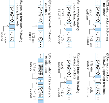
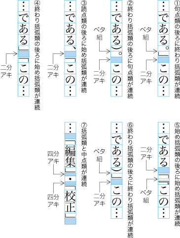
The line adjustment rules shown above have been established because the default half em spacing before or after consecutive punctuation marks, or quarter em spacing before and after them, makes the line look sparse and doesn't make the line appear well-proportioned (see Figure 70 ).
それぞれの後ろ又は前を二分アキ,又は前後を四分アキにし,全角の幅にすると空き量が目立ち,体裁がよくないからである(Figure 70 ).
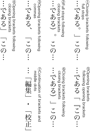
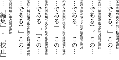
Note
3.1.5 Positioning of Opening Brackets at Line Head 行頭の始め括弧類の配置方法
When starting a new line with opening brackets (cl-01) there are some patterns as shown in Figure 71 . Note that the amount of line indent after the line feed (the first line indent of a new paragraph) is assumed to be a one em space across all the patterns.
行頭に配置する始め括弧類(cl-01)の配置方法には,Figure 71 のような方式がある.なお,改行の行頭(段落における第1行目の行頭)の字下げを全角アキとする場合である.
-
The first line indent after the line feed is set full-width (one em) and the next line after the first line break starts with no space (so-called tentsuki) (see Figure 71 ①).
-
The first line indent after the line feed is set one and a half em and the next line indent after the first line break is set to a half em (see Figure 71 ②).
改行行頭の字下げは全角半(全角の1.5倍)アキ,折返し行頭の字下げは二分アキとする(Figure 71 の②).
-
The first line indent after the line feed is set at a half em and the next line after the first line break is set tentsuki (see Figure 71 ③).
改行行頭の字下げは二分アキ,折返し行頭は天付きとする(Figure 71 の③).
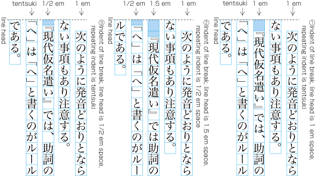
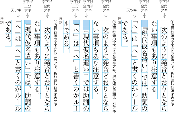
Note
Note
3.1.6 Positioning of Dividing Punctuation Marks (Question Mark and Exclamation Mark) and Hyphens 区切り約物及びハイフン類の配置方法
The dividing punctuation marks (cl-04) (QUESTION MARK "?" and EXCLAMATION MARK "!") should be full-width, and they are typeset as follows.
区切り約物(cl-04)(疑問符[?] (QUESTION MARK)と感嘆符[!] (EXCLAMATION MARK))の字幅は,全角とし,次のように配置する.
-
Basically, add no spacing before dividing punctuation marks (cl-04) at the end of a sentence and add one em spacing after them (see Figure 73 ). However when a closing bracket (cl-02) follows right after the dividing punctuation mark, add no spacing after the dividing punctuation mark and add half em spacing after the closing bracket (see Figure 73 ).
文末にくる区切り約物(cl-04)の前はベタ組とし,区切り約物(cl-04)の後ろは全角アキとする(Figure 73 ).ただし,区切り約物の後ろに終わり括弧類(cl-02)がくる場合は,この字間はベタ組とし,終わり括弧類の後ろを二分アキにする(Figure 73 ).
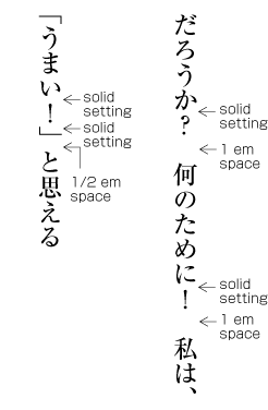
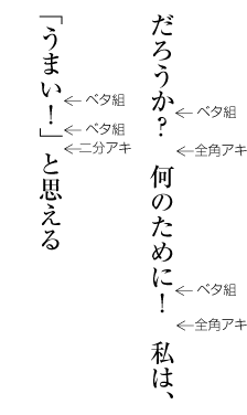
Figure 73 Positioning of dividing punctuation marks (Examples in vertical writing mode). 区切り約物の配置例(縦組の場合) Note
Note
Note
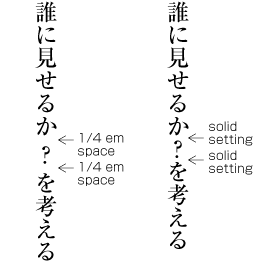
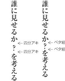
Figure 74 Examples of positioning of dividing punctuation marks in the middle of a sentence (in vertical writing mode). 文中の区切り約物の配置例(縦組の場合) Note
-
When dividing punctuation marks (cl-04) at the end of a sentence reach the end of a line, apply the following rules (see Figure 75 ).
文末に付く区切り約物(cl-04)が行末にくる場合は,次のようにする(Figure 75 ).
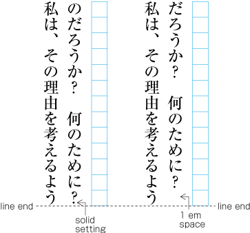
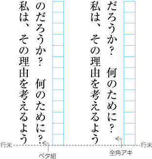
Figure 75 Examples of positioning of dividing punctuation marks at the end of a line (in vertical writing mode). 行末の区切り約物の配置例(縦組の場合) -
If the line length is 13 character widths and a dividing punctuation mark (cl-04) occurs in the 12th character position, one em spacing should be appended after it.
行長がそこに使用されている文字サイズの13倍とする.この場合,12倍の位置にきたときは区切り約物(cl-04)の後ろを全角アキとする.
-
If the line length is 13 character widths and a dividing punctuation mark (cl-04) occurs in the 13th character position, no spacing should be appended after it. In addition, do not carry over the one em space usually appended after the dividing punctuation marks to the line head of the next line; the line in this case should be set tentsuki.
行長がそこに使用されている文字サイズの13倍とする.この場合,13倍の位置にくるときは区切り約物(cl-04)の後ろをベタ組とする.さらに,次の行頭の下がりは全角アキとしないで,天付きとする.
-
The character width of hyphens (cl-03) varies according to the type of hyphen. HYPHEN "‐" should be quarter em width (i.e. one quarter of an em width), EN DASH "–" and KATAKANA-HIRAGANA DOUBLE HYPHEN "゠" should be half-width (a half em width), WAVE DASH "〜" should be full-width. Basically there should be no spacing before and after hyphens (cl-03). However, half em spacing should be appended, in principle, when opening brackets (cl-01) follow right after a hyphen (cl-03) and quarter em spacing when middle dots (cl-05) follow a hyphen (cl-03).
ハイフン類(cl-03)のハイフン[‐] (HYPHEN)の字幅は四分角,二分ダッシュ[–] (EN DASH)及び二重ハイフン[゠] (KATAKANA-HIRAGANA DOUBLE HYPHEN)の字幅は半角,波ダッシュ[〜] (WAVE DASH)の字幅は全角とし,ハイフン類(cl-03)の前後はベタ組とする.ただし,ハイフン類(cl-03)の後ろに始め括弧類(cl-01)がくる場合はそれらの字間を原則として二分アキ,ハイフン類(cl-03)の後ろに中点類(cl-05)がくる場合はそれらの字間を原則として四分アキとする.
3.1.7 Characters Not Starting a Line 行頭禁則
In principle, no line should begin with closing brackets (cl-02), hyphens (cl-03), dividing punctuation marks (cl-04), middle dots (cl-05), full stops (cl-06), commas (cl-07), iteration marks (cl-09), a prolonged sound mark (cl-10), small kana (cl-11) or warichu closing brackets (cl-29) (line-start prohibition rule). Otherwise the line would have an odd appearance.
終わり括弧類(cl-02),ハイフン類(cl-03),区切り約物(cl-04),中点類(cl-05),句点類(cl-06),読点類(cl-07),繰返し記号(cl-09),長音記号(cl-10),小書きの仮名(cl-11)及び割注終わり括弧類(cl-29)を行頭に配置してはならない(行頭禁則).これは体裁がよくないからである.
Note
Note
Note
Note
3.1.8 Characters Not Ending a Line 行末禁則
No line should end with opening brackets (cl-01) or warichu opening brackets (cl-28) (line-end prohibition rules). Otherwise the line would have an odd appearance.
始め括弧類(cl-01)及び割注始め括弧類(cl-28)を行末に配置してはならない(行末禁則).これは体裁がよくないからである.
Note
3.1.9 Positioning of Closing Brackets, Full Stops, Commas and Middle Dots at Line End 行末に配置する終わり括弧類,句点類,読点類及び中点類の配置方法
In principle, closing brackets (cl-02), commas (cl-07) or full stops (cl-06) at the line end have half em spacing after them (see Figure 76 ). This half em spacing can be removed for line adjustment (for more about line adjustment, see § 3.8 Line Adjustment 行の調整処理 ). However, the possibilities are only half em spacing or solid. Other spacing, such as quarter em spacing should not be used. In principle, the middle dot (cl-05) character at the line end also has quarter em spacing before and after, and is handled like a full-width character (see Figure 76 ). This quarter em spacing can also be removed for line adjustment, namely middle dots (cl-05) can be set solid before and after (about line adjustment, see § 3.8 Line Adjustment 行の調整処理 ). However, in this case also, the only possibilities are quarter em spacing or solid setting. Other intermediate-sized spacing should not be used.
行末に配置する終わり括弧類(cl-02),読点類(cl-07)及び句点類(cl-06)は,その後ろを原則として二分アキとする(Figure 76 ).この,原則として二分アキとする箇所は,行の調整処理の詰める場合の対象にして,ベタ組としてもよい(行の調整処理については,§ 3.8 Line Adjustment 行の調整処理 を参照).ただし,空き量を二分アキにするか又はベタ組にするかのどちらかで,その中間の値(例えば四分アキなど)としてはならない.また,行末に配置する中点類(cl-05)は,その前及び後ろを原則として四分アキとし,全角の扱いとする(Figure 76 ).この原則として四分アキとする箇所も,行の調整処理の詰める場合の対象にして,中点類(cl-05)の前及び後ろを一緒にベタ組としてもよい(行の調整処理については§ 3.8 Line Adjustment 行の調整処理 を参照).ただし,空き量を四分アキとするかベタ組にするかのどちらかで,その中間の値としてはならない.
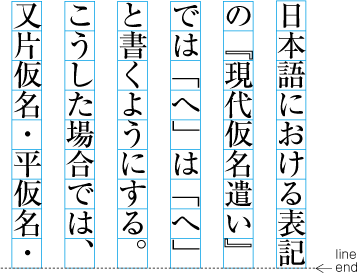
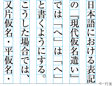
Note
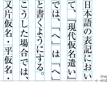
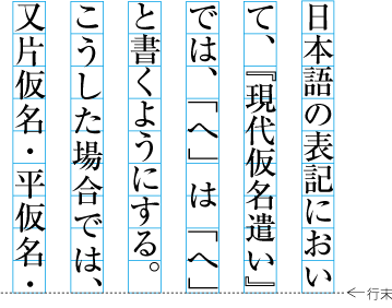
Note
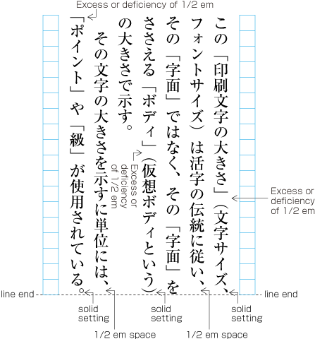
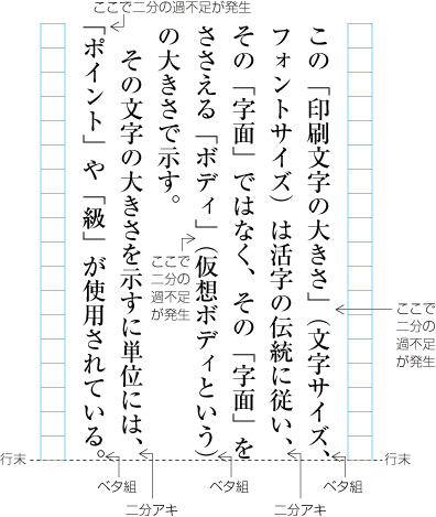
Note
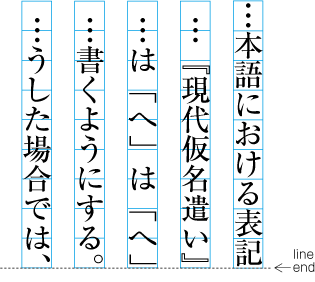
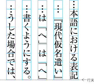
3.1.10 Unbreakable Character Sequences 分割禁止
If the following characters and symbols appear in sequence there will be no line break between them. The reason is that these characters and symbols are to be handled as one unit.
次のような文字・記号が連続する場合は,その字間で2行に分割しない(分割禁止).これは,それらの文字・記号を一体として扱いたいためである.
Note
Note
-
Between a sequence of EM DASH "—" characters (to be more specific, for a double dash, see Figure 80 ). Note that some systems implement HORIZONTAL BAR "―" with very similar behavior to EM DASH "—".
連続する全角ダッシュ[—] (EM DASH)と全角ダッシュ[—] (EM DASH)との間(具体的には2倍ダッシュ[――])(Figure 80 ).なお,処理系によっては,[―] (HORIZONTAL BAR)にも,同様の振る舞いを実装しているものもある.
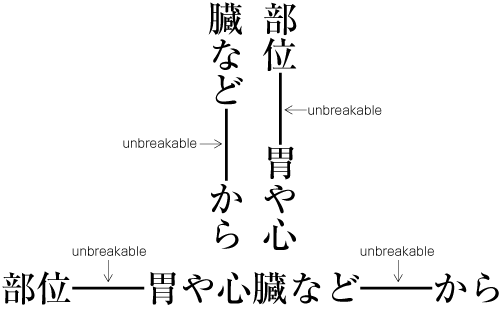
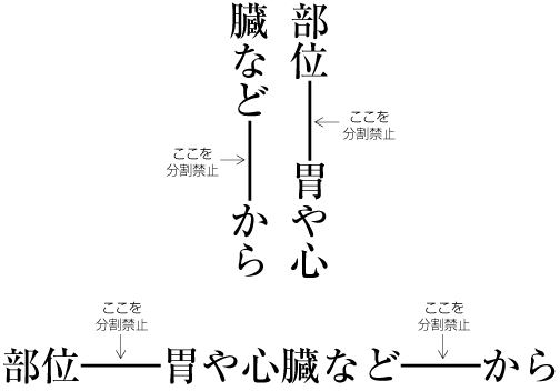
Figure 80 Sequence of EM DASH characters is unbreakable. 全角ダッシュと全角ダッシュとの間は分割禁止 Note
Note
-
Between sequences of HORIZONTAL ELLIPSIS "…" or TWO DOT LEADER "‥" (to be more specific, double HORIZONTAL ELLIPSIS "……" or double TWO DOT LEADER "‥‥").
連続する三点リーダ[…] (HORIZONTAL ELLIPSIS)又は二点リーダ[‥] (TWO DOT LEADER)の字間(具体的には2倍三点リーダ[……]又は2倍二点リーダ[‥‥]).
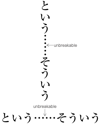
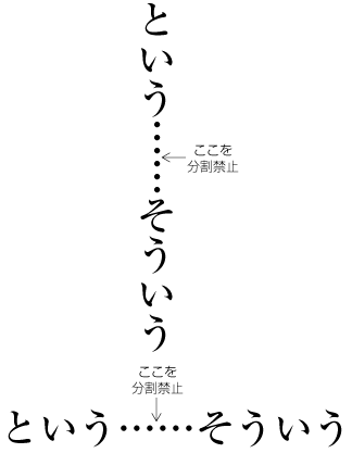
Figure 81 Unbreakable sequence of HORIZONTAL ELLIPSIS. 三点リーダと三点リーダとの間は分割禁止 Note
-
Between European numerals (see Figure 82 , Figure 83 , and Figure 84 .). European numerals indicate decimal place via the position of a numeral.
連続するアラビア数字の字間(Figure 82 ,Figure 83 ,Figure 84 ).アラビア数字は,位置で桁を示すことによる.
Note
Note
-
Between prefixed abbreviations (cl-12) (YEN SIGN "¥",DOLLAR SIGN "$",CENT SIGN "¢" etc.) and the following arabic or ideographic numeral (see Figure 82 ). The reason is that such character sequences are to be handled as one unit.
前置省略記号(cl-12)(円記号[¥] (YEN SIGN),ドル記号[$] (DOLLAR SIGN)など)とその後ろにくるアラビア数字・漢数字との間(Figure 82 ).それらの文字列を一体として扱いたいためである.
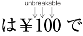
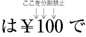
Figure 82 Unbreakable sequences between prefixed abbreviations and the following European numeral. 前置省略記号とアラビア数字の間は分割禁止 -
Between postfixed abbreviations (cl-13) (PERCENT SIGN "%", PER MILLE SIGN "‰" etc.) and the preceding European numeral or ideographic numeral (see Figure 83 ). The reason is that such character sequences are to be handled as one unit.
後置省略記号(cl-13)(パーセント[%] (PERCENT SIGN),パーミル[‰] (PER MILLE SIGN)など)とその前にくるアラビア数字・漢数字との間(Figure 83 ).それらの文字列を一体として扱いたいためである.
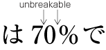
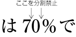
Figure 83 Unbreakable sequences between postfixed abbreviations and the preceding European numeral. アラビア数字と後置省略記号の間は分割禁止 Note
-
Inter-letter spacing among Western characters (cl-27) in a word (or, sequence of letters, which it is not possible to hyphenate), or unit indicators (km, kg, mm etc.) in Latin letters (see Figure 84 ).
欧文用文字(cl-27)の単語のハイフネーション可能な箇所以外の字間及び単位記号(km, kg, mmなど)の字間(Figure 84 ).
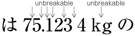
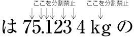
Figure 84 It is not possible to break a line between letters in unit symbols using Latin letters. 欧字の単位記号(単位記号中の文字)の字間は分割禁止 Note
Note
Note
-
Inter-letter spacing among ruby characters, when composed as mono-ruby. Note that it is possible to break a line between base characters with mono-ruby (see Figure 85 ).
モノルビで配置したルビ文字列の字間(Figure 85 ).一体として扱うためである.なお,モノルビが付いた親文字とモノルビが付いた親文字との字間は,分割可能である.
-
Inter-letter spacing among ruby characters or base characters, composed as group-ruby (see Figure 85 ).
グループルビで配置した親文字列及びルビ文字列の字間(Figure 85 ).一体として扱うためである.
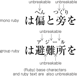
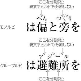
Figure 85 Example of unbreakable sequences of ruby. ルビ文字列の分割禁止の例 Note
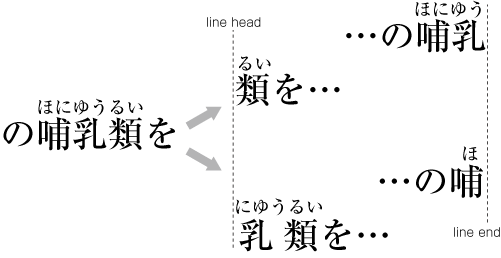
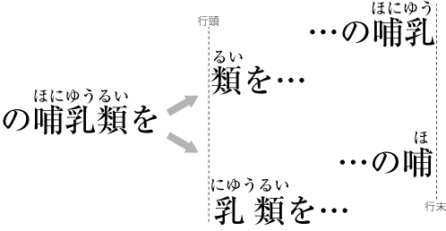
Figure 86 Example of a line break for jukugo-ruby. 熟語ルビを分割した例 -
Between a subscript or superscript and an adjacent base character (preceding or following) (see Figure 87 ), or between base characters with ornament characters, or between ornament characters themselves. The reason is that these character sequences are to be handled as one object.
親文字とその前又は後ろに付く添え字との字間.添え字が付く親文字の文字列,及び添え字の文字列の字間(Figure 87 ).それらの文字列を一体として扱いたいためである.
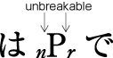
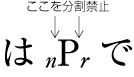
Figure 87 Unbreakable sequences between a character and its related subscripts. 添え字及び親文字の字間は分割禁止 -
In order to create a correspondence between notes and the related main text, reference marks (aijirushi) are often added. Line breaks are not allowed before the reference mark or between letters of the reference mark itself (see Figure 88 ). The application of the no-line-break rule here is a matter of style.
注と本文との対応を付けるために合印が付くことが多い.この合印の前及び合印の文字列の字間(Figure 88 ).これは体裁上の問題による.
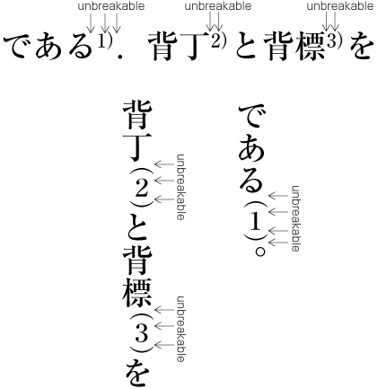
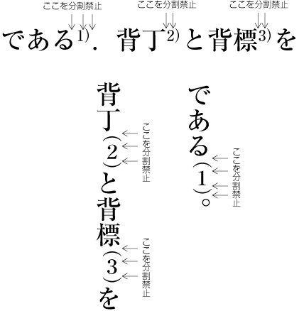
Figure 88 Unbreakable sequences before an aijirushi (reference marks, European numerals or ideographic numerals). 注の合印の前では分割禁止 Note
Note
-
After warichu opening brackets (cl-28), which open warichu, or before warichu closing brackets (cl-29), which close warichu.
割注行を囲む割注始め括弧類(cl-28)の後ろ,割注行を囲む割注終わり括弧類(cl-29)の前.
-
A unit of furiwake. A unit of furiwake is handled as one object.
同一の振分け.同一の振分けは,一体として扱う.
3.1.11 Character Sequences which Do Not Allow Increase of Spacing as Part of Line Adjustment Processing 行の調整処理で字間を空ける処理に使用しない箇所
For line adjustment processing, spacing must not be increased between the following characters. (This is called the inseparable characters rule.) The reason is that these characters or symbols should appear as one unit (for more about line adjustment, see § 3.8 Line Adjustment 行の調整処理 ).
行の調整処理の際に,字間を空けて処理する場合,次の字間には空き量を入れることは避ける(分離禁止ともいう).これは,それらの文字・記号を一体として扱いたいためである(行の調整処理については,§ 3.8 Line Adjustment 行の調整処理 を参照).
Note
Note
-
There must be no added spacing between any characters described in § 3.1.10 Unbreakable Character Sequences 分割禁止 .
§ 3.1.10 Unbreakable Character Sequences 分割禁止 で掲げた字間は,すべて行の調整処理で字間を空ける箇所としては避ける.
Note
-
In addition to the cases mentioned above, the inseparable character rule has to be applied to the following cases.
上記以外では,次も行の調整処理で字間を空ける箇所としては避ける.
-
Before or after opening brackets (cl-01) or closing brackets (cl-02).
始め括弧類(cl-01)及び終わり括弧類(cl-02)の前及び後ろ.
Note
-
Before or after full stops (cl-06) or commas (cl-07).
句点類(cl-06)及び読点類(cl-07)の前及び後ろ.
-
Before or after middle dots (cl-05).
中点類(cl-05)の前及び後ろ.
-
Before or after dividing punctuation marks (cl-04).
区切り約物(cl-04)の前及び後ろ.
-
Before or after hyphens (cl-03).
ハイフン類(cl-03)の前及び後ろ.
-
Before or after one em, etc. space between Japanese characters.
全角アキなどの和字間隔の前及び後ろ.
-
Among base characters with jukugo-ruby.
熟語ルビが付いた親文字列の字間
-
3.1.12 Examples of Line Adjustment 行の調整処理例
Methods of line adjustment processing are discussed in § 3.8 Line Adjustment 行の調整処理 . However, since layout processing of punctuation marks is one reason for the need for line adjustment processing, we will here introduce two main examples of cases where line adjustment processing is necessary, and show adjustment examples (see Figure 89 ).
行の調整処理の処理方法については,§ 3.8 Line Adjustment 行の調整処理 で解説するが,行の調整処理が必要になる要因の1つに約物の組版処理が関係することから,ここでは行の調整処理が必要となる主な2つの例とその調整例について解説する(Figure 89 ).
-
The principal approach in Japanese composition is that with the exception of the last line of a paragraph, the length of all lines is the same, so all lines are aligned. As explained before, the line length is set to be n-times the character size established for the kihon-hanmen. Hence, as long as only full-width characters are used, all lines have the same length (see ① at Figure 89 ).
日本語組版では,1行の行長に満たない段落の最終行を除き,行長をそろえるのが原則である.行長は,前述したように文字サイズの整数倍に設定するので,全角の文字を並べていく限りでは,行長はそろうことになる(Figure 89 の①).
-
In Figure 89 at ②, there is an IDEOGRAPHIC COMMA "、" followed by a LEFT CORNER BRACKET "「", and the total space taken by the two characters is one and a half em. That means that the line overshoots or runs short of the edge of the kihon-hanmen by a half em. To restore a uniform line length, line adjustment is applied as shown at ③ in Figure 89 . The half em space overshoot or shortage is recovered by reducing inter-character spacing to a quarter em before the LEFT CORNER BRACKET "「" and after the RIGHT CORNER BRACKET "」".
Figure 89 の②では,読点[、] (IDEOGRAPHIC COMMA)と始めかぎ括弧[「] (LEFT CORNER BRACKET)が連続し,この2つの約物全体の字幅及び空き量の合計は1.5倍となり,行長で二分の過不足が発生する.そこで,Figure 89 の③のように始めかぎ括弧[「] (LEFT CORNER BRACKET)の前の二分アキ及び終わりかぎ括弧[」] (RIGHT CORNER BRACKET)の後ろの二分アキを四分アキに詰める処理(追込み処理という)が可能なので,ここで二分の過不足の調整を行い,行長をそろえる.
-
At ④ in Figure 89 , the 15th character is an opening bracket (cl-01). This should not appear at the line end. Ideally, a full width spacing reduction would be applied, and the character "前" on the second line would be moved onto the first line in the 15th position. In that way, the problem could be avoided. However, in this example a full-width spacing reduction is not possible, so line adjustment processing is applied as shown at ⑤ in Figure 89 . The opening bracket (cl-01) is moved to the second line, and line adjustment by inter-character spacing expansion is applied. That means that spacing is added in the first line at places where it is allowed.
Figure 89 の④では,15字目に始め括弧類(cl-01)がくるので,この配置を回避する調整が必要になる.その行で全角の分を詰める処理が可能であれば,その処理を行い,2行目の“前”の文字を1行目の15字目に配置し,問題を回避できる.しかし,この例では全角の分を詰める処理が不可能なので,Figure 89 の⑤のように始め括弧類を2行目に移動し,1行目の字間を空ける調整が可能な箇所で空ける処理(追出し処理という)を行い,1行目の行長をそろえる処理を行う.
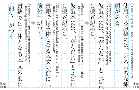
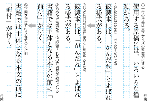
Figure 89 Examples of line adjustment. 行の調整を行った例
3.2 Japanese and Western Mixed Text Composition (including Horizontal-in-Vertical Text Composition) 和欧文混植処理(縦中横処理を含む)
3.2.1 Composition of Japanese and Western Mixed Texts 和文と欧文との混植
There are a lot of examples of Japanese text in which Western and/or Greek letters are mixed among Japanese letters. Examples are as follows:
和文の中にラテン文字やギリシャ文字などの欧字・欧文を混植(和欧文混植)する例は多い.次のような例がある.
-
Using one Latin letter as a symbol for something, like "A" and "B".
AとBといったように欧字1字を記号として使用する.
-
Using a Western word in a Japanese context, like "editor".
editorのように欧字の単語をそのまま使用する.
-
Using acronyms of things and organization names, like "DTP" and "GDP".
GDPやDTPなどの組織名や事項に関する頭字語として使用する.
-
Writing Western book titles and authors in lists of referred books with original spelling.
欧文の文献表示などで著者名や書名などを原本通り表記する.
Latin letters are also used in itemized lists and numbering of headings, as well as symbols for units, symbols for chemical elements, and mathematical symbols. As can be judged from these examples, mixtures of Latin letters among Japanese letters are in daily use in Japanese composition.
箇条書きや見出しの頭に付く番号,さらに,単位記号・元素記号・数学記号等でも欧字は使用されており,日本語組版にとっては,和欧文混植は,ごく一般的な事例になっている.
Note
Note
Note
3.2.2 Mixed Text Composition in Horizontal Writing Mode 横組の和欧文混植に用いる文字
In horizontal writing mode the basic approach is to use proportional Western fonts (Figure 90 ). For European numerals, both half-width fonts and proportional fonts are used. Note that Western word space (cl-26) is a one third em space, in principle, except at line head, line head of warichu, line end and line end of warichu. Western word space (cl-26) at line head, line head of warichu, line end and line end of warichu, is set solid.
横組では,原則としてプロポーショナルな欧字を用いる(Figure 90 ).また,アラビア数字は,半角のアラビア数字又はプロポーショナルなアラビア数字を用いる.なお,欧文間隔(cl-26)は,三分アキを原則とする.ただし,行頭,割注行頭,行末及び割注行末の欧文間隔(cl-26)は,空き量を0とする.
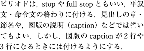
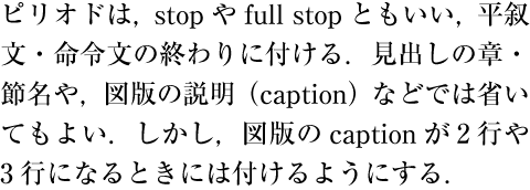
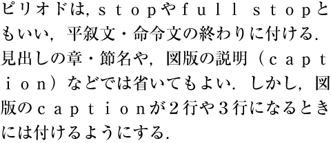
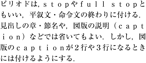
Note
Note
Note
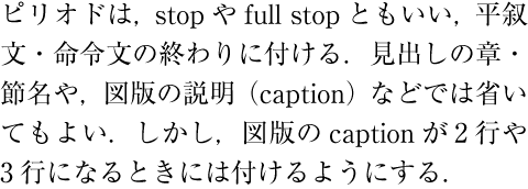
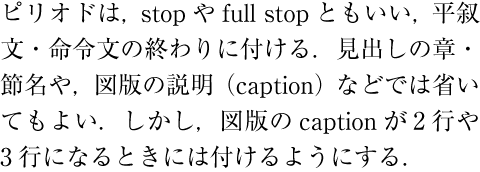
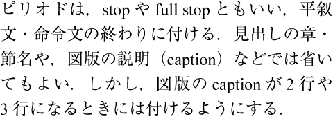
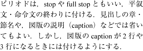
Note
3.2.3 Mixed Text Composition in Vertical Writing Mode 縦組の和欧文混植に用いる文字
As explained in § 2.3.2 Major Differences between Vertical Writing Mode and Horizontal Writing Mode 縦組と横組の主な相違点 , there are three different styles for setting Latin letters and European numerals in vertical writing mode:
縦組では,§ 2.3.2 Major Differences between Vertical Writing Mode and Horizontal Writing Mode 縦組と横組の主な相違点 で解説したように,欧字及びアラビア数字を配置する方法としては,次の3つの方法がある.
-
Setting Latin letters and/or European numerals one by one in inline direction with Japanese characters (see Figure 94 ). Single Latin letters or Arabic numerals are set with this style. In this case, a full width monospace font is usually used. Currently, proportional Western style fonts are also sometimes used with this style.
和文文字と同じように正常な向きで,1字1字配置する(Figure 94 ).文中に配置する欧字又はアラビア数字が1字の場合は,この方法で配置する.この場合,欧字及びアラビア数字は,一般に全角のモノスペースの文字を用いる.プロポーショナルな文字を用い,全角のスペースに正常な向きにして配置する方法もある.
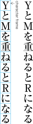
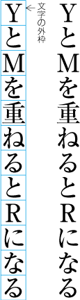
Figure 94 Example of Latin letters in normal orientation. 正常な向きで配置した欧字の例 -
Setting Latin letters and/or European numerals rotated 90 degrees clockwise in vertical text mode (Figure 95 ). This style is usually adopted when Latin letters compose a word or sentence. Proportional fonts are specified for characters in this style, as in horizontal writing mode (or half-width fonts for European numerals).
文字を時計回りに90度回転し,配置する(Figure 95 ).文中に配置する欧字が一般の単語又は文の場合は,この方法で配置する.この場合,横組と同様にプロポーショナルな文字(又はアラビア数字は半角の文字)を用いる.
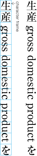
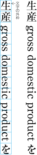
Figure 95 Example of Latin letters rotated 90 degrees clockwise. 文字を時計回りに90度回転し配置した欧字の例 -
Setting Latin letters and/or European numerals in tate-chu-yoko (horizontal-in-vertical setting, see Figure 96 ). Tate-chu-yoko layout is usually adopted when dealing with a two-digit number in European numerals, or a combination of two or three Latin letters, the length of which is equal to the default size of the line in paragraph direction or longer than that just to an acceptable extent. (A combination of two or three Latin letters may be rotated 90 degrees clockwise rather than set in tate-chu-yoko layout.) Proportional glyphs (or half-width glyphs for European numerals) are used for characters in tate-chu-yoko layout.
縦中横(正常な向きのまま,横組にする)にして配置する(Figure 96 ).2桁のアラビア数字,行の幅とほぼ同じ程度かやや行の幅よりはみ出す程度の記号として用いる2文字程度の欧字の文字列では,一般に縦中横にする(後者の2文字程度の欧字の文字列は,文字を時計回りに90度回転し,配置する方法もある).この場合,プロポーショナルな文字(又はアラビア数字は半角の文字)を用いる.
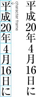
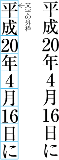
Figure 96 Example of European numerals in tate-chu-yoko (horizontal-in-vertical setting). 縦中横にしたアラビア数字の例 Note
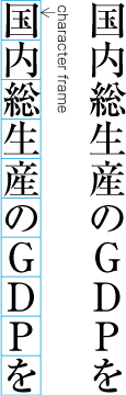
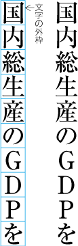
Figure 97 Example of acronyms set one by one in normal orientation. 正常な向きで配置した頭字語の例 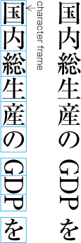
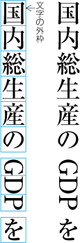
Figure 98 Example of acronyms rotated 90 degrees clockwise. 文字を時計回りに90度回転し配置した頭字語の例 Note
3.2.4 Method for Setting Full-width Latin Letters and European Numerals 全角のモノスペースの欧字及び全角のモノスペースのアラビア数字の配置方法
When full-width and fixed-width Western characters or European numerals are set in vertical writing mode as "quasi" Japanese characters, inter-character spacing between these characters and hiragana (cl-15), katakana (cl-16) or ideographic characters (cl-19) are set solid, similar to ordinary ideographic characters (cl-19) (see Figure 99 ). Also, in principle, when full-width and fixed-width Western characters or European numerals are set after full stops (cl-06), commas (cl-07) or closing brackets (cl-02), or before opening brackets (cl-01), insert half em spacing after commas (cl-07) or closing brackets (cl-02), or before opening brackets (cl-01). In addition, in these cases, insert half em spacing after full stops (cl-06). When full-width and fixed-width Western characters or European numerals are set before a full stop (cl-06), comma (cl-07) or closing bracket (cl-02), or after an opening bracket (cl-01), the inter-character spacing before the full stop, comma or closing bracket, or after the opening bracket is set solid.
縦組で全角のモノスペースの欧字及び全角のモノスペースのアラビア数字を正常な向きで1字1字配置する場合は,一般の漢字と同様に前後に配置する平仮名(cl-15),片仮名(cl-16)又は漢字等(cl-19)との字間をベタ組にして配置する(Figure 99 ).また,句点類(cl-06),読点類(cl-07)若しくは終わり括弧類(cl-02)の後ろ,又は始め括弧類(cl-01)の前に全角のモノスペースの欧字又は全角のモノスペースのアラビア数字がくる場合は,読点類(cl-07)若しくは終わり括弧類(cl-02)の後ろ,又は始め括弧類(cl-01)の前は,原則として二分アキとし,句点類(cl-06)の後ろは二分アキとする.句点類(cl-06),読点類(cl-07),若しくは終わり括弧類(cl-02)の前,又は始め括弧類(cl-01)の後ろに全角のモノスペースの欧字又は全角のモノスペースのアラビア数字がくる場合は,句点類(cl-06),読点類(cl-07)若しくは終わり括弧類(cl-02)の前,又は始め括弧類(cl-01)の後ろをベタ組とする.
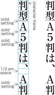
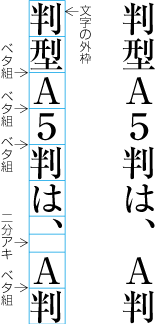
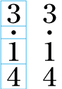
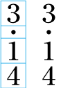
Note
Note
3.2.5 Handling of Tate-chu-yoko (Horizontal-in-Vertical Settings) 縦中横の処理
To set strings as tate-chu-yoko (horizontal-in-vertical setting), first set from left to right using solid setting, then align the whole string to the center of the vertical line (Figure 101 ). When hiragana (cl-15), katakana (cl-16) or ideographic characters (cl-19) are set before/after tate-chu-yoko, the inter-character spacing is set solid. In principle, when tate-chu-yoko is set after a comma (cl-07) or closing bracket (cl-02), or before an opening bracket (cl-01), half em spacing is added. In addition, when tate-chu-yoko is set after a full stop (cl-06) in the middle of a line, half em spacing is added. When a full stop (cl-06) is set at the end of a line, half em spacing is inserted after it, in principle. When tate-chu-yoko is set before full stops, commas or closing brackets, or after opening brackets, the inter-character spacing is set solid.
縦中横に配置する文字列は,横方向(左から右方向)にベタ組で配置し,その文字列全体を行の中央に配置する(Figure 101 ).なお,縦中横の前後に配置する平仮名(cl-15),片仮名(cl-16)又は漢字等(cl-19)との字間は,ベタ組にする.縦中横の文字列が読点類(cl-07)若しくは終わり括弧類(cl-02)の後ろ,又は始め括弧類(cl-01)の前にくる場合は,それらとの字間を原則として二分アキとする.行中で縦中横の文字列が句点類(cl-06)の後ろにくる場合は,その字間を二分アキとする.ただし,句点類(cl-06)が行末に位置した場合は,句点類(cl-06)の後ろを原則として二分アキにする.句点類(cl-06),読点類(cl-07)若しくは終わり括弧類(cl-02)の前,又は始め括弧類(cl-01)の後ろに縦中横の文字列がくる場合は,その字間はベタ組とする.
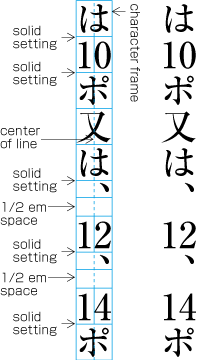
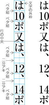
Note
3.2.6 Handling of Western Text in Japanese Text using Proportional Western Fonts プロポーショナルな欧字を用いた和欧文混植処理
Composition rules for Western characters, Western text and European numerals, set rotated 90 degrees clockwise in vertical writing mode, and horizontal writing mode, are as follows:
縦組で文字を時計回りに90度回転して配置する欧字・欧文・アラビア数字又は横組で混植する欧字・欧文・アラビア数字の配置方法は,次のようにする.
-
A sequence of Western characters in a Western word should not be broken across a line-break, except where hyphenation is allowed.
-
When line adjustment is done with line adjustment by inter-character spacing reduction, Western word space (cl-26) is used as first priority. Also, when line adjustment is done with line adjustment by inter-character spacing expansion, Western word spaces are used as first priority.
追込み処理で字間を詰める場合,その処理対象として欧文間隔(cl-26)を優先的に使用し,追出し処理で字間を空ける場合も,その処理対象として欧文間隔を優先的に使用する.
-
When line adjustment by inter-character spacing expansion is used, inter-character spacing within Western words and European numerals is not used for expansion.
追出し処理の際には,欧文及びアラビア数字の字間は,字間を空ける調整箇所としない.
-
Inter-character spacing, between hiragana (cl-15), katakana (cl-16) or ideographic characters (cl-19) and Western characters or European numerals, is quarter em spacing (see Figure 102 ). The issue as to whether the quarter em spacing can be used for line