An HTML form is a section of a document containing normal content, markup, and special elements called controls. Controls respond to and accept user input. Users generally "complete" forms by entering text, selecting menu items, etc., and then submitting the form for processing. Submitted forms may either be mailed to another user or fed to a program for treatment.
Controls may be check boxes, radio buttons, labels, menus, etc. Each control may be assigned a name. When the form is submitted, some controls (depending on their state) have their name and current value submitted along with the form. The nature of the value submitted depends on the control (e.g., the value of a text box is the input text).
Note: This specification includes more detailed information about forms in sections on form display issues. Further information on encoding form contents is expected to be added in later revisions to this draft.
A form can contain text and markup (paragraphs, lists, etc.) as well as the controls listed below.
The scope of the name attribute for any controls within a FORM element is the FORM element.
The following example specifies that the submitted form will be processed by the "adduser" program. The form will be sent to the program using the HTTP POST method.
 <FORM action="http://somesite.com/prog/adduser" method="post">
 ...form contents...
 </FORM>
The following example shows how to send a submitted form to an email address.
 <FORM action="mailto:Kligor.T@gee.whiz.com" method="post">
 ...form contents...
 </FORM>
The following control elements generally appear within a FORM element declaration. However, these elements may also appear outside of a FORM element declaration when they are used to build user interfaces. This is discussed later in this specification, in the section on intrinsic events.
Control labels
Some form controls automatically have labels associated with
them (press buttons created by INPUT
and BUTTON) while most do not
(text fields created by INPUT and
TEXTAREA, checkboxes and radio
buttons created by INPUT, and menus
created by SELECT).
For those controls that have implicit labels, user agents should take the value of the value attribute for the label string.
For those controls without implicit labels, authors must provide labels before or after the control element's definition. This is illustrated in the examples below.
The nature of a control defined by the INPUT element depends on the value of the type attribute.
The following sample HTML fragment defines a simple form that allows the user to enter a first name, last name, email address, and sex. When the submit button is activated, the form is sent to the program specified by the action attribute.
 <FORM action="http://somesite.com/prog/adduser" method="post">
    <P>
    First name: <INPUT type="text" name="firstname"><BR>
    Last name: <INPUT type="text" name="lastname"><BR>
    email: <INPUT type="text" name="email"><BR>
    <INPUT type="radio" name="sex" value="Male"> Male<BR>
    <INPUT type="radio" name="sex" value="Female"> Female<BR>
    <INPUT type="submit" value="Send"> <INPUT type="reset">
 </FORM>
This form might be rendered as follows:
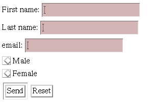
In the section on the LABEL element, we discuss marking up labels such as "First name".
The following example shows how the contents of a user-specified file may be submitted with a form. This example is based on an example from [RFC1867].
In this example, the user is prompted to enter a name and a list of names of files whose contents should be submitted with the form. By specifying the enctype value of "multipart/form-data", each file's contents are stored in a separate section of a multipart document.
<FORM action="http://server.dom/cgi/handle"
    enctype="multipart/form-data"
    method="post">
 What is your name? <INPUT type="text" name="name_of_sender">
 What files are you sending? <INPUT type="file" name="name_of_files">
</FORM>
Please consult [RFC1867] for more information about file submissions.
ISINDEX is deprecated. Users should use the INPUT element instead of this element.
The ISINDEX element causes the user agent to prompt the user for a single line of input (allowing any number of characters). The user agent may use the value of the prompt attribute as a title for the prompt.
Semantics of ISINDEX. Currently, the semantics for ISINDEX are only well-defined when the base URL for the enclosing document is an HTTP URL. In practice, the input string is restricted to Latin-1 as there is no mechanism for the URL to specify a different character set.
A BUTTON element whose type is "submit" is very similar to an INPUT element whose type is "submit". They both cause a form to be submitted, but the BUTTON element allows richer presentational possibilities.
A BUTTON element whose type is "submit" and whose content is an image (e.g., the IMG element) is very similar to an INPUT element whose type is "image". They both cause a form to be submitted, but their presentation is different. In this context, an INPUT element is supposed to be rendered as a "flat" image, while a BUTTON is supposed to be rendered as a button (e.g., with relief and an up/down motion when clicked).
The following example expands a previous example by substituting the INPUT elements that create submit and reset buttons with button BUTTON instances. The buttons contain images by way of the IMG element.
 <FORM action="http://somesite.com/prog/adduser" method="post">
    <P>
    First name: <INPUT type="text" name="firstname"><BR>
    Last name: <INPUT type="text" name="lastname"><BR>
    email: <INPUT type="text" name="email"><BR>
    <INPUT type="radio" name="sex" value="Male"> Male<BR>
    <INPUT type="radio" name="sex" value="Female"> Female<BR>
    <BUTTON name="submit" value="submit" type="submit">
    Send<IMG src="/icons/wow.gif" alt="wow"></BUTTON>
    <BUTTON name="reset" type="reset">
    Reset<IMG src="/icons/oops.gif" alt="oops"></BUTTON>
 </FORM>
If a BUTTON is used with an IMG element, you are recommended to exploit the IMG element's alt attribute to provide a description for users unable to see the image.
It is illegal to associate an image map with an IMG that appears as the contents of a BUTTON element.
A BUTTON element whose type is "reset" is very similar to an INPUT element whose type is "reset". They both cause controls to regain their initial values, but the BUTTON element allows richer presentation.
The BUTTON element may also be used together with scripts, in which case it's type should be "button". When such a button is activated, a client-side script is executed. We discuss this use of BUTTON later in the specification in the section on intrinsic events.
The SELECT element creates a list of choices that may be selected by the user. Each SELECT element must contain at least one choice. Each choice is specified by an instance of the OPTION element.
User agents should use the content of the OPTION element as the displayed choice.
In this example, we create a menu that allows the user to select which of seven software components to install. The first and second components are initially selected but may be deselected by the user. The remaining components are not initially selected. The size attribute states that the menu should only have 4 rows even though the user may select from among 7 options. The other options must be made available through a scrolling mechanism.
The SELECT is followed by submit and reset buttons.
<FORM action="http://somesite.com/prog/component-select" method="post">
   <SELECT multiple size="4" name="component-select">
      <OPTION selected value="Component_1_a">Component_1</OPTION>
      <OPTION selected value="Component_1_b">Component_2</OPTION>
      <OPTION>Component_3</OPTION>
      <OPTION>Component_4</OPTION>
      <OPTION>Component_5</OPTION>
      <OPTION>Component_6</OPTION>
      <OPTION>Component_7</OPTION>
   </SELECT>
   <INPUT type="submit" value="Send"><INPUT type="reset">
</FORM>
When the form is submitted, each selected choice will be paired with the name "component-select" and submitted. The submitted value of each OPTION will be its contents, except where overridden by the value attribute (here, in the first two components).
The TEXTAREA element creates a multi-line text input control (as opposed to a single-line INPUT control). The content of this element provides the initial text presented by the control.
This example creates a TEXTAREA control that is 20 rows by 80 columns and contains two lines of text initially. The TEXTAREA is followed by submit and reset buttons.
<FORM action="http://somesite.com/prog/text-read" method="post">
   <TEXTAREA rows="20" cols="80">
   First line of initial text.
   Second line of initial text.
   </TEXTAREA>
   <INPUT type="submit" value="Send"><INPUT type="reset">
</FORM>
Setting the readonly attribute allows authors to display unmodifiable text in a TEXTAREA. This differs from using standard marked-up text in a document because the value of TEXTAREA is submitted with the form.
It is recommended that user agents canonicalize line endings to CR, LF (ASCII decimal 13, 10) when submitting the field's contents. The character set for submitted data should be ISO Latin-1, unless the server has previously indicated that it can support alternative character sets.
The LABEL element may be used to attach information to other control elements (excluding other LABEL elements). Labels may be rendered by user agents in a number of ways (e.g., visually, read by speech synthesizers, etc.)
When a LABEL element receives focus, it passes the focus on to its associated control. See the section below on access keys for examples.
To associate a label with another control explicitly, set the for attribute of the LABEL.
This example creates a table that is used to align two INPUT controls and their associated labels. Each label is associated explicitly with one of the INPUT elements.
<FORM action="..." method="post">
<TABLE>
  <TR>
    <TD><LABEL for="fname">First Name</LABEL>
    <TD><INPUT type="text" name="firstname" id="fname">
  <TR>
    <TD><LABEL for="lname">Last Name</LABEL>
    <TD><INPUT type="text" name="lastname" id="lname">
</TABLE>
<FORM>
This example extends a previous example form to include LABEL elements. Note that the LABEL elements are associated to the INPUT elements through the id attribute.
 <FORM action="http://somesite.com/prog/adduser" method="post">
    <P>
    <LABEL for="firstname">First name: </LABEL><INPUT
              type="text" id="firstname"><BR>
    <LABEL for="lastname">Last name: </LABEL><INPUT
              type="text" id="lastname"><BR>
    <LABEL for="email"email: </LABEL><INPUT
              type="text" id="email"><BR>
    <INPUT type="radio" name="sex" value="Male"> Male<BR>
    <INPUT type="radio" name="sex" value="Female"> Female<BR>
    <INPUT type="submit" value="Send"> <INPUT type="reset">
 </FORM>
More than one LABEL may be associated with the same control by creating multiple references via the for attribute.
To associate a label with another control implicitly, make the control the contents of the LABEL. In this case, the LABEL may only contain one other control element. The label itself may be positioned before or after the associated control.
In this example, we implicitly associate two labels and two INPUT elements. Notice that the implicit association prevents us from being able to layout the label and its associated control in a table (see the previous example).
<FORM action="..." method="post">
<LABEL>
   First Name
   <INPUT type="text" name="firstname">
</LABEL>
<LABEL>
   <INPUT type="text" name="lastname">
   Last Name
</LABEL>
</FORM>
The FIELDSET and LEGEND elements
<!--
  #PCDATA is to solve the mixed content problem,
  per specification only whitespace is allowed there!
 -->
<!ELEMENT FIELDSET - - (#PCDATA,LEGEND,%block)>
<!ATTLIST FIELDSET
  %attrs;                          -- %coreattrs, %i18n, %events --
  >
<!ELEMENT LEGEND - - (%inline;)+>
<!ENTITY % LAlign "(top|bottom|left|right)">
<!ATTLIST LEGEND            -- fieldset legend --
  %attrs;                          -- %coreattrs, %i18n, %events --
  align       %LAlign;   #IMPLIED  -- relative to fieldset --
  accesskey   CDATA      #IMPLIED  -- accessibility key character --
  >
Start tag: required, End tag: required
LEGEND Attribute definitions
- top: The legend is above the fieldset. This is the default value.
- bottom: The legend is below the fieldset.
- left: The legend is to the left of the fieldset.
- right: The legend is to the right of the fieldset.
Attributes defined elsewhere
- id, class (document-wide identifiers)
- lang (language information), dir (text direction)
- title (element titles)
- style (inline style information)
- accesskey (access keys)
- align (alignment)
- onclick, ondblclick, onmousedown, onmouseup, onmouseover, onmousemove, onmouseout, onkeypress, onkeydown, onkeyup (intrinsic events)
The FIELDSET element allows form designers to group thematically related controls together. Grouping controls makes it easier for users to understand their purpose while simultaneously facilitating tabbing navigation for visual user agents and speech navigation for speech-oriented user agents. The proper use of this element makes documents more accessible to people with disabilities.
The LEGEND element allows designers to assign a caption to a FIELDSET. The legend improves accessibility when the FIELDSET is rendered non-visually. When rendered visually, setting the align attribute on the LEGEND element aligns it with respect to the FIELDSET.
In this example, we create a form that one might fill out at the doctor's office. It is divided into three sections: personal information, medical history, and current medication. Each section contains controls for inputting the appropriate information.
<FORM action="..." method="post">
<FIELDSET>
<LEGEND align="top">Personal Information</LEGEND>
Last Name: <INPUT name="personal_lastname" type="text" tabindex="1">
First Name: <INPUT name="personal_firstname" type="text" tabindex="2">
Address: <INPUT name="personal_address" type="text" tabindex="3">
...more personal information...
</FIELDSET>
<FIELDSET>
<LEGEND align="top">Medical History</LEGEND>
<INPUT name="history_illness"
       type="checkbox"
       value="Smallpox" tabindex="20"> Smallpox</INPUT>
<INPUT name="history_illness"
       type="checkbox"
       value="Mumps" tabindex="21"> Mumps</INPUT>
<INPUT name="history_illness"
       type="checkbox"
       value="Dizziness" tabindex="22"> Dizziness</INPUT>
<INPUT name="history_illness"
       type="checkbox"
       value="Sneezing" tabindex="23"> Sneezing</INPUT>
...more medical history...
</FIELDSET>
<FIELDSET>
<LEGEND align="top">Current Medication</LEGEND>
Are you currently taking any medication?
<INPUT name="medication_now"
       type="radio"
       value="Yes" tabindex="35">Yes</INPUT>
<INPUT name="medication_now"
       type="radio"
       value="No" tabindex="35">No</INPUT>
If you are currently taking medication, please indicate
it in the space below:
<TEXTAREA name="current_medication"
          rows="20" cols="50"
          tabindex="40">
</TEXTAREA>
</FIELDSET>
</FORM>
Note that in this example, we might improve the presentation of the form by aligning elements within each FIELDSET (with style sheets), adding color and font information (with style sheets), adding scripting (say, to only open the "current medication" text area if the user indicates he or she is currently on medication), etc.
Giving focus to an element
Active elements in HTML documents must receive focus from the user in order to perform their tasks. For example, users must activate a link specified by the A element in order to follow the specified link. Similarly, users must give a TEXTAREA focus in order to enter text into it.
There are several ways to give focus to an element:
- Designate the element with a pointing device.
- Navigate from one element to the next with the keyboard. The document's author may define a tabbing order that specifies the order in which elements will receive focus if the user navigates the document with the keyboard (tabbing navigation). Once selected, an element may be activated by some other key sequence.
- Select an element by a series of keyboard actions known as an access key (sometimes called "keyboard shortcut" or "keyboard accelerator").
Tabbing navigation
Attribute definitions
- tabindex = integer
- This attribute specifies the position of the current element in the tabbing order for the current document. This value may be a positive or negative integer.
The tabbing order defines the order in which elements will receive focus when navigated by the user via the keyboard. The tabbing order may include elements nested within other elements.
Elements that may receive focus should be navigated by user agents according to the following rules:
- Those elements that support the tabindex attribute and assign a postive value to it are navigated first. Navigation proceeds from the element with the lowest tabindex value to the element with the highest value. Values need not be sequential nor must they begin with any particular value. Elements that have identical tabindex should be navigated in the order they appear in the document.
- Those elements that do not define the tabindex attribute or do not support it are navigated next. These elements are navigated in the order they appear in the document.
- Those elements that support the tabindex attribute and assign a negative value to it do not participate in the tabbing order.
- Elements that are disabled do not participate in the tabbing order.
The following elements support the tabindex attribute: A, AREA, OBJECT, INPUT, SELECT, TEXTAREA, and BUTTON.
In this example, the tabbing order will be the BUTTON, the INPUT elements in order (note that "field1" and the button share the same tabindex, but "field1" appears later in the document), and finally the link created by the A element.
<HTML>
<BODY>
...some text...
Click to go to the
<A tabindex="10" href="http://www.w3.org/">W3C Website.</A>
...some more...
<BUTTON type="button" name="get-database"
           tabindex="1" onclick="get-database">
Click me to receive the current database.
</BUTTON>
...some more...
<FORM action="..." method="post">
<INPUT tabindex="1" type="text" name="field1">
<INPUT tabindex="2" type="text" name="field2">
<INPUT tabindex="3" type="submit" name="submit">
</FORM>
</BODY>
</HTML>
Tabbing keys. The actual key sequence that causes tabbing navigation or element activation depends on the configuration of the user agent (e.g., the "tab" key is used for navigation and the "enter" key is used to activate a selected element).
User agents may also define key sequences to navigate the tabbing order in reverse. When the end (or beginning) of the tabbing order is reached, user agents may circle back to the beginning (or end).
Access keys
Attribute definitions
Pressing an access key assigned to an element gives focus to the element. The action that is executed when an element receives focus depends on the element. Links defined by A are generally followed by the user agent, activated radio buttons change values, text fields with focus allow user input, etc.
The following elements support the accesskey attribute: LABEL, A, CAPTION, and LEGEND.
This example assigns the access key "U" to a label associated with an INPUT control. Typing the access key gives focus to the label which in turn gives it to the associated control. The user may then enter text into the INPUT area.
<FORM action="..." method="post">
<LABEL for="user" accesskey="U">
User Name
</LABEL>
<INPUT type="text" name="user">
</FORM>
In this example, we assign an access key to a link defined by the A element. Typing this access key takes the user to another document, in this case, a table of contents.
<A accesskey="C"
      href="http://somplace.com/specification/contents.html">
    Table of Contents</A>
The invocation of access keys depends on the underlying system. For instance, on machines running MS Windows, one generally has to press the "alt" key in addition to the access key. On Apple systems, one generally has to press the "cmd" key in addition to the access key.
The rendering of access keys depends on the user agent. We recommend that authors include the access key in label text or wherever the access key is to apply. User agents should render the value of an access key in such a way as to emphasize its role and to distinguish it from other characters (e.g., by underlining it).
Disabled and read-only elements
In contexts where user input is either undesirable or irrelevant, it is important to be able to disable an element or render it read-only. For example, one may want to disable a form's submit button until the user has entered some required data. Similarly, an author may want to include a piece of read-only text that must be submitted as a value along with the form. The following sections describe disabled and read-only elements.
Disabled elements
Attribute definitions
- disabled
- When set for a form control, this boolean attribute disables the control for user input.
When set, the disabled attribute has the following effects on an element:
- Disabled elements do not receive focus.
- Disabled elements are skipped in tabbing navigation.
- Values of disabled controls are not submitted with a form.
The following elements support the disabled attribute: INPUT, TEXTAREA, SELECT, OPTION, OBJECT, LABEL, and BUTTON.
How disabled elements are rendered depends on the user agent. For example, some user agents "gray out" disabled menu items, button labels, etc.
In this example, the disabled INPUT element cannot receive user input nor will its value be submitted with the form.
<INPUT disabled name="fred" value="stone">
Note: The only way to modify dynamically the value of the disabled attribute is through a script.
Read-only elements
Attribute definitions
- readonly
- When set for a form control, this boolean attribute prohibits changes to control.
The readonly attribute specifies whether the element may be modified by the user.
When set, the readonly attribute has the following effects on an element:
- Read-only elements receive focus but cannot be modified by the user.
- Read-only elements are included in tabbing navigation.
- Values of read-only controls are submitted with a form.
The following elements support the readonly attribute: INPUT, TEXT, PASSWORD, and TEXTAREA.
How read-only elements are rendered depends on the user agent.
Note: The only way to modify dynamically the value of the readonly attribute is through a script.
Form submission
Which element values are submitted
Not all elements have their values submitted with a form. Conforming user agents should not submit:
- Disabled form controls.
- Form controls without values for the name attribute.
- OBJECT elements without the name attribute.
- OBJECT elements with the declare attribute.
previous next contents elements attributes