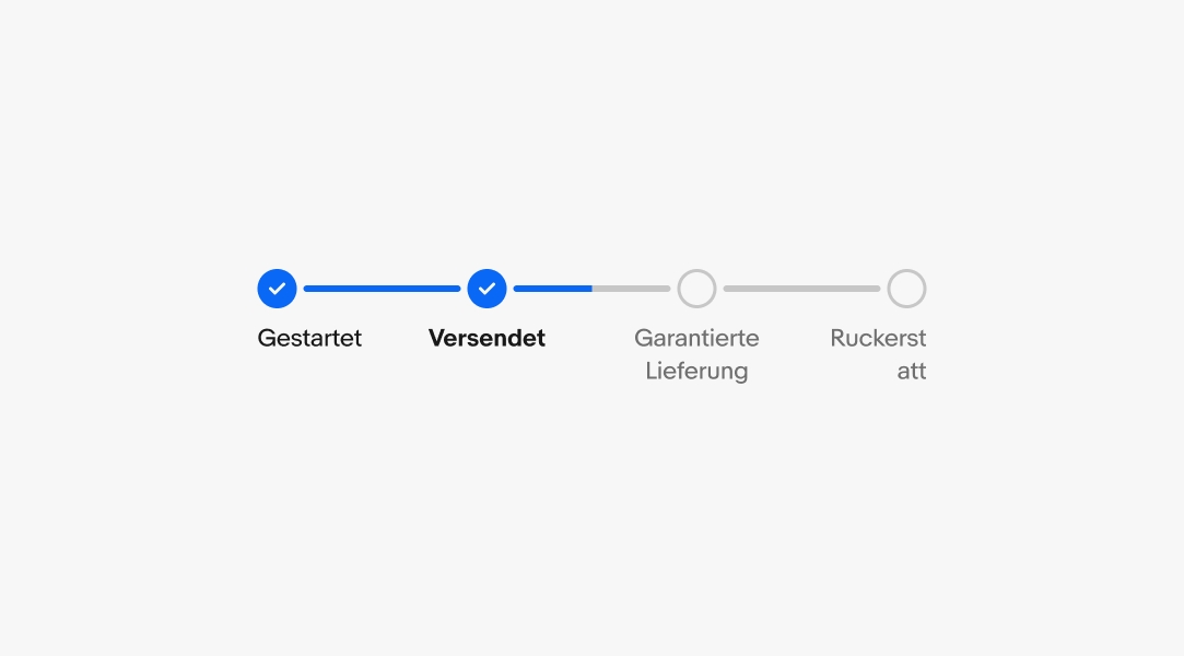
Progress stepper
v4.1
Progress steppers are visual indicators of progression through a process or experience.

On this page
Glanceable
Progress steppers are immediately understandable at a glance.
Minimal
Progress steppers use minimal visual UI to allow for quick identification.
Informative
Progress steppers focus on key milestones.
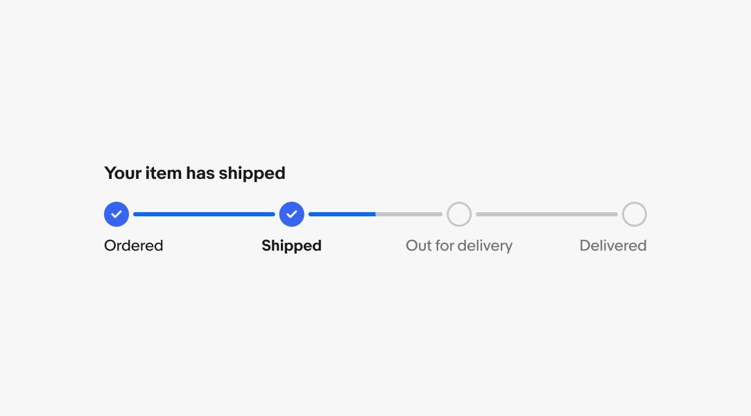
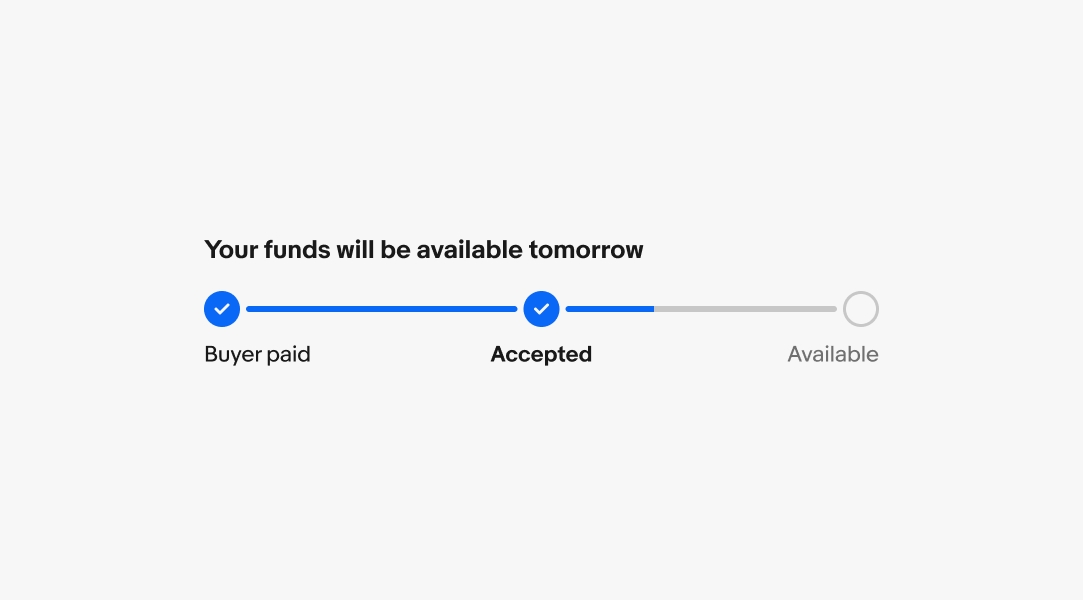
Title
Required. The title tells the user the most recent and meaningful update at a glance. Write from the user’s POV.
- Use sentence case
- No ending punctuation
Labels
Labels communicate the key milestones of a flow.
Primary label
Required. The primary label names the milestone and helps users understand their place in the flow. Describe the user-facing event, not the system's state.
- Use sentence case
- No ending punctuation
- Keep to 1–3 words
- Use parallel structure across all steps
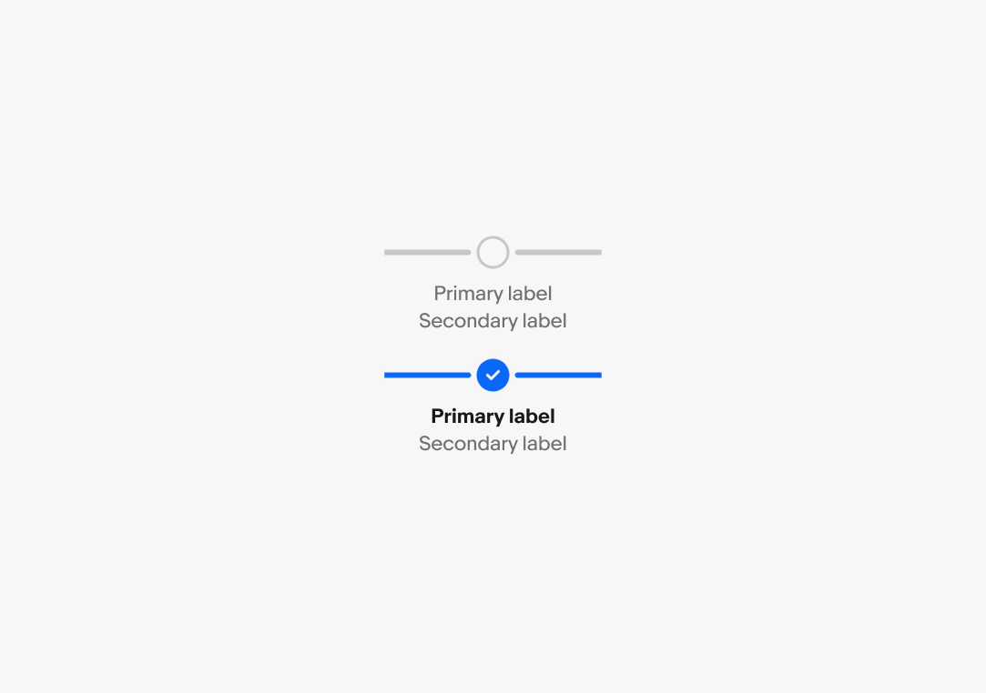
Secondary label
Optional. The secondary label adds supporting context below the primary label, such as a completion date or short status note.
- Use sentence case
- No ending punctuation
- Keep to 1 line
Horizontal orientation
Use horizontal steppers when saving vertical space is important. They allow for scrolling if the content extends off screen, but we recommend avoiding this behavior where possible.
Vertical orientation
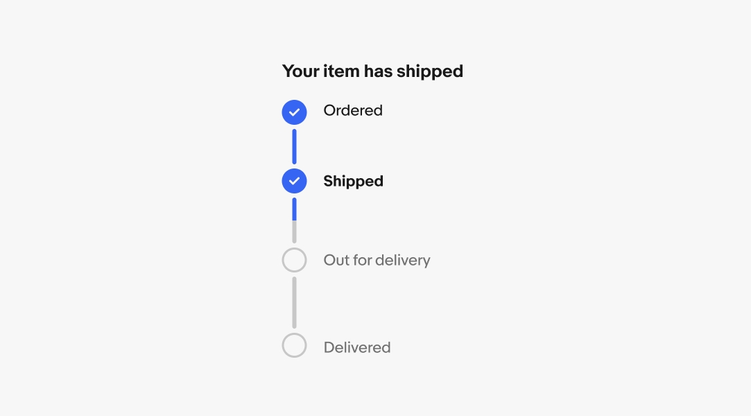
The vertical orientation is available when vertical space isn’t an issue. This is the preferred orientation on smaller screens with more steps.
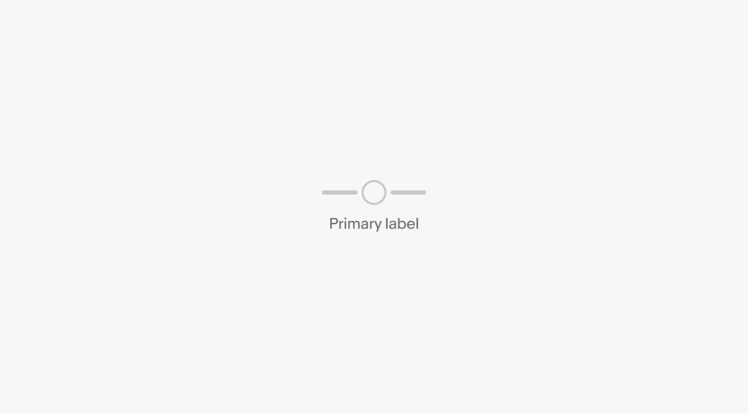
Incomplete state
Steps that have not been completed use the incomplete state. Incomplete steps indicate what is expected to occur, and only changes state when completed or when an issue occurs.
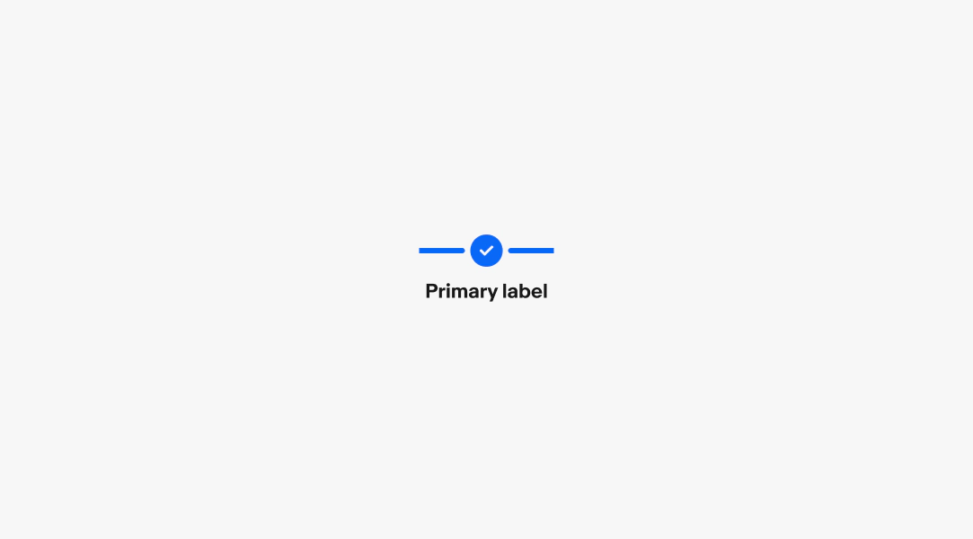
Latest state
A checkmark and bold title means this was the most recent completed step and the following step is in process. This state doesn’t apply to the last step in the stepper.
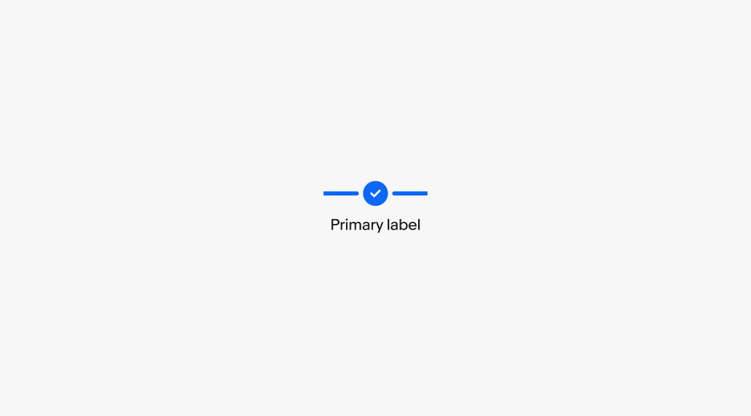
Completed state
A checkmark and non-bold label means this step is complete and the process has moved on. The final step of the stepper enters this state by default when completed.
Blocked state
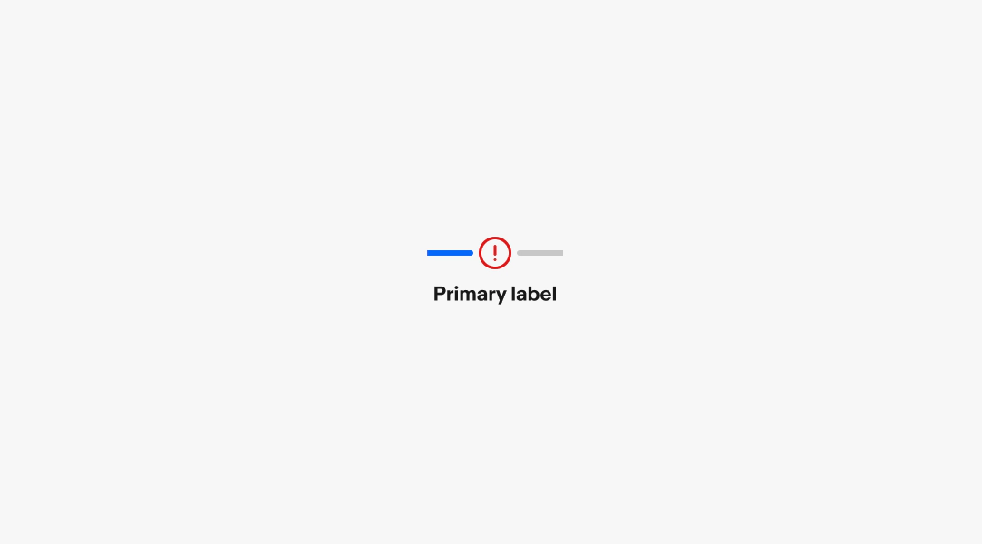
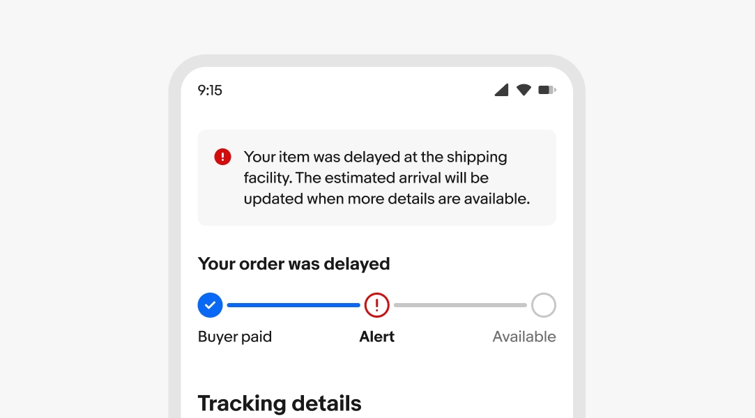
The outlined error icon indicates that a blocking issue has occurred and requires user attention before the process can continue. Errors should be paired with an alert banner or notice providing more information about what happened and how to resolve the issue, if possible.
Errors
When an error occurs, use a section or alert notice to display an error message.
Example title
Description
Number of steps
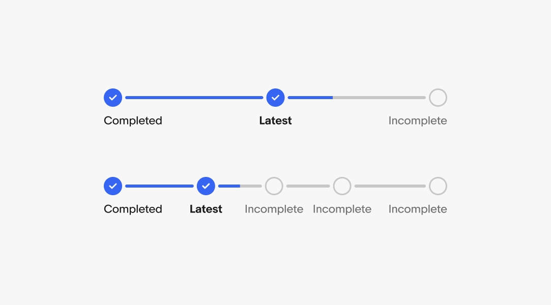
Steppers have a minimum of 3 steps and maximum of 7 steps. Use the fewest steps needed to avoid overwhelming the user. Only add a step if it represents a distinct milestone.
Minimum height
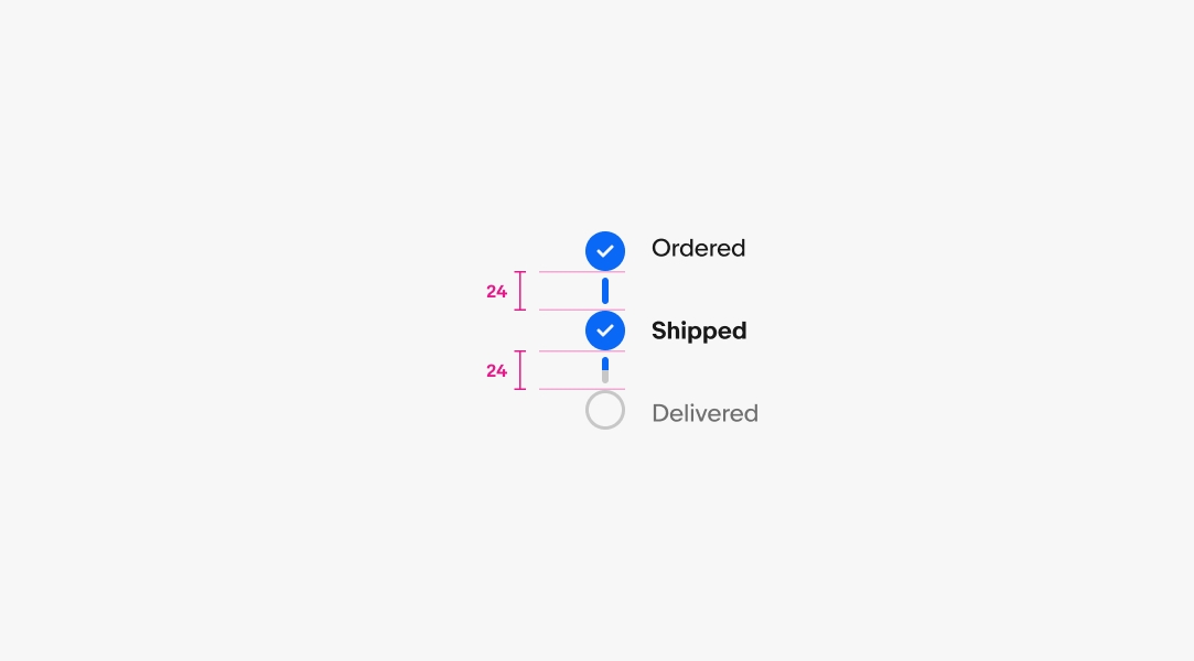
For vertical steppers, the minimum gap height between step icons is 24px.
Minimum step width
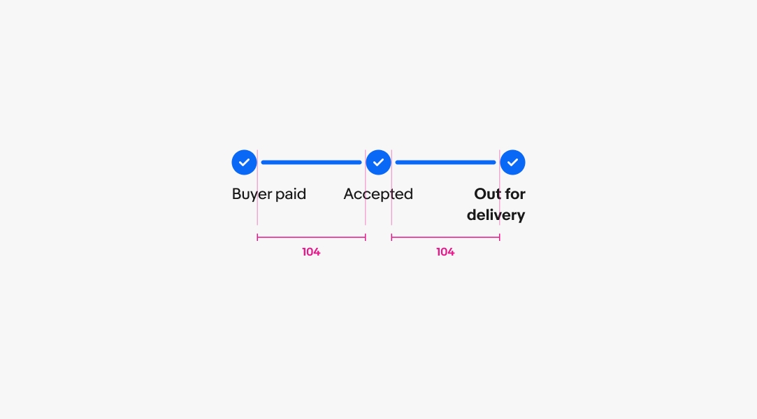
For horizontal steps, the minimum gap width between step icons is 104px.
Maximum stepper width
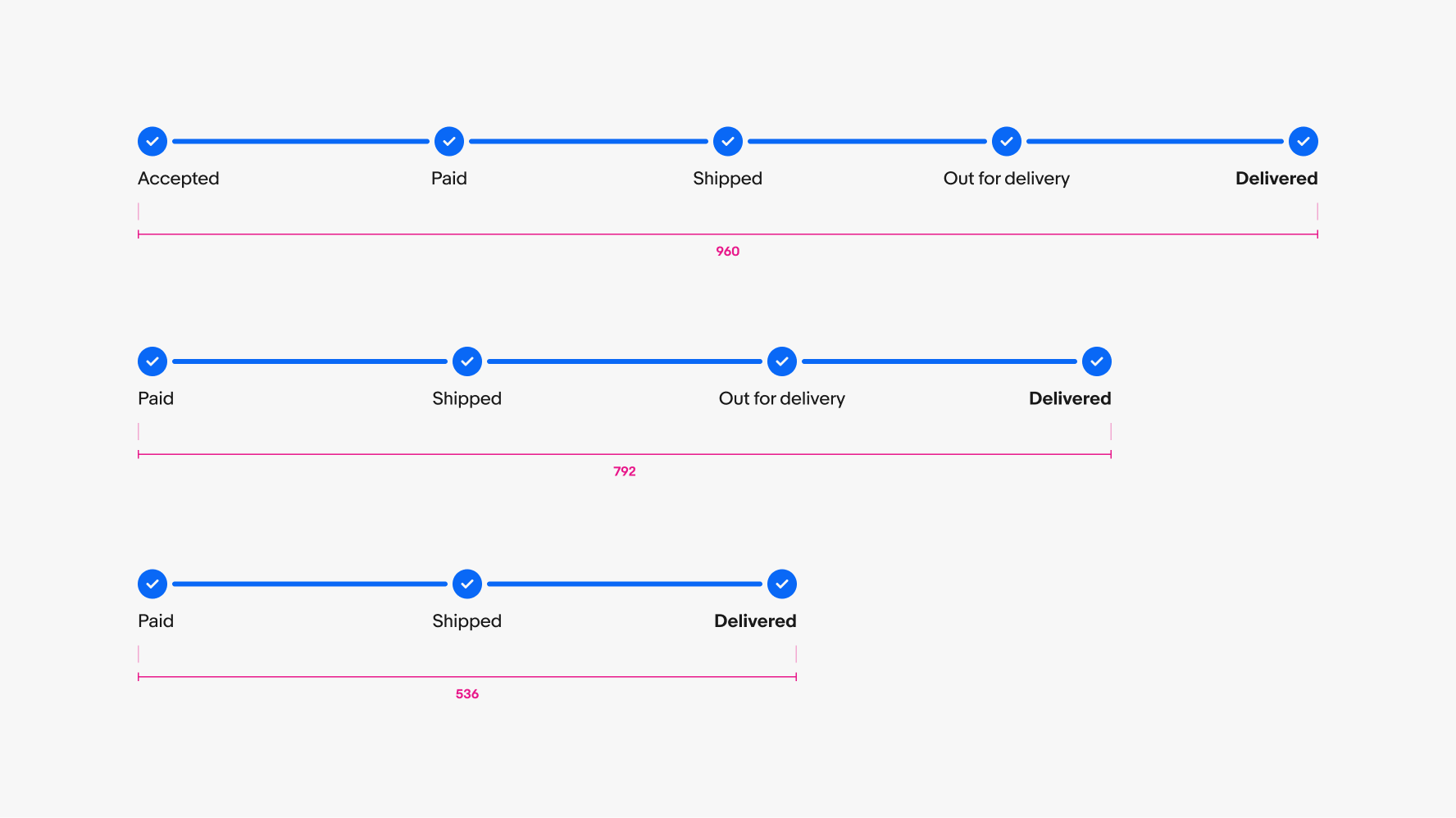
If there are enough steps, steppers will stretch to fill their parent container. Aim to keep steppers to a reasonable width according to the number of steps. Overly wide steppers can reduce the stepper’s readability.
Scroll behavior
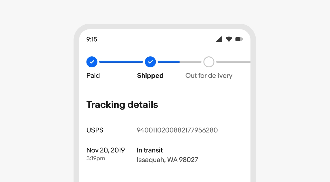
The stepper component behaves similar to a carousel when the content extends beyond the screen. The latest step is scrolled into view by default.
Label overflow
Longer labels wrap to a new line when wider than the step’s width.