Rusty Mitchell
6,632
posts


@seekbus
Unabashed nitpixeler. My opinions reflect the views of your employer.
Nashville, TN
Joined October 2007

Why I hate voice interfaces exhibit 12,043. Me: Hey Siri, turn the bedroom lights off. Siri: You can only make one request at a time. Me: [Repeats request] Siri: [Repeats refusal to act or learn from their mistake] Me: [Repeats request] Siri:[Finally turns lights off]
Want to wager a guess as to what these section icons represent? In our most recent post on designing great streaming TV apps, we look at main menu navigation approaches and make design recommendations like avoiding “mystery meat” iconography. blog.mercury.io/designing-grea…
Because so many people use several streaming TV apps across multiple platforms, the small differences and inconsistencies between apps sometimes feel like death by a thousand cuts. I’d love your thoughts on this new series on designing streaming TV apps we’ve been working on.

Did you know 66% of US households have multiple connected TV devices and 58% use 3 or more paid streaming services? We are starting a series on designing great streaming TV apps. Check out our introduction and give us your thoughts. #streamingTV #appdesign blog.mercury.io/designing-grea…
The Mercury design team has been doing a deep dive into designing great streaming TV apps. We realized that people often use several TV apps across multiple platforms. Because of this, design inconsistencies create a greater strain on the user than they normally would. (1/4)
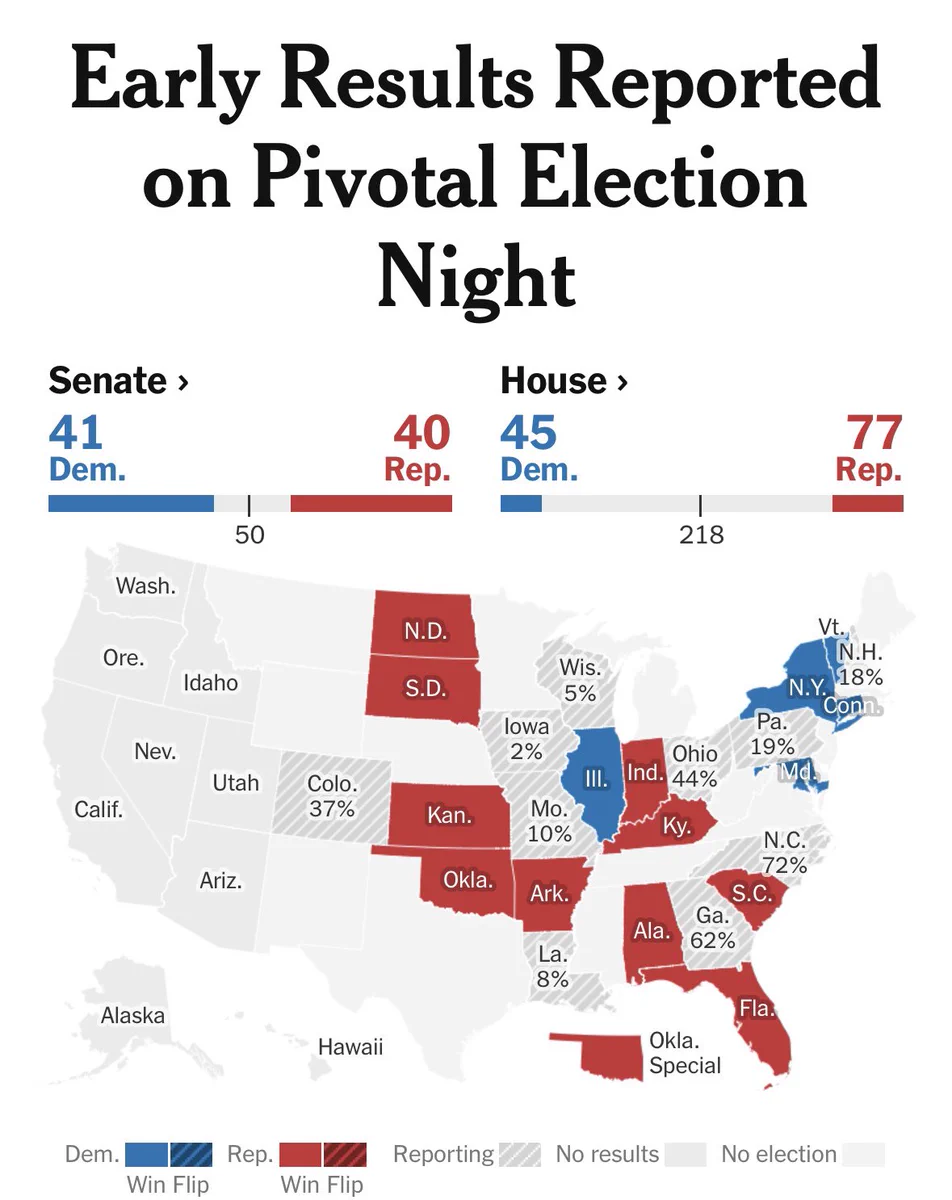
- @nytimes
Your choice to use the same pattern fill for Reporting and Flip states makes it look like Reporting states are undecided Flip states. These should have been completely different patterns.