Here you’ll find a host of example plots with the code that generated them.
Histograms
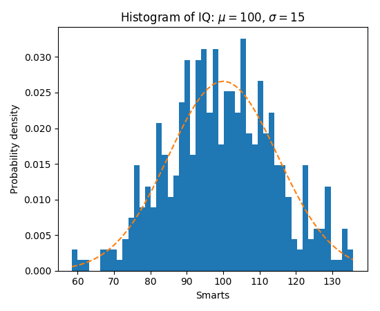
The hist() command automatically generates
histograms and returns the bin counts or probabilities:
(Source code, png, pdf)
mplot3d
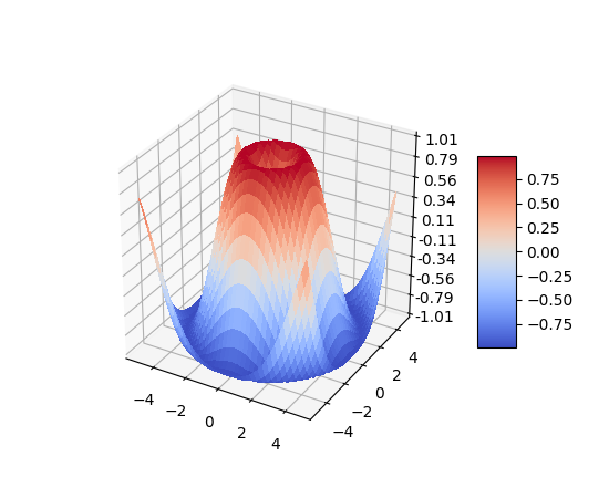
The mplot3d toolkit (see mplot3d tutorial and mplot3d Examples) has support for simple 3d graphs including surface, wireframe, scatter, and bar charts.
(Source code, png, pdf)
Thanks to John Porter, Jonathon Taylor, Reinier Heeres, and Ben Root for
the mplot3d toolkit. This toolkit is included with all standard matplotlib
installs.
Streamplot
The streamplot() function plots the streamlines of
a vector field. In addition to simply plotting the streamlines, it allows you
to map the colors and/or line widths of streamlines to a separate parameter,
such as the speed or local intensity of the vector field.
This feature complements the quiver() function for
plotting vector fields. Thanks to Tom Flannaghan and Tony Yu for adding the
streamplot function.
Ellipses
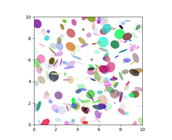
In support of the
Phoenix mission to
Mars (which used matplotlib to display ground tracking of spacecraft),
Michael Droettboom built on work by Charlie Moad to provide an extremely
accurate 8-spline approximation to elliptical arcs (see
Arc), which are insensitive to zoom level.
(Source code, png, pdf)
Pie charts
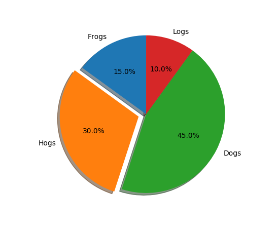
The pie() command allows you to easily create pie
charts. Optional features include auto-labeling the percentage of area,
exploding one or more wedges from the center of the pie, and a shadow effect.
Take a close look at the attached code, which generates this figure in just
a few lines of code.
(Source code, png, pdf)
Scatter demo
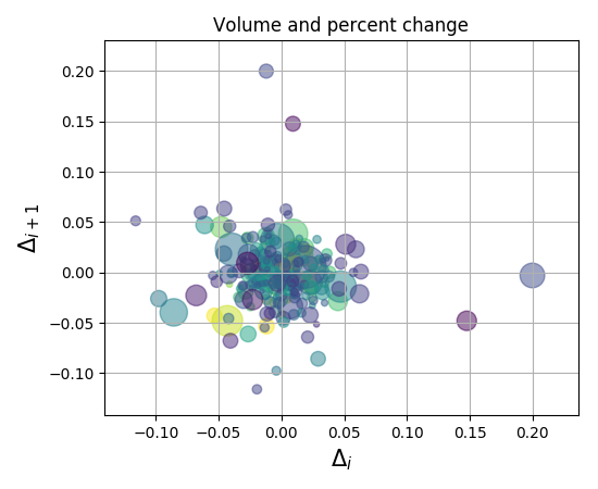
The scatter() command makes a scatter plot
with (optional) size and color arguments. This example plots changes
in Google’s stock price, with marker sizes reflecting the
trading volume and colors varying with time. Here, the
alpha attribute is used to make semitransparent circle markers.
(Source code, png, pdf)
Fill demo
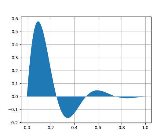
The fill() command lets you
plot filled curves and polygons:
(Source code, png, pdf)
Thanks to Andrew Straw for adding this function.
Log plots
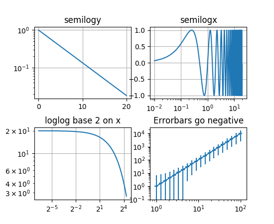
The semilogx(),
semilogy() and
loglog() functions simplify the creation of
logarithmic plots.
(Source code, png, pdf)
Thanks to Andrew Straw, Darren Dale and Gregory Lielens for contributions log-scaling infrastructure.
Mathtext_examples
Below is a sampling of the many TeX expressions now supported by matplotlib’s
internal mathtext engine. The mathtext module provides TeX style mathematical
expressions using FreeType
and the DejaVu, BaKoMa computer modern, or STIX
fonts. See the matplotlib.mathtext module for additional details.
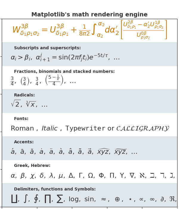
Matplotlib’s mathtext infrastructure is an independent implementation and does not require TeX or any external packages installed on your computer. See the tutorial at Writing mathematical expressions.
Native TeX rendering
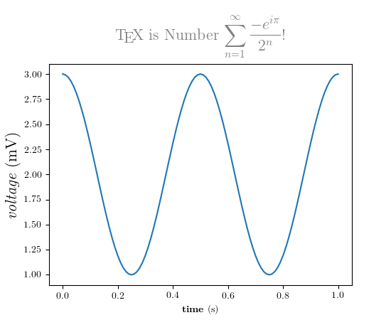
Although matplotlib’s internal math rendering engine is quite powerful, sometimes you need TeX. Matplotlib supports external TeX rendering of strings with the usetex option.
(Source code, png, pdf)