Note
Click here to download the full example code
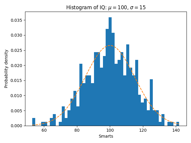
In addition to the basic histogram, this demo shows a few optional features:
- Setting the number of data bins.
- The
normedflag, which normalizes bin heights so that the integral of the histogram is 1. The resulting histogram is an approximation of the probability density function. - Setting the face color of the bars.
- Setting the opacity (alpha value).
Selecting different bin counts and sizes can significantly affect the shape of a histogram. The Astropy docs have a great section on how to select these parameters.
import matplotlib
import numpy as np
import matplotlib.pyplot as plt
np.random.seed(19680801)
# example data
mu = 100  # mean of distribution
sigma = 15  # standard deviation of distribution
x = mu + sigma * np.random.randn(437)
num_bins = 50
fig, ax = plt.subplots()
# the histogram of the data
n, bins, patches = ax.hist(x, num_bins, density=1)
# add a 'best fit' line
y = ((1 / (np.sqrt(2 * np.pi) * sigma)) *
     np.exp(-0.5 * (1 / sigma * (bins - mu))**2))
ax.plot(bins, y, '--')
ax.set_xlabel('Smarts')
ax.set_ylabel('Probability density')
ax.set_title(r'Histogram of IQ: $\mu=100$, $\sigma=15$')
# Tweak spacing to prevent clipping of ylabel
fig.tight_layout()
plt.show()
References
The use of the following functions and methods is shown in this example:
matplotlib.axes.Axes.hist
matplotlib.axes.Axes.set_title
matplotlib.axes.Axes.set_xlabel
matplotlib.axes.Axes.set_ylabel
Out:
<function Axes.set_ylabel at 0x7fb11b446c80>
Keywords: matplotlib code example, codex, python plot, pyplot Gallery generated by Sphinx-Gallery