
Highlights
- Waveform progress bar powered by
wavesurfer.js - Playlist with drag-and-drop reorder, repeat, shuffle
- Fully customizable — swap any sub-component, CSS variable theming, light & dark themes
- Compound slots —
AudioPlayer.Volume,AudioPlayer.Progress,AudioPlayer.PlayList, etc. for partial customization without losing the preset - Multi-instance playlist — render multiple players on the same page with isolated playlist drawers and fully independent audio state
- Accessible — WAI-ARIA patterns, full keyboard navigation, axe-tested
- TypeScript-first — typed props and hooks (
useAudioPlayer, sub-hooks) - SSR-friendly — works with Next.js App Router / Server Components
DEMO
https://codesandbox.io/p/sandbox/basic-nfrpfq
or
https://stackblitz.com/edit/stackblitz-webcontainer-api-starter-nevxganw?file=src%2FApp.tsx
Flexible and Customizable UI
Waveform progress with wavesurfer.js

Customizable layout and placement — with light & dark themes
Full View


Position Change


Particular View

Installation
npm install --save react-modern-audio-player
Requirements
- React 18.0.0 or higher
- react-dom 18.0.0 or higher
For React 16/17 projects, use v1.x of this library.
Quick Start
import AudioPlayer from "react-modern-audio-player";
const playList = [
  {
    name: "name",
    writer: "writer",
    img: "image.jpg",
    src: "audio.mp3",
    id: 1,
  },
];
function Player() {
  return <AudioPlayer playList={playList} />;
}
Next.js / Server Components
This library includes the 'use client' directive and can be imported directly in Next.js App Router.
Server Component — render <AudioPlayer> with static props (no hooks, no compound components):
// app/page.tsx — Server Component, no 'use client' needed
import AudioPlayer from "react-modern-audio-player";
const playList = [
  {
    name: "track",
    writer: "artist",
    img: "cover.jpg",
    src: "audio.mp3",
    id: 1,
  },
];
export default function Page() {
  return <AudioPlayer playList={playList} activeUI={{ playButton: true }} />;
}
Client Component — use useAudioPlayer hooks or AudioPlayer.CustomComponent:
"use client";
// app/player/page.tsx — Client Component required for hooks & compound pattern
import AudioPlayer, { useAudioPlayer } from "react-modern-audio-player";
function Controls() {
  const { isPlaying, togglePlay } = useAudioPlayer();
  return <button onClick={togglePlay}>{isPlaying ? "Pause" : "Play"}</button>;
}
export default function PlayerPage() {
  return (
    <AudioPlayer playList={playList}>
      <AudioPlayer.CustomComponent id="controls">
        <Controls />
      </AudioPlayer.CustomComponent>
    </AudioPlayer>
  );
}
Why
'use client'? The library's'use client'directive marks the client boundary — it allows Server Components to import and render<AudioPlayer>. However,useAudioPlayer()hooks andAudioPlayer.CustomComponentrequire client-side React features (state, context), so components using them must be Client Components.
Table of Contents
| Category | Sections |
|---|---|
| Props | PlayList · InitialStates · ActiveUI · Placement · RootContainerProps |
| Override & Style | CustomIcons · CoverImgsCss · Theme mode · ID & Classnames |
| Player Hook API | useAudioPlayer · AudioPlayerControls · Sub-Hooks |
| Custom Component | Custom Component · Compound Slots |
| Accessibility | Keyboard support |
| Gotchas | Gotchas |
| Example | Example |
| Security | Security & Trust Model |
Props
interface AudioPlayerProps {
  playList: PlayList;
  audioInitialState?: InitialStates;
  audioRef?: React.MutableRefObject<HTMLAudioElement>;
  activeUI?: ActiveUI;
  customIcons?: CustomIcons;
  coverImgsCss?: CoverImgsCss;
  placement?: {
    player?: PlayerPlacement;
    playList?: PlayListPlacement;
    interface?: InterfacePlacement;
    volumeSlider?: VolumeSliderPlacement;
    speedSelector?: SpeedSelectorPlacement;
    timeTooltip?: TimeTooltipPlacement;
  };
  rootContainerProps?: RootContainerProps;
  colorScheme?: "light" | "dark";
}
| Prop | Type | Default |
|---|---|---|
playList |
PlayList | [ ] |
audioInitialState |
InitialStates | isPlaying: false repeatType: "ALL" volume: 1 |
activeUI |
ActiveUI | playButton : true |
customIcons |
CustomIcons | undefined |
coverImgsCss |
CoverImgsCss | undefined |
placement |
Placement | playListPlacement : "bottom" interfacePlacement :DefaultInterfacePlacement |
rootContainerProps |
RootContainerProps | width: 100% position: 'static' className: rmap-player-provider |
colorScheme |
"light" | "dark" |
undefined (follows OS prefers-color-scheme) |
PlayList
type PlayList = Array<AudioData>;
type AudioData = {
  src: string;
  id: number;
  name?: string;
  writer?: string;
  img?: string;
  description?: string | ReactNode;
  customTrackInfo?: string | ReactNode;
  // Long-form & streaming (all optional, opt-in)
  isLive?: boolean;
  duration?: number;
  peaks?: number[] | number[][];
  preload?: "none" | "metadata" | "auto";
};
Long-form & live streams — automatic waveform fallback
A plain { src, id } track just works — the player automatically detects
long-form and live tracks and falls back from the waveform to a standard
seekable bar. Fallback kicks in when a track is:
- a live stream,
- longer than 30 minutes, or
- over 50 MB (detected via a
HEADrequest on same-origin / CORS-enabled hosts).
Live auto-detection relies on the browser reporting
duration === Infinityafter metadata loads. A few streams reportNaNinstead and are treated as normal tracks — setisLive: trueexplicitly for those.
You can override or hint any of this with optional AudioData fields:
| Field | Type | Effect |
|---|---|---|
isLive |
boolean |
Marks the track as a live stream. The waveform skips decoding and falls back to the standard seekable bar progress, seeking is guarded on endless streams, and the duration UI no longer leaks Infinity. |
duration |
number (seconds) |
Optional early hint for the total length — detection is automatic from metadata, so set this only to gate before metadata loads (or to force the bar fallback for a track over 30 minutes). Also drives H:MM:SS display. |
peaks |
number[] | number[][] |
Server-precomputed, normalized amplitude samples (single array, or one per channel) — the same shape wavesurfer.load() accepts. When provided, the real waveform renders with no client-side decode (recommended for large files). |
preload |
"none" | "metadata" | "auto" |
Per-track override of the native <audio preload> attribute. |
const playList = [
  {
    id: 1,
    src: "/podcast-3h.mp3",
    name: "Long episode",
    duration: 3 * 60 * 60,
  },
  {
    id: 2,
    src: "https://stream.example.com/live",
    name: "Live radio",
    isLive: true,
  },
];
Empty playlist handling
Passing playList={[]} renders the player in an empty state without crashing. This is useful while waiting for asynchronous track data:
function App() {
  const [tracks, setTracks] = useState<PlayList>([]);
  useEffect(() => {
    fetchTracks().then(setTracks);
  }, []);
  // Safe — the player mounts with no audio source and activates once tracks arrive.
  return <AudioPlayer playList={tracks} />;
}
- When the playlist becomes empty after updates, playback stops and all time state resets.
- When
audioInitialState.curPlayIddoesn't match any track in the current list, the player falls back toplayList[0]automatically.
InitialStates
type InitialStates = Omit<
  React.AudioHTMLAttributes<HTMLAudioElement>,
  "autoPlay"
> & {
  isPlaying?: boolean;
  repeatType?: RepeatType;
  volume?: number;
  currentTime?: number;
  duration?: number;
  curPlayId: number;
  playListExpanded?: boolean;
};
playListExpanded: trueopens the playlist drawer on mount. Consistent with the other fields onaudioInitialState, this is read once at mount and is not tracked in reducer state.
ActiveUI
type ActiveUI = {
  all: boolean;
  playButton: boolean;
  playList: PlayListUI;
  prevNnext: boolean;
  volume: boolean;
  volumeSlider: boolean;
  repeatType: boolean;
  trackTime: boolean;
  trackInfo: boolean;
  artwork: boolean;
  progress: ProgressUI;
  playbackRate: boolean;
};
type ProgressUI = "waveform" | "bar" | false;
type PlayListUI = "sortable" | "unSortable" | false;
CustomIcons
type CustomIcons = {
  play: ReactNode;
  pause: ReactNode;
  prev: ReactNode;
  next: ReactNode;
  repeatOne: ReactNode;
  repeatAll: ReactNode;
  repeatNone: ReactNode;
  repeatShuffle: ReactNode;
  volumeFull: ReactNode;
  volumeHalf: ReactNode;
  volumeMuted: ReactNode;
  playList: ReactNode;
};
CoverImgsCss
interface CoverImgsCss {
  artwork?: React.CSSProperties;
  listThumbnail?: React.CSSProperties;
}
Placement
type PlayerPlacement =
  | "bottom"
  | "top"
  | "bottom-left"
  | "bottom-right"
  | "top-left"
  | "top-right";
type VolumeSliderPlacement = "bottom" | "top" | "left" | "right";
type SpeedSelectorPlacement = "bottom" | "top" | "left" | "right";
type TimeTooltipPlacement = "top" | "bottom";
type PlayListPlacement = "bottom" | "top";
type InterfacePlacement = {
  templateArea?: InterfaceGridTemplateArea;
  customComponentsArea?: InterfaceGridCustomComponentsArea<TMaxLength>;
  itemCustomArea?: InterfaceGridItemArea;
};
type InterfacePlacementKey =
  | Exclude<keyof ActiveUI, "all" | "prevNnext" | "trackTime">
  | "trackTimeCurrent"
  | "trackTimeDuration";
type InterfacePlacementValue = "row1-1" | "row1-2" | "row1-3" | "row1-4" | ... more ... | "row10-10"
/** if you apply custom components, values must be "row1-1" ~ any more */
type InterfaceGridTemplateArea = Record<InterfacePlacementKey,InterfacePlacementValue>;
type InterfaceGridCustomComponentsArea = Record<componentId,InterfacePlacementValue>;
type InterfaceGridItemArea = Partial<Record<InterfacePlacementKey, string>>;
  /** example
   * progress : 2-4
   * repeatBtn : row1-4 / 2 / row1-4 / 10
   *
   * check MDN - grid area
   * https://developer.mozilla.org/ko/docs/Web/CSS/grid-area
   */
Default interface placement
const defaultInterfacePlacement = {
  templateArea: {
    artwork: "row1-1",
    trackInfo: "row1-2",
    trackTimeCurrent: "row1-3",
    trackTimeDuration: "row1-4",
    progress: "row1-5",
    repeatType: "row1-6",
    volume: "row1-7",
    playButton: "row1-8",
    playList: "row1-9",
    playbackRate: "row1-10",
  },
};
RootContainerProps
rootContainerProps accepts any standard HTMLAttributes<HTMLDivElement> (e.g. className, style, data-*). The root container always has the class rmap-player-provider applied automatically.
⚠️ Setting the native CSS
color-schemeproperty viarootContainerProps={{ style: { colorScheme: "dark" } }}will not toggle the player's theme. The library's theme is driven by theprefers-color-schememedia query and the[data-theme]attribute selector — use the top-levelcolorSchemeprop instead.
Override Style
Theme mode (dark mode)
Dark mode is driven by
system-theme(prefers-color-scheme: dark) by default. To force a specific theme regardless of OS preference, pass the top-levelcolorScheme="light" | "dark"prop on<AudioPlayer>— this applies adata-themeattribute on.rmap-player-providerwhich overrides the media query. You can override any color by redefining the CSS variables below on.rmap-player-provider.
@media (prefers-color-scheme: dark) {
  .rmap-player-provider {
    --rm-audio-player-interface-container: #1e1e1e;
    /* override other variables as needed */
  }
}
ID & Classnames
root ID
- rm-audio-player
Multi-instance note: when multiple
<AudioPlayer>instances share a page the rootidis duplicated across them. Playlist and audio state are still isolated per instance (each player has its own React provider tree and its own<audio>DOM node). If you need per-instance selectors, target via the class names below rather than the id.
root ClassName
- rmap-player-provider
color variables
.rmap-player-provider {
  --rm-audio-player-text-color: #2c2c2c;
  --rm-audio-player-shadow: 0 0 0;
  --rm-audio-player-interface-container: #f5f5f5;
  --rm-audio-player-volume-background: #ccc;
  --rm-audio-player-volume-panel-background: #f2f2f2;
  --rm-audio-player-volume-panel-border: #ccc;
  --rm-audio-player-volume-thumb: #5c5c5c;
  --rm-audio-player-volume-fill: rgba(0, 0, 0, 0.5);
  --rm-audio-player-volume-track: #ababab;
  --rm-audio-player-track-current-time: #0072f5;
  --rm-audio-player-track-duration: #8c8c8c;
  --rm-audio-player-progress-bar: #0072f5;
  --rm-audio-player-progress-bar-background: #393939;
  --rm-audio-player-tooltip-background: #f2f2f2;
  --rm-audio-player-waveform-cursor: #4b4b4b;
  --rm-audio-player-waveform-background: var(
    --rm-audio-player-progress-bar-background
  );
  --rm-audio-player-waveform-bar: var(--rm-audio-player-progress-bar);
  --rm-audio-player-sortable-list: #eaeaea;
  --rm-audio-player-sortable-list-button-active: #0072f5;
  --rm-audio-player-selected-list-item-background: #b3b3b3;
}
useAudioPlayer
Control the player externally using the useAudioPlayer hook. Must be called inside AudioPlayerStateProvider (or AudioPlayer which wraps it).
import AudioPlayer, { useAudioPlayer } from "react-modern-audio-player";
function PlayerControls() {
  const {
    isPlaying,
    currentTrack,
    currentTime,
    duration,
    togglePlay,
    next,
    prev,
    seek,
    setVolume,
    setTrack,
  } = useAudioPlayer();
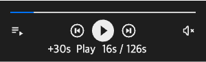
  const timeLabel = `${currentTime.toFixed(0)}s / ${duration.toFixed(0)}s`;
  return (
    <div>
      <button onClick={togglePlay}>{isPlaying ? "Pause" : "Play"}</button>
      <button onClick={prev}>Prev</button>
      <button onClick={next}>Next</button>
      <button onClick={() => seek(30)}>+30s</button>
      <button onClick={() => setVolume(0.5)}>Volume 50%</button>
      <button onClick={() => setTrack(1)}>Track 2</button>
      <p>
        {currentTrack?.name} — {timeLabel}
      </p>
    </div>
  );
}
function App() {
  const playList = [{ id: 1, src: "audio.mp3", name: "Track 1" }];
  return (
    <AudioPlayer playList={playList}>
      <PlayerControls />
    </AudioPlayer>
  );
}
AudioPlayerControls
| Property | Type | Description |
|---|---|---|
isPlaying |
boolean |
Current playback state |
volume |
number |
Current volume (0–1) |
currentTime |
number |
Elapsed time in seconds |
duration |
number |
Track duration in seconds |
repeatType |
RepeatType |
Current repeat mode |
muted |
boolean |
Whether audio is muted |
currentTrack |
AudioData | null |
Currently playing track |
currentIndex |
number |
Index in playlist |
playList |
PlayList |
Full playlist |
play() |
() => void |
Start playback |
pause() |
() => void |
Pause playback |
togglePlay() |
() => void |
Toggle play/pause |
next() |
() => void |
Skip to next track |
prev() |
() => void |
Skip to previous track |
seek(time) |
(time: number) => void |
Seek to time in seconds |
setVolume(vol) |
(volume: number) => void |
Set volume (0–1, clamped) |
toggleMute() |
() => void |
Toggle mute on/off |
setTrack(index) |
(index: number) => void |
Jump to playlist index |
playbackRate |
number |
Current playback rate (1 = normal). Default 1. |
setPlaybackRate(rate) |
(rate: number) => void |
Set playback rate. No clamping; browser enforces HTML5 bounds. |
Sub-Hooks
useAudioPlayer subscribes to all context slices. For fine-grained re-render control, use domain-specific sub-hooks:
import {
  useAudioPlayerPlayback,
  useAudioPlayerTrack,
  useAudioPlayerVolume,
  useAudioPlayerTime,
  useAudioPlayerElement,
} from "react-modern-audio-player";
// Only re-renders on play/pause and repeat type changes
function PlayButton() {
  const { isPlaying, togglePlay } = useAudioPlayerPlayback();
  return <button onClick={togglePlay}>{isPlaying ? "Pause" : "Play"}</button>;
}
// Only re-renders on time updates
function TimeDisplay() {
  const { currentTime, duration } = useAudioPlayerTime();
  return (
    <span>
      {currentTime.toFixed(0)}s / {duration.toFixed(0)}s
    </span>
  );
}
| Hook | Returns |
|---|---|
useAudioPlayerPlayback |
{ isPlaying, repeatType, playbackRate, play, pause, togglePlay, setPlaybackRate } |
useAudioPlayerTrack |
{ currentPlayId, currentIndex, playList, currentTrack, setTrack, next, prev } |
useAudioPlayerVolume |
{ volume, muted, setVolume, toggleMute } |
useAudioPlayerTime |
{ currentTime, duration, seek } |
useAudioPlayerElement |
{ audioEl, waveformInst } (advanced) |
Context Hooks
Components inside AudioPlayer can subscribe to only the state slice they need, avoiding unnecessary re-renders.
import {
  usePlaybackContext, // curAudioState: { isPlaying, repeatType, volume, muted, isLoadedMetaData }
  useTrackContext, // playList, curIdx, curPlayId
  useUIContext, // activeUI, interfacePlacement, playListPlacement, playerPlacement, volumeSliderPlacement
  useResourceContext, // elementRefs, customIcons, coverImgsCss
} from "react-modern-audio-player";
const MyComponent = () => {
  const { curAudioState } = usePlaybackContext();
  return <span>{curAudioState.isPlaying ? "Playing" : "Paused"}</span>;
};
| Hook | Returns |
|---|---|
usePlaybackContext |
{ curAudioState: AudioState } |
useTrackContext |
{ playList, curIdx, curPlayId } |
useUIContext |
{ activeUI, interfacePlacement, playListPlacement, playerPlacement, volumeSliderPlacement } |
useResourceContext |
{ elementRefs, customIcons, coverImgsCss } |
Custom Component
You can place a custom component anywhere in the player interface using AudioPlayer.CustomComponent. Use useAudioPlayer inside it to access player state and controls.
import AudioPlayer, {
  useAudioPlayer,
  InterfacePlacement,
  DEFAULT_INTERFACE_GRID_BOUND,
} from "react-modern-audio-player";
const activeUI: ActiveUI = {
  all: true,
};
// `as 12` pins the literal type — TS arithmetic widens
// `DEFAULT_INTERFACE_GRID_BOUND + 1` to `number`, which would erase grid-coord
const TOTAL_INTERFACE_GRID_BOUND = (DEFAULT_INTERFACE_GRID_BOUND + 1) as 12;
// `row1-${DEFAULT_INTERFACE_GRID_BOUND}` resolves to `"row1-11"` —
// the first cell beyond the default template area (which fills 1..10).
const customComponentGridArea = `row1-${DEFAULT_INTERFACE_GRID_BOUND}`;
const placement = {
  interface: {
    customComponentsArea: {
      playerCustomComponent: customComponentGridArea,
    },
  } as InterfacePlacement<typeof TOTAL_INTERFACE_GRID_BOUND>,
  /**
   * The generic on `InterfacePlacement<N>` is an exclusive upper bound on grid
   * indices — usable cells are `1..(N - 1)`. Default is
   * `DEFAULT_INTERFACE_GRID_BOUND` (= 11), giving cells `1..10` which the
   * built-in template area already occupies (e.g. `playbackRate` at `row1-10`).
   * To reserve an additional cell for the custom component, pass `<N + 1>` —
   * here `<12>` makes `row1-11` a valid coordinate.
   */
};
const CustomComponent = () => {
  const { currentTime, duration, seek, isPlaying, togglePlay } =
    useAudioPlayer();
  return (
    <>
      <button onClick={() => seek(currentTime + 30)}>+30s</button>
      <button onClick={togglePlay}>{isPlaying ? "Pause" : "Play"}</button>
      <span>
        {currentTime.toFixed(0)}s / {duration.toFixed(0)}s
      </span>
    </>
  );
};
<AudioPlayer playList={playList} placement={placement} activeUI={activeUI}>
  <AudioPlayer.CustomComponent id="playerCustomComponent">
    <CustomComponent />
  </AudioPlayer.CustomComponent>
</AudioPlayer>;
Compound Slots
AudioPlayer exposes its built-in controls as static members so you can re-place or augment individual pieces without rebuilding the whole layout.
| Member | Renders |
|---|---|
AudioPlayer.Progress |
progress bar / waveform |
AudioPlayer.Volume |
volume trigger + slider (accepts triggerType?: "click" | "hover", placement?: VolumeSliderPlacement) |
AudioPlayer.PlayList |
sortable playlist drawer (accepts initialExpanded?) |
AudioPlayer.PlayListEmpty |
fallback rendered inside the playlist drawer when playList is empty |
AudioPlayer.PlayButton |
Play + Prev + Next group (Prev/Next visibility follows activeUI.prevNnext) |
AudioPlayer.RepeatButton |
repeat-type button |
AudioPlayer.SpeedSelector |
playback rate dropdown (accepts options?, formatRate?, triggerType?: "click" | "hover", placement?: SpeedSelectorPlacement) |
AudioPlayer.Artwork |
track artwork |
AudioPlayer.TrackInfo |
track title / writer |
AudioPlayer.TrackTime |
current + duration time |
AudioPlayer.CustomComponent |
user-defined slot |
Each slot accepts the full GridItemLayoutProps set — gridArea?, visible?, width?, padding?, justifySelf?, UNSAFE_className? — plus its own domain props. AudioPlayer.TrackTime is the exception: it only exposes visible? because the slot maps to two grid areas internally.
Native HTML attributes (className, style, onClick, data-*, etc.) are not forwarded by compound slots. Compose the underlying primitives (PlayBtn, PrevBtn, NextBtn, etc., still exported) when full DOM control is needed; headless support with native attribute pass-through is planned for v3.
Mental model — activeUI vs compound children
activeUIgoverns the preset (default layout) — which built-in controls are shown.- Compound children are explicit placements that always render (
visibledefaults totrue).
The two layers are orthogonal. Compound children render additively alongside the preset. To truly replace a preset control, disable it in activeUI and render the compound counterpart:
// Remove the default volume, re-place it with a custom gridArea
<AudioPlayer playList={playList} activeUI={{ all: true, volume: false }}>
  <AudioPlayer.Volume gridArea="row1-5" />
</AudioPlayer>
In development, a console.warn is emitted when a compound slot is rendered while its preset counterpart is still active, so silent duplication is easy to catch.
AudioPlayer.PlayButton and activeUI.prevNnext
AudioPlayer.PlayButton is a single slot that renders the Play + Prev + Next group as one unit. There is no separate AudioPlayer.PrevButton / AudioPlayer.NextButton compound slot — Prev / Next are part of the PlayButton compound, and there are two ways to render them.
Method 1 — AudioPlayer.PlayButton compound (group)
Place the whole group at a custom grid area; Prev / Next visibility inside the group follows activeUI.prevNnext (which defaults to activeUI.all):
// Re-place the full Play + Prev + Next group at a custom area
<AudioPlayer
  playList={playList}
  activeUI={{ all: true, playButton: false }} // hide the preset transport
>
  <AudioPlayer.PlayButton gridArea="row1-3" />
</AudioPlayer>
// Same compound, but render Play only — Prev / Next hidden by activeUI.prevNnext
<AudioPlayer
  playList={playList}
  activeUI={{ all: true, playButton: false, prevNnext: false }}
>
  <AudioPlayer.PlayButton gridArea="row1-3" />
</AudioPlayer>
Method 2 — primitives via AudioPlayer.CustomComponent
When you need finer control — placing Prev / Play / Next in different grid cells, applying custom wrappers, or attaching native HTML attributes — drop down to the PlayBtn, PrevBtn, and NextBtn primitives (still exported) and render them inside AudioPlayer.CustomComponent:
import AudioPlayer, {
  PrevBtn,
  PlayBtn,
  NextBtn,
} from "react-modern-audio-player";
<AudioPlayer
  playList={playList}
  activeUI={{ all: true, playButton: false }} // hide the preset transport
  placement={{
    interface: { customComponentsArea: { "custom-transport": "row1-3" } },
  }}
>
  <AudioPlayer.CustomComponent id="custom-transport">
    <div className="my-transport">
      <PrevBtn isVisible />
      <PlayBtn />
      <NextBtn isVisible />
    </div>
  </AudioPlayer.CustomComponent>
</AudioPlayer>;
PrevBtn / NextBtn accept an isVisible boolean for symmetry with the compound group's visibility logic; pass false to omit them. Use Method 2 when Method 1's group placement and activeUI.prevNnext toggle aren't enough.
Custom empty-playlist UI
Pass children to AudioPlayer.PlayListEmpty to render a custom node inside the playlist drawer when playList is empty. Omit the slot to keep the default (drawer content renders nothing).
<AudioPlayer playList={[]}>
  <AudioPlayer.PlayListEmpty>
    <div className="my-empty">Playlist is empty</div>
  </AudioPlayer.PlayListEmpty>
</AudioPlayer>
PlayListEmpty is a marker slot; its children are consumed by the drawer via context and the component itself does not render in-place.
Accessibility
The player follows WAI-ARIA patterns and is fully navigable by keyboard and screen readers.
Keyboard support
All controls are reachable via Tab and respond to standard keyboard activation. The playlist uses the WAI-ARIA "Listbox with Rearrangeable Options" pattern:
| Key | Action |
|---|---|
Tab / Shift+Tab |
Move focus between player controls |
Space / Enter |
Activate the focused button (play/pause, prev/next, repeat, mute, playlist) |
ArrowUp / ArrowDown |
Move focus between playlist items |
Alt+ArrowUp / Alt+ArrowDown |
Reorder the focused playlist item |
Enter / Space on a playlist item |
Select and play that track |
Drag-and-drop reordering is preserved as an alternative — keyboard and mouse both call the same onReorder handler.
Gotchas
Common integration mistakes to avoid:
- Don't toggle the theme via
rootContainerProps.style.colorScheme. The native CSScolor-schemeproperty does not switch the player's theme. Use the top-levelcolorSchemeprop, which drives the[data-theme]attribute and re-initializes the waveform colors. - Set the
InterfacePlacementgeneric when placingcustomComponentsAreabeyond row 9. TypeScript rejects values past the default range, so useInterfacePlacement<N>whereNis(max row length + 1)— e.g.InterfacePlacement<11>for"row1-10"(see Custom Component). AudioPlayer.CustomComponentaccepts a single React element child. It usesReact.cloneElementinternally, so passing multiple children or a primitive (string, number) will throw.- Volume is
0..1, not0..100.setVolumeclamps out-of-range values, sosetVolume(50)silently becomessetVolume(1). - Compound slots don't forward native HTML attributes.
<AudioPlayer.Volume className="...">is rejected by TypeScript — onlyGridItemLayoutProps(layout) pass through. Compose the underlying primitives (PlayBtn,PrevBtn,NextBtn, etc., still exported) when you needclassName,style,onClick, ordata-*. Full headless support is planned for v3. id: 0is a valid track id. The reducer uses nullish checks, so tracks withid: 0are handled correctly — don't filter them out ofplayListon the assumption that zero is falsy.- Don't import the CSS manually. Styles are auto-injected via
sideEffects: ["*.css"];import "react-modern-audio-player/dist/index.css"will 404 or double-load. - Multiple mounted
<AudioPlayer>instances don't share React state, but they do share the user's speakers. Each instance has its own provider and its own<audio>element, so the state is isolated — but if two instances both play, the user hears both tracks simultaneously. Coordinate playback yourself (e.g. pause the others when oneplay()fires).
Example
function App() {
  return (
    <div>
      <AudioPlayer
        playList={playList}
        audioInitialState={{
          muted: true,
          volume: 0.2,
          curPlayId: 1,
        }}
        placement={{
          interface: {
            templateArea: {
              trackTimeDuration: "row1-5",
              progress: "row1-4",
              playButton: "row1-6",
              repeatType: "row1-7",
              volume: "row1-8",
            },
          },
          player: "bottom-left",
        }}
        activeUI={{
          all: true,
          progress: "waveform",
        }}
      />
    </div>
  );
}
Security & Trust Model
A few props on this library are typed as string | ReactNode — most notably:
React's standard JSX rendering applies. A plain string passed to one of these props is auto-escaped by React — so description: "<img src=x onerror=alert(1)>" becomes harmless text. If, however, you construct the ReactNode yourself using dangerouslySetInnerHTML, React runs whatever HTML you put there. This is React's documented contract; see Dangerously setting the inner HTML on react.dev.
When the content originates from user-generated input, the consumer is responsible for sanitizing it before it is handed to this library:
- Prefer passing a plain string — React's escape is sufficient.
- If you must inject HTML (e.g. a Markdown preview), sanitize first with DOMPurify or a vetted Markdown parser, then wrap the result in JSX.
This library does not bundle a sanitizer because the trust boundary, allowed-tag policy, and rendering pipeline all depend on the consumer's data source — only the integrating application has that context.