
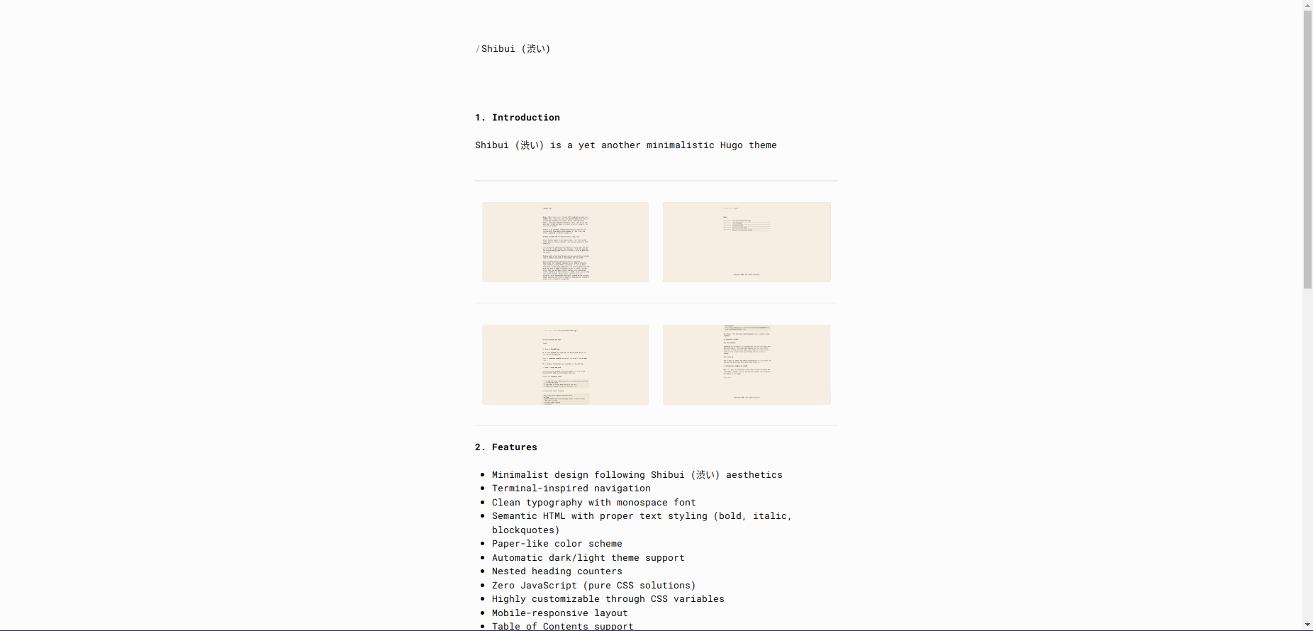
A minimalist Hugo theme emphasizing simplicity and refinement
Table of contents:
- Features
- Installation
- Color Scheme
- Customization
- Contributing
- License
- Demo
- Theme Structure
- Updating
- Version Requirements
- Credits
 |
 |
 |
 |
Shibui (渋い) (adjective), shibumi (渋み) (subjective noun), or shibusa (渋さ) (objective noun) are Japanese words that refer to a particular aesthetic of simple, subtle, and unobtrusive beauty. Like other Japanese aesthetics terms, such as iki and wabi-sabi, shibui can apply to a wide variety of subjects, not just art or fashion.
Features
- Minimalist design following Shibui (渋い) aesthetics
- Terminal-inspired navigation
- Clean typography with monospace font
- Semantic HTML with proper text styling (bold, italic, blockquotes)
- Paper-like color scheme
- Automatic dark/light theme support
- Nested heading counters
- Zero JavaScript (pure CSS solutions)
- Highly customizable through CSS variables
- Mobile-responsive layout
- Table of Contents support
- Tags support
- Customizable
Installation
As a Git Submodule
git submodule add https://github.com/ntk148v/shibui.git themes/shibui
git submodule update --init --recursive
Configuration
Add the following to your config.toml:
baseURL = 'http://example.org/'
locale = 'en-us'
title = 'Your Site Title'
theme = "shibui"
[params]
  author = "Your Name"
  email = "your.email@example.com"
[menu]
  [[menu.main]]
    name = "Posts"
    url = "/posts/"
    weight = 1
  [[menu.main]]
    name = "About"
    url = "/about/"
    weight = 2
Page Configuration
In the front matter of your content files:
---
title: 'Your Post Title'
date: 2023-06-13
tags: ['hugo', 'theme']
---
Theme Parameters
You can configure theme behavior by adding parameters to your site's config.toml:
[params]
  author = "Your Name"
  email = "your.email@example.com"
  # Enable/disable comments on posts (default: true)
  comments = true
  # Default table of contents visibility per page (default: true)
  # Can be overridden per-page with `toc: false` in front matter
  showtoc = true
  # Show estimated reading time on posts (default: true)
  showreadingtime = true
  # Show last modified date on posts (default: false)
  showlastmod = false
  # Social links (optional)
  twitterHandle = "username"
  ogImage = "/images/og-image.jpg"
Supported front matter parameters for individual pages:
toc(boolean): Show/hide table of contents (default: true)comments(boolean): Enable/disable comments for this page (default: site.Params.comments)showreadingtime(boolean): Override reading time display (default: site.Params.showreadingtime)showlastmod(boolean): Override last modified date display (default: site.Params.showlastmod)
Color Scheme
The theme uses a paper-like color palette, use a background primary color as base and then derive the rest of theme colors by shifting lightness (or saturation/hue if needed) relative to that base, so we can easily generate multiple variants (light, dark, high-contrast, etc.). Therefore, you can adjust just base color and keep the same vibe, checkout #4 for preview.
/* Base theme knobs */
--bg-h: 0;
--bg-s: 0%;
--bg-l: 99%;
/* Background colors */
--color-bg-primary: hsl(var(--bg-h) var(--bg-s) var(--bg-l));
--color-bg-secondary: hsl(var(--bg-h) var(--bg-s) calc(var(--bg-l) - 2%));
--color-border: hsl(var(--bg-h) var(--bg-s) calc(var(--bg-l) - 6%));
--color-selection-bg: hsl(var(--bg-h) var(--bg-s) calc(var(--bg-l) - 13%));
/* Text colors with WCAG-friendly contrast */
/* Primary: ensures near-black on light bg and near-white on dark bg */
--color-text-primary: hsl(
  var(--bg-h) var(--bg-s) clamp(8%, calc(100% - var(--bg-l)), 92%)
);
/* Muted: softer but still >4.5:1 contrast */
--color-text-muted: hsl(
  var(--bg-h) var(--bg-s) clamp(30%, calc(85% - var(--bg-l)), 75%)
);
/* Code text: slightly brighter than muted */
--color-text-code: hsl(
  var(--bg-h) var(--bg-s) clamp(20%, calc(90% - var(--bg-l)), 85%)
);
Customization
CSS Variables
You can customize the theme by overriding CSS variables in your assets/css/custom.css:
For example, you want to create a dark theme, just adjust the base color.
:root {
  /* Base theme knobs */
  --bg-h: 0;
  --bg-s: 0%;
  --bg-l: 12%;
}
Contributing
Contributions are welcome! Primary goals are:
- Maintain minimalist design principles
- Keep it simple and efficient
- Avoid JavaScript when CSS can solve the problem
- Follow Shibui (渋い) aesthetics
License
MIT
Demo
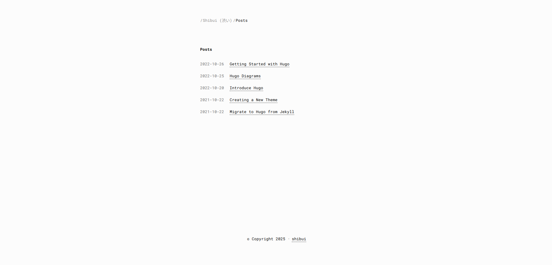
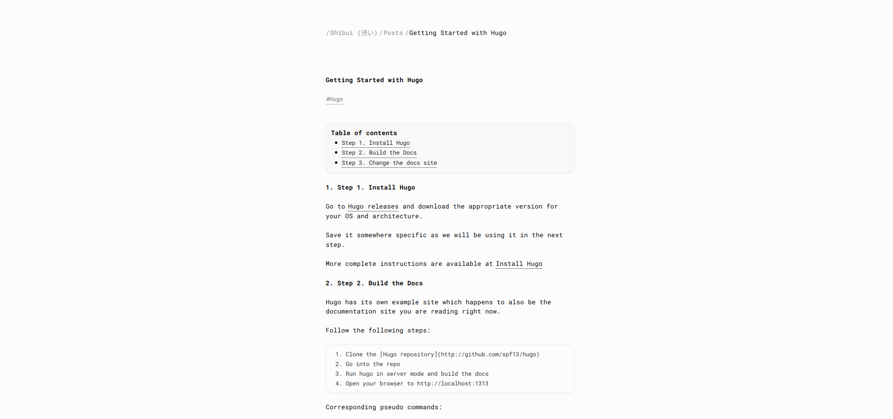
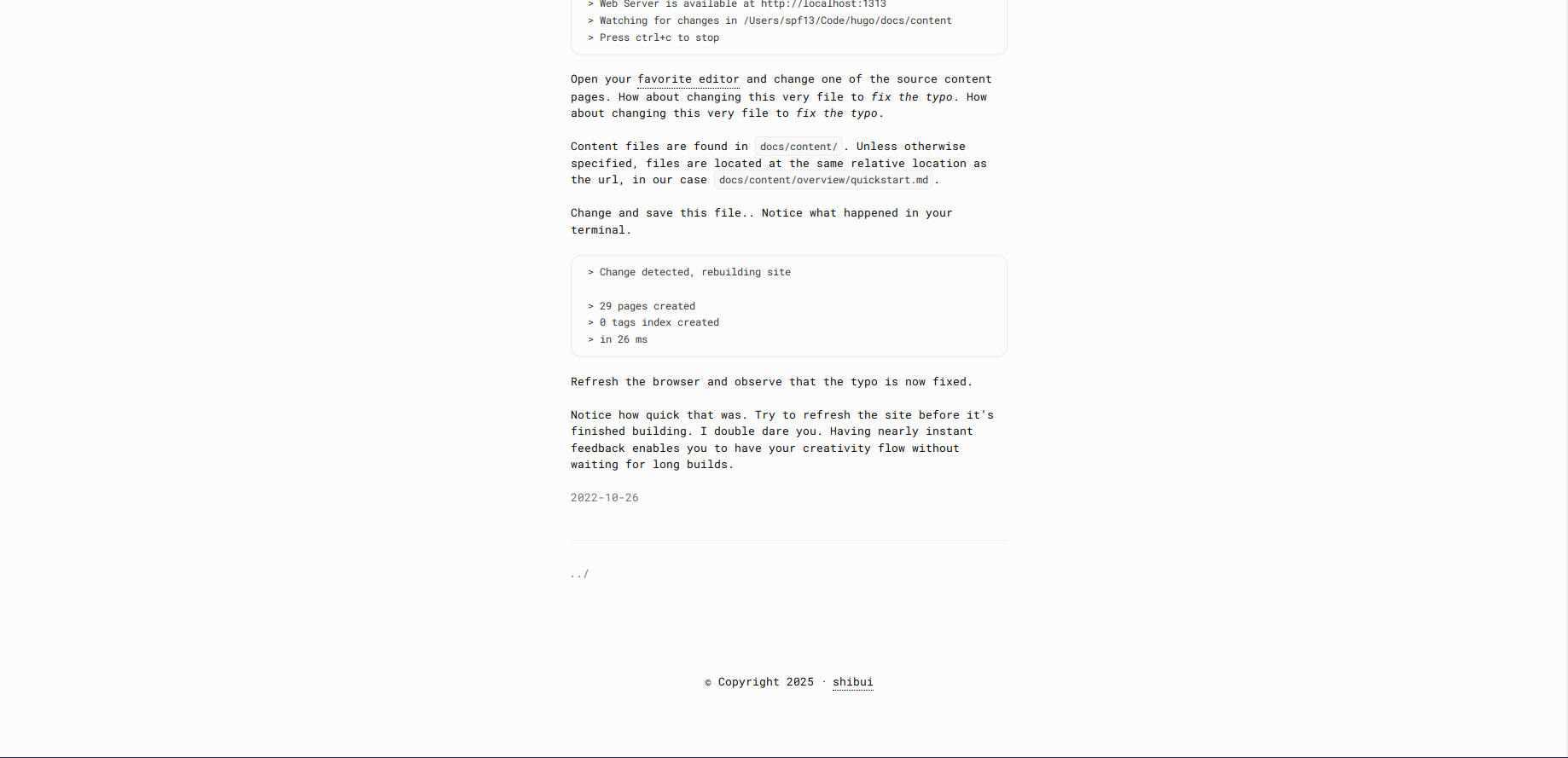
Visit the demo site to see the theme in action.
Theme Structure
shibui/
├── archetypes/          # Content template files
├── assets/
│   ├── css/            # Theme CSS files
│   └── js/             # Theme JavaScript files
├── layouts/            # Template files
│   ├── _default/       # Default templates
│   ├── _partials/      # Reusable template parts
│   └── index.html      # Homepage template
├── static/             # Static assets
└── exampleSite/        # Example site for reference
Template Organization
layouts/_default/baseof.html: Base template with common layoutlayouts/_default/single.html: Template for individual pageslayouts/_default/list.html: Template for section pageslayouts/_partials/: Contains reusable components like header, footerlayouts/index.html: Homepage template
Assets
The theme uses a minimal set of assets:
- CSS: Single stylesheet with CSS variables for customization
- JS: Optional JavaScript for enhanced functionality
- Static: Basic favicon and other static assets
ExampleSite
The exampleSite directory contains a complete example of a site using the theme. Use it as a reference for:
- Configuration setup
- Content organization
- Front matter examples
- Menu structure
Updating
Since the theme is installed as a Git submodule, you can update it to the latest version with:
cd themes/shibui
git pull origin main
Version Requirements
- Hugo Extended v0.93.0 or higher
- Go 1.18 or higher (for Hugo modules)
Credits
This theme was inspired by various minimalist designs and the Japanese concept of Shibui (渋い). Special thanks to:
- William Jansson
- The Hugo community
- Minimalist design principles
- Japanese aesthetics, particularly Shibui