API information regarding each chart is not addressed in this document. Refer to the API Guide.
Creating the Chart
There are two different ways to create the LineArea chart. The LineArea chart can be created through the constructor function or the static function. The two methods both result in returning an instance of the chart. The HTML element in which the chart is drawn el, data data, and the options object options are taken as parameters. If the element in which the chart is drawn contains elements other than the chart itself, it may unintentionally affect the chart. Therefore, it is recommended that you use an empty HTML element.
import { LineAreaChart } from '@toast-ui/chart';
const chart = new LineAreaChart({el, data, options});
// or
import Chart from '@toast-ui/chart';
const chart = Chart.lineAreaChart({el, data, options});
Basic Chart
Data Type
The data is entered as series and categories. Each chart's series is provided to the line and area, respectively, and must be completed with both name and data. The data must be a numeric value.
const data = {
  categories: [
    '2020.01',
    '2020.02',
    '2020.03',
    '2020.04',
    '2020.05',
    '2020.06',
    '2020.07',
    '2020.08',
    '2020.09',
    '2020.10',
    '2020.11',
    '2014.12',
  ],
  series: {
    area: [
      {
        name: 'Effective Load',
        data: [150, 130, 100, 125, 128, 44, 66, 162, 77, 70, 68, 103],
      },
    ],
    line: [
      {
        name: 'Power Usage',
        data: [72, 80, 110, 117, 129, 137, 134, 66, 121, 88, 114, 117],
      },
    ],
  },
}
visible
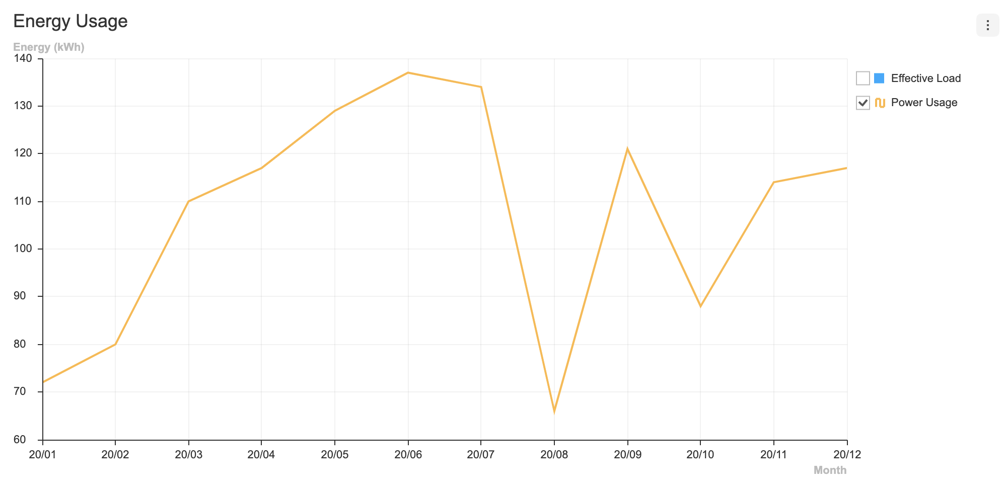
Each series can have visible option. The visible option determines whether the series is displayed when the chart is first drawn. The default is true.
const data = {
  categories: [
    '2020.01',
    '2020.02',
    '2020.03',
    '2020.04',
    '2020.05',
    '2020.06',
    '2020.07',
    '2020.08',
    '2020.09',
    '2020.10',
    '2020.11',
    '2020.12',
  ],
  series: {
    area: [
      {
        name: 'Effective Load',
        data: [150, 130, 100, 125, 128, 44, 66, 162, 77, 70, 68, 103],
        visible: false,
      },
    ],
    line: [
      {
        name: 'Power Usage',
        data: [72, 80, 110, 117, 129, 137, 134, 66, 121, 88, 114, 117],
      },
    ],
  },
}
If you create a chart by applying the above option, you can see that the checkbox is unchecked.
Options
options should be used as an object. Options for each chart can be applied through line and area. The available options are as follows.
type options = {
  chart?: {
    //...
  }
  xAxis?: {
    //...
  }
  yAxis?: {
    //...
  }
  legend?: {
    //...
  }
  exportMenu?: {
    //...
  }
  tooltip?: {
    //...
  }
  responsive?: {
    //...
  }
  theme?: {
    // More explanations in the `theme` chapter.
  }
  series?: {
    selectable?: boolean;
    zoomable?: boolean;
    showDot?: boolean;
    lineWidth?: number;
    spline?: boolean;
    shift?: boolean;
    line?: {
      selectable?: boolean;
      spline?: boolean;
      showDot?: boolean;
      dataLabels?: {
        visible?: boolean;
        anchor?: DataLabelAnchor;
        offsetX?: number;
        offsetY?: number;
        formatter?: Formatter;
      }
    }
    area?: {
      selectable?: boolean;
      stack?: boolean | {
        type: 'normal' | 'percent';
      };
      spline?: boolean;
      showDot?: boolean;
      dataLabels?: {
        visible?: boolean;
        anchor?: DataLabelAnchor;
        offsetX?: number;
        offsetY?: number;
        formatter?: Formatter;
      }
    }
    dataLabels?: {
      visible?: boolean;
      anchor?: DataLabelAnchor;
      offsetX?: number;
      offsetY?: number;
      formatter?: Formatter;
    }
  }
}
Applying options that should be applied to both charts is the same as other charts. If there are options that must be applied only to one of the charts, use line and area to specify.
Let's create a simple example and apply common options as well as separate options.
const options = {
  series: {
    showDot: true,
    line: {
      spline: true
    },
    area: {
      dataLabels: {
        visible: true
      }
    }
  }
};
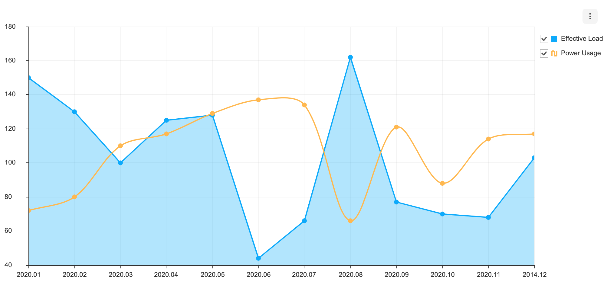
Common options that can be used with this chart are not addressed in this document. Refer to the respective options guide. Furthermore, for information regarding scatter and line charts options, refer to the respective guide. (Links:
chartOptions, Axis, Legend, Export, ToolTip,responsiveOptions, Live Update, Line Chart, Area Chart, )
dataLabels
If the series.dataLabels option is configured, the data labels are displayed for both Line and Area charts.
const options = {
  ...
  series: {
    dataLabels: {
      visible: true;
    }
  }
};
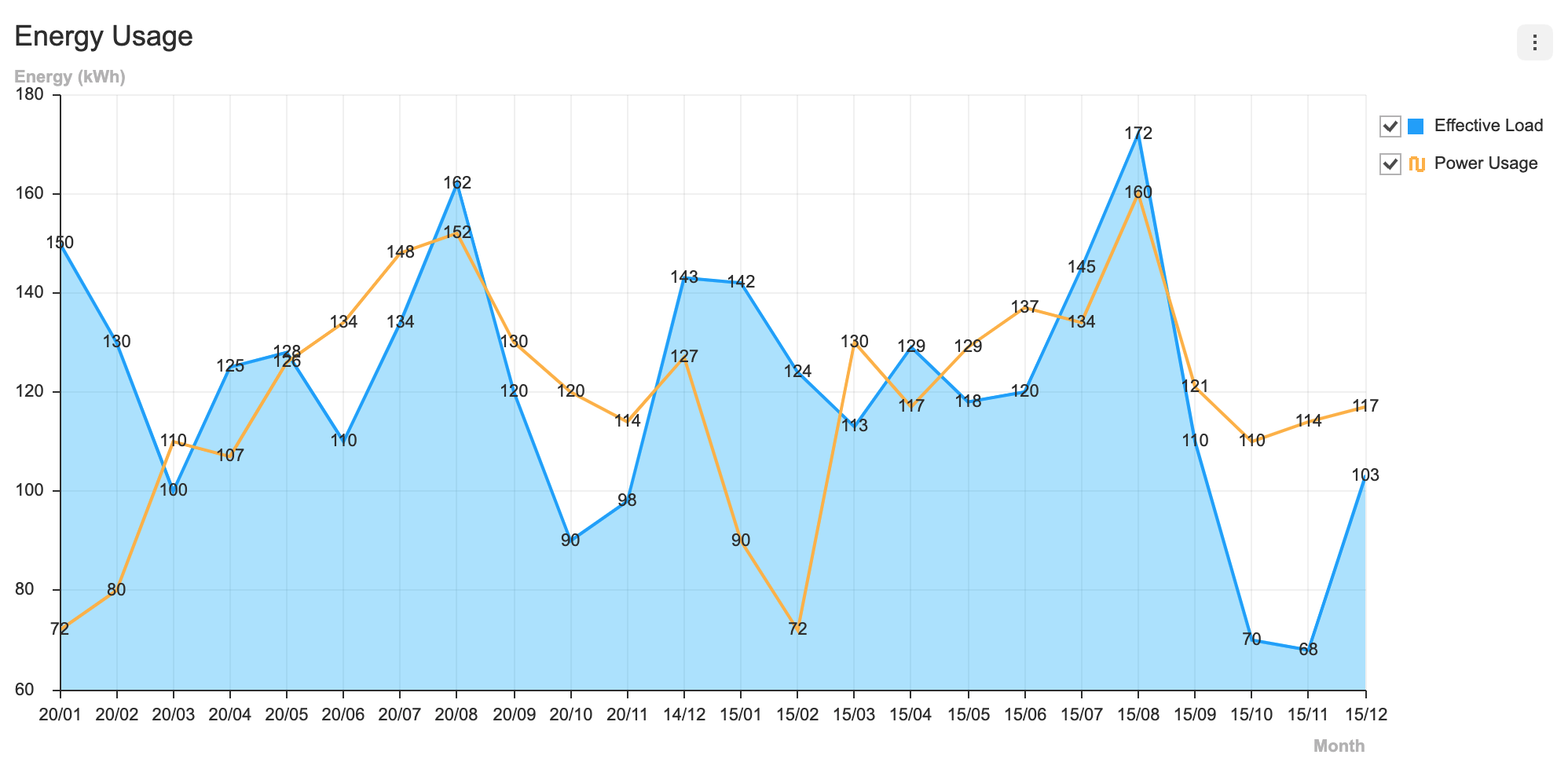
Each series option can have its own series options, and options related to data labels can be defined in greater detail.
type LineAreaChartSeriesOption = {
  line: { // Line series options
    ...
    dataLabels: {
      // Line series data label options
    }
  },
  area: { // Area series options
    ...
    dataLabels: {
      // Area series data label options
    }
  }
};
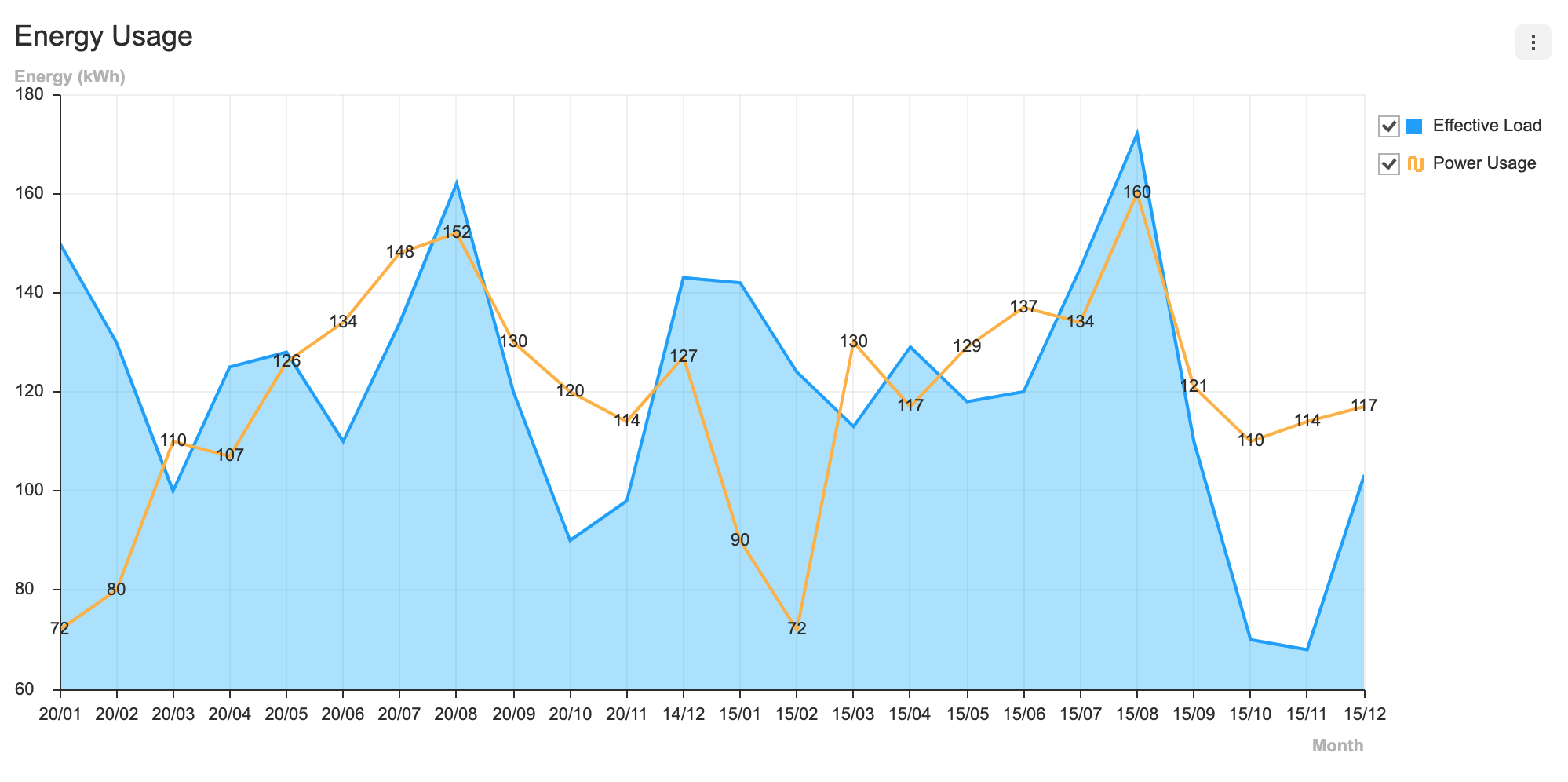
For example, the following code displays the data label for the Line series without displaying the data label for the Area series.
const options = {
  series: {
    line: {
      dataLabels: {
        visible: true
      }
    }
  }
};
Series Theme
To apply different styles for two charts, use series.line or series.area to define the themes. The color can be used to define a common color for two charts, or different colors can be applied using the line and area attributes.
interface LineAreaChartSeriesTheme {
  colors: string[];
  line: {
    // themes for line chart series
  };
  area: {
    // themes for area chart series
  };
};
Let's apply some styles to the charts, for example.
const theme = {
  theme: {
    series: {
      colors: ['#ff3322', '#bbcc22'],
      line: {
        dot: {
          borderColor: '#009dff',
          borderWidth: 2,
          radius: 7,
        },
      },
      area: {
        areaOpacity: 0.5,
      },
    },
  },
};
The result is as shown below.

When defining styles for each series' data label, use series.line.dataLabels or series.area.dataLabels.
type LineAreaChartDataLabelTheme = {
  series: {
    line: {
      dataLabels: {
        // Line series data label themes
      }
    },
    area: {
      dataLabels: {
        // Area series data label themes
      }
    }
  }
};
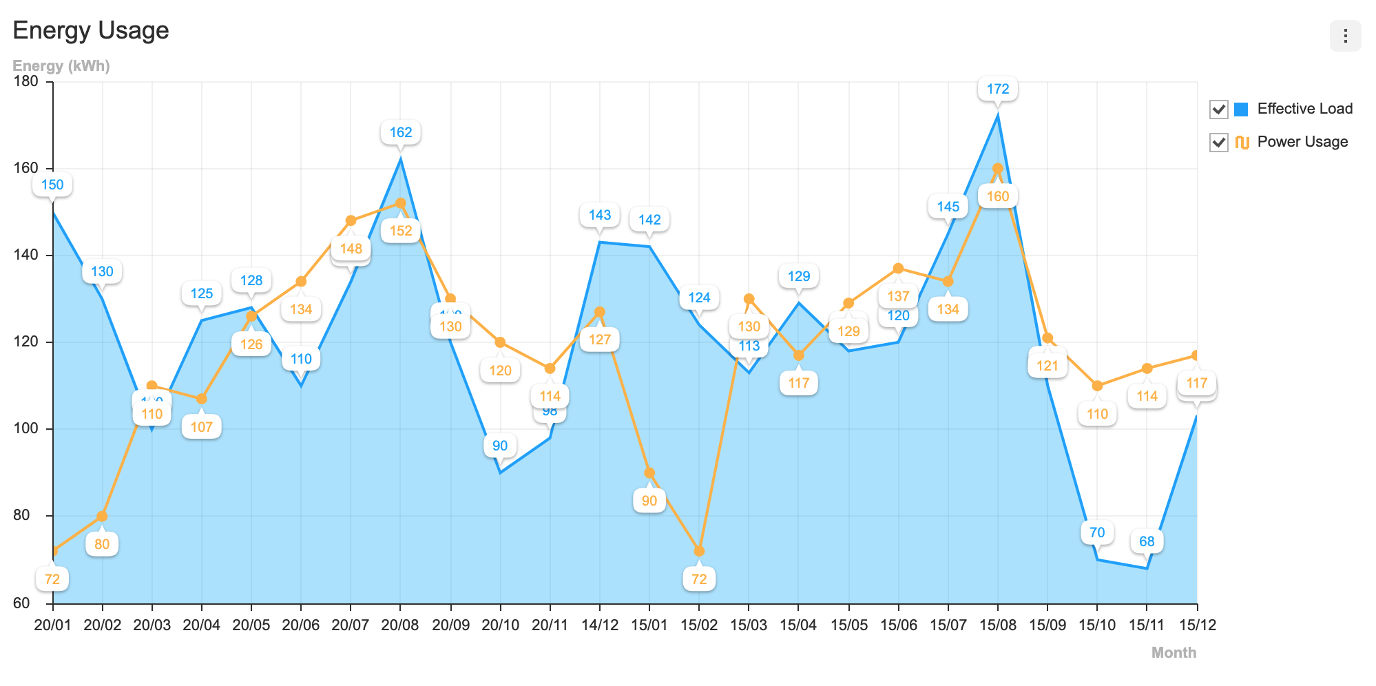
The example below modifies the data label font color, size, and weight for the Line series and data label text bubble styles for the Area series.
const options = {
  series: {
    line: {
      showDot: true,
      dataLabels: { visible: true, offsetY: 15 }
    },
    area: {
      dataLabels: { visible: true, offsetY: -15 }
    },
  },
  theme: {
    series: {
      line: {
        dataLabels: {
          fontSize: 10,
          fontWeight: 300,
          useSeriesColor: true,
          textBubble: {
            visible: true,
            paddingY: 3,
            paddingX: 6,
            arrow: {
              visible: true,
              width: 5,
              height: 5,
              direction: 'top',
            },
          },
        },
      },
      area: {
        dataLabels: {
          fontSize: 10,
          fontWeight: 300,
          useSeriesColor: true,
          textBubble: {
            visible: true,
            paddingY: 3,
            paddingX: 6,
            arrow: {
              visible: true,
              width: 5,
              height: 5,
              direction: 'bottom'
            }
          }
        }
      }
    }
  }
};
Themes for Line Chart and Area Chart can be found in respective guides.