This looks great, the only thing I'd say is to make sure it looks the way we want when the output window is at its minimum width.
On MDN pages the editor is laid out "side by side": that is with the example choices on the left and the output on the right, as it is in the local server that's started by npm run start. Then if the page width goes below some threshold it switches to "top and bottom", with the example choices above and the output below.
I'm not sure what the exact threshold is, but it seems to give us a minimum output window width of about 285 pixels. At that width the flex items wrap into a single column, which cuts off the top and bottom of the container:
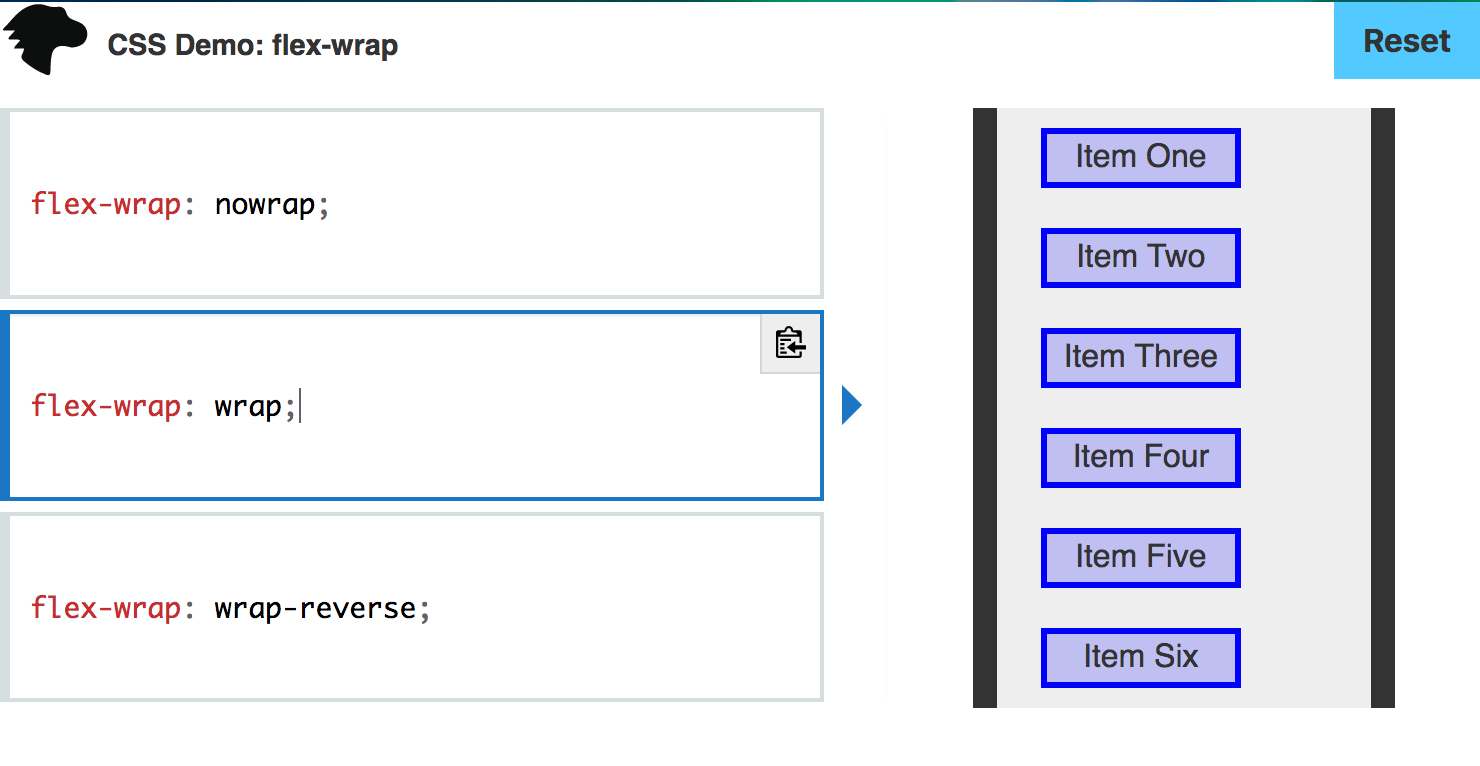
I wasn't sure if this was intentional, but if not perhaps it would be good to make the items narrower?