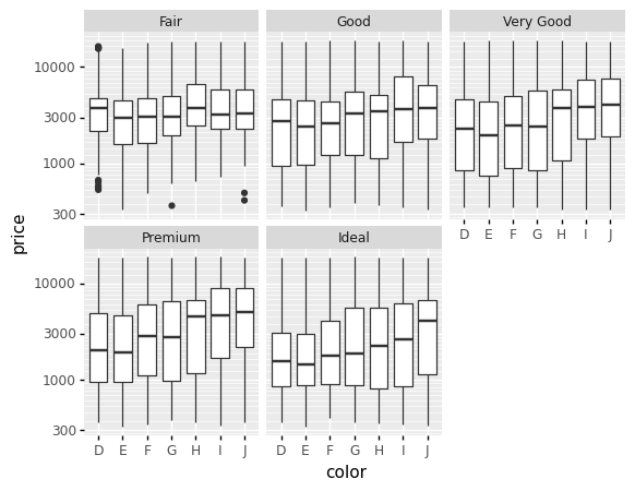
I'm trying to illustrate the difference between plotting the log-transformed data vs plotting the raw data in a log-transformed scale. I tell my students to do the latter:
from plotnine import *
from plotnine.data import diamonds
(ggplot(diamonds, aes('color', 'price')) +
    geom_boxplot() + facet_wrap('cut') +
    scale_y_log10())
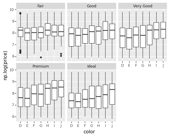
To plot the transformed data I thought about this coming from ggplot myself:
import numpy as np
(ggplot(diamonds, aes('color', 'np.log(price)')) +
    geom_boxplot() + facet_wrap('cut'))
But a student suggested this, which I would expect to yield the same as above but it doesn't:
(ggplot(diamonds, aes('color', np.log(diamonds['price']))) +
    geom_boxplot() + facet_wrap('cut'))
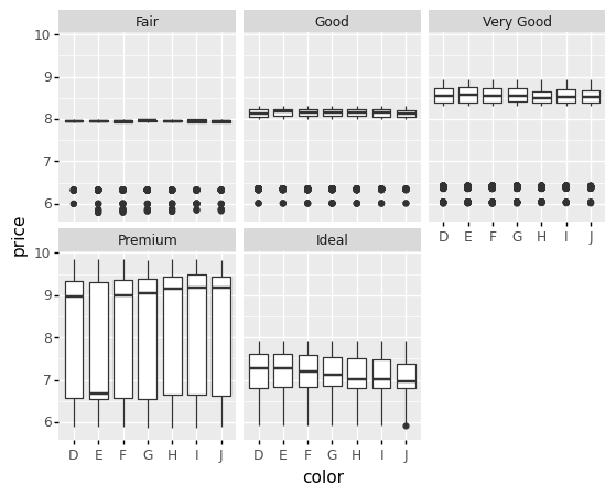
I was wondering about the difference between the last two plots, and if you suggest one or the other provided that both gave the same result. Can't find anything about this in the documentation; perhaps I just missed it.
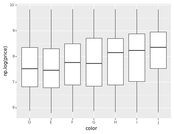
By the way, it all works just fine if we don't facet. The last two plots are like this: