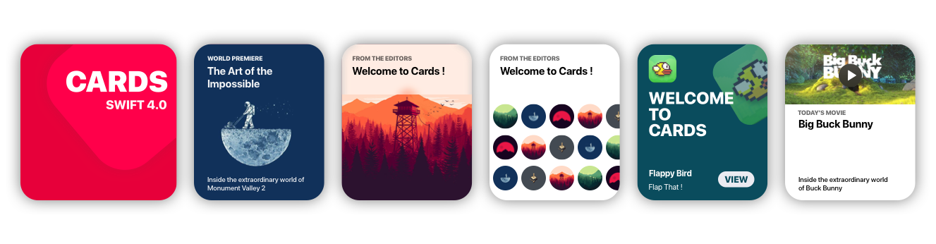
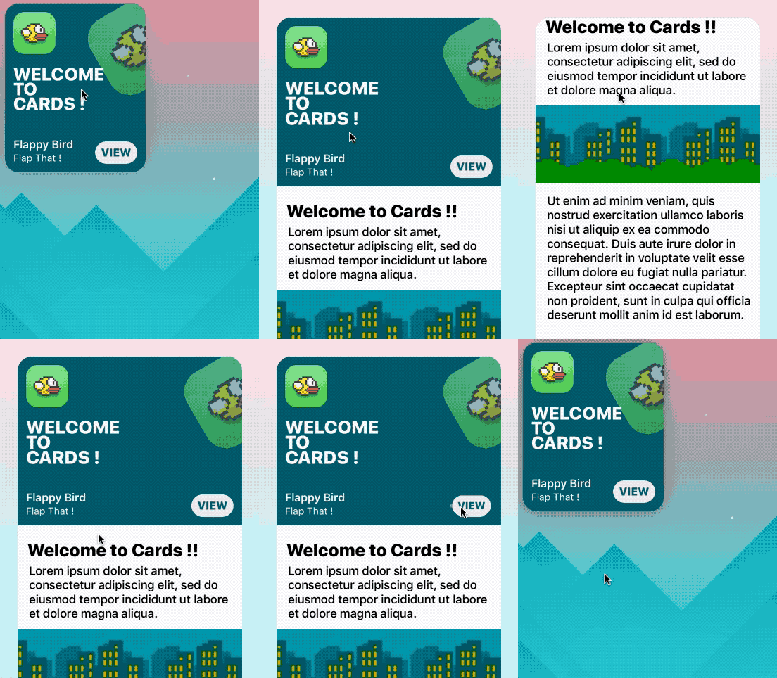
Cards brings to Xcode the card views seen in the new iOS XI Appstore.
Getting Started
Storyboard
- Go to main.storyboard and add a blank UIView
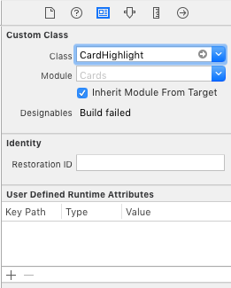
- Open the Identity Inspector and type 'CardHighlight' the 'class' field
- Make sure you have 'Cards' selected in 'Module' field
- Switch to the Attributes Inspector and configure it as you like.
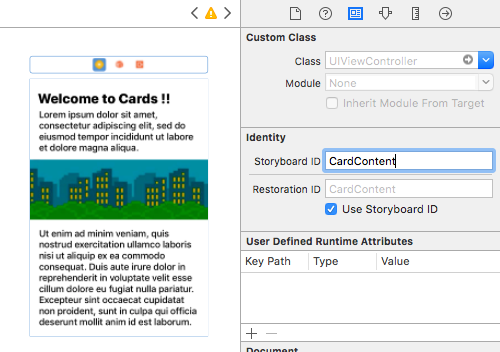
- Drag a blank UIViewController and design its view as you like
- Move to the Identity inspector
- Type 'CardContent' in the StoryboardID field.
Code
import Cards
// Aspect Ratio of 5:6 is preferred
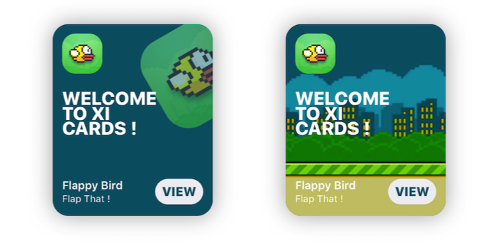
let card = CardHighlight(frame: CGRect(x: 10, y: 30, width: 200 , height: 240))
card.backgroundColor = UIColor(red: 0, green: 94/255, blue: 112/255, alpha: 1)
card.icon = UIImage(named: "flappy")
card.title = "Welcome \nto \nCards !"
card.itemTitle = "Flappy Bird"
card.itemSubtitle = "Flap That !"
card.textColor = UIColor.white
card.hasParallax = true
let cardContentVC = storyboard!.instantiateViewController(withIdentifier: "CardContent")
card.shouldPresent(cardContentVC, from: self, fullscreen: false)
view.addSubview(card)
Prerequisites
- Xcode 10.2 or newer
- Swift 5.0
Installation
Cocoapods
use_frameworks!
pod 'Cards'
Manual
- Download the repo
- ⌘C ⌘V the 'Cards' folder in your project
- In your Project's Info go to 'Build Phases'
- Open 'Compile Sources' and add all the files in the folder
Overview
Customization
//Shadow settings
var shadowBlur: CGFloat
var shadowOpacity: Float
var shadowColor: UIColor
var backgroundImage: UIImage?
var backgroundColor: UIColor
var textColor: UIColor 	//Color used for the labels
var insets: CGFloat 	//Spacing between content and card borders
var cardRadius: CGFloat //Corner radius of the card
var icons: [UIImage]? 	//DataSource for CardGroupSliding
var blurEffect: UIBlurEffectStyle //Blur effect of CardGroup
Usage
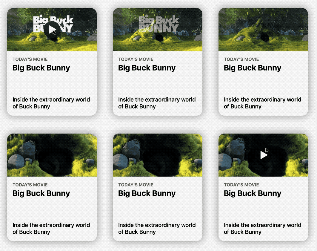
CardPlayer
let card = CardPlayer(frame: CGRect(x: 40, y: 50, width: 300 , height: 360))
card.textColor = UIColor.black
card.videoSource = URL(string: "http://clips.vorwaerts-gmbh.de/big_buck_bunny.mp4")
card.shouldDisplayPlayer(from: self)    //Required.
card.playerCover = UIImage(named: "mvBackground")!  // Shows while the player is loading
card.playImage = UIImage(named: "CardPlayerPlayIcon")!  // Play button icon
card.isAutoplayEnabled = true
card.shouldRestartVideoWhenPlaybackEnds = true
card.title = "Big Buck Bunny"
card.subtitle = "Inside the extraordinary world of Buck Bunny"
card.category = "today's movie"
view.addSubview(card)
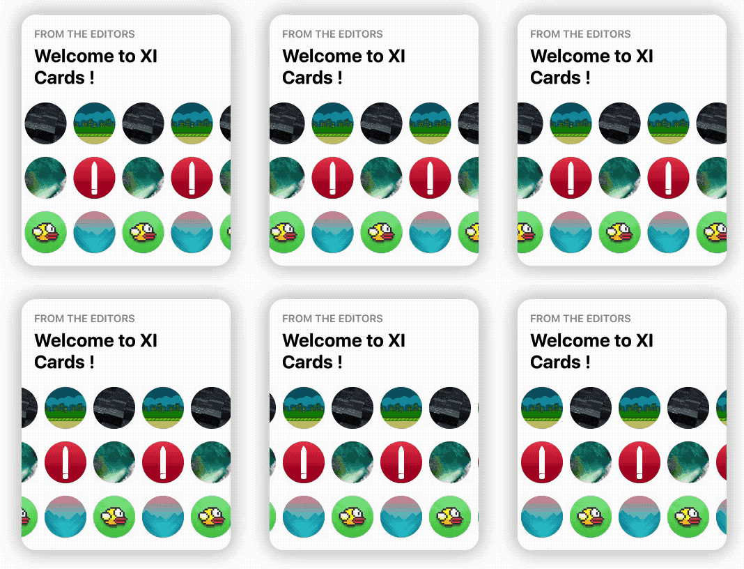
CardGroupSliding
    let icons: [UIImage] = [
        UIImage(named: "grBackground")!,
        UIImage(named: "background")!,
        UIImage(named: "flappy")!,
        UIImage(named: "flBackground")!,
        UIImage(named: "icon")!,
        UIImage(named: "mvBackground")!
    ]   // Data source for CardGroupSliding
    let card = CardGroupSliding(frame: CGRect(x: 40, y: 50, width: 300 , height: 360))
    card.textColor = UIColor.black
    card.icons = icons
    card.iconsSize = 60
    card.iconsRadius = 30
    card.title = "from the editors"
    card.subtitle = "Welcome to XI Cards !"
    view.addSubview(card)
Documentation
See the Wiki, to learn in depth infos about Cards.
GO!
Issues & Feature requests
If you encounter any problems or have any trouble using Cards, feel free to open an issue. I'll answer you as soon as I see it.
New features, or improvements to the framework are welcome (open an issue).
Thanksto
- Patrick Piemonte - providing Player framework used in CardPlayer.swift
- Mac Bellingrath
License
Cards is released under the MIT License.