WARNING: StatsPlots is now integrated into https://github.com/JuliaPlots/Plots.jl for Plots v2, please make corresponding PRs there.
Original author: Thomas Breloff (@tbreloff), maintained by the JuliaPlots members
This package is a drop-in replacement for Plots.jl that contains many statistical recipes for concepts and types introduced in the JuliaStats organization.
- Types:
- DataFrames
- Distributions
- Recipes:
It is thus slightly less lightweight, but has more functionality.
Initialize:
#]add StatsPlots # install the package if it isn't installed
using StatsPlots # no need for `using Plots` as that is reexported here
gr(size=(400,300))
Table-like data structures, including DataFrames, IndexedTables, DataStreams, etc... (see here for an exhaustive list), are supported thanks to the macro @df which allows passing columns as symbols. Those columns can then be manipulated inside the plot call, like normal Arrays:
using DataFrames, IndexedTables
df = DataFrame(a = 1:10, b = 10 .* rand(10), c = 10 .* rand(10))
@df df plot(:a, [:b :c], colour = [:red :blue])
@df df scatter(:a, :b, markersize = 4 .* log.(:c .+ 0.1))
t = table(1:10, rand(10), names = [:a, :b]) # IndexedTable
@df t scatter(2 .* :b)
Inside a @df macro call, the cols utility function can be used to refer to a range of columns:
@df df plot(:a, cols(2:3), colour = [:red :blue])
or to refer to a column whose symbol is represented by a variable:
s = :b
@df df plot(:a, cols(s))
cols() will refer to all columns of the data table.
In case of ambiguity, symbols not referring to DataFrame columns must be escaped by ^():
df[:red] = rand(10)
@df df plot(:a, [:b :c], colour = ^([:red :blue]))
The @df macro plays nicely with the new syntax of the Query.jl data manipulation package (v0.8 and above), in that a plot command can be added at the end of a query pipeline, without having to explicitly collect the outcome of the query first:
using Query, StatsPlots
df |>
    @filter(_.a > 5) |>
    @map({_.b, d = _.c-10}) |>
    @df scatter(:b, :d)
The @df syntax is also compatible with the Plots.jl grouping machinery:
using RDatasets
school = RDatasets.dataset("mlmRev","Hsb82")
@df school density(:MAch, group = :Sx)
To group by more than one column, use a tuple of symbols:
@df school density(:MAch, group = (:Sx, :Sector), legend = :topleft)
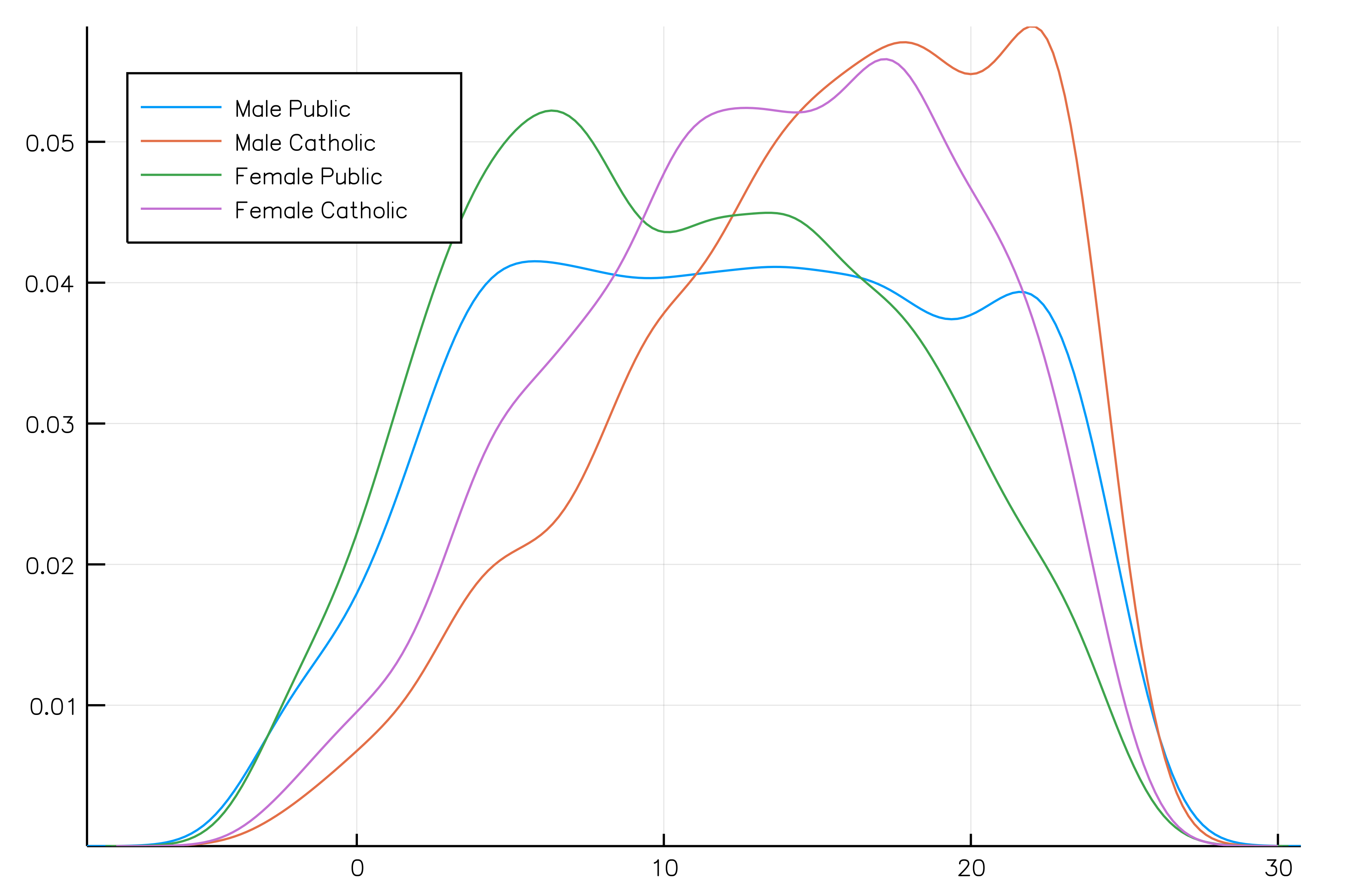
To name the legend entries with custom or automatic names (i.e. Sex = Male, Sector = Public) use the curly bracket syntax group = {Sex = :Sx, :Sector}. Entries with = get the custom name you give, whereas entries without = take the name of the column.
The old syntax, passing the DataFrame as the first argument to the plot call is no longer supported.
Visualizing a table interactively
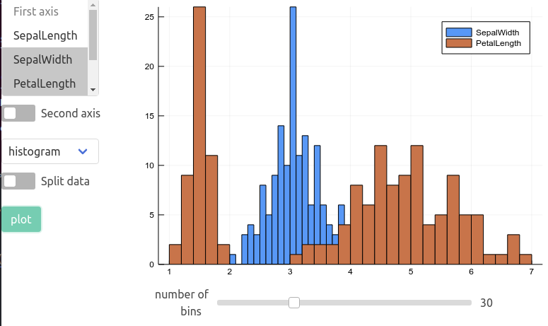
A GUI based on the Interact package is available to create plots from a table interactively, using any of the recipes defined below. This small app can be deployed in a Jupyter lab / notebook, Juno plot pane, a Blink window or in the browser, see here for instructions.
import RDatasets
iris = RDatasets.dataset("datasets", "iris")
using StatsPlots, Interact
using Blink
w = Window()
body!(w, dataviewer(iris))
marginalhist with DataFrames
using RDatasets
iris = dataset("datasets","iris")
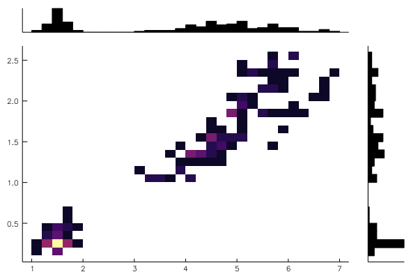
@df iris marginalhist(:PetalLength, :PetalWidth)
marginalscatter with DataFrames
using RDatasets
iris = dataset("datasets","iris")
@df iris marginalscatter(:PetalLength, :PetalWidth)
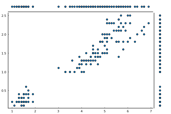
marginalkde
x = randn(1024)
y = randn(1024)
marginalkde(x, x+y)
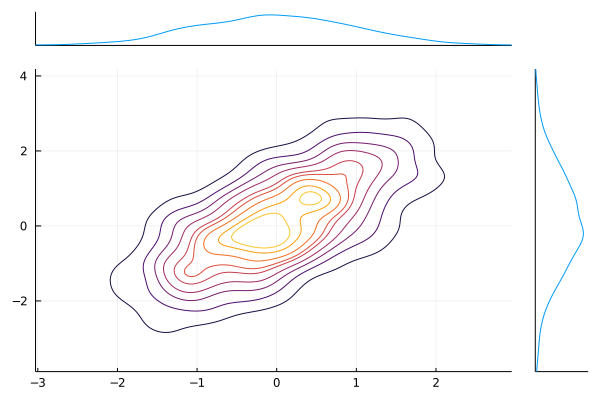
levels=Ncan be used to set the number of contour levels (default 10); levels are evenly-spaced in the cumulative probability mass.clip=((-xl, xh), (-yl, yh))(default((-3, 3), (-3, 3))) can be used to adjust the bounds of the plot. Clip values are expressed as multiples of the[0.16-0.5]and[0.5,0.84]percentiles of the underlying 1D distributions (these would be 1-sigma ranges for a Gaussian).
corrplot and cornerplot
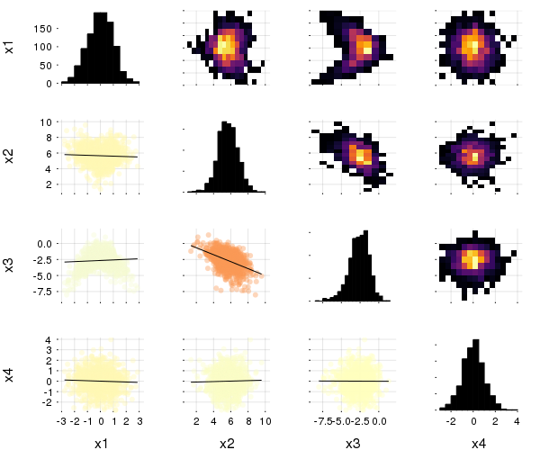
This plot type shows the correlation among input variables. The marker color in scatter plots reveal the degree of correlation. Pass the desired colorgradient to markercolor. With the default gradient positive correlations are blue, neutral are yellow and negative are red. In the 2d-histograms the color gradient show the frequency of points in that bin (as usual controlled by seriescolor).
gr(size = (600, 500))
then
@df iris corrplot([:SepalLength :SepalWidth :PetalLength :PetalWidth], grid = false)
or also:
@df iris corrplot(cols(1:4), grid = false)
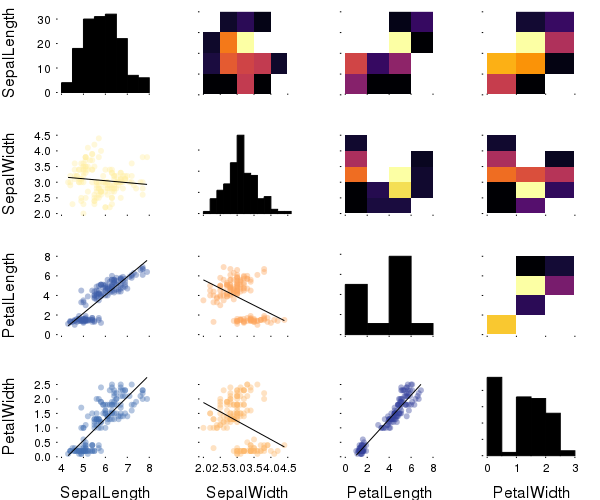
A correlation plot may also be produced from a matrix:
M = randn(1000,4)
M[:,2] .+= 0.8sqrt.(abs.(M[:,1])) .- 0.5M[:,3] .+ 5
M[:,3] .-= 0.7M[:,1].^2 .+ 2
corrplot(M, label = ["x$i" for i=1:4])
cornerplot(M)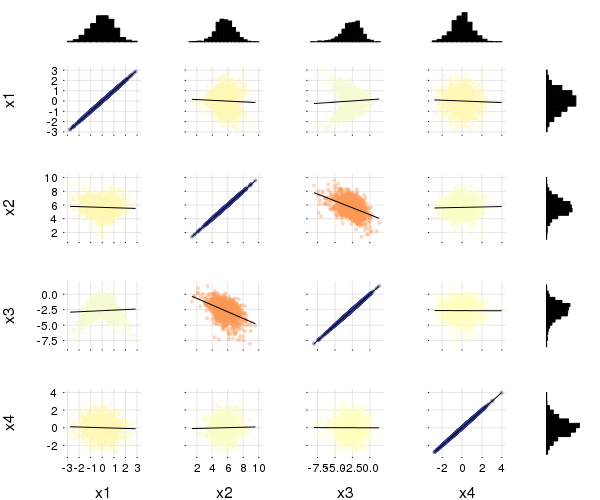
cornerplot(M, compact=true)
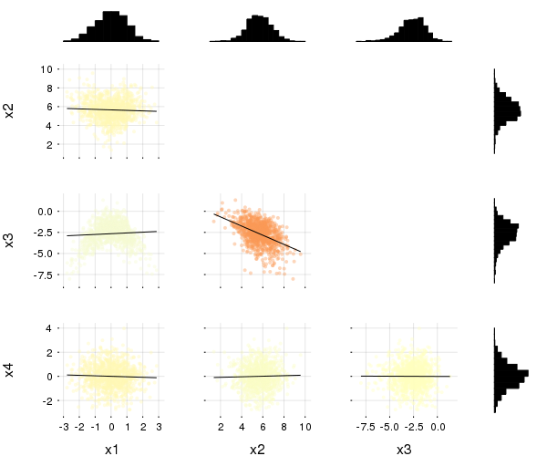
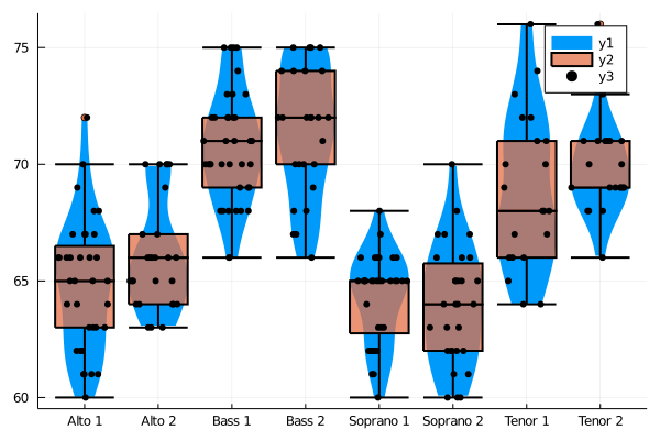
boxplot, dotplot, and violin
import RDatasets
singers = RDatasets.dataset("lattice", "singer")
@df singers violin(string.(:VoicePart), :Height, linewidth=0)
@df singers boxplot!(string.(:VoicePart), :Height, fillalpha=0.75, linewidth=2)
@df singers dotplot!(string.(:VoicePart), :Height, marker=(:black, stroke(0)))
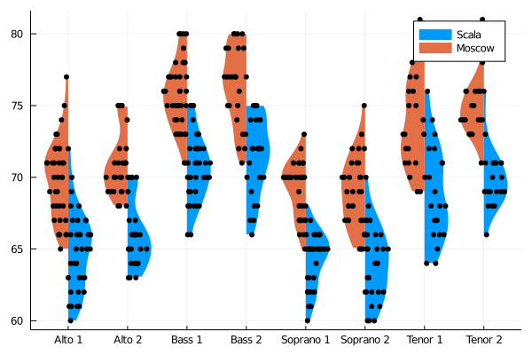
Asymmetric violin or dot plots can be created using the side keyword (:both - default,:right or :left), e.g.:
singers_moscow = deepcopy(singers)
singers_moscow[:Height] = singers_moscow[:Height] .+ 5
@df singers violin(string.(:VoicePart), :Height, side=:right, linewidth=0, label="Scala")
@df singers_moscow violin!(string.(:VoicePart), :Height, side=:left, linewidth=0, label="Moscow")
@df singers dotplot!(string.(:VoicePart), :Height, side=:right, marker=(:black,stroke(0)), label="")
@df singers_moscow dotplot!(string.(:VoicePart), :Height, side=:left, marker=(:black,stroke(0)), label="")
Dot plots can spread their dots over the full width of their column mode = :uniform, or restricted to the kernel density
(i.e. width of violin plot) with mode = :density (default). Horizontal position is random, so dots are repositioned
each time the plot is recreated. mode = :none keeps the dots along the center.
Equal-area histograms
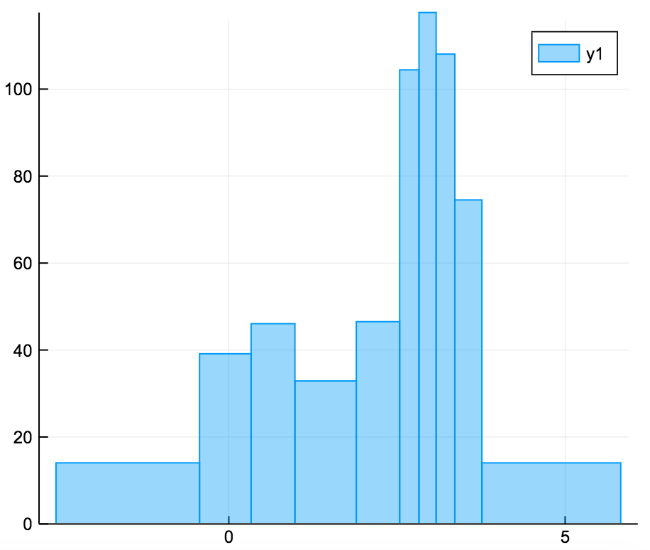
The ea-histogram is an alternative histogram implementation, where every 'box' in the histogram contains the same number of sample points and all boxes have the same area. Areas with a higher density of points thus get higher boxes. This type of histogram shows spikes well, but may oversmooth in the tails. The y axis is not intuitively interpretable.
a = [randn(100); randn(100) .+ 3; randn(100) ./ 2 .+ 3]
ea_histogram(a, bins = :scott, fillalpha = 0.4)
AndrewsPlot
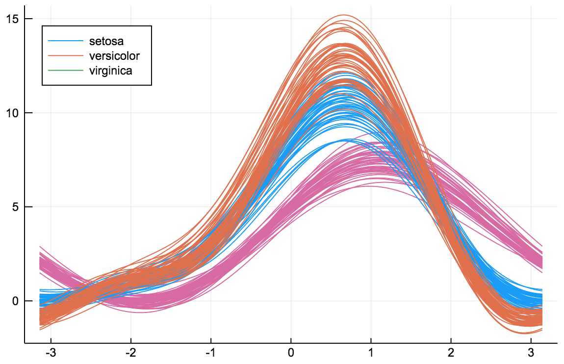
AndrewsPlots are a way to visualize structure in high-dimensional data by depicting each row of an array or table as a line that varies with the values in columns. https://en.wikipedia.org/wiki/Andrews_plot
using RDatasets
iris = dataset("datasets", "iris")
@df iris andrewsplot(:Species, cols(1:4), legend = :topleft)
ErrorLine
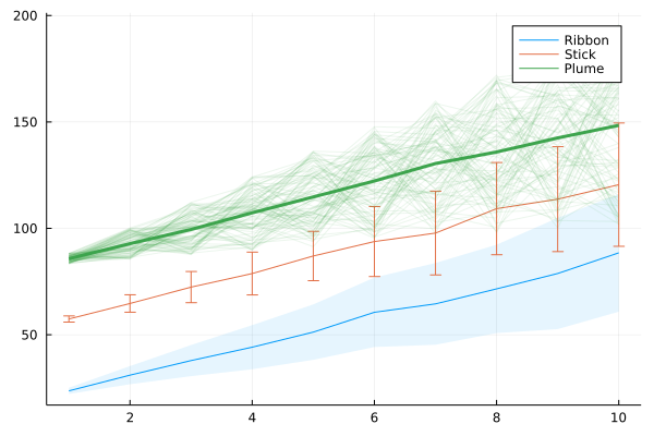
The ErrorLine function shows error distributions for lines plots in a variety of styles.
x = 1:10
y = fill(NaN, 10, 100, 3)
for i = axes(y,3)
    y[:,:,i] = collect(1:2:20) .+ rand(10,100).*5 .* collect(1:2:20) .+ rand()*100
end
errorline(1:10, y[:,:,1], errorstyle=:ribbon, label="Ribbon")
errorline!(1:10, y[:,:,2], errorstyle=:stick, label="Stick", secondarycolor=:matched)
errorline!(1:10, y[:,:,3], errorstyle=:plume, label="Plume")
Distributions
using Distributions
plot(Normal(3,5), fill=(0, .5,:orange))

dist = Gamma(2)
scatter(dist, leg=false)
bar!(dist, func=cdf, alpha=0.3)

Quantile-Quantile plots
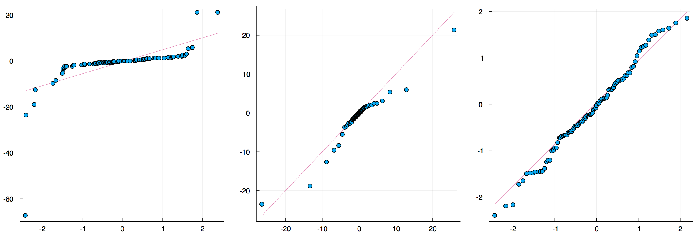
The qqplot function compares the quantiles of two distributions, and accepts either a vector of sample values or a Distribution. The qqnorm is a shorthand for comparing a distribution to the normal distribution. If the distributions are similar the points will be on a straight line.
x = rand(Normal(), 100)
y = rand(Cauchy(), 100)
plot(
 qqplot(x, y, qqline = :fit), # qqplot of two samples, show a fitted regression line
 qqplot(Cauchy, y),           # compare with a Cauchy distribution fitted to y; pass an instance (e.g. Normal(0,1)) to compare with a specific distribution
 qqnorm(x, qqline = :R)       # the :R default line passes through the 1st and 3rd quartiles of the distribution
)
Grouped Bar plots
groupedbar(rand(10,3), bar_position = :stack, bar_width=0.7)

This is the default:
groupedbar(rand(10,3), bar_position = :dodge, bar_width=0.7)

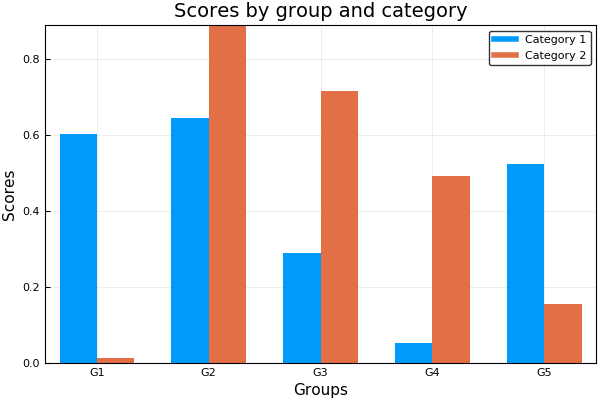
The group syntax is also possible in combination with groupedbar:
ctg = repeat(["Category 1", "Category 2"], inner = 5)
nam = repeat("G" .* string.(1:5), outer = 2)
groupedbar(nam, rand(5, 2), group = ctg, xlabel = "Groups", ylabel = "Scores",
        title = "Scores by group and category", bar_width = 0.67,
        lw = 0, framestyle = :box)
Grouped Histograms
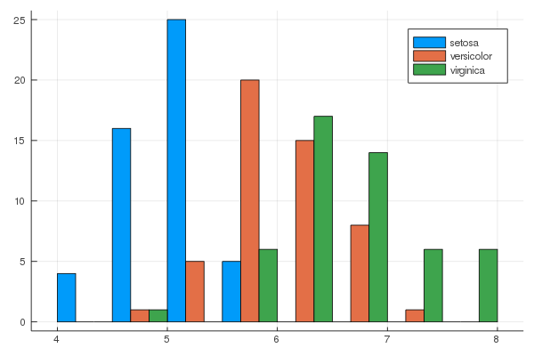
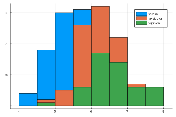
using RDatasets
iris = dataset("datasets", "iris")
@df iris groupedhist(:SepalLength, group = :Species, bar_position = :dodge)
@df iris groupedhist(:SepalLength, group = :Species, bar_position = :stack)
Dendrograms
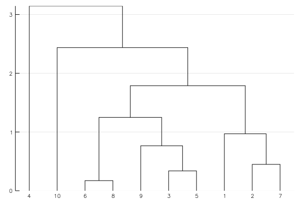
using Clustering
D = rand(10, 10)
D += D'
hc = hclust(D, linkage=:single)
plot(hc)
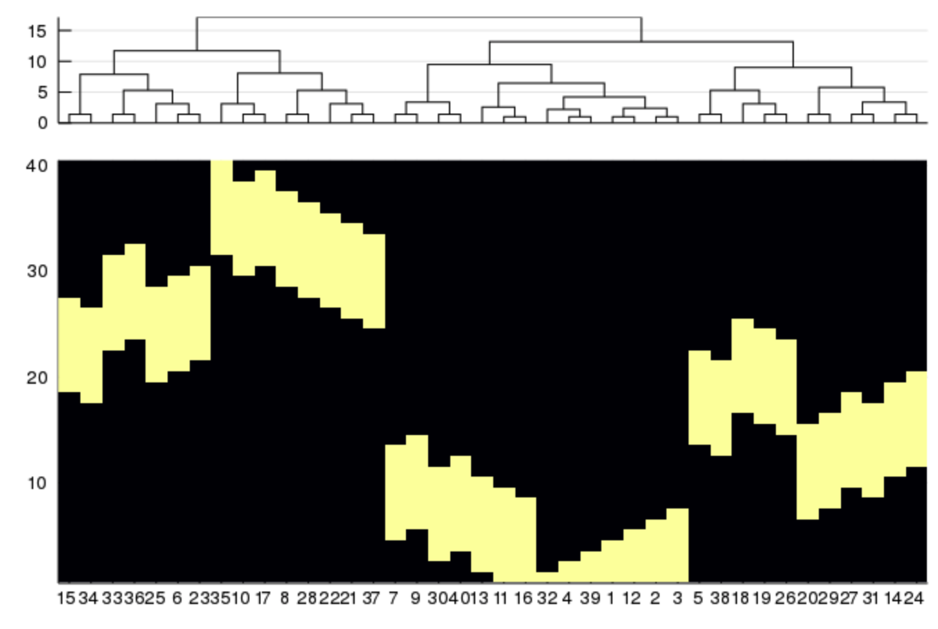
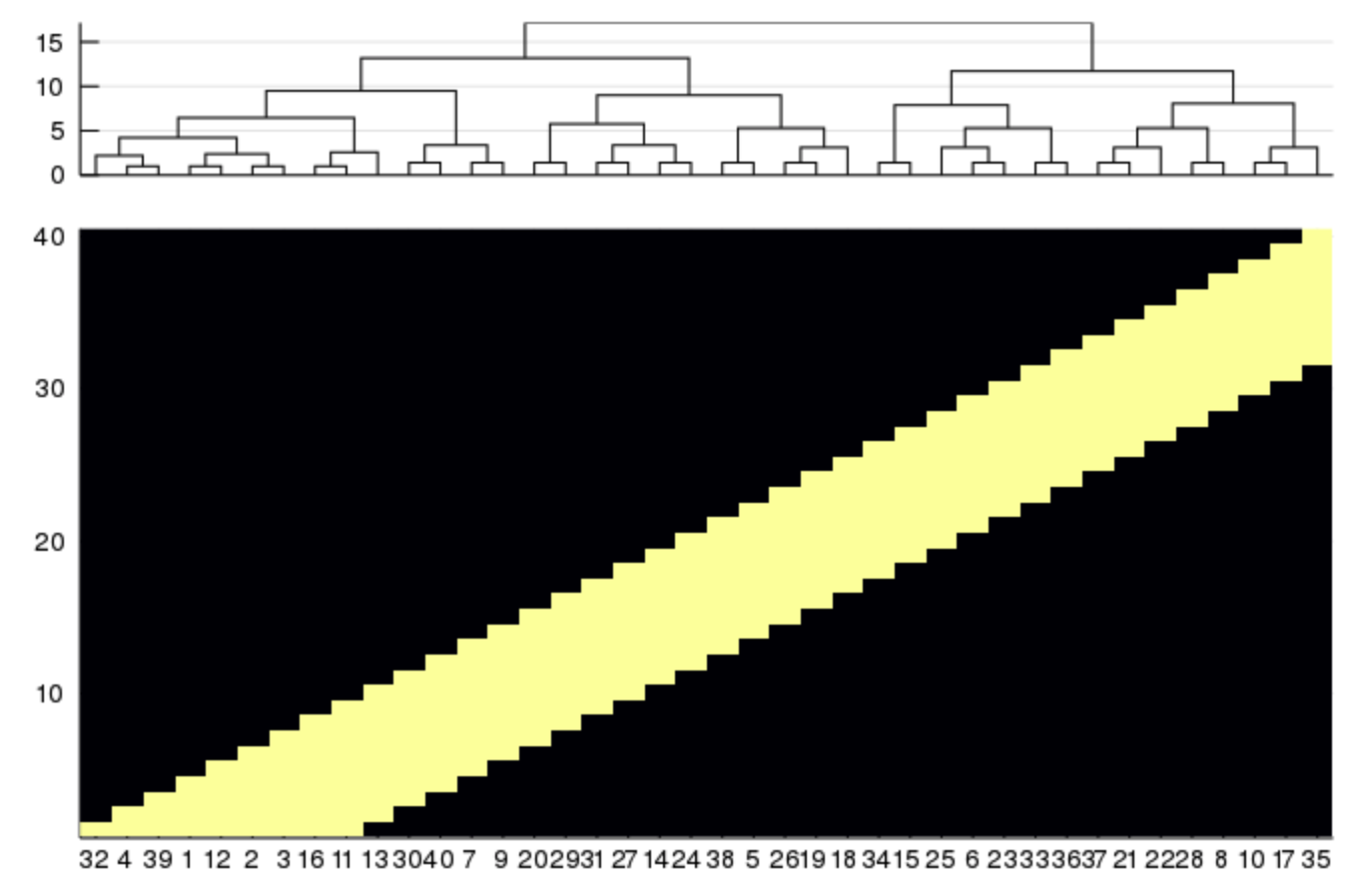
The branchorder=:optimal option in hclust() can be used to minimize
the distance between neighboring leaves:
using Clustering
using Distances
using StatsPlots
using Random
n = 40
mat = zeros(Int, n, n)
# create banded matrix
for i in 1:n
    last = minimum([i+Int(floor(n/5)), n])
    for j in i:last
        mat[i,j] = 1
    end
end
# randomize order
mat = mat[:, randperm(n)]
dm = pairwise(Euclidean(), mat, dims=2)
# normal ordering
hcl1 = hclust(dm, linkage=:average)
plot(
    plot(hcl1, xticks=false),
    heatmap(mat[:, hcl1.order], colorbar=false, xticks=(1:n, ["$i" for i in hcl1.order])),
    layout=grid(2,1, heights=[0.2,0.8])
    )
Compare to:
# optimal ordering
hcl2 = hclust(dm, linkage=:average, branchorder=:optimal)
plot(
    plot(hcl2, xticks=false),
    heatmap(mat[:, hcl2.order], colorbar=false, xticks=(1:n, ["$i" for i in hcl2.order])),
    layout=grid(2,1, heights=[0.2,0.8])
    )
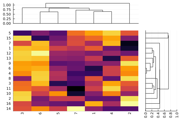
Dendrogram on the right side
using Distances
using Clustering
using StatsBase
using StatsPlots
pd=rand(Float64,16,7)
dist_col=pairwise(CorrDist(),pd,dims=2)
hc_col=hclust(dist_col, branchorder=:optimal)
dist_row=pairwise(CorrDist(),pd,dims=1)
hc_row=hclust(dist_row, branchorder=:optimal)
pdz=similar(pd)
for row in hc_row.order
	pdz[row,hc_col.order]=zscore(pd[row,hc_col.order])
end
nrows=length(hc_row.order)
rowlabels=(1:16)[hc_row.order]
ncols=length(hc_col.order)
collabels=(1:7)[hc_col.order]
l = grid(2,2,heights=[0.2,0.8,0.2,0.8],widths=[0.8,0.2,0.8,0.2])
plot(
	layout = l,
	plot(hc_col,xticks=false),
	plot(ticks=nothing,border=:none),
	plot(
		pdz[hc_row.order,hc_col.order],
		st=:heatmap,
		#yticks=(1:nrows,rowlabels),
		yticks=(1:nrows,rowlabels),
		xticks=(1:ncols,collabels),
		xrotation=90,
		colorbar=false
	),
	plot(hc_row,yticks=false,xrotation=90,orientation=:horizontal,xlim=(0,1))
)
GroupedErrors.jl for population analysis
Population analysis on a table-like data structures can be done using the highly recommended GroupedErrors package.
This external package, in combination with StatsPlots, greatly simplifies the creation of two types of plots:
1. Subject by subject plot (generally a scatter plot)
Some simple summary statistics are computed for each experimental subject (mean is default but any scalar valued function would do) and then plotted against some other summary statistics, potentially splitting by some categorical experimental variable.
2. Population plot (generally a ribbon plot in continuous case, or bar plot in discrete case)
Some statistical analysis is computed at the single subject level (for example the density/hazard/cumulative of some variable, or the expected value of a variable given another) and the analysis is summarized across subjects (taking for example mean and s.e.m), potentially splitting by some categorical experimental variable.
For more information please refer to the README.
A GUI based on QML and the GR Plots.jl backend to simplify the use of StatsPlots.jl and GroupedErrors.jl even further can be found here (usable but still in alpha stage).
Ordinations
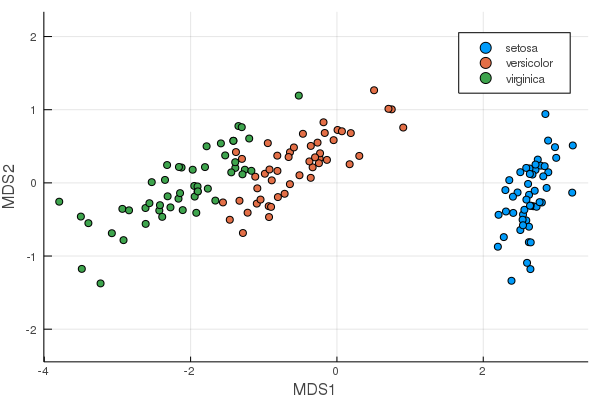
MDS from MultivariateStats.jl
can be plotted as scatter plots.
using MultivariateStats, RDatasets, StatsPlots
iris = dataset("datasets", "iris")
X = convert(Matrix, iris[:, 1:4])
M = fit(MDS, X'; maxoutdim=2)
plot(M, group=iris.Species)
PCA will be added once the API in MultivariateStats is changed. See JuliaStats/MultivariateStats.jl#109 and JuliaStats/MultivariateStats.jl#95.
Covariance ellipses
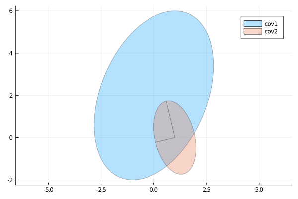
A 2×2 covariance matrix Σ can be plotted as an ellipse, which is a contour line of a Gaussian density function with variance Σ.
covellipse([0,2], [2 1; 1 4], n_std=2, aspect_ratio=1, label="cov1")
covellipse!([1,0], [1 -0.5; -0.5 3], showaxes=true, label="cov2")