Note: This is an addendum to our Photoscanned Texture Creation Process - start there if you are interested in learning how to create your own PBR materials using photogrammetry.
When taking photos, there are many camera settings (and post settings) that determine the brightness and colors of the resulting image.
It's tempting to guess at the "correct" brightness like an ordinary photographer would, based on what you think it should look like, and similarly what a good white balance should be.
However human vision (and your monitor) is not perfect.
Remember the goal of texture scanning is to copy a surface from the real world and paste it into a 3D scene that you can render with. If you do anything by eye or guestimation, you will absolutely end up with a result that is not accurate.
For example, this is the concrete floor in our garage:
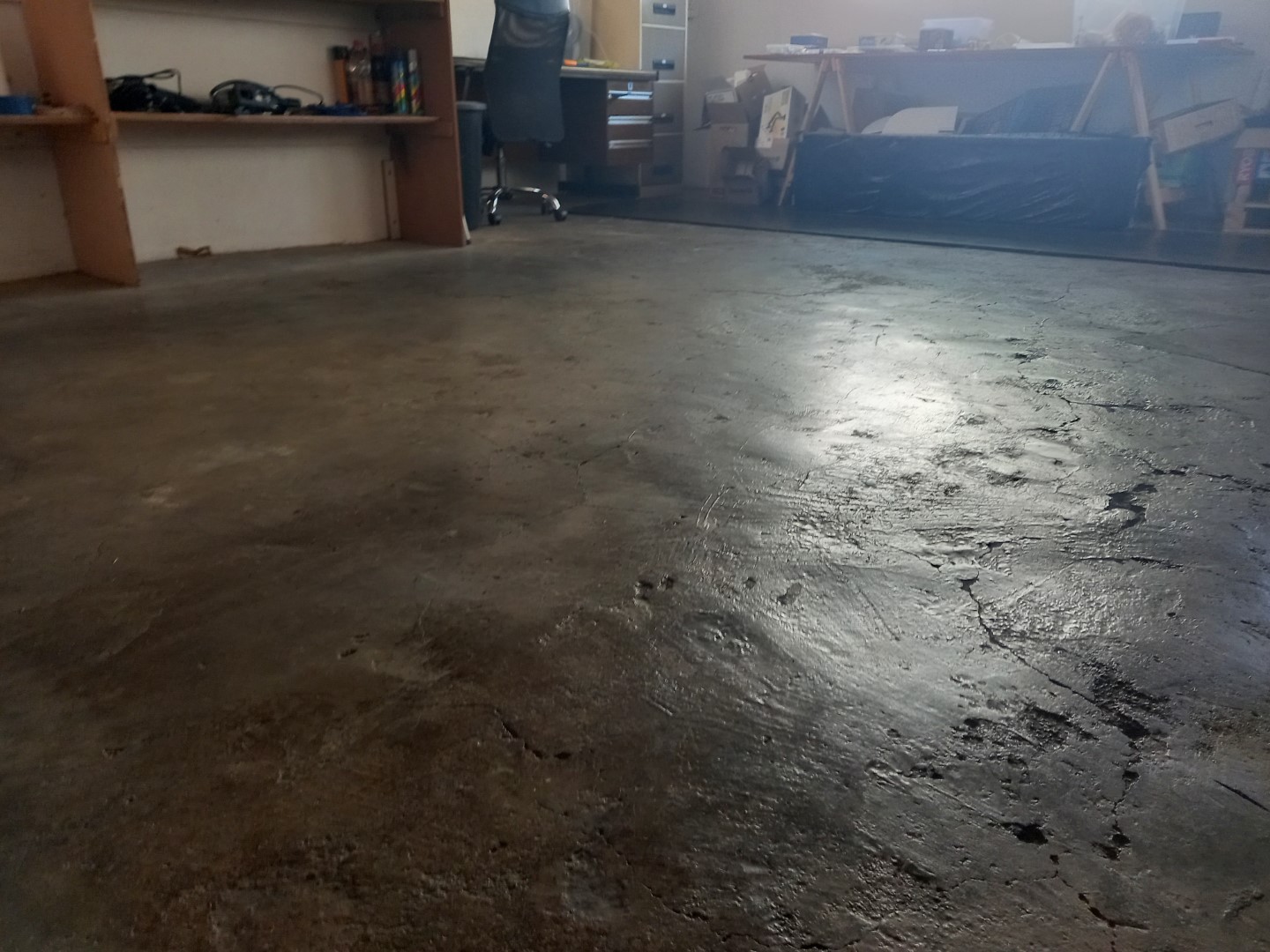
Based on my experience in the dimly lit room, this is about what I would say the texture should look like:
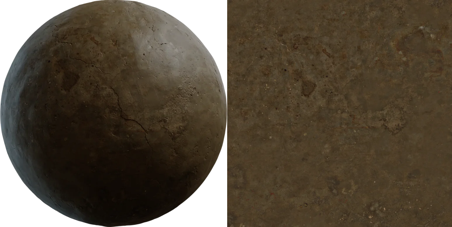
However because my experience is subjective, this is wrong. After calibration, the material actually looks like this:
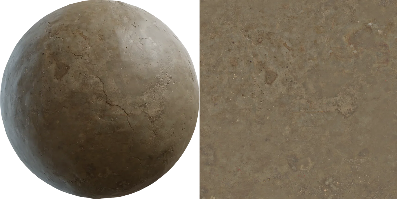
Now that the material is color calibrated, it will appear correct in a 3D render under any lighting conditions, dim or not.
But how do we know this, and how do we fix it?
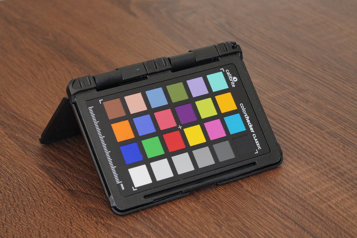
With a carefully crafted collection of colored quads, we can adjust our texture to match reality, and more importantly, achieve more realistic and consistent renders.
Gone are the errors of subjective interpretation. It doesn't matter if you are color blind or your monitor is wildly inaccurate. With objective measurements and calibration processes, we can correct almost any texture.
The way these color charts are meant to be used is to build a profile using their dedicated software and apply that profile to all your photos in the shoot. However, the color profiles built into our raw processing software are quite accurate out of the box (for our cameras at least), so there's little need to go all the way and build a profile.
Instead, we simply need to calibrate the exposure (which the dedicated calibration software will not do) and set the white balance.
Overall our workflow is to calibrate up-front with the raw files. You can also calibrate your final texture itself (as long as you haven't done any exposure or color tweaks, intentionally or not), but it's easier to do it when processing the raw files anyway.
Like anything in photogrammetry, if you put garbage in, you get garbage out.
Meaning it's absolutely critical to shoot the color chart in a way that is going to be accurate. There's little point in calibrating something if the reference you're using is different from the target data.
- Shoot the chart flat on the surface you are scanning, so the lighting matches.
- Ensure your chart is less than 3 years old and clean of dirt, grime, and fingerprints. Some dirt is unavoidable, but as long as there are some big clean areas in each patch you're fine.
- Use a standard chart with known precise color values, such as the Calibrite/x-rite Macbeth color checkers - we use the passport variant for portability and protection.
- Shoot the chart using the exact same camera settings and lighting conditions. The easiest way to do this is to simply leave the chart on the edge of the area you want to scan, instead of doing it separately before/after. If you're using a flash, be sure to keep a constant distance between the flash and the surface.
- Base the exposure of your entire texture scan off of a good exposure of the chart, or slightly darker.
- Keep the chart in the center of your frame.
- Put the chart on the floor if you're scanning a wall, or put it against the wall if you're scanning a floor - the lighting will be different and offset your calibrated exposure.
- Use an old chart that you think "should be OK" - noticeable fading and yellowing of colors occur after around 3-4 years, or sooner if exposed regularly. This means all your textures will be more blue than they should be, and possibly more colorful.
- Assume a white piece of paper is pure white.
- Go back at another time to shoot the chart if you forgot it - different lighting means the chart calibration will likely do more harm than good. You'll need to reshoot the entire scan if you care about calibration.
- Over-expose (clip) and part of the color chart, especially the white corner square.
- Shoot the chart in the corner of the frame, where lens vignetting can offset the calibration process.
Cameras and raw processing software apply all sorts of fancy adjustments to make photos look pretty.
We don't want that, we want the raw unchanged photons as ugly as they come. We want the colors of the pixels in our photo to correspond directly to the energy of the light captured. In other words, we want linear images.
This is absolutely critical, as our single-point exposure calibration below relies on the images being fully linear.
To get this, the first step is to disable the default tone curve. In Adobe Lightroom this is not possible without using 3rd party tools to generate custom profiles, so we recommend using Raw Therapee or Darktable instead (both free and open source).
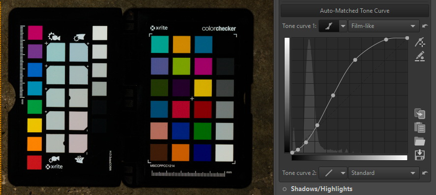
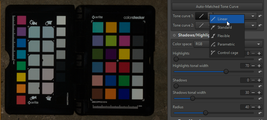
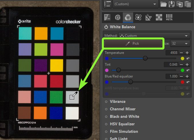
Next, we want to make sure our whites and greys are not slightly orange or blue due to the color of the lighting we shot them in, or the imperfections of your flash.
This can be done easily using the white balance picker on the second grey square:
Finally, the most important part, setting our white levels.
In RawTherapee, we can place static pickers on our image to constantly display the color values (in multiple areas at once even, but since we know our image is linear we only need one):
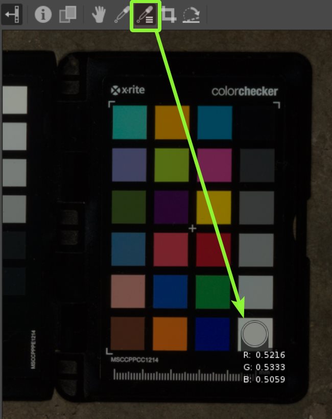
You can make these pick areas bigger and smaller by holding control and left/right clicking on them. The bigger the area, the better the average sample of the area to smooth out the noise. You'll find the sample area also changes as you zoom in and out of the image.
Then, we want to see these RGB values in a 0-255 range that we can match. To do this, just click a few times on this area of the navigator to toggle between the display modes:
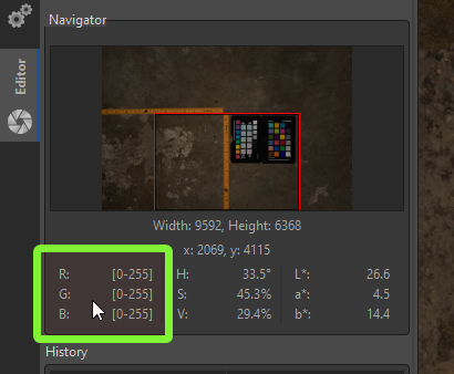
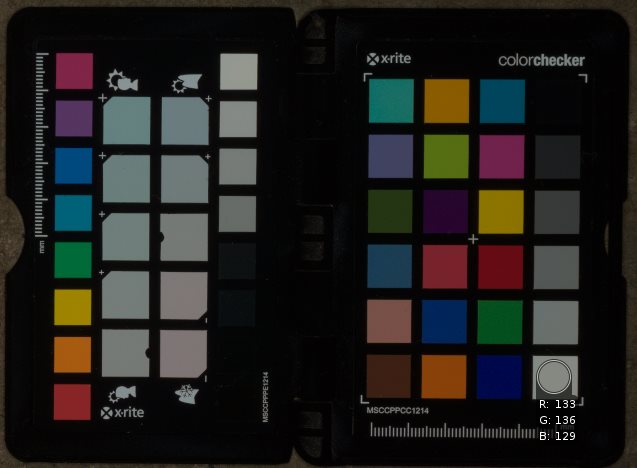
OK then, now we're ready to adjust our exposure until the white level is correct… but what is “correct”?
This topic is a bit of a can of worms, and the main cause of revisions of this workflow.
In a nutshell, the white value we're aiming for is [244, 244, 241] if you're shooting in natural light, or [235, 232, 226] if you're shooting with a cross-polarized flash (i.e. accounting for the lack of a specular component). If you're interested in the proof and research into this topic, we recommend Martin Geupel's excellent articles on the subject.
As you can see, our values are far off initially. To adjust them, we can simply adjust the exposure compensation:
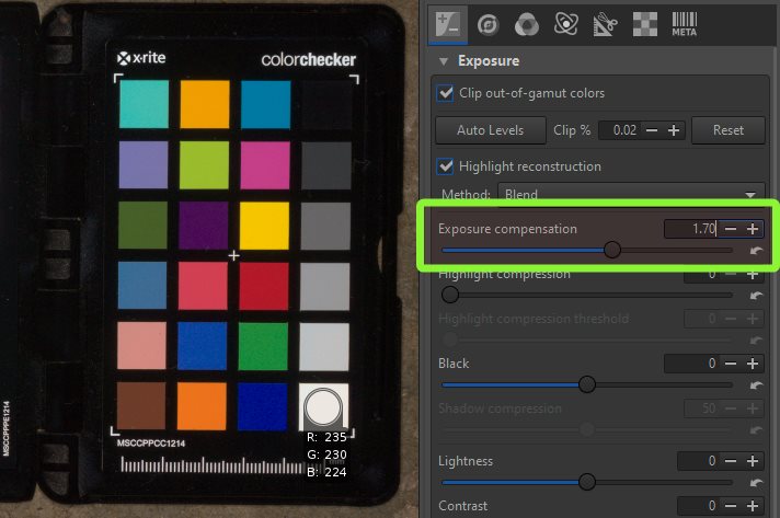
We're close, and honestly close enough, but if one of your channels is a bit further off you can go a step further and use the RGB curves section of the color tab in order to adjust each channel independently and achieve an even closer match:
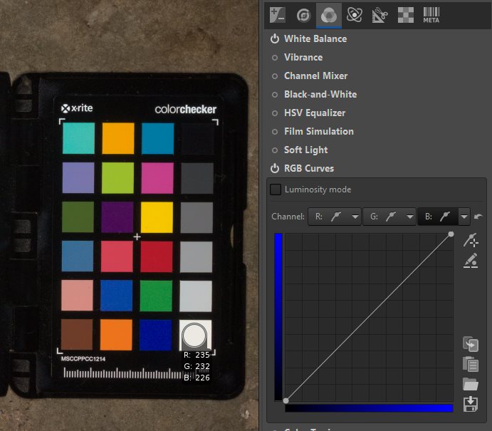
Notice that if you pan around your image and zoom in and out, the sampled values change slightly due to the noise in the image. This is unavoidable, and a good reason not to spend too much time getting exact matching values. See the “It's never going to be perfect” section below if you're tempted to try.
The foundation of the color chart workflow is knowing what color those little squares are supposed to be. You'd think it would be easy to find this information, and you'd be right, however, what you'll find is conflicting sources with slightly different values.
Typically the values may vary by 1-5 on the 0-255 scale which is enough to make a noticeable difference in contrast. But if you're using an older reference, the values may be even further off.
X-rite changed the formula for their chart colors quite significantly around 2014, and these old values (now wrong for modern charts) are sometimes still proliferated across the web and even inside calibration tools.
We obtained noticeably different results when calibrating using supposedly the same chart preset in different software, so we reached out to Calibrite to receive a list of sRGB values for our chart, which you can download here.
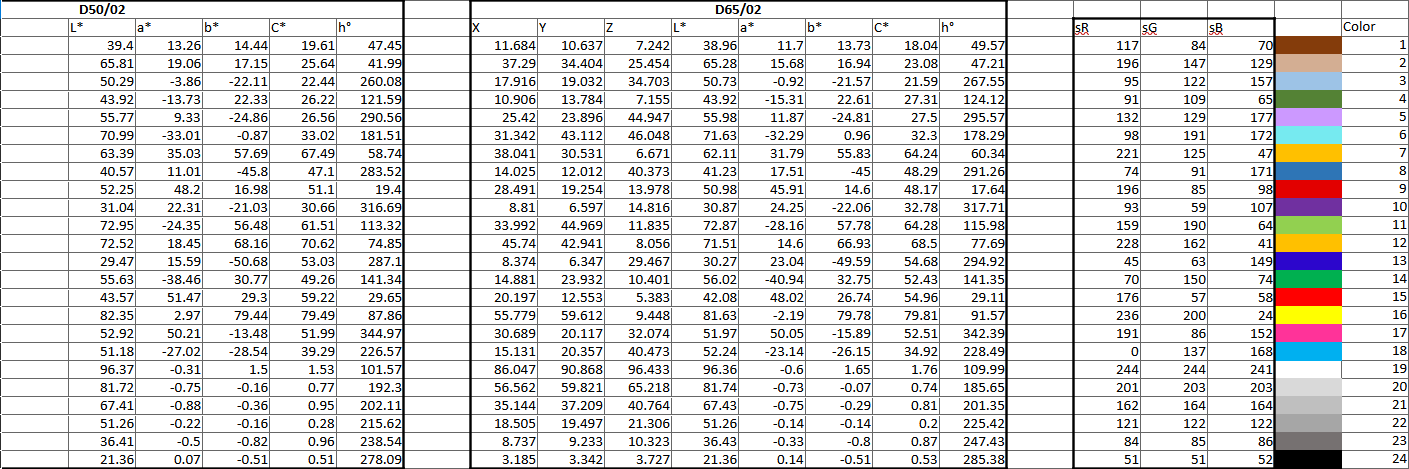
Be sure to confirm for yourself what the values for your chart are meant to be, and that your calibrated output is as close as possible.
But ultimately, in the real world perfection is unobtainable. Yes, you can theoretically create a perfect color profile such that the values match exactly with the chart reference...
- But what about all the millions of colors in between or beyond the 24 colors on the chart? How should these be interpolated?
- How much does your camera's noise floor change the contrast of its photos?
- What effect did the wall nearby your surface have on the variance of lighting across the captured area? Or even the color of your clothing and where you stood?
- Did the clouds move during the capture? Did the sun?
- Does your camera sensor warm up the longer you shoot? What effect does this have on the noise floor?
- Does your flash output exactly the same amount of light for every trigger?
- Did the distance between your flash and the surface change by a few millimeters across the scan?
- Did your delighting or seam removal process adjust the shading slightly one way or another?
- Did your photoscanning software blend the seams between images using subtle exposure adjustments?
- Is the vignette correction for your lens perfectly calibrated?
- Is sRGB in a 0-255 range even accurate enough?
- Was the chart exactly parallel to the surface or was it slightly lumpy?
- A chart may have a rated life span of 2 years, but that doesn't mean it suddenly changes color on the 730th day.
Ultimately, color calibration is a rabbit hole you could go crazy in. When you start chasing perfection, you can easily do more harm than good if you don't fully understand and control all of the circumstances, which in reality is not possible.
Our mindset at Poly Haven is to make a decent effort that gets you 95% of the way there, and then spend the time we've saved by avoiding the rabbit hole to improve the material in other more significant ways.