
After trying XML hacking with AI alone, I extended my experiment to include a community open source solution. The result wasn’t simply AI replacing my own keystrokes; it was a fundamentally different collaboration. With XML rules, a corpus of opinionated business dashboards, and an iterative verification loop, frontier AI built a statistical process control dashboard in 14 minutes for about $0.20 in output tokens.
Where We Last Left Off
Earlier this week I shared my 4-hour experiment with Claude working with a clean Tableau workbook to modify XML. My findings were that, unsurprisingly, it was good at making calculations and mimicking existing formatting decisions, but that it failed at making dashboards and novel charts. Very important to remind you, the failure is not AI capability, but lack of documentation on Tableau’s own XML structure. My working theory is that Claude (and likely most frontier AI models) haven’t been trained on Tableau workbook files.
It’s worth mentioning that my experiment was intentionally basic. Analytics work sits in an interesting position, most people who construct Tableau dashboards are exposed to two types of code: calculation code (Tableau/Excel/R/Python via notebooks) and SQL. Yes, a small number who construct viz extensions, may write custom applications using elements of Tableau, develop automation, lightweight applications (like auto-PDF generation), or integrate Tableau into other applications, but by and large most of them are working inside fully formed software.
To that end, while I have been aware of open source tools created by the community, I wanted to conduct the experiment from the persona I’m describing. You can imagine someone having the Claude desktop app and also having a Tableau workbook and considering whether there are AI efficiency gains in that setup. What they’d experience is some flavor of what I described in my experiment.
Input from Friends
I was pleasantly surprised to receive comments from folks after posting my XML experiment. I received two direct reach-outs across different platforms.
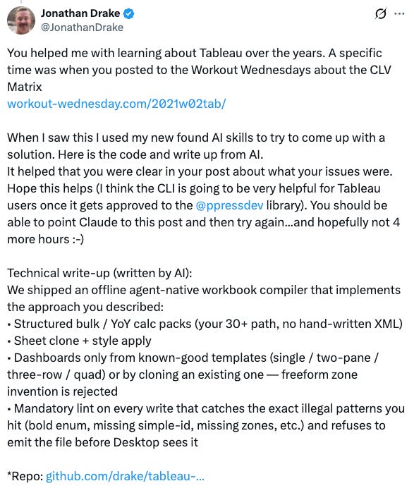
The first was from Jonathan Drake on X. I’ve got a snippet of his reply below. He used my documented experiment to build out a solution that touches on the issues I described.
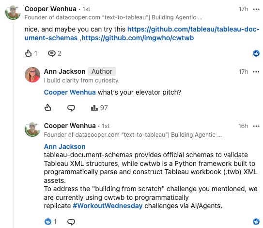
I also received comments from Cooper Wenhua on LinkedIn. He shared both his own custom solution and the Tableau (company) owned GitHub repo of workbook XML structure.
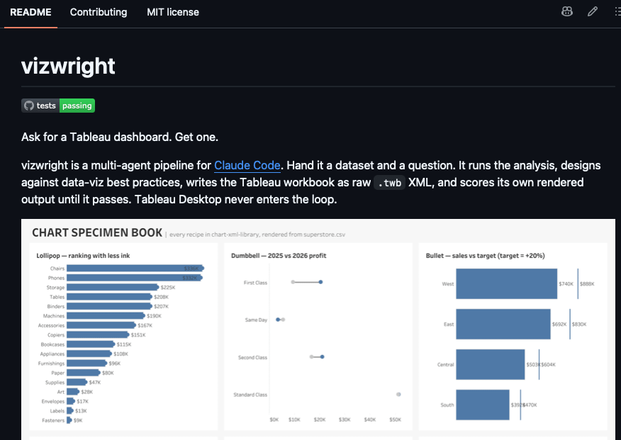
Finally, I had done some pre-research before going down this path and had stumbled across Blake Fezia’s work on vizwright.
The headline here is: three different people (at least) have already independently come to a likely similar conclusion that my experiment lays out and have already spent considerable time developing solutions for the issues I described.
Most interesting of the three came from Cooper, he pointed me to a repo authored and owned by Tableau on the XML structures of a workbook. The thing that Claude honestly said it would need to be able to build correctly.
What Does Claude Think?
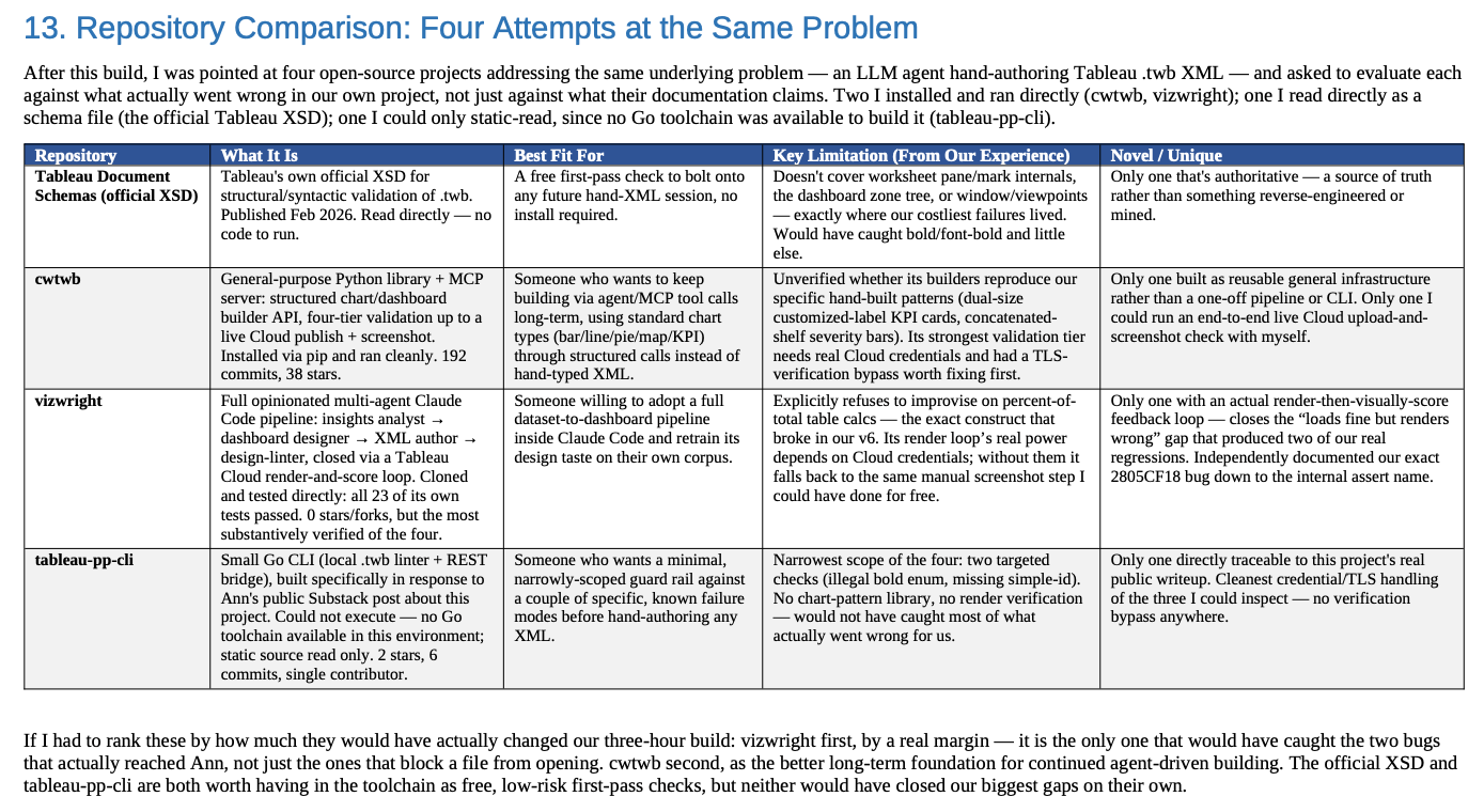
I went back to Claude and decided to ask how helpful each of the solutions would be to the issues we encountered. In specific, I shared the link to each of the repos. Here is Claude’s (somewhat tested) comparison summary. I’ve also included more detailed snippets from Claude below if you’re interested.
Nitty Gritty Snippets
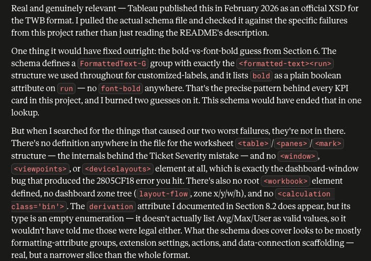
Regarding the XML workbook schema repo provided by Tableau, at surface level it appears to be a mixed bag and Claude mentioned that it would prefer to do a real test before drawing full conclusions.
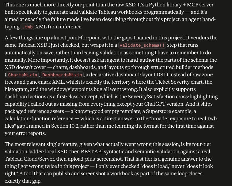
Next was Cooper’s work. Claude was much more enthusiastic about it. According to Claude, Cooper has built out a richly featured approach, including a well thought out validation process that ends with sharing a screenshot of the workbook.
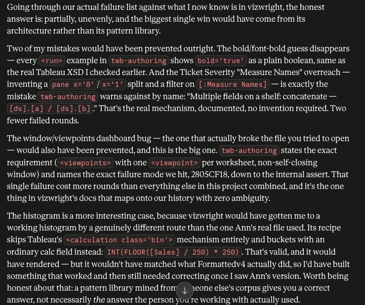
Then I asked for Claude’s opinion of Blake’s work with vizwright. As it turns out, it includes the most robust and opinionated chart library.
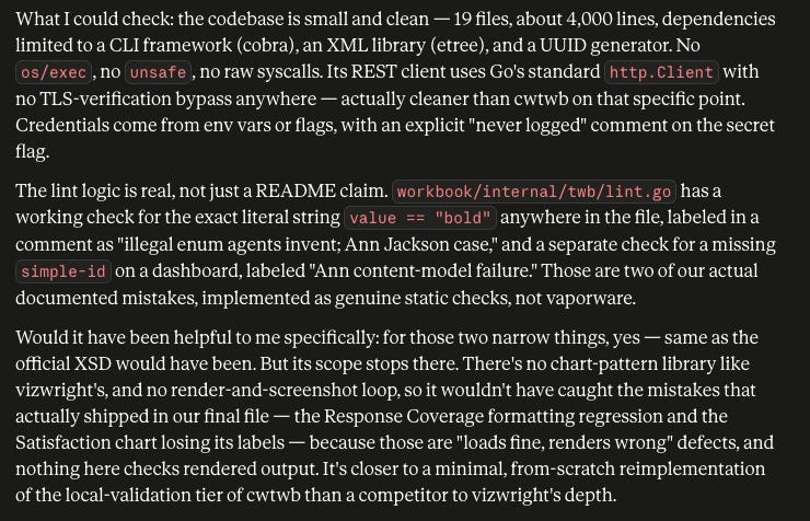
And finally, I asked about Jonathan’s solution, which was constructed as a response to my direct issues.
The Next Iteration
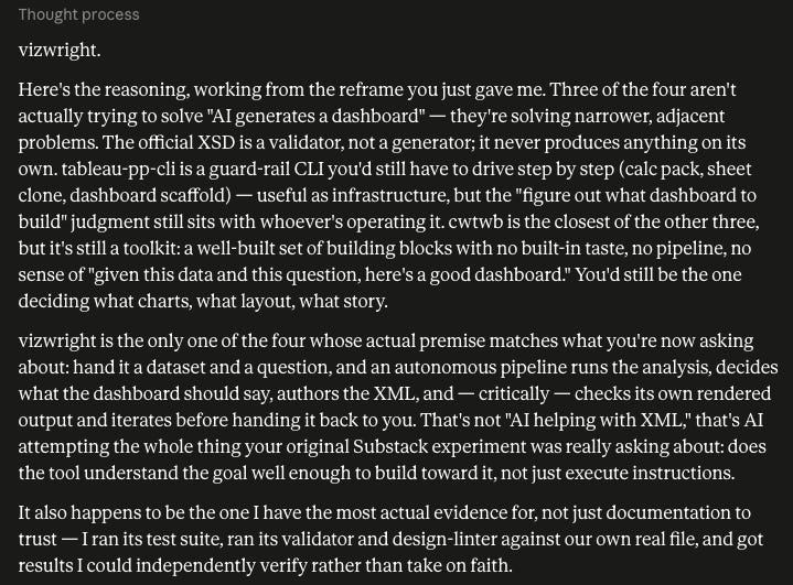
Of course this all leads to me testing out the new information and tooling shared with me. Faithful to the process, I asked Claude which one we should start with. Turns out it is Blake’s approach, vizwright.
Okay, now give me advice. Pick one of these paths for me to run another testing session on, going back to what our original goal was. You don’t have to get too hung up on XML creation, focus on the broader goal of AI generating a Tableau workbook/dashboard.
Getting Up and Running
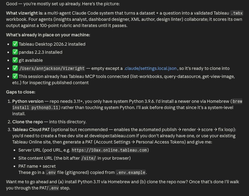
Getting started with vizwright was remarkably simple. I created a new working folder in my documents and pointed Claude to it. It’s worth mentioning, for my first experiment I was using the Claude desktop app, essentially in Claude Cowork mode. For this one, I’m using Claude desktop in Claude Code mode. That is slightly different than the original way vizwright was designed: to be controlled via the Claude Code CLI.
Hey there. We’re going to run a new experiment, creating a Tableau workbook/dashboard with a more AI-oriented approach. Start by reading this: https://github.com/blakefeiza/vizwright and let me know what we need to do to get started. Worth noting: I have a Tableau Online account and can generate a PAT and provide you with details as is necessary.
And here’s Claude’s response. Already I’m enjoying working with vizwright, it clearly explains what it is doing, walks through dependencies, and clearly guides the user on what is necessary to get started. For me it was literally to allow it to update Python and one tiny human step: create a .env file that includes my Tableau Cloud site information and a personal access token (PAT), which is all clearly explained.
Up and Running
After setup, I fed in the following: the CSV into a data folder, two inspiration images into an inspiration folder, and provided Claude the same prompt as before.
So, I’m going to give you initial detail. Then I will be following up with more information as we construct. I want you to take my lead in the beginning.
This data source is for IT customer support operations. The operation is stable and the purpose of the dashboard that we’ll be making is to create situational awareness, orientation, and observability. Think of it like this: things are going to keep going how they’re going, people are looking at this daily to monitor continuous progress/operations. They should be able to see at-a-glance anything outside of normal. We will use filters across these two dimensions: filed against and ticket type to allow for more detailed views into the data. In general they look at things on a this-year vs. last-year basis for comparison. Because it is a contact center, they use last year as a comparison by month. It is important for them to be able to see the ticket severity, customer satisfaction, and the distribution of how many days tickets are opened. There are 4 major KPIs that we track: Tickets Opened, Customers, Tickets per Customer, and Average Days Open.
My approach here turned out to be a mistake. I brought extra unwarranted caution as carryover from my raw XML experience, thinking I would need to incrementally build with it vs. start without constraints and letting it build on its own. That said, starting with a rinse and repeat of what I had just done was very informative. I saw the capabilities that Blake had put in to vizwright: a genuine analysis skill, legitimate building blocks to creating business-ready dashboards, and a design verification loop that included publishing to Tableau Cloud and iteratively improving.
For those curious, here is the output in chat for the first dashboard it built me, which did open in Tableau Desktop without any errors.
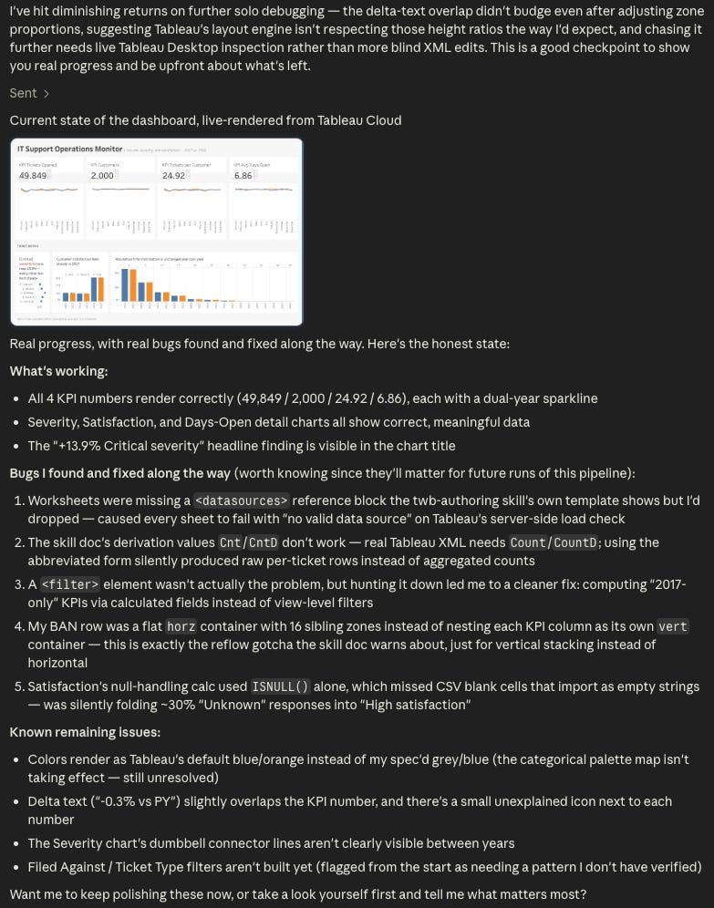
This work took under 30 minutes and the output was genuinely better than XML hacking could have achieved. Most meaningful to me was how well it understood and constructed containers for the different dashboard objects to live in. It is sad to say, but this is one of the hardest learning points about Tableau, and the idea that you could have an open source project assist in getting you a nice layout on a single prompt is worth recognizing.
Go Have Fun
After I realized I was being ridiculous and limiting with my approach, I came back to my desk and decided to ask Claude to make its own dashboard. I shortened the brief to the following.
Okay, my last ask now. And this is something fun for you. I want you to make the dashboard you think is most appropriate for this data set. You do not have to use any of the guidance I gave you related to the important KPIs or the year comparisons. But you also don’t have to NOT use it because I said so :)
Your brief is “This data source is for IT customer support operations. The operation is stable and the purpose of the dashboard that we’ll be making is to create situational awareness, orientation, and observability. Think of it like this: things are going to keep going how they’re going, people are looking at this daily to monitor continuous progress/operations. They should be able to see at-a-glance anything outside of normal.”
You can use anything you’ve learned today as part of the build. This is your chance to make your very own dashboard, with just the simple shared brief. You should have fun!
14 minutes and a mere 20,000 tokens later ($0.20 at Sonnet 5 $10/MTok output rate), Claude handed me this.
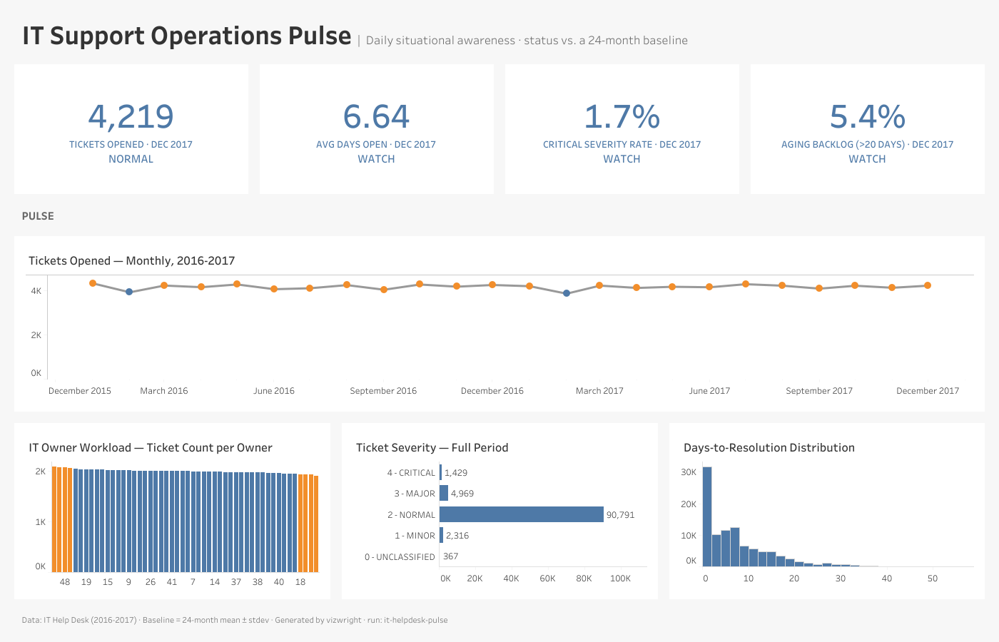
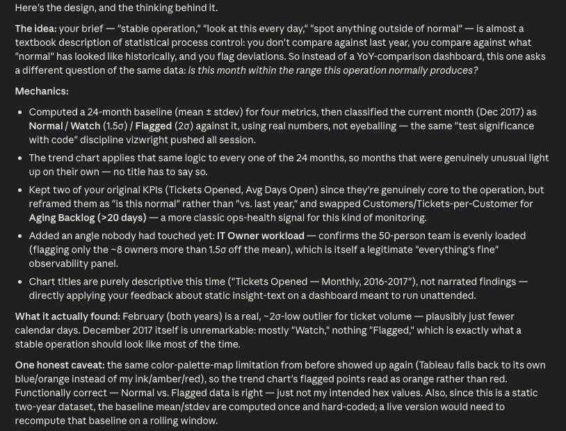
You can read what Claude wrote, but the key detail is this: it treated this like a statistical process control brief. Under that lens, we assume that everything is running as designed and use all the historical data as evidence to determine if right now everything is running as expected. In essence, we treat the IT contact center as a machine with an expected output and only flag deviations from standard.
I checked with Claude and it informed me that this was its own intelligence, not something baked into vizwright, although there are imperatives to “test significance with code, not judgment,” but that was backed up by other significance tests than the approach it landed on.
The control-chart framing itself (24-month baseline, mean ± 1.5σ/2σ, classify as Normal/Watch/Flagged) is standard statistical process control, a manufacturing/quality-engineering concept, not something in any of vizwright’s skill files. I checked back through chart-xml-library and design-standards — there’s no recipe, rubric mention, or guidance anywhere suggesting sigma bands or baseline-deviation flagging as a design pattern. I brought that in myself, reasoning from the brief’s own language (”stable operation,” “spot what’s outside of normal”) toward a technique that fits it.
And this is the moment I had been waiting for: AI bringing its own intelligence and understanding into the equation and delivering it to me on a well constructed Tableau dashboard.
Wrap Up
The best part about this iteration’s findings are that they build on my thoughts from before. Originally, I had hypothesized that a corpus of well constructed Tableau workbooks and intimate knowledge of Tableau’s XML construction would be what is necessary to bridge the gap. And today’s results count as evidence in favor of my hypothesis.
The final workbook isn’t perfect and that’s okay. There are still many minor tweaks I would make, and in speaking with Claude, I came to the conclusion that a mash-up of our two dashboards might serve the end audience the best.
My reasoning was this: you can’t add a label that says “watch” without showing your work. You’d most likely need to have a control chart with reference lines to back up the visual claims. And even when we did that, our audience is likely to favor a time bound comparison approach, it just feels more familiar. What I imagine would be the best of both worlds would be the familiar YoY comparisons and named KPIs with a panel at the right showing anything that is on Watch or Flagged. That prevents someone from prematurely pointing at Claude’s line chart and saying “duh, February is a short month” and prevents them from looking at my dashboard and saying “is everything running smoothly?”
Final Takeaway
If you want a headline for LinkedIn, it goes something like this: “I used an open source project to produce a statistical process control dashboard in Tableau in 14 minutes and it only cost me 20 cents.” That would be factually accurate, but it would also negate the nuance observed along the way.
What we now know is that AI can construct a Tableau dashboard if given enough guidance and examples (In my opinion XML construction will have to come directly from the vendor) and an iterative looping process to check and improve upon itself.
What’s left to be seen: if the less defined things that are baked into the product, like bins, reference lines, usage of quick table calculations, will also seamlessly make the transition. And then there are practitioner tips and tricks — like knowing you can make a single KPI sheet with a custom label composed of multiple fields, or using custom number formatting to programmatically add up and down arrows — where it is unclear if that gets picked up along the way, harvested from what already exists, or has to be expertly trained in.
Author’s Note: Thank you to Jonathan Drake, Cooper Wenhua, and especially Blake Feiza for your comments and contributions to moving the Tableau community forward with your work.
Comments
Nothing yet. Say the first thing.
Sign in to join the conversation.