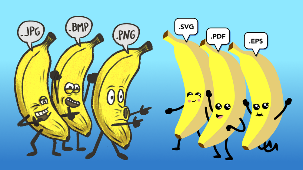
Confused by vector files, raster images or 300 dpi requirements? This simple guide explains the difference between raster and vector graphics, when to use each file type, and how to avoid blurry logos, pixelated figures and printing headaches.
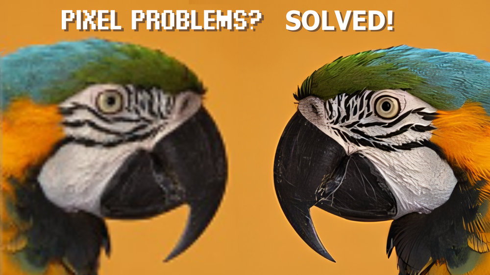
Struggling with blurry images for posters or publications? Here are three practical ways to upscale pixellated images for print, plus when to be careful with AI tools that can change what your image actually shows.
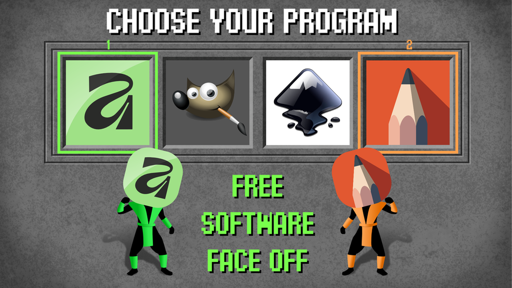
Compare the best free graphic design programs for researchers - GIMP, Inkscape, Sketchbook, and Affinity - and choose the right tool for figures, posters, and graphical abstracts.
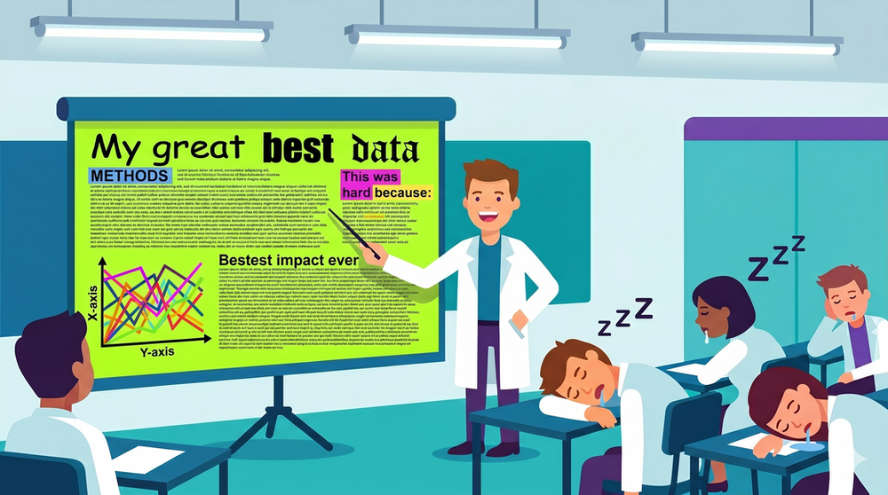
Slide decks aren’t going anywhere, but “death by PowerPoint” is optional. Here’s how to ditch cluttered slides and use clear text, strong contrast and simpler visuals to keep your audience engaged.
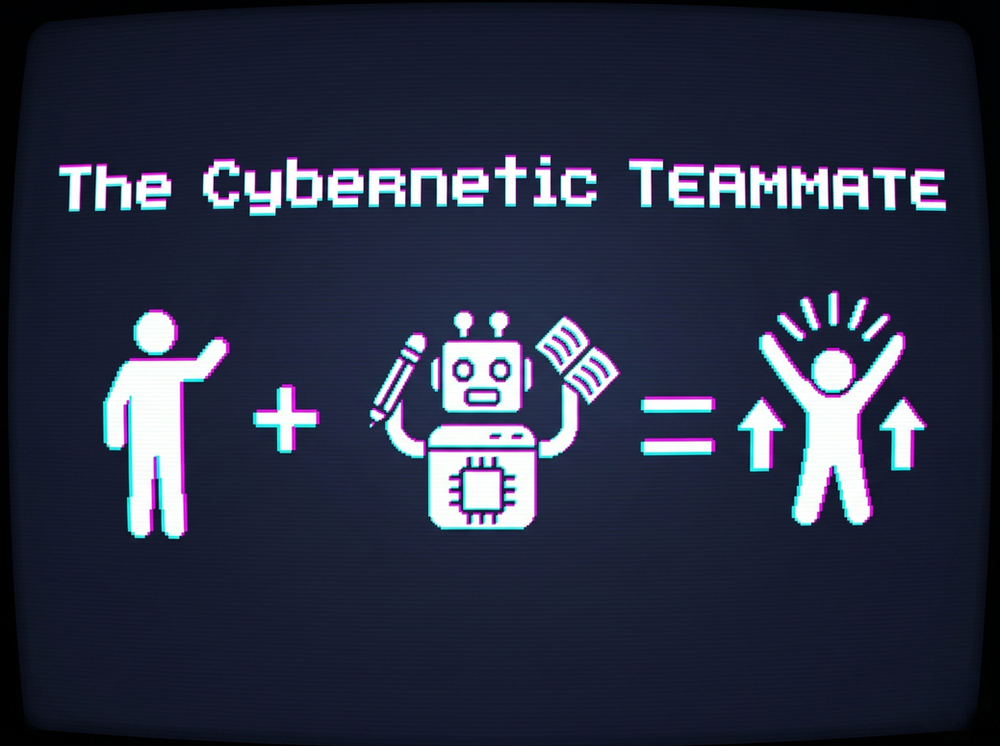
AI isn’t replacing teamwork - it’s reshaping it. Drawing on a major Harvard Business School experiment, this article explains how AI can help solo workers perform like teams, break down professional silos, and make work feel more energising (not less).
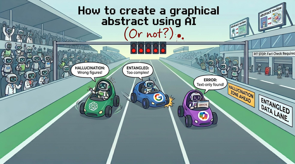
"I’m a scientist, not a designer!" We put the top AI tools to the test to see if they can actually create a journal-ready graphical abstract. The result? A mix of helpful insights and a few hilarious "AI hallucinations" Here’s what we learned about the limits of AI in science communication.
See how Dr. Fabio Arsego used AI training to secure a $360k grant and transform his career in precision agriculture. Learn to make AI your research collaborator.
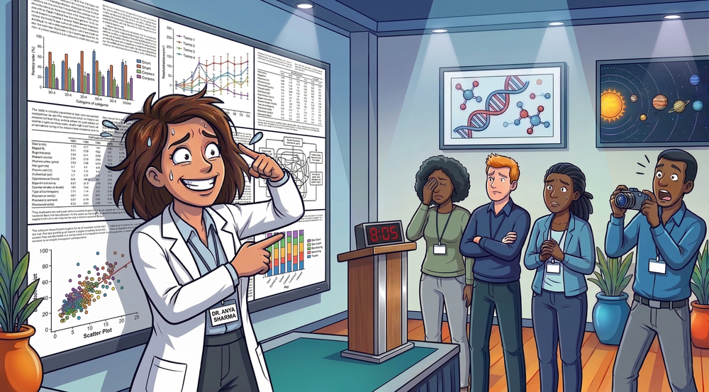
We’re breaking down the most common presentation fails, from unreadable slides to nervous swaying. Learn how to ditch the jargon and hook your audience in the first 10 seconds.