
Welcome back to my mini blog series! I’m taking you through my process for illustrating some spreads from Little Red Riding Hood. Last time, I wrote about writing the script, thumbnailing and choosing a colour palette. Today, character designs and roughs!
Character Designs: Little Red Riding Hood
With my colour palette already mostly decided, I moved on to character designs! I wanted to make sure I had the two main characters ‘done’ so I could keep them consistent in my illustrations. I also wanted to settle on some ‘style rules’ for consistency too!
I started with the most important: Little Red Riding Hood herself!
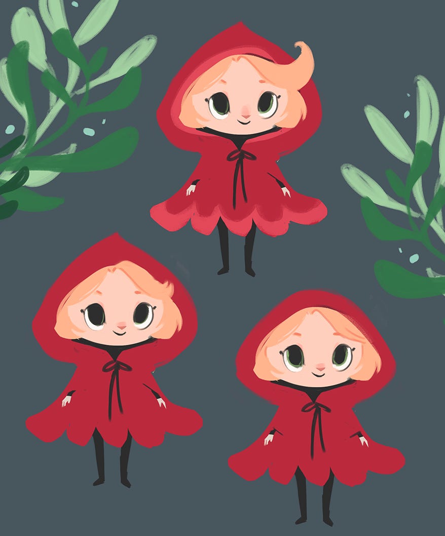
One guilty admission: I actually did some really rough pencil sketches before these but I think I must have thrown them away because I can’t find them anywhere! They were awful, but they helped me smooth out a lot of ideas which meant these digital ones are much closer to the end result.
Next I refined my design with some more drawings, exploring Little Red’s personality, how she would look and move, as well as ironing out rendering style and details.
It was at this point that her bird companion came along! I felt like these designs needed something extra, and actually the bird came in really handy later on in the final illustrations to help with storytelling and visual humour to lighten up some scarier scenes!
Character Designs: The Wolf!
Next I moved onto the wolf! I already had an idea in mind based on the wolf’s character; I wanted him to look sneaky and a little bit cheeky! I also knew I wanted to use purples to fit in with my colour scheme.
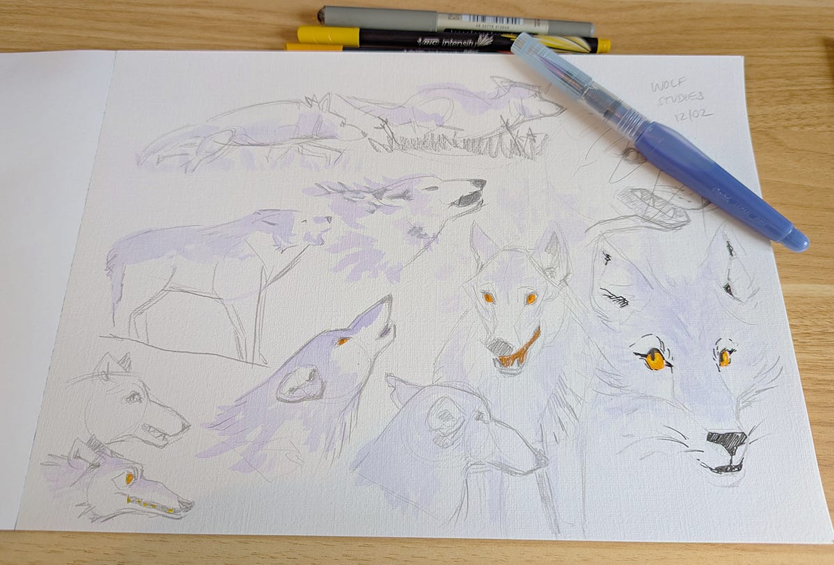
I started by doing some studies using photo reference. I haven’t drawn that many wolves before and I wanted to get to grips with how they look and move before starting my design. I also had a fancy new watercolour pen I wanted to try out!
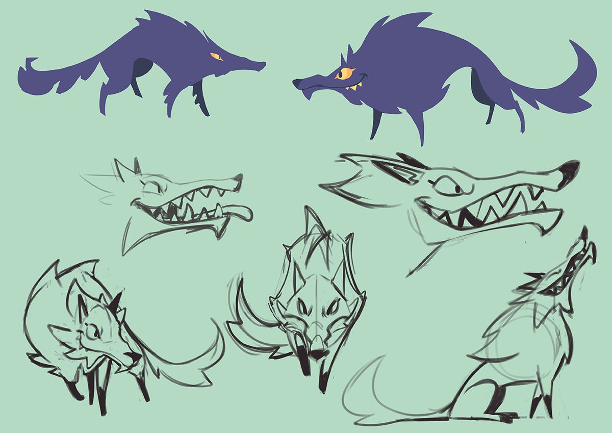
I then moved to working digitally (as that’s how I was planning on doing my final illustrations) and worked on the final design. As you can see above, I use a combination of blocking out interesting shapes in silhouette and sketching. I find silhouettes really useful for creating impactful characters and quickly exploring ideas!
I then refined these sketches, deciding things like colour and how I would render the wolf to keep him consistent with the style of Little Red Riding Hood’s character. At this point I felt like the wolf was a little bit too scary, so you’ll see later on I softened him a little (less pointy teeth, for example!).
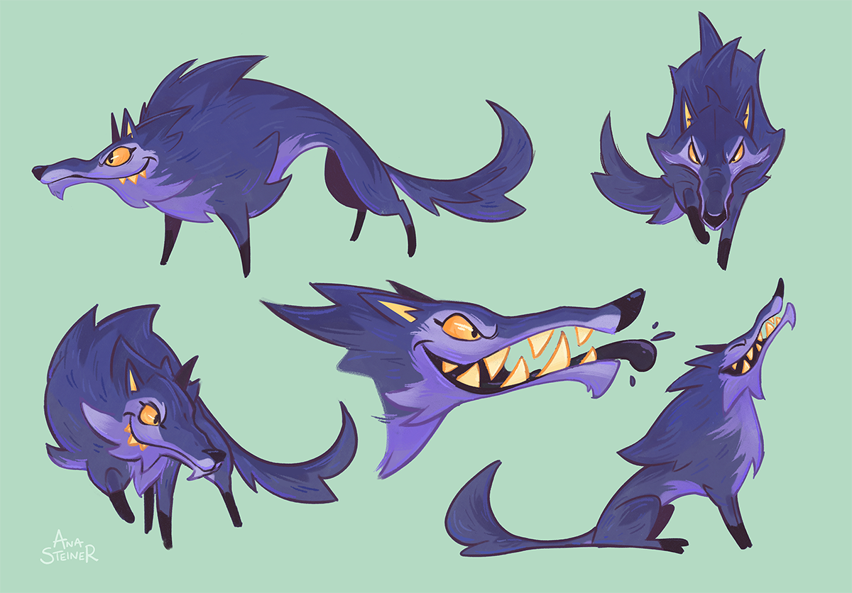
Roughs
With my two main characters decided, I moved onto roughs (sketches) for spreads! As this is just a personal project I wasn’t planning on illustrating the whole book. If I was, I think I would have done a character design for Granny first too.
I did all my roughs at the same time as again I wanted to keep things consistent! I felt like if I took a spread all the way to ‘final’ (such a scary word!) then it’d be difficult to remember which brushes and colours I used, as well as how I rendered it (especially if other work came up in between!). So it made sense to do everything together in stages. I also added the gutter (middle of the two pages) and text at this point to make sure everything was all laid out nicely.
With spread 1 being so complex (so much foliage!) I decided to start by blocking out the values rather than sketching straight away. This helped me to organise the composition and make sure it reads well despite being so detailed. I then sketched over the top, trying to focus on big shapes (‘work big to small’ is a useful mantra!) so the scene didn’t become too busy and confusing to look at.
For the wolf’s sequence, I sketched out the illustration then added the values underneath, tweaking the sketch as I went. Again, I really like adding values at this stage to make sure the composition reads well - I don’t think you can get all the information with just linework!
I like to make most of my big decisions at this stage as it’s so much harder to change fundamental things like composition later on!
As you can see I ended up adding the bird to these too. I felt they were just too scary otherwise and they needed the bird to add some lightness! I also softened the wolf’s look, making him less sharp and pointy. I did go through quite a few options though - as you can see below! Can you spot the differences?
I also went back and did some other options for the first spread as I felt like it needed some extra interest on the first page. At this point, I chose the wolf peeking out from the undergrowth, but in the end I added the flowers too as you’ll see later on!
That’s it for now! I hope you enjoyed this insight into my working process! Next time, I’ll be sharing colour roughs, then my process from black and white to finished illustration!
Doodle Bugs is a reader-supported publication. You can sign up as a free member to receive all my posts, however there is a paid tier for those who want to support my work - which is hugely appreciated!
Additionally, if you know anyone who would like this blog series I’d be so happy if you shared it with them!
Comments
Nothing yet. Say the first thing.
Sign in to join the conversation.