
Welcome back (again!) to my mini blog series! I’m taking you through my process for illustrating some spreads from Little Red Riding Hood. Last time, I shared some of my character designs and sketches - and today I’m going to talk a little bit about colour roughs!
Maybe it’s not the technical term, but it’s what I call them! A colour rough for me is the stage where I take a sketch, make it smaller and throw some colours on until it feels right!
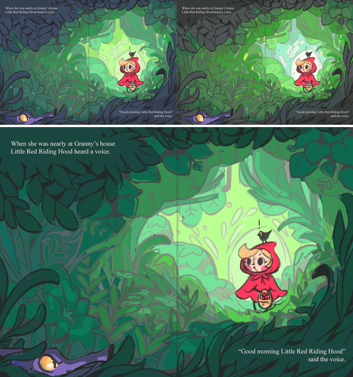
I find doing colour roughs before getting into the full illustration is a really good way to quickly experiment with colour combinations and make decisions to avoid confusion later on! It also feels much lower pressure to work messily on a smaller version before applying it to the big scary final piece.
This is a stage for playing around and finding what works!
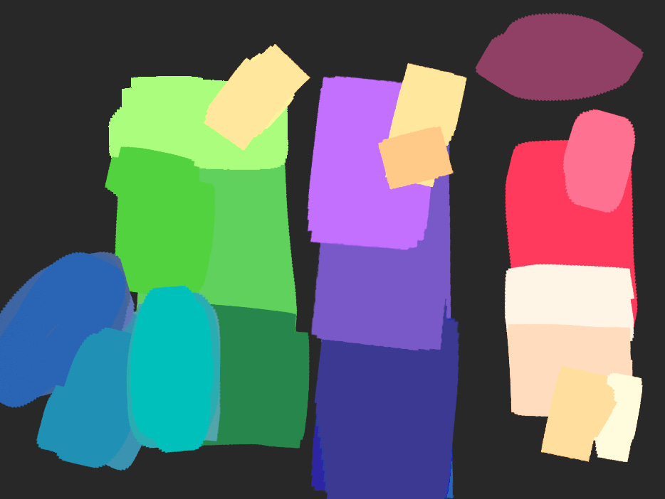
For the colour roughs, I took the sketch I already had, scaled it down (while keeping the linework on a separate layer) and just started playing with colours. I had a palette already roughly decided so I could start there for the main bits - e.g. Little Red Riding Hood herself, and the wolf!
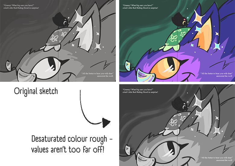
I also made sure to refer back to the values I’d established in the sketch to make sure I wasn’t going too far away from them (check this tutorial for a good way of doing that in Photoshop!).
Nothing needs to be neat, and I mostly just use a full opacity blocky brush to get ideas down quickly!
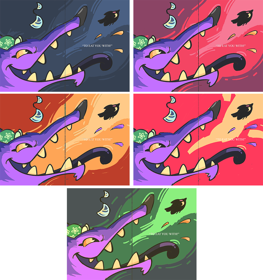
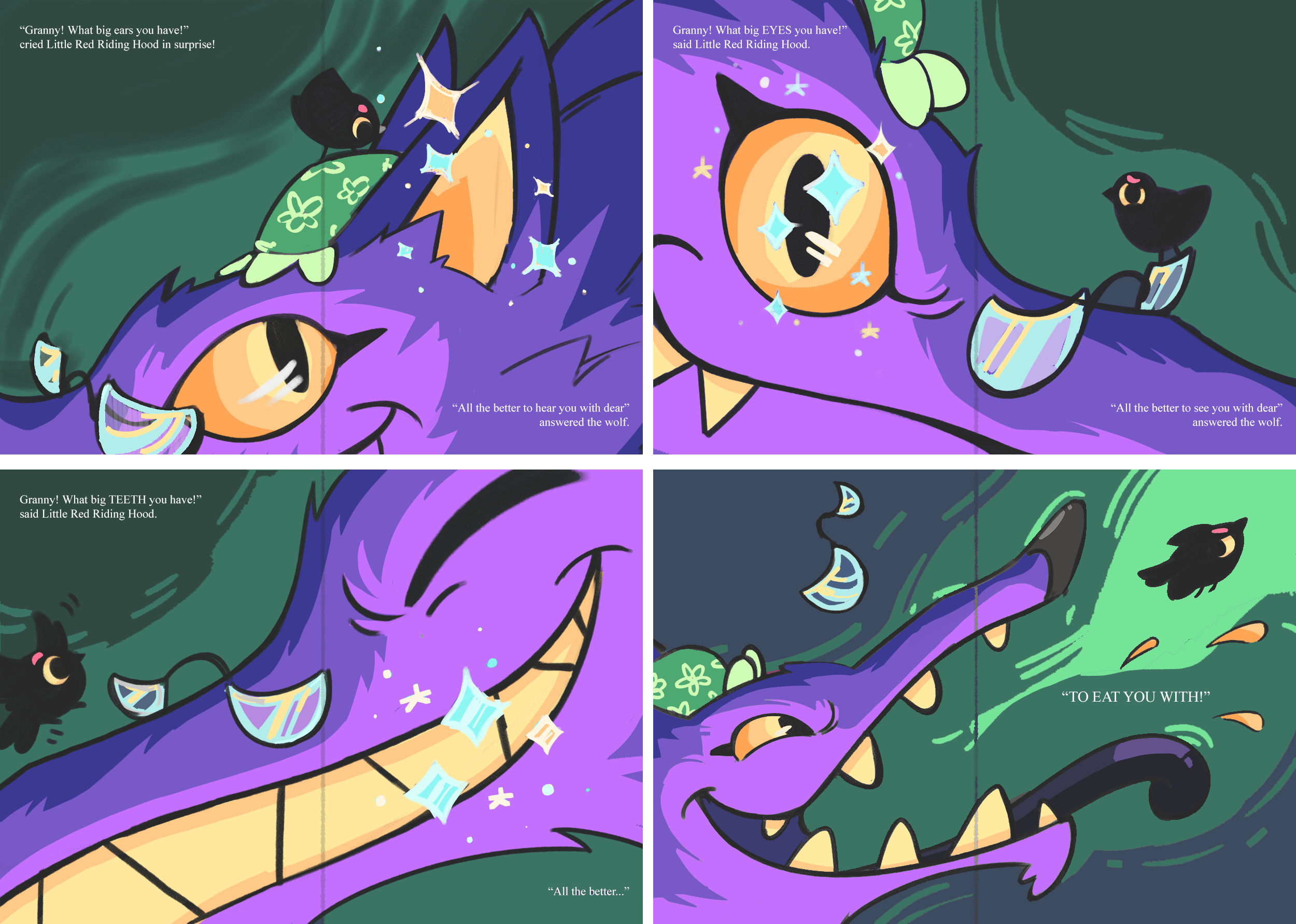
I did the wolf sequence all in one go as I wanted to keep the colours consistent across all four pages. This sequence was actually a bit tricky as I hadn’t given much thought to the background colour - I didn’t want it to be too attention grabbing but I didn’t want it to look too boring. AND I didn’t want it to be too scary on the last page!
So I ended up exploring a blue background…
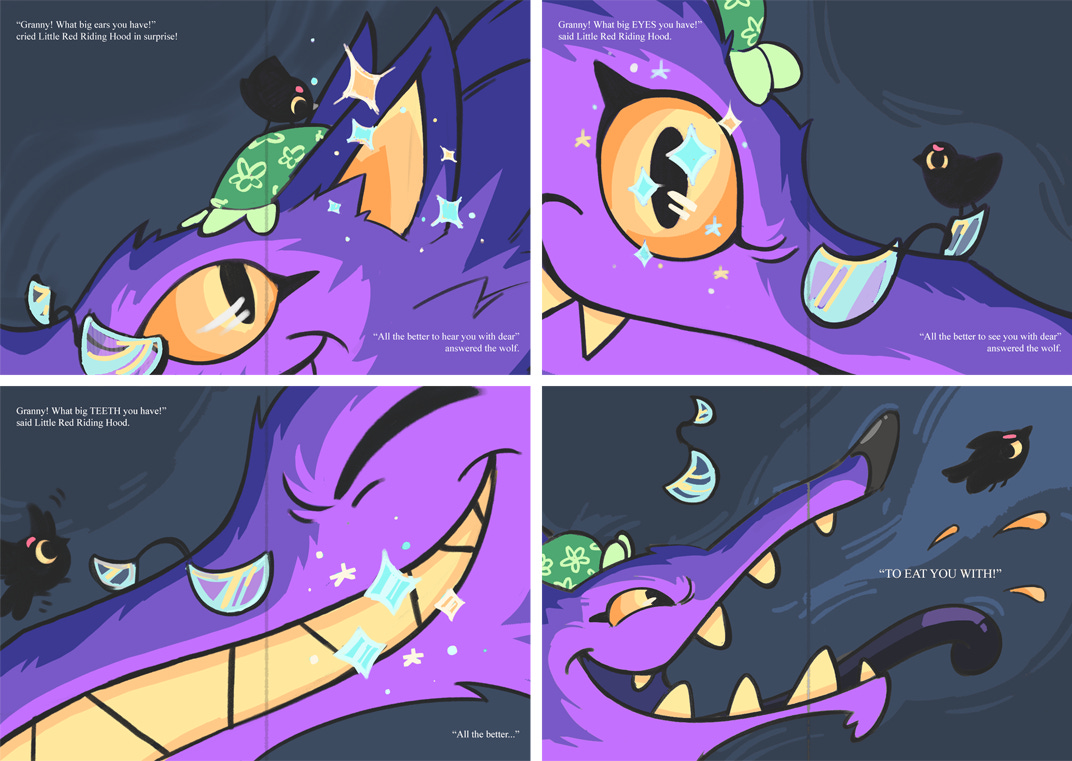
A green background…
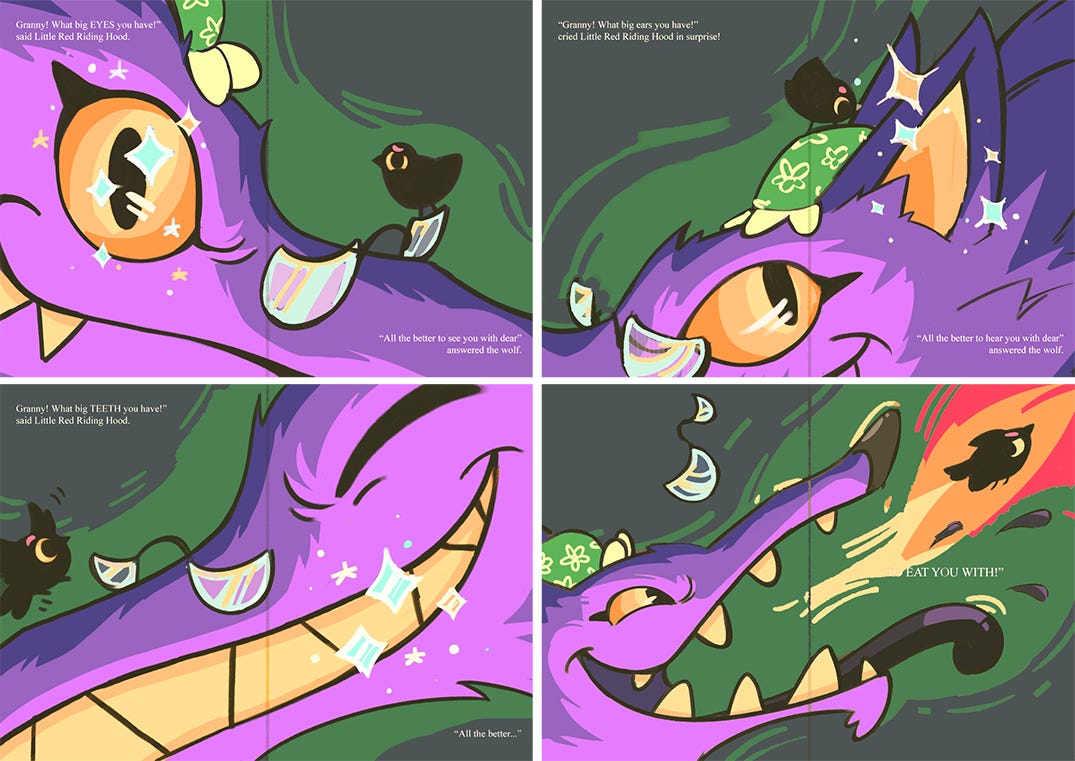
And lots and lots… and lots (!) of options for the third page!
Before settling on a muted blue-green!
Pretty much now my process is to draw the rest of the horse work on the full illustration! I’ll be showing that, as well as a really quick run-through of my process for the cover next time!
Thank you so much for reading - I hope you’re still enjoying this insight into how I work! Just as a reminder, all the content on my Substack is free but I would hugely appreciate it if you wanted to subscribe. It’s just £4, so basically buying me a much-needed coffee once a month!
No posts
Comments
Nothing yet. Say the first thing.
Sign in to join the conversation.