
I’m an artist and creative technologist. I write about generative art, code, creativity and other interconnected topics. You can expect a diary on Fridays sharing the things I’ve been working on. Thanks for joining me here. 💖
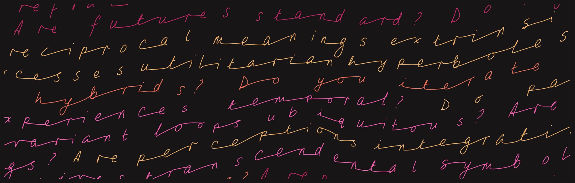
Something exciting coming up:
I’ll be releasing a series of handwriting prints for sale on Weds 23rd of April!
I’m all-in on art at the moment, which is lovely. I’ve got several projects on the go and I’m alternating between them. Last week it was all about a commission (which is still ongoing) and this week my focus has been the prints. I’ve got lots of bits to show you in this diary!
One of the hardest things about making art full time is figuring out what to work on. It’s a balance between planning, deadlines, instinct and whatever feels most alive creatively. You can’t always work on the thing that is most appealing, but you don’t want to stifle natural creative vibes either.
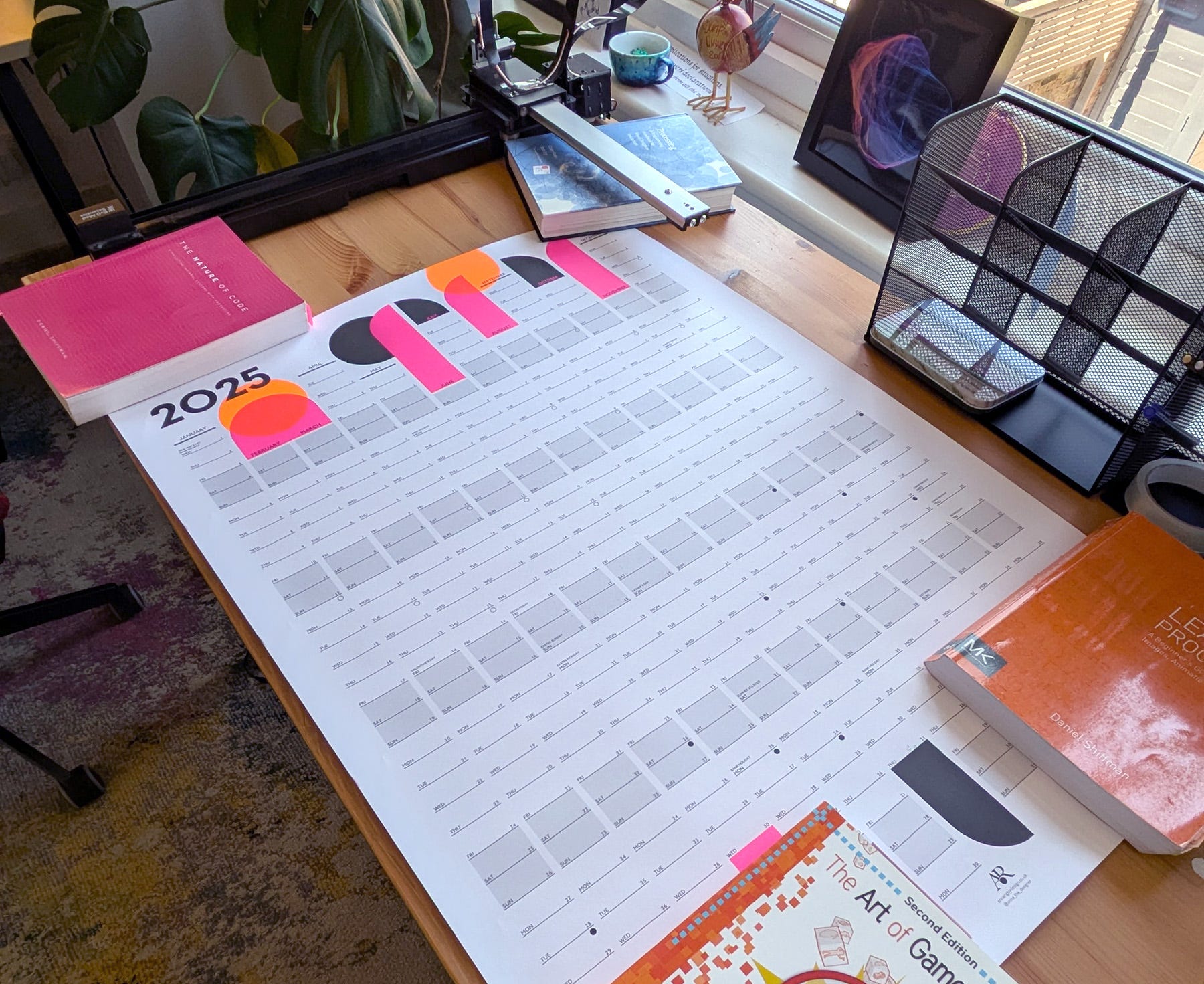
Despite all my planning (daily To Do lists, weekly schedules and a huge year calendar), I don’t feel like I’m following a clear path but more like something is unfolding. There’s a sense that there are unknown results to be discovered rather than known outcomes to be reached. It’s a bit like swimming in the dark - disorienting but it feels nice.
I hope you enjoy seeing what I’ve been up to!
In anticipation of releasing my handwriting series, I’ve been looking at test prints. Some of these were ordered months ago and some more recently.
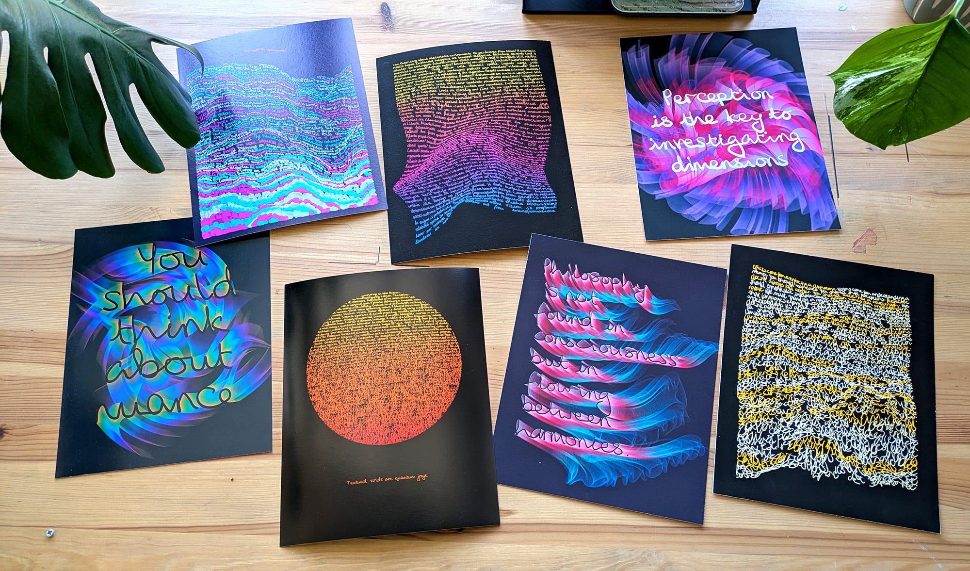
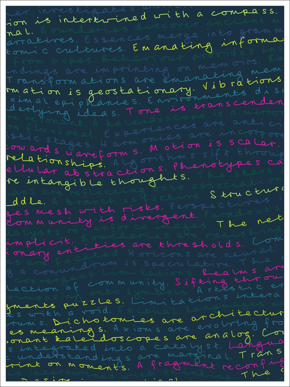
For this upcoming collection I’ll be focusing on designs with lots of sentences written in smaller handwriting, rather than the single larger sentences.
I’ve tried out several papers including:
Hahnemühle German Etching (matte)
Hahnemühle Photo Rag (matte)
Hahnemühle Pearl (satin gloss)
Canson Baryta (gloss)
and I’ve settled on using one of the matte options. It’ll most likely be the Photo Rag, as it is smoother and less textured.
It’s crazy how different things can look on print versus on screen so it’s super important to get test prints and evaluate them!
My favourite thing is the way the gradients of colour are popping in these ones (and I’m looking forward to seeing that second design on matte paper).
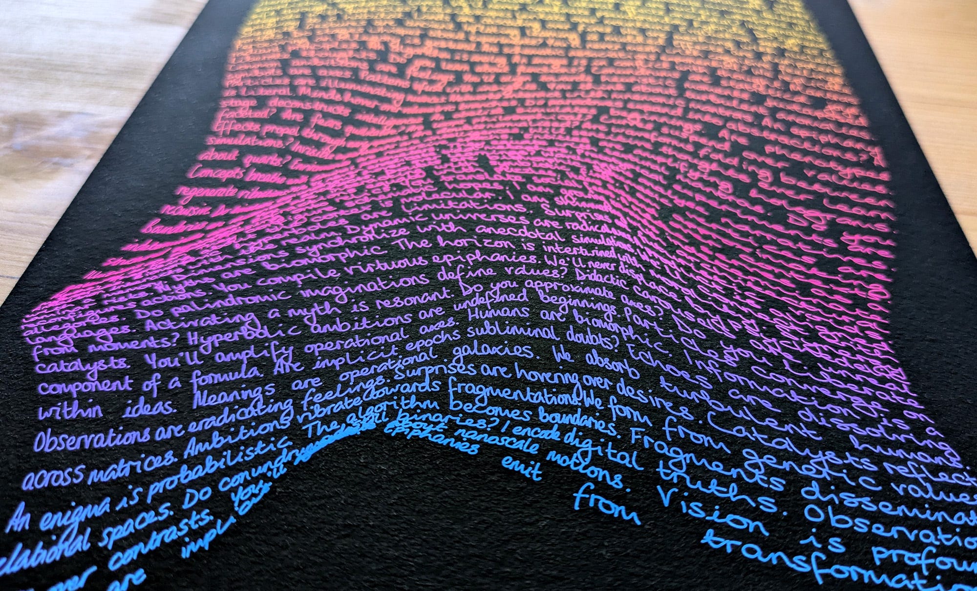
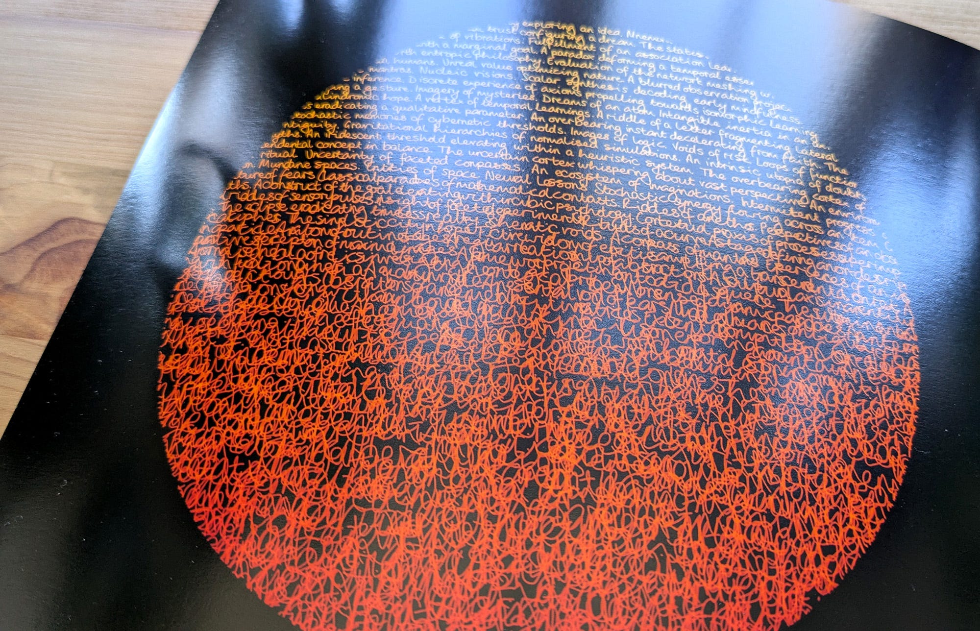
One thing I noticed is that taking a dark background right up to the edge of the matte papers can result in an uneven white edge, which I don’t love, so I’ll be adding white borders around the edge of each print instead of making them full bleed.
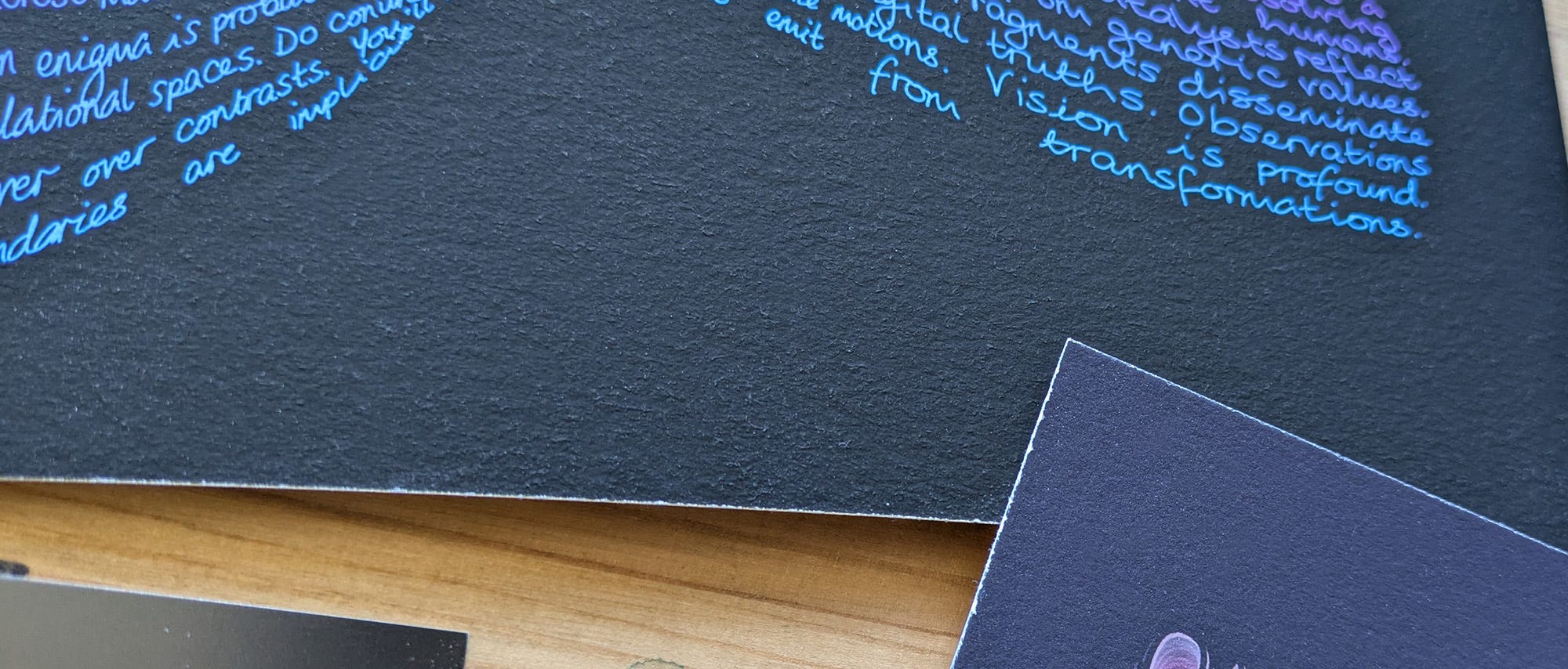
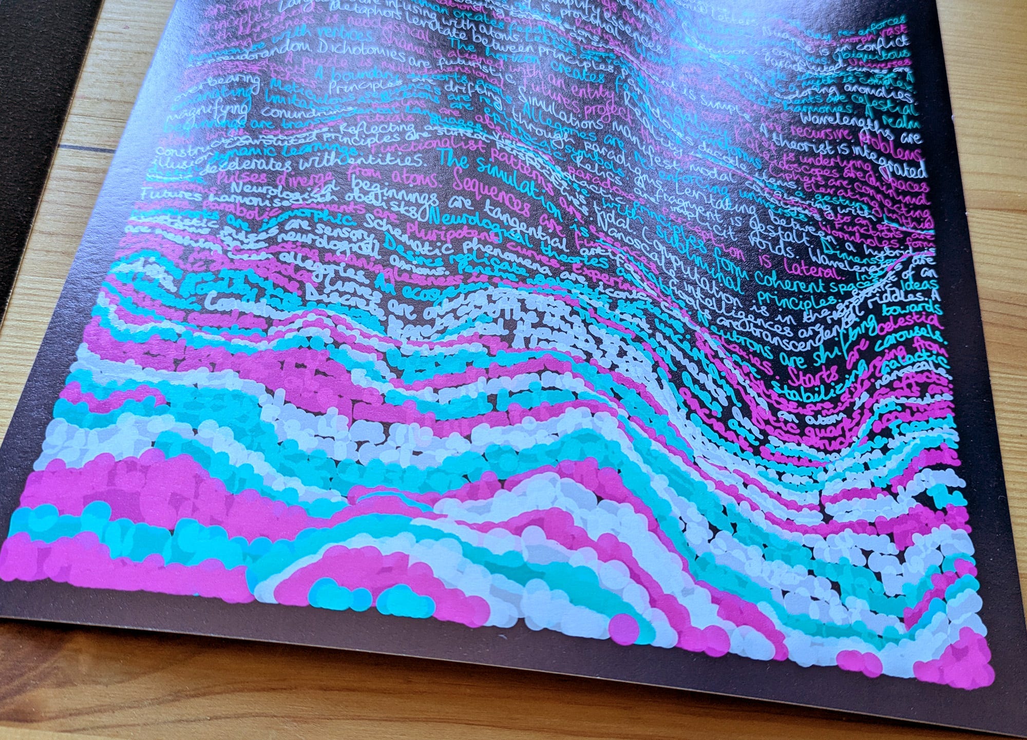
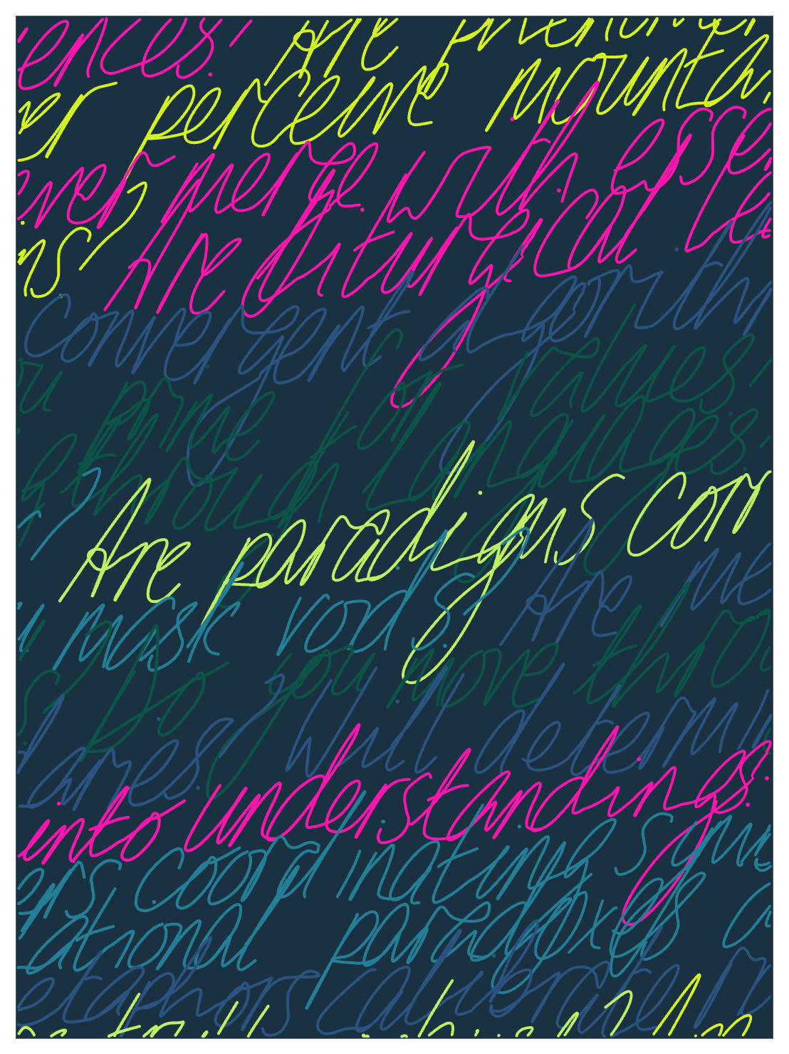
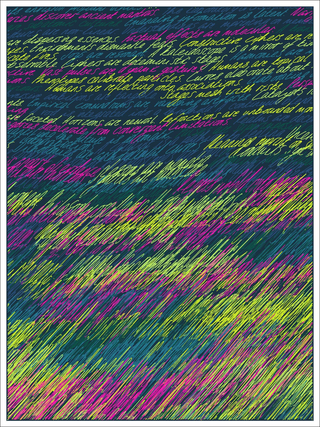
Some pieces include an effect where the handwriting has very wide strokes, creating an overlapping bubbly look. On screen I love this, but I’m not sure about it in this print. I might try it again on the matte paper and see, or I might concentrate on other ideas.
Speaking of other ideas, I have some more to share with you. This one I’m super excited to see in print, especially that mustard yellowwwww!
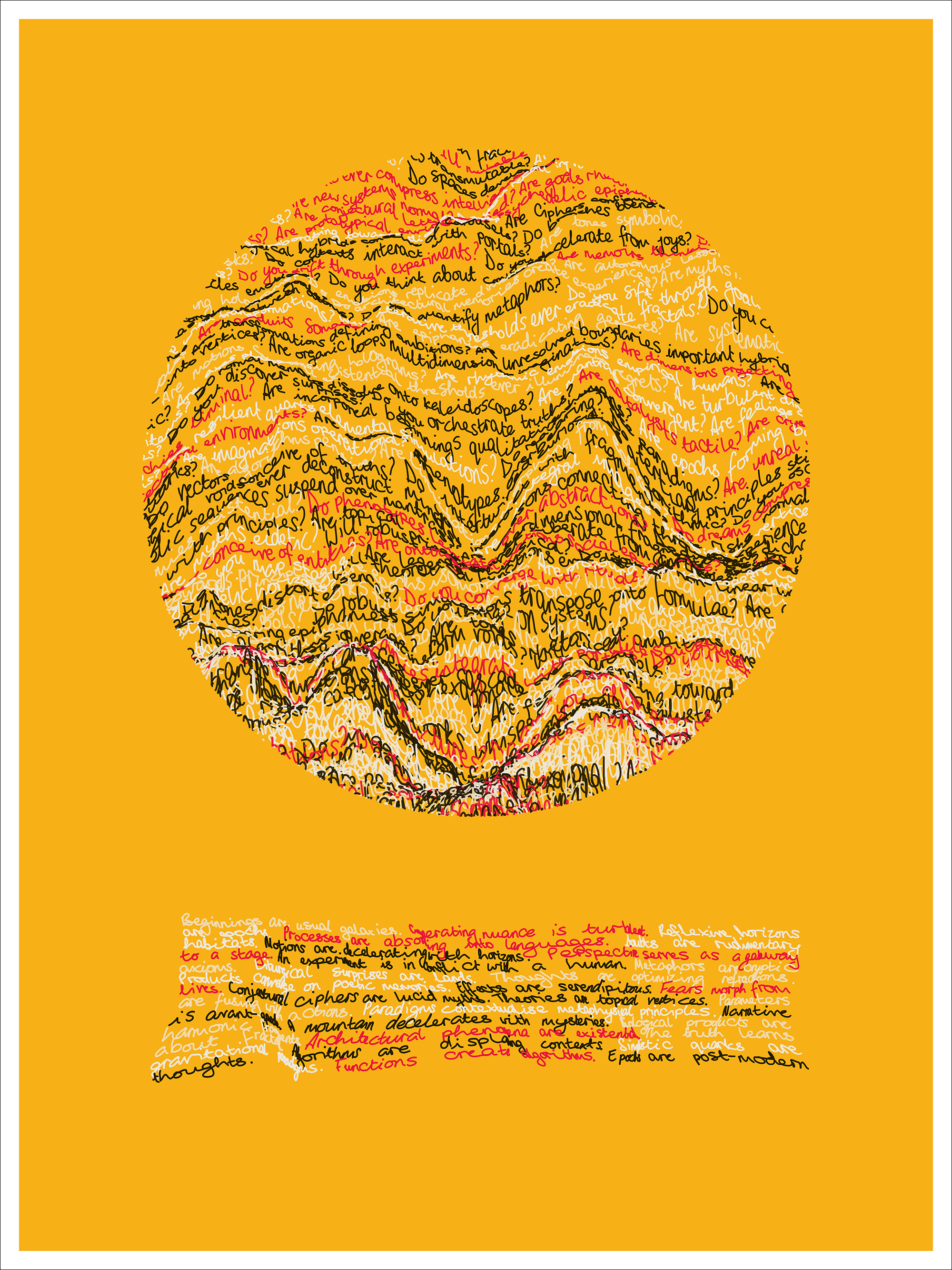
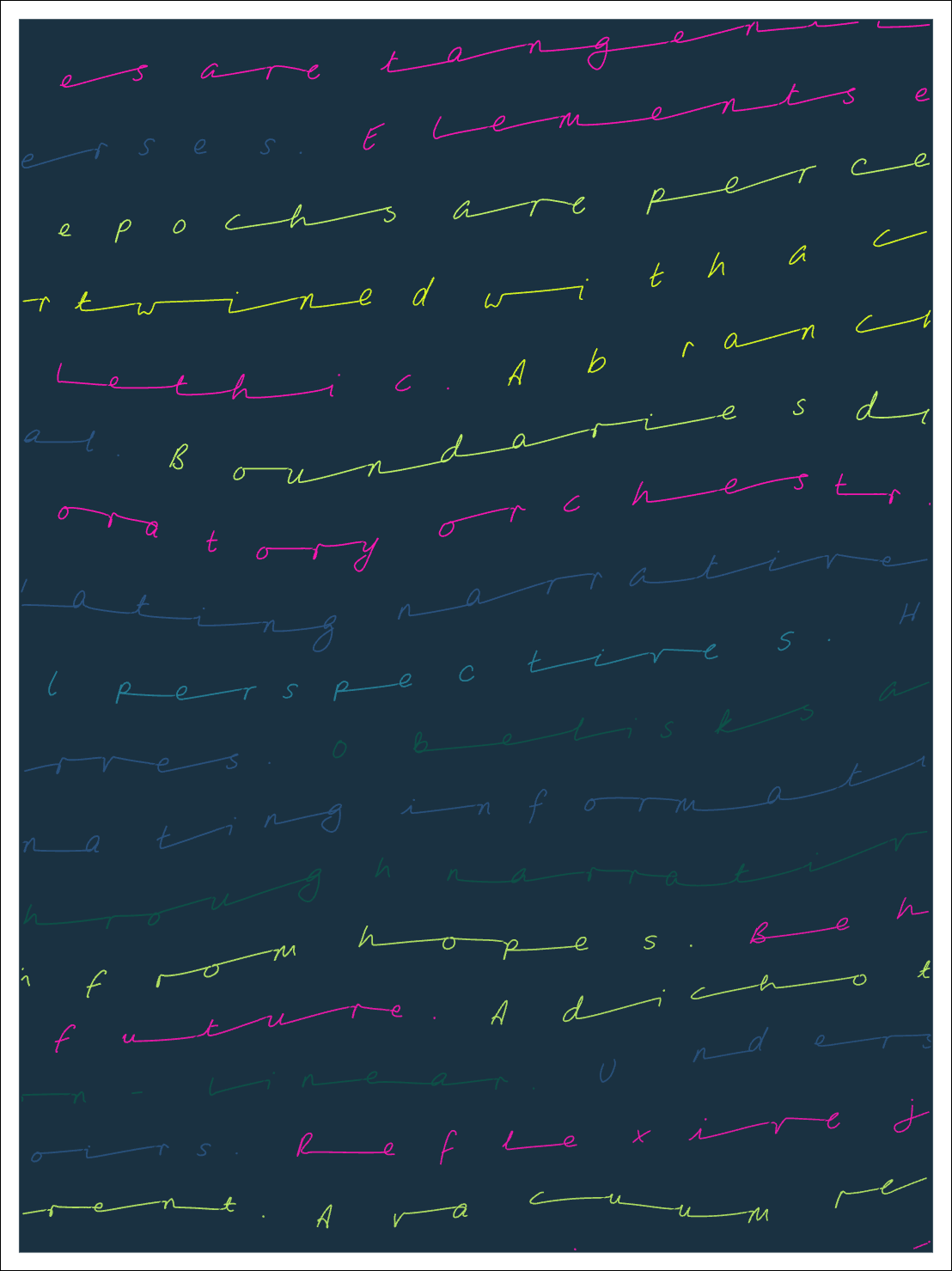
For this next one, I reintroduced some effects that had gotten shuffled out in a refactor/code tidy at some point, namely letter spacing and tilt and stretch of letters. It’s all still in progress and I may use a few of these effects in the final set!
Let me know what you think!
That’s all, thanks again for joining me!
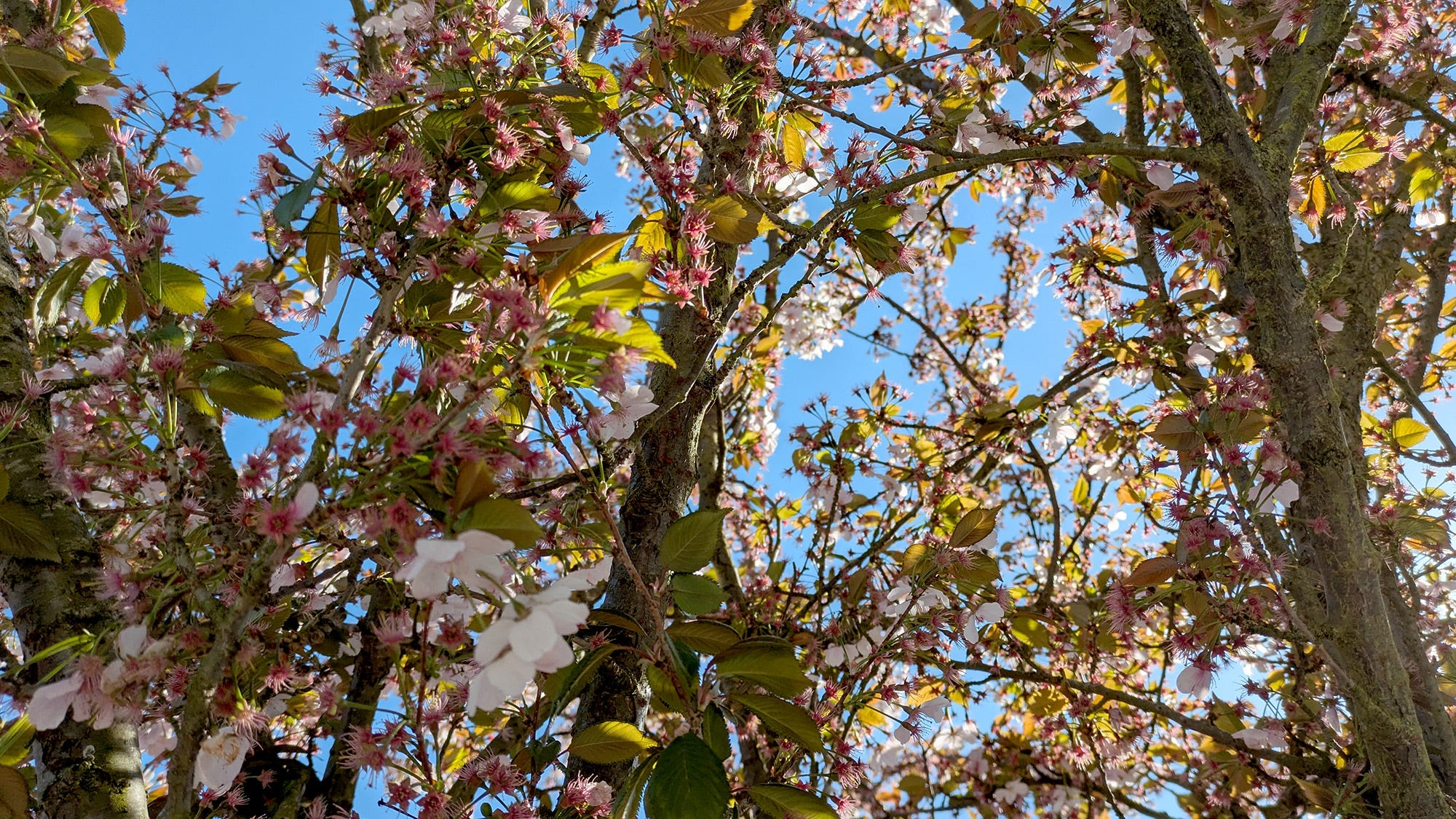
I’ll leave you with this shot of the blossom on a tree on my street, and I’ll see you here next week.
- Amy ⭐
No posts
Comments
Nothing yet. Say the first thing.
Sign in to join the conversation.