
Type Design
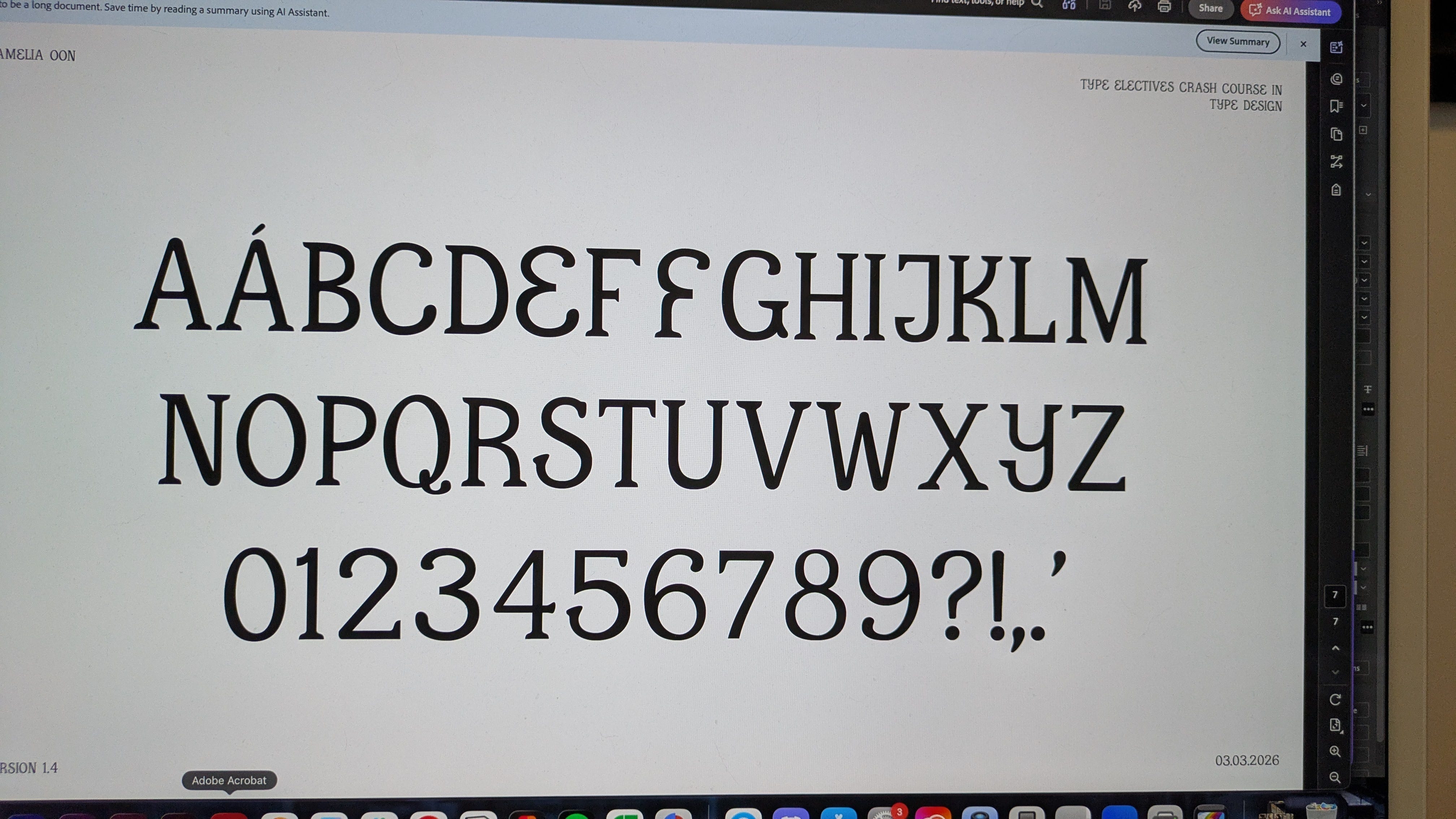
This month I took a type design class from Type Electives to finally fulfill a long-time bucket list item: designing my first font! As a former kid who would sketch out the alphabet in different “handwritings” over and over again, it’s something I’ve been thinking about but putting off for years. I finally decided that I would make it happen by signing up for a class and putting a structured timeline and outside help on the project.
The last class happened recently and I have a set of capital letters and numerals that still need some tweaking. I would say this phase of the project is nearly done! But over the next month or so, I’d like to also work on my lowercase letters, diacritics and other special characters before publishing the font for people to download. It’s been really fun getting to work on something that’s just for me and also fulfills a long time goal.
New Majority Capital Foundation Annual Report
I mentioned in last month’s newsletter that this project was close to, but not quite complete. If you didn’t see my last post, this is a website annual report that I did some design work on (layout/interaction, not visual direction or branding) with Ciampa Creative. It’s now finally launched!
Heated Rivalry
I’ve now, like everyone else and their mother, seen Heated Rivalry. My girlfriend and I binged it as our Valentine’s Day date, and I thoroughly enjoyed it! An outcome of watching this show that I fully did not anticipate was an itch to get back into making short films. The algorithm decided to show me a bunch of the lead actors’ short films on YouTube and it made me so nostalgic for the stuff I was making in college that I now have a note in my phone full of dumb short film ideas. If anyone in NYC wants to make a silly short film with me, let me know!
Pride (2014)
I watched this movie with some folks from Sunrise NYC and loved it. The film showcases the solidarity between queer protesters and striking miners, a message I always appreciate. I also appreciated the optimistic tone of the movie, especially considering the subject matter could have easily been portrayed as a tragedy (we’re living enough tragedy in these times that it’s good to have a break!)
“I have No Mouth and I Must Scream,” Harlan Ellison
I saw this short story recommended in the comments section of a video about AI bots insulting humans on their own automated social media platform. It’s always interesting to read about people having the same sentiments and predictions in the 60s as they do now.
The Politics of Design, Ruben Pater
I started this one recently and despite the short length haven’t finished it. But so far I’m enjoying reading about the myriad of examples of how politics and culture influence design and vice versa.
I’m also still working on 1Q84 and The Death and Life of Great American Cities from last month but it’s been a slow reading month for me so not much progress there.
Brooklyn museum
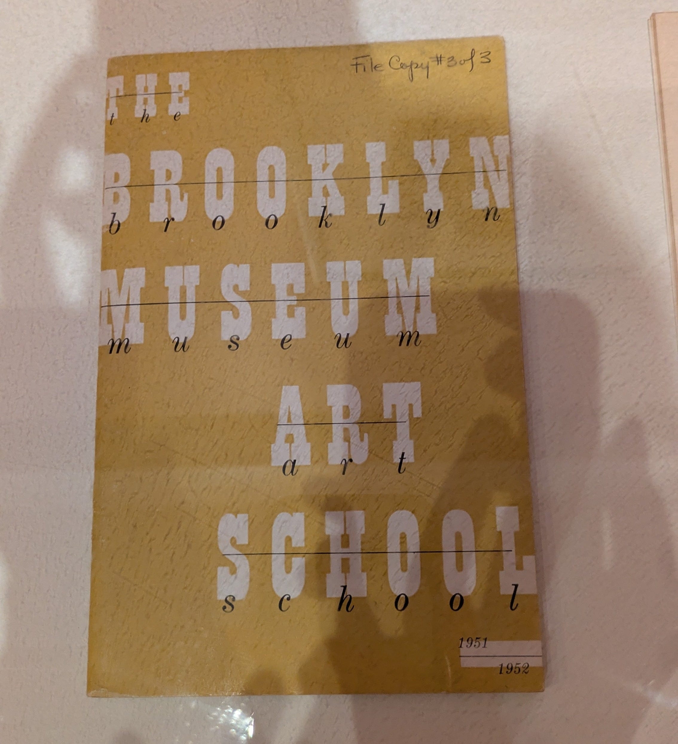
Earlier this month, a couple friends visited and we went to the Brooklyn museum. It’s been a few months since I’ve been to a museum and even longer since I’d been to the Brooklyn museum in particular. I’d forgotten how inspiring it is to see art in person! It also happens to be the Brooklyn museum’s 200th anniversary so there was plenty of art inspired by the city that coincidentally sparked an idea for a project that I’ll be working on in the upcoming month. More on that further down!
Type Tonight
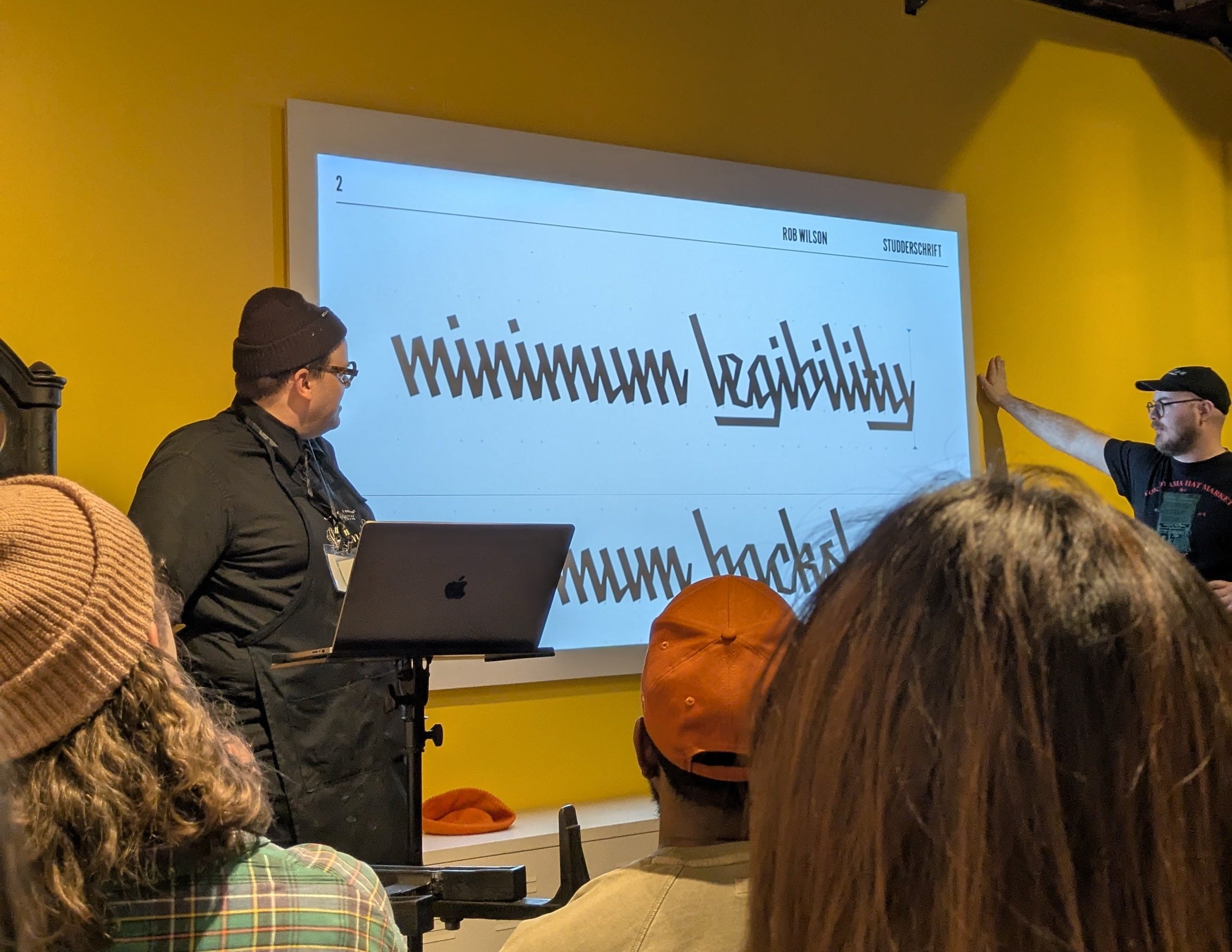
I attended, for the first time, Type Tonight, a monthly typography event here in NYC. In contrast to more formalized presentations you might find at AIGA, Type Tonight is a more intimate gathering where designers present their work and ask for thoughts and feedback. It was really cool to see what other designers are working on and also to hear the particularities that more experienced designers pick up on when it comes to critiquing a font.
I’ll be making a piece of art to submit to the Sunrise NYC Art Show! Sunrise NYC is a climate organizing group I’m involved in and we’re planning a fundraiser art show for the spring. The theme for the show is The Future of New York and we’re taking submissions here.
I’ll be working on my own submission for the show: a collage piece that consists of newspapers headlines about the rising affordability crisis of New York. I’ve started scoping out newspapers and can’t wait to get started! (If you live in NYC and have any old newspapers, lmk!)
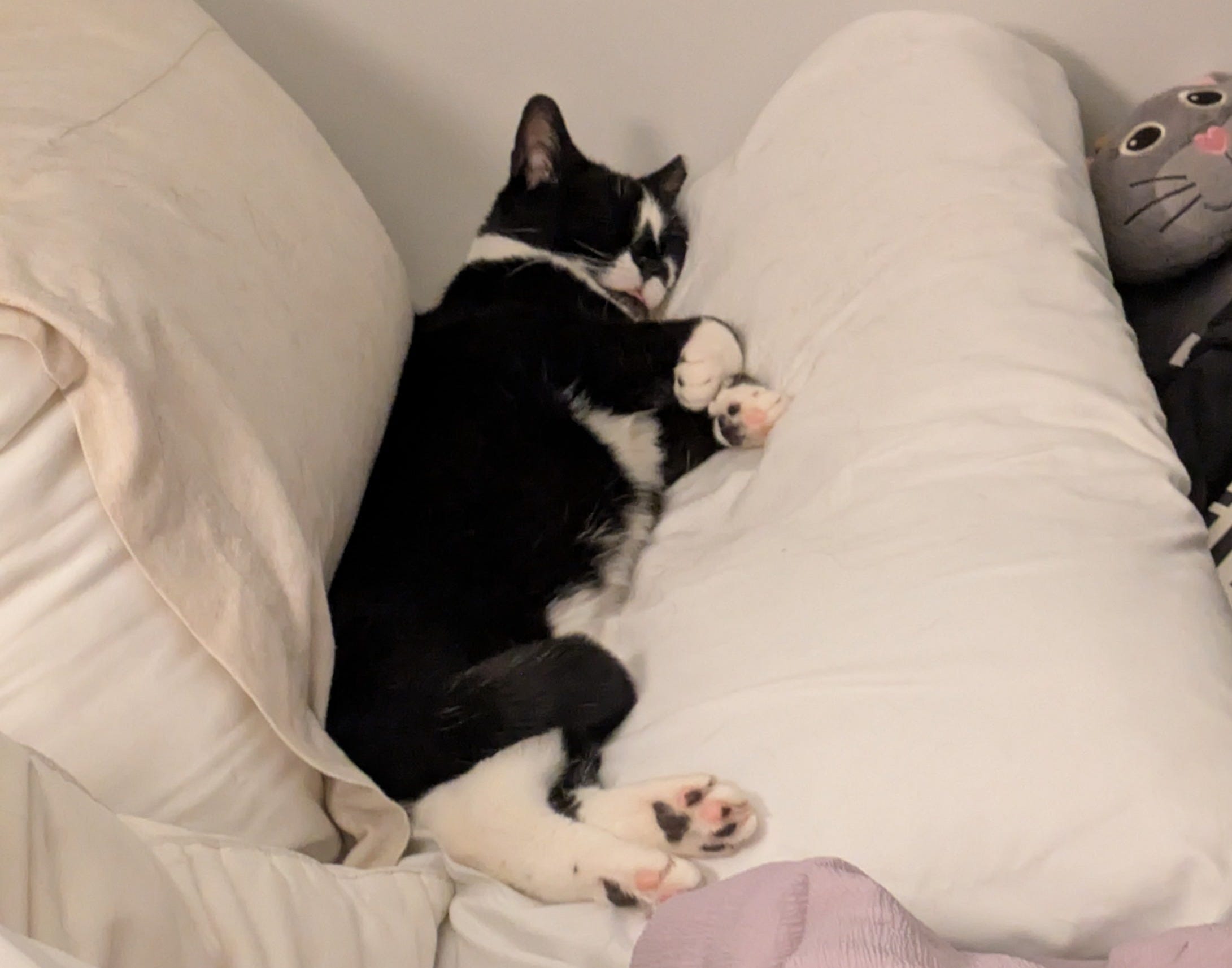
For making it through my long winded spiel you get a photo of my perfect baby cat, Tuna!
Comments
Nothing yet. Say the first thing.
Sign in to join the conversation.