

I think my former article, “Before you build a dashboard,” mainly covers this point, but for @DataYap, this is a skill that shows a data professional with experience.
This is Part 21
For entry-level analysts, BI analysts, or tech professionals, a dashboard is “done” when it has multiple charts and designs. That’s the finish line.
For an experienced professional, a data visualization is “done” when it directly answers a question without confusion.

How to show experience and data maturity in data viz:
Using Calculated Columns to answer questions:
Here’s an example I used in my last article. Weekly signups. If you’re asked: “Can you show weekly signups?”
You could throw the counts on a line chart, but that’s exactly what a beginner would do. Weekly signups are just numbers until you shape them into something meaningful.
Instead, you can create a calculated column that flags whether the signup came from the landing page experiment or the default flow. The same chart goes from “weekly signups” to:
Which flow drove more users
Where the drop-off was happening
Whether the experiment was worth keeping
Calculated columns reframe the question, allowing the visualization to speak for itself.

UX Matters (Even for data folks)
Took a while to admit this, but a dashboard is a product. The user is whoever opens it: your manager, a client, or the team.
If they can’t navigate it or don’t know where to look, the insight dies on the page.
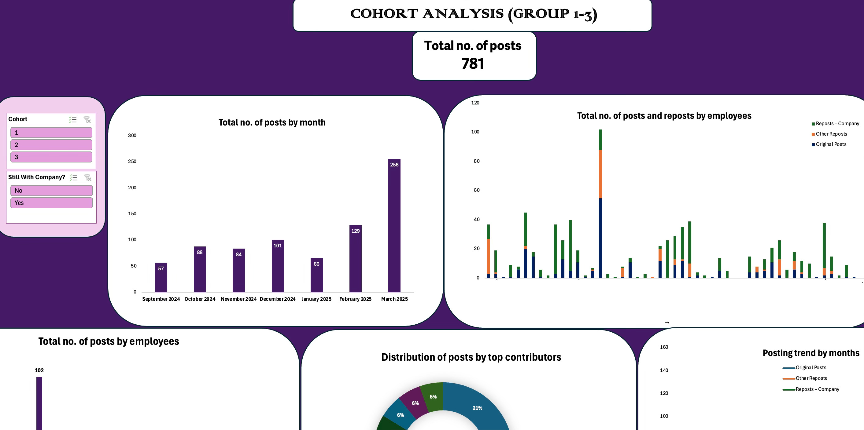
Make your product easy for users by:
1. Sorting by what matters most (instead of alphabetical order)
2. Highlighting the outlier
3. Writing plain labels (“New Customers”, not “Cust_Acct_ID”)

Hitting the nail on the head
A common phrase that means get to the point.
A good chart doesn’t waste words.
Bar for comparisons, line for trends, scatter for distribution, or if you want to be risky.
Yes, there are some lovely and incredible chart designs. If you have Tableau Public, you will see some fantastic work, but they tell you what you need to know and how to navigate these dashboards.
Don’t squeeze too many KPIs into a dashboard, remove some of the vanity metrics.
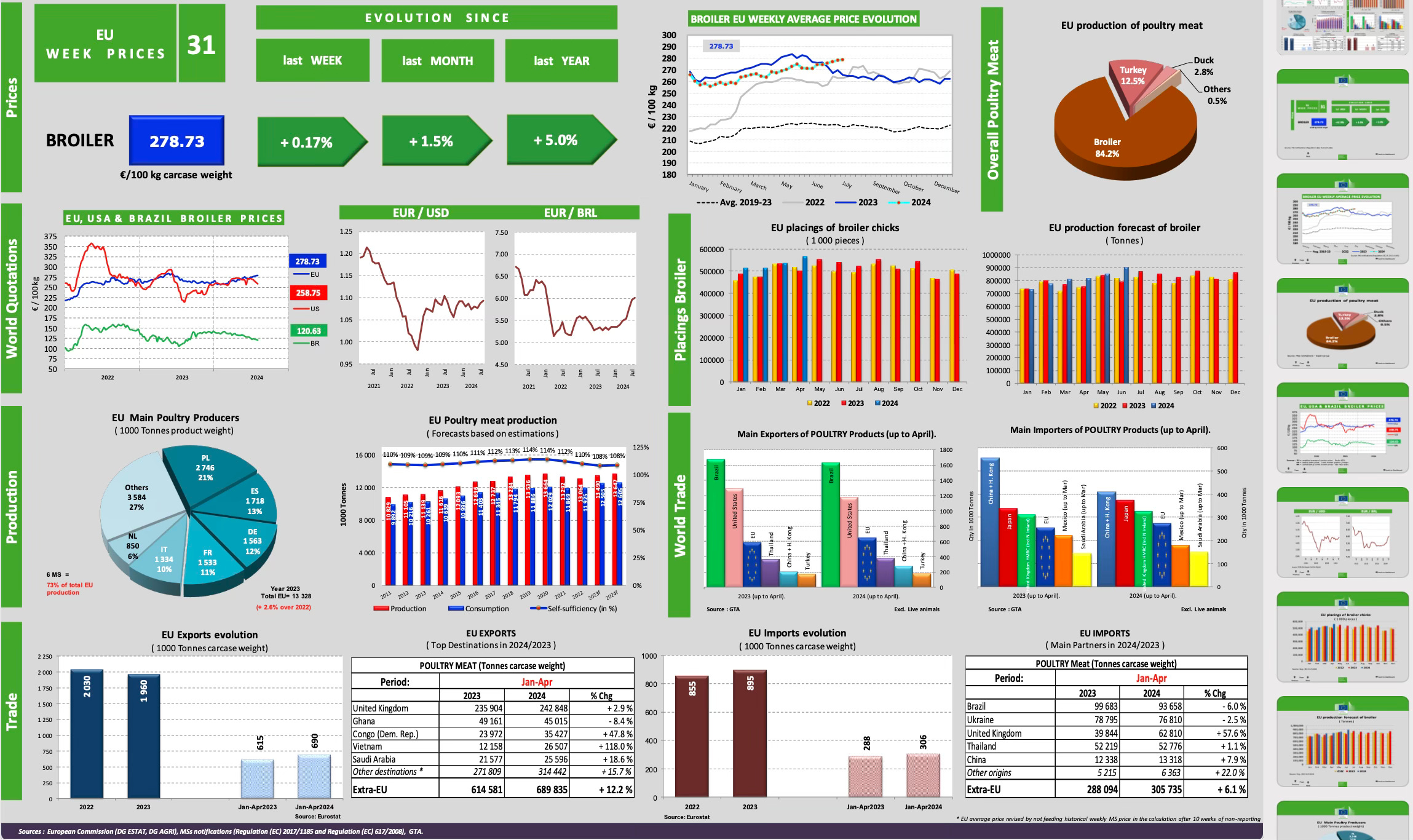
If your stakeholder requests weekly signups, don’t stop there. Ask: “What are you trying to decide?”
For example, if it’s a budget allocation, show signups per channel.
If it’s product performance, show retention curves.
If it’s campaign testing, show conversion deltas.
Same dataset, different stories. Maturity is choosing the one that hits the nail on the head.

Fun, but serious.
Data viz is a lot of serious work, but it doesn’t have to be sterile. I keep charts readable but not boring.
Add some color for emphasis, but don’t go overboard. Include some whitespace and annotations.
The fun is in making someone see what you saw, faster.
Data maturity means answering the questions about a dataset for the person trying to use the data and the “corresponding answers”.

Conclusion

A bad viz can ruin a good dataset. I know this because I have some bad viz too.
A well-designed chart can make complex data more accessible.
That’s the difference between drawing graphs and communicating.
Data maturity.
Till next time, see you in Part 3,
- Amy

Enjoyed this? Read, comment, share with your team, subscribe for more.
Be data-informed, data-driven, but not data-obsessed
🔗 Biz and whimsy: https://linktr.ee/amyusifoh
🔗 Connect with me on LinkedIn and GitHub for more analytics insights.
🔗 Get the free design toolkit and workflow: dashboard design toolkit
Data analyst ⬩ Spreadsheet advocate ⬩ Freelancer ⬩ Turning data into useful insights
Read Part 1 here: Achieving data maturity (PART 1)
Thanks for reading Data according to me...! Subscribe for free to receive new posts and support my work.
Comments
Nothing yet. Say the first thing.
Sign in to join the conversation.