
It’s the summer of 2019, I’m a new college grad with a lifetime of creative endeavors but no creative degree to show for it, and big dreams to start taking on graphic design clients of my own. I had just stepped away from the idea of continuing my education in communicative disorders, and instead of grad school I work full-time that summer for my dad’s print shop. The choice that changes everything.
I still remember my mom telling me, “Say yes to the client inquiry! Even if you don’t know what you’re doing! You can always ask dad!”
That mindset — a combination of slightly delusional confidence and a willingness to figure things out along the way — is what propelled Poised Avenue into what it is today. Despite having no formal graphic design training, I've gone on to work with brands/clients like Minted and Zola. So if you're waiting until you feel "qualified" enough, consider this your reminder: just go for it. Say yes to the project. You can always ask me.
That’s exactly what I want this series to be. A back pocket resource for all things print design. Where you can ask questions and learn new things — and teach me some stuff along the way too! Because I get it, designing for print is intimidating. But if you don’t ever try, how do you know what you’re missing? Projects you could have said yes to are slipping by every time you talk yourself into feeling disqualified for the job. I’m no better designer than you, and I’m here to show you what’s possible in the world of print. So saddle up, cowgirl, and enjoy the ride!
Designing for a screen is very different than designing for paper, or any other print substrate1. For starters, a design meant for screen can often be edited over and over if mistakes are found. However, a print can’t be edited once it is printed. This is often the most intimidating part of print because it means that your design file must be perfect in order to yield the print results you’re after.
So, what are the biggest differences in designing for screen versus paper?
The first and biggest would be color. Or, in other words, designing with light vs designing with ink. And yes, to be fair, even print design starts on a screen. But this is why understanding the ideas below are so important. Because if print is your end goal, you must know the constraints of using digitally rendered colors and how those colors will be translated to ink.
In digital design, color is created with light using RGB, an additive color model. This means colors are formed by adding light. So the more light you add, the brighter the result becomes.
In print, color is created with ink using CMYK (otherwise referred to by printers as four color process) or Pantone (or PMS). This is a subtractive color model, where inks absorb (subtract) light rather than emit it. The more ink is applied, the more light is absorbed by the paper, which determines the final color you see.
Because of this, RGB has a much wider color gamut2 than CMYK or PMS. You can see this visually defined in the graphic below.
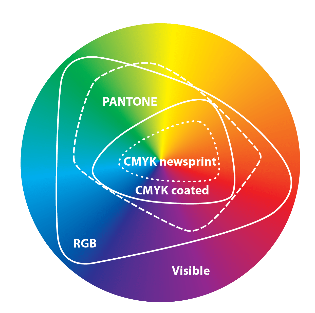
With what we discussed above in mind, you can now understand that color can shift slightly between digital design and print. Typically, this is caused by color settings on your desktop, not starting a print design in the CMYK color space3, or not understanding the ways your ink will lay on your substrate. All three of these things are important to note whenever designing for print.
Because screens are backlit, colors on your screen can look brighter and more contrasted than they will in print, even if you are working in a CMYK colorspace. That’s because ink absorbs parts of the light that hits it, and the paper reflects the rest back to your eye. This is why both the type of paper you choose and where the piece is viewed will affect how color appears in print.
For example, an uncoated stock will absorb more ink than a coated stock, making colors slightly more dull or less crisp. And of course, color will change slightly if the stock you’re using is colored itself.
Surrounding light sources can also effect color. Color will look most accurate under natural lighting than any other type of lighting. Just like the color of a stock can slightly change how an ink color is perceived, so can surrounding lighting. A banner, for example, hung outside will appear differently than a banner hung inside a warm-lit hallway.
These factors don’t replace strong color choices in the design file, but they directly influence how those choices are ultimately perceived in print, making them important to consider too.
Understand the colorspaces and their respective gamuts. Hoping to print in CMYK but designing outside of the CMYK gamut will only lead to disappointment, muddied colors, and added costs when you’re forced into PMS for color-matching.
Always design with the final product in mind. Keep things like what substrate you’ll print on or where/how the print will be displayed/handled.
Don’t rely on your screen to judge color contrast. In print, colors often appear slightly more muted or flattened than they do on a backlit display, so it’s important to design with that shift in mind. Instead of relying on subtle differences between colors, build in intentional contrast early in the design process so hierarchy still holds up once printed.
Choose your paper as part of your design. The type of paper and the paper’s color should be considered at the start of your design process. For the most accurate color match, use a true white paper stock.
If you want to hear me talk more about print, listen in on my latest podcast interview with Jen of Better: the brand designer podcast where we talk all things print design!
And finally, if you enjoy learning about print design, be sure to subscribe!
I put out new print education posts every first Friday of the month. If you want a deeper dive into print, consider becoming a paid subscriber for just $5 a month to gain access to my printer interview series (coming this month!) where I’ll ask the most burning print questions to the print experts themselves. New printer interviews will go live every third Friday of the month.
See you guys in the next Print Education post, where we’ll take an even deeper dive into color! If you have questions about color in print, be sure to drop them in the comments below!
Until next time!
In the printing industry, a substrate is any base material or surface onto which ink, toner, or paint is applied. It is the foundation of the print and can vary widely. Common substrates include paper, cardstock, plastics, fabrics, metals, and glass.
A color gamut is the specific range of colors that a device can capture, display, or reproduce.
You can still start in an RGB colorspace if you are confident in color matching or converting colors for print. But I prefer starting in CMYK if my intent is to print.
Comments
Nothing yet. Say the first thing.
Sign in to join the conversation.