
I have a complicated relationship with the color pink.
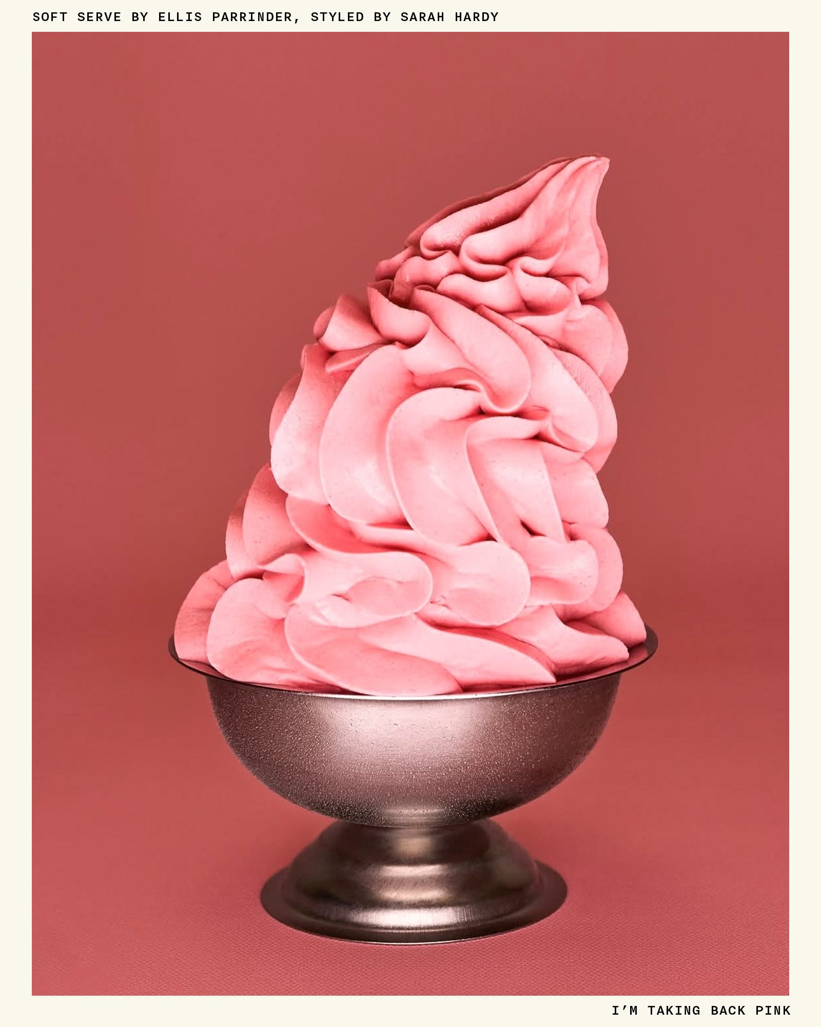
I think most designers (or just anyone aware of color trends) can relate to the fixation-to-visceral-rejection pipeline a color can take. It’s like when you eat Greek yogurt every morning for breakfast and then suddenly, without warning, your trusty 2% Fage is utterly revolting. Sometimes that shift comes from overuse, a negative association or memory, or the color’s place in the trend cycle at any given moment. For me, when it comes to pink, it’s all of the above.
I worked at a brand called ban.do from 2012 through 2020, where I started at 22 as a graphic designer and left at 30 as the creative director. (I could write essays about my time there, but I’m saving it all for the memoir, as they say.) If you remember ban.do in its heyday, you probably remember a brand bursting with color, quippy-now-cringey sayings (“Not without my coffee!”), and lots of things shaped like other things (pool floats shaped like soda cans, stress balls shaped like croissants, and so on). It was playful, tongue-in-cheek, and of-the-time. It was also very, very pink.
The Pantones we had on regular rotation are burned into my memory: 806 C, a cool-toned neon pink, for our packaging in the early days; 706 C, a powdery blush, for our first collection of yoga accessories; and 176 C—Millennial Pink at its finest—for just about everything else. By the time I reached my eighth year at the brand, I was over it. I got the color ick. So when I left my job, I left pink behind, too.
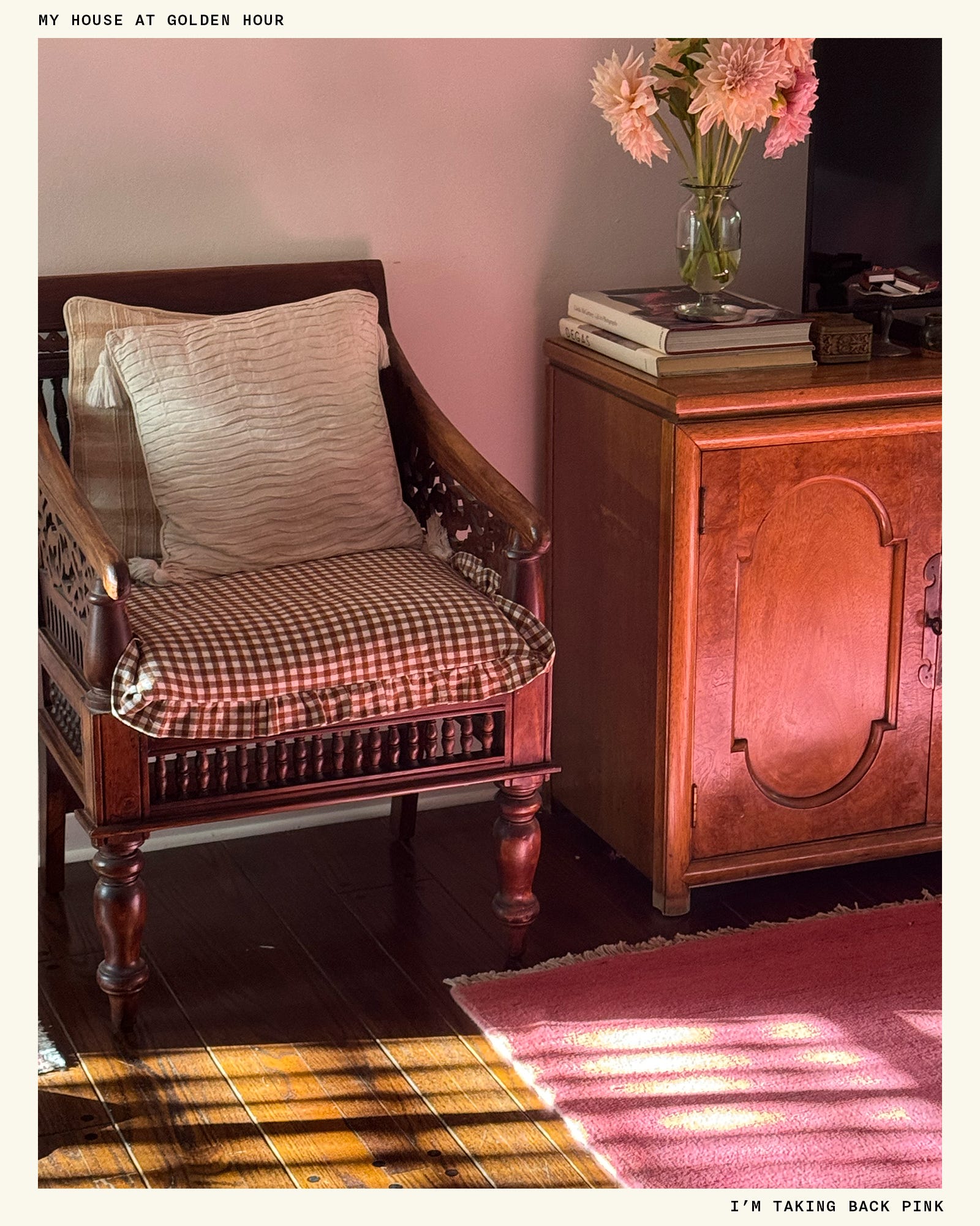
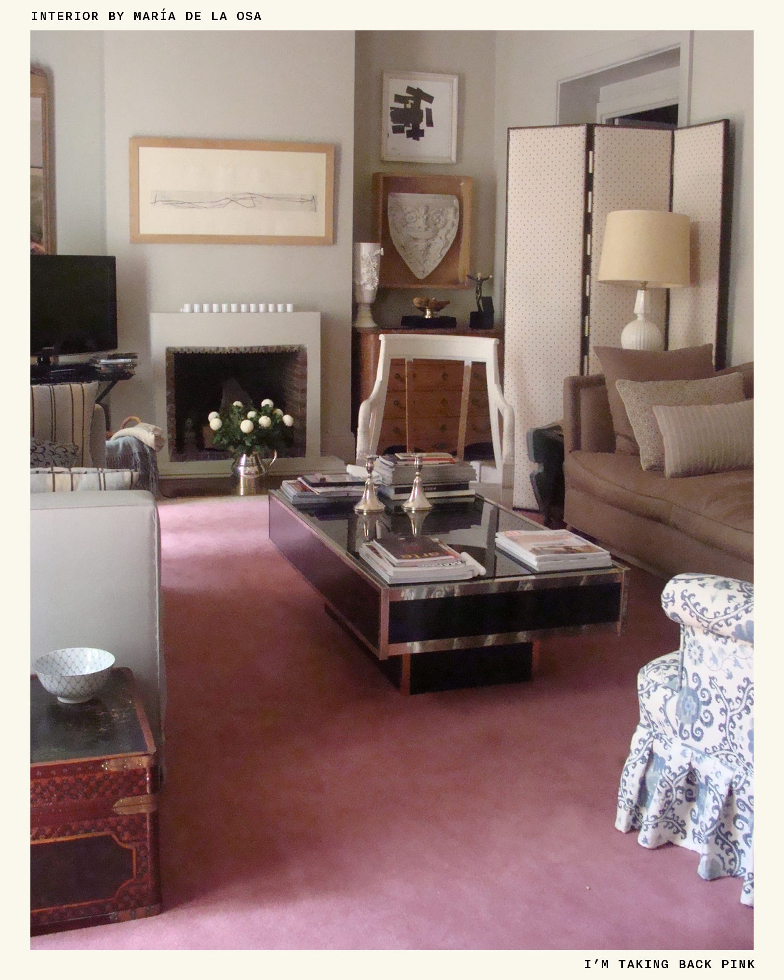
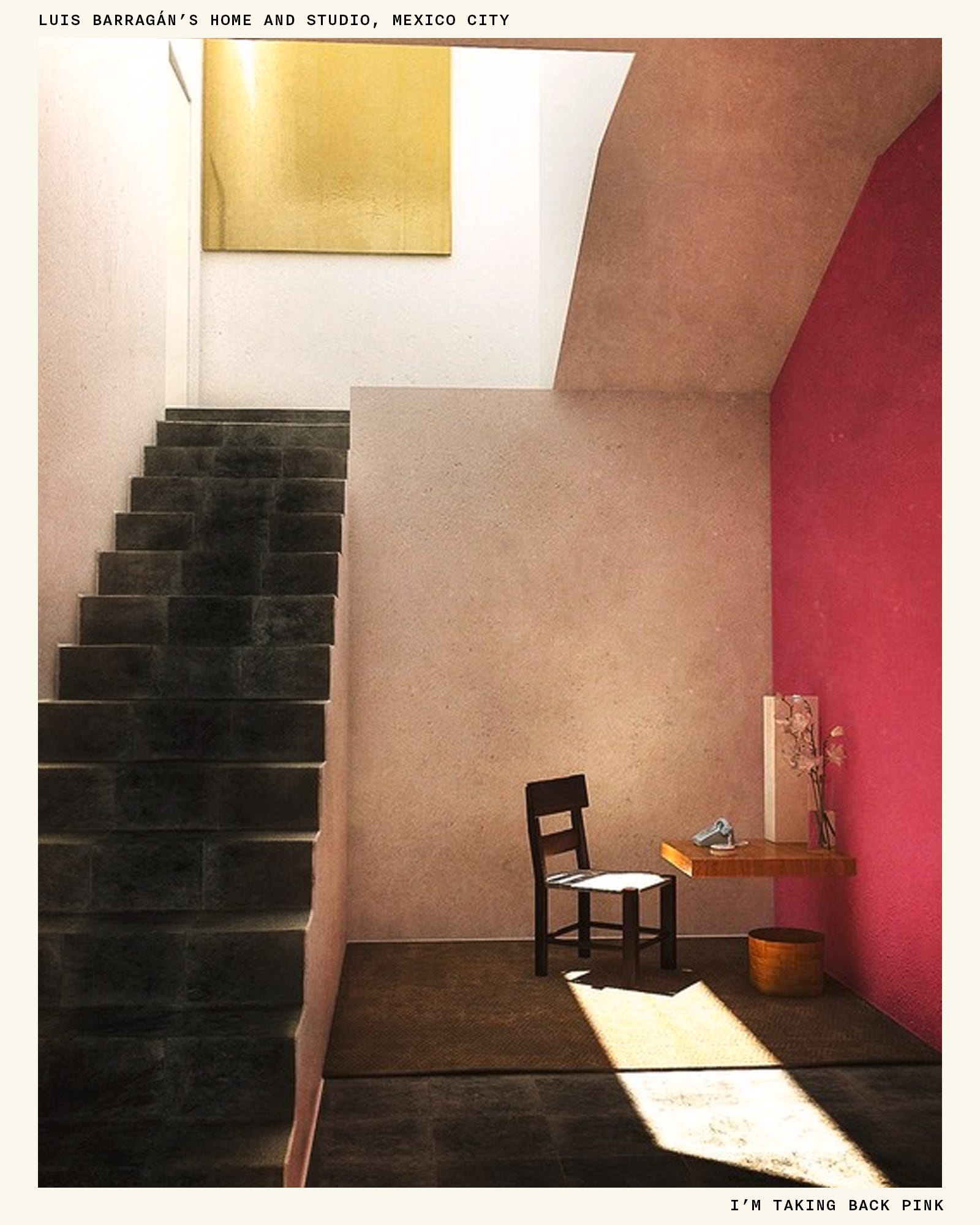
Which brings us to this year, when, as many of you know (because I won’t stop talking about it), I ended up with 8 by 10 feet of a hot pink rug beneath my feet after months of searching for just the right thing. It was a move that shocked even me—almost everything in my apartment is a shade of brown or cream, and I wasn’t sure it even made sense, but it felt right. I kept coming back to Luis Barragán, the famous Mexican architect whose homes were equal parts rustic folk art and surfaces painted in swaths of bright color. Barragán’s house and studio in Mexico City has stayed with me since I first visited in 2018, and I often think about how his wood tones and stone floors successfully coexist with a bright yellow ceiling and hot pink walls. Something about this pink rug felt aligned with a Barragán-ian sensibility, and that was enough for me to take the risk.
We all have those things—a color, a pattern, a scent—that remind us of something specific, like a distant era or a person or a place. But I think it’s in our best interest to open ourselves up to the possibility that we don’t have to ban something—even Millennial Pink—for the rest of our lives; we just have to recontextualize it. Color isn’t a binary thing—something doesn’t have to be either neutral or colorful, and you don’t have to be someone who wears color or doesn’t. If I can rehab my relationship with pink, the same is true for the pops of red you amassed in your closet two falls ago or the butter yellow duvet cover you bought on a whim.
A few tricks to undo the ick:
I surround the color with neutrals.
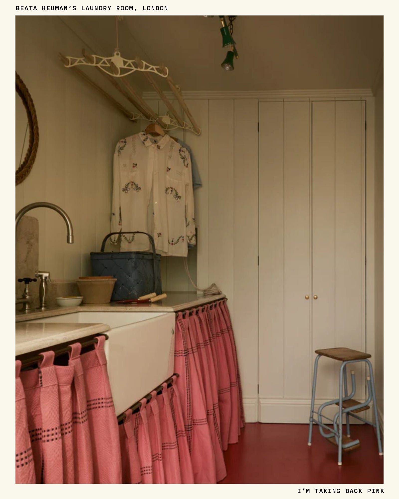
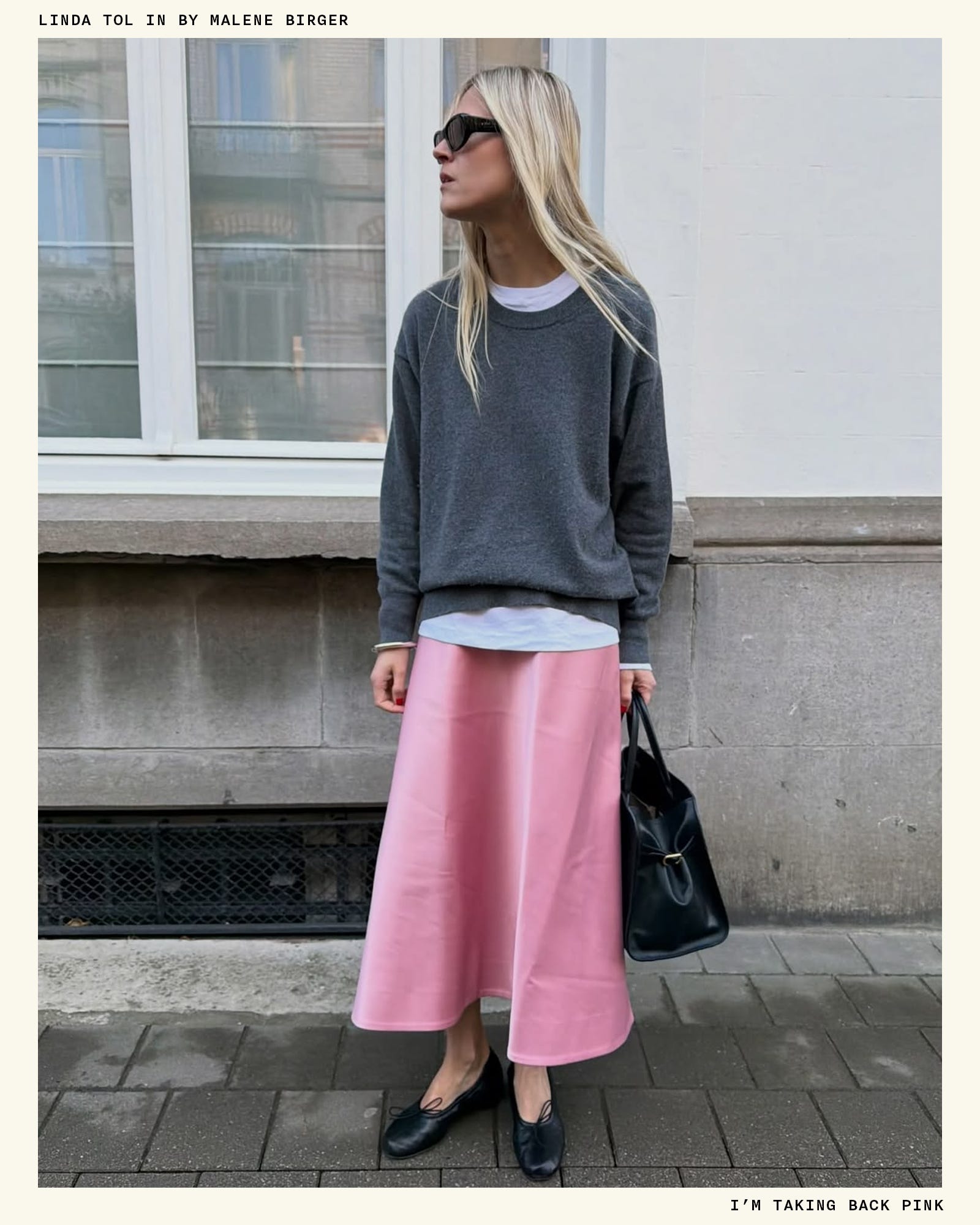
The simplest way to introduce a color into (or back into) your life is to choose just one instance for that color to exist in an otherwise neutral space. The pink rug is a good example of this—almost everything else in the room is wood or white linen, so it can peacefully breathe without needing to complement anything around it. I have a pair of pink Yuni Buffa flats that I love, but I only ever wear them with neutrals, like my J. Crew khakis or my Donni sheer cargos in black—it’s just how I feel most comfortable.
I think about texture.
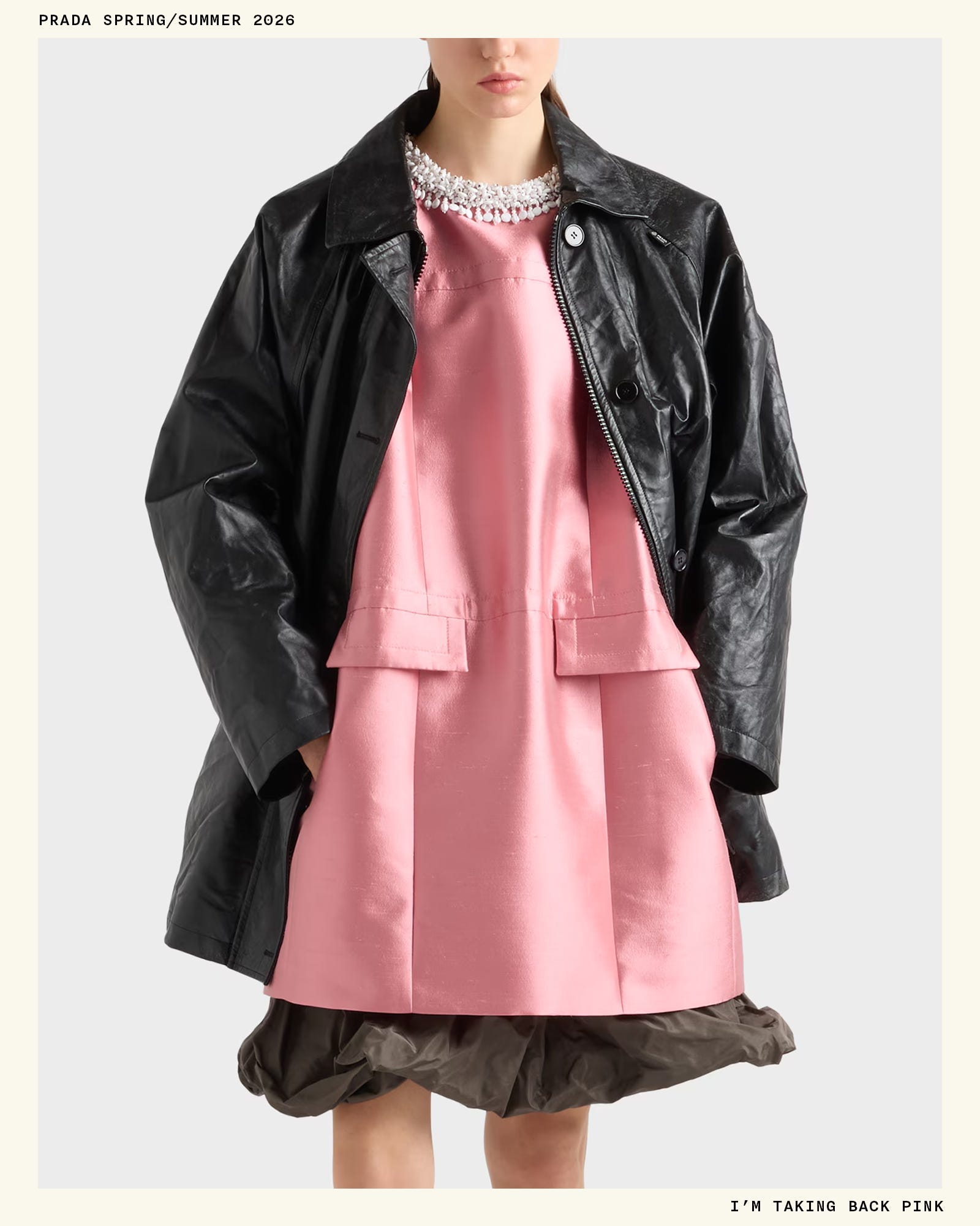
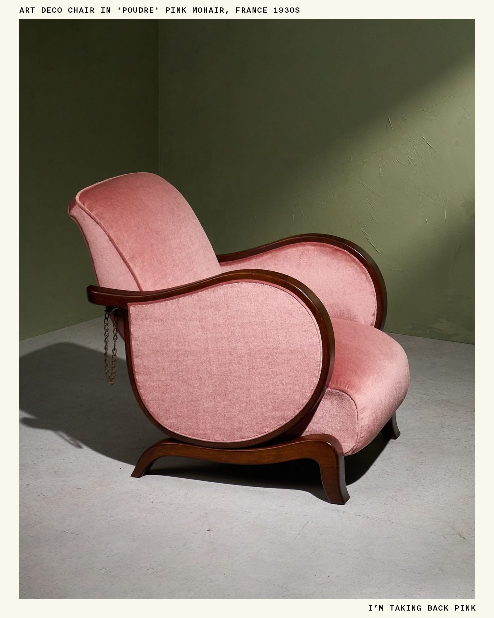
Sometimes it’s the combination of a color and a texture—for me, shiny pink plastic—that’s the issue, and by being more intentional about that combo, you can break through the negative association. Pink is obviously so sweet, so by balancing it with something like leather or wood or mohair, it can be pulled into another tonal territory, one that’s a little more interesting. I bought a Valesque bag earlier this summer in a perfect petal-y pink (sold out, but more colors here), but the reason why I like it is because of its thin, black leather handle. If the handle were made of the same material as the body, or if it were something like silver metal or a gold chain, it would feel too girlish for me, but that contrast really works wonders.
I get weird with color combinations.
Millennial Pink is doomed when it’s paired with light blue, mint green, or lavender—2016 killed those color combos, and I don’t know that they’ll recover in my lifetime. But like texture, sometimes it’s the unexpected pairing of two colors that creates the contrast you need to make a color feel new again. Combining dark brown and hot pink has become a go-to for me, personally—it’s not something I would have done ten years ago, and now I can’t stop. Sometimes I like to think of a particularly “icky” color, like a yellowy beige or a trash green, and see if it works when paired with a non-icky color, like a bubblegum pink. I’m often pleasantly surprised.
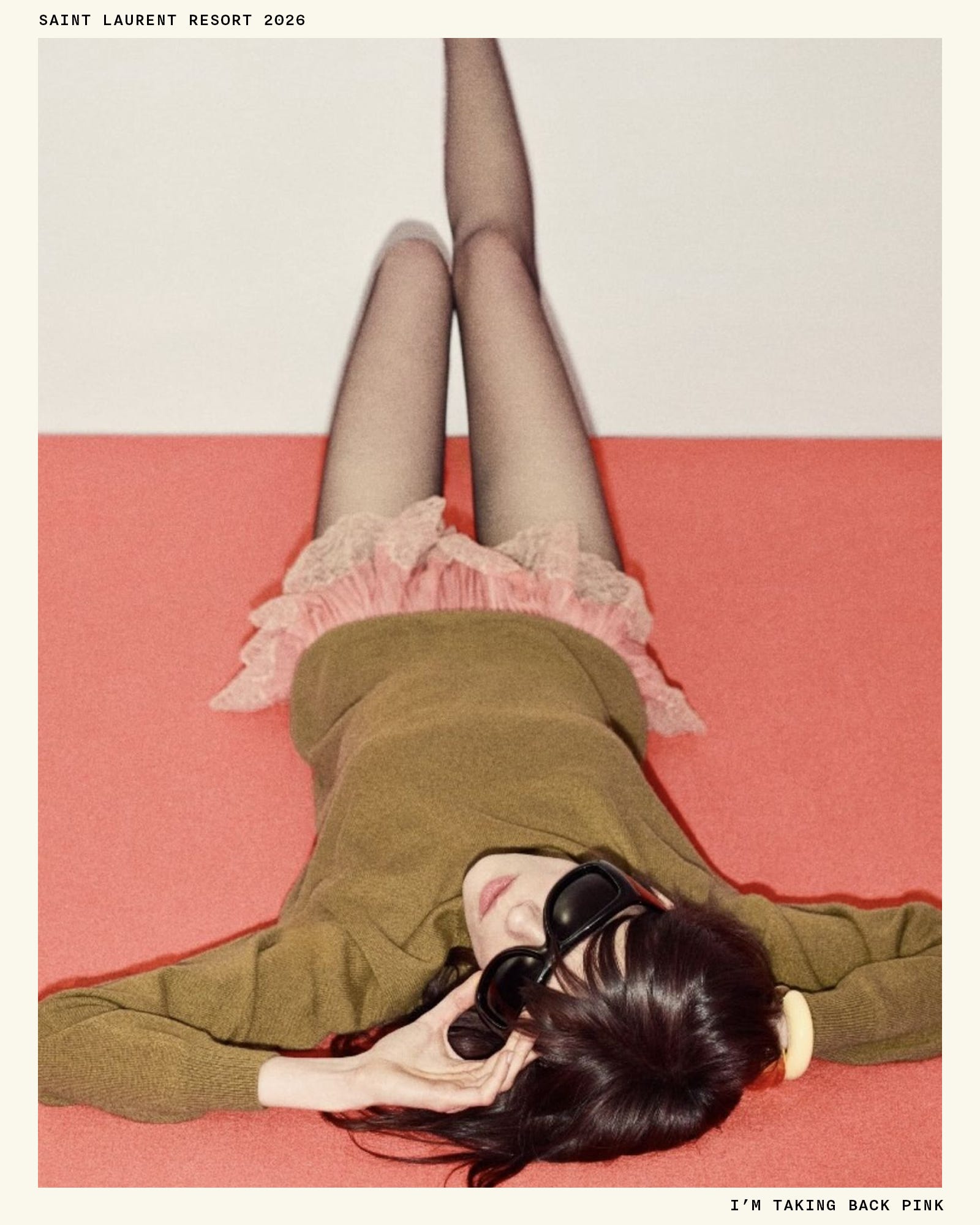
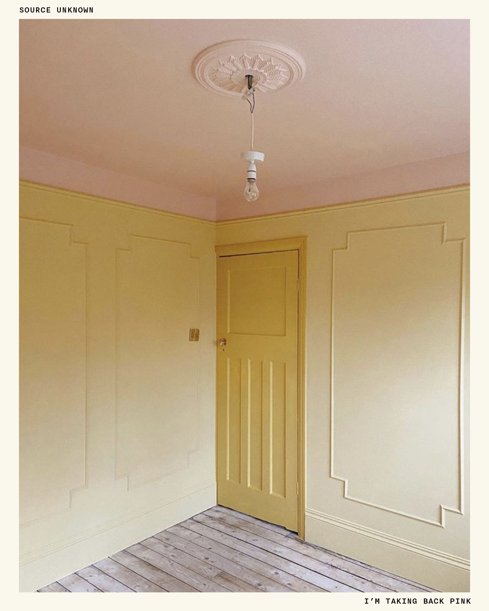
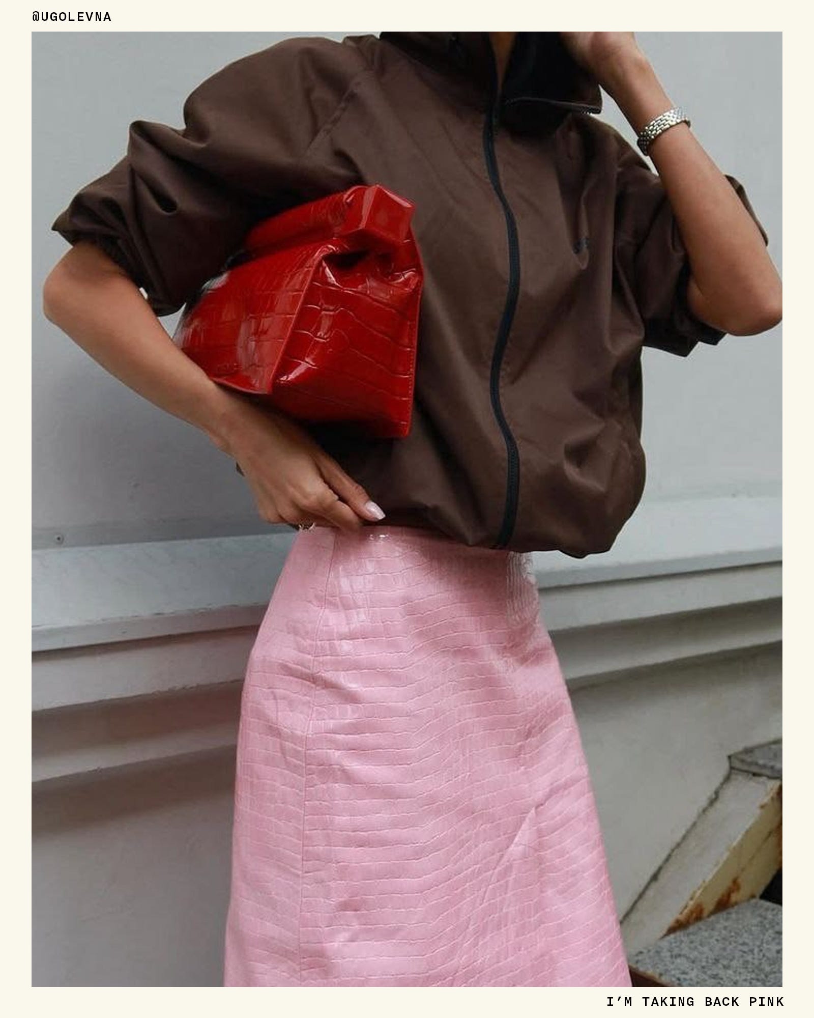
I think it’s good to revisit our visual proclivities once in a while. Allowing art and design and passing trends to influence you a bit isn’t a bad thing—it’s what keeps things interesting. Who knows what innocuous thing I currently hate will become my entire personality next year! But if you too have gotten sucked into a color trend, or maybe you just went through a phase, hope is not lost.
x
Ali
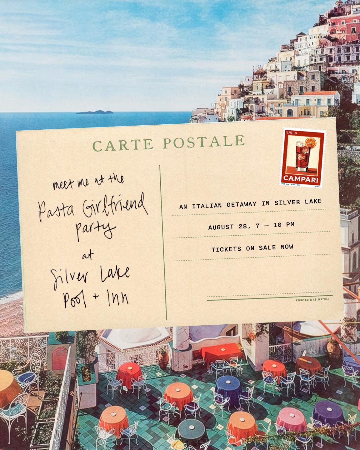
LA! I’m having a big party in Silver Lake on Friday, August 28th!
Pasta, cocktails, and sunset views. Details and tickets here.
You Too Can Live in the World of David Hockney
·
Jul 31
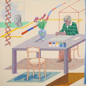
I can’t think of an artist who has had a bigger impact on me personally, so in the spirit of his work and wardrobe, I’ve gathered a few things that remind me of David Hockney’s greatest artistic and sartorial hits—especially in his LA days.
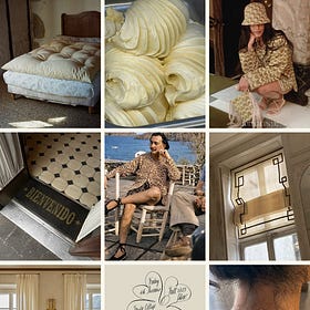
You Should Start a Cookbook Club
·
Jul 16
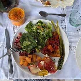
Last weekend, my cookbook club assembled for our twelfth dinner in my friend Victoria’s backyard. We’ve been meeting on a near-quarterly basis for three years now, and as the club founder and self-appointed president, it’s one of my most treasured extracurricular activities.
Comments
Nothing yet. Say the first thing.
Sign in to join the conversation.