
TL;DR: Last week I ran a simple experiment in my Notes. By the end of it, 29 creators had made their own magazine spreads of themselves, I gained 21 new subscribers, and Chad Thiele and I ended up building a library of 22 publication styles together. Here’s what actually made it work — and how to run your own version.
The best Substack content doesn’t just inform people. It makes them feel like they belong somewhere.
The projects that spread aren’t always the most polished. They’re the ones that make people feel like they have a place in them.
Hey! I’m Pinkie. I help creators build recognizable Substack brands that drive consistent subscriber growth. I share the exact branding systems, prompts, and workflows I use to transform ideas into distinctive, repeatable output. If you’re new to AI Meets Girlboss, welcome! If you’d like to work with me on your brand, let’s collab! 🩷🦩

What you’ll learn in this post:
Why some Substack content gets recreated, not just liked — and the 6 mechanics behind it
How a single Prompt Tuesday note turned into a 29-person community experiment
7 publication styles to try, with prompts ready to copy
How to pick the one that actually fits your brand
The full 22-prompt library as a downloadable resource (paid)
Daria Cupareanu built an interactive Christmas tree with 90+ Substack creator ornaments. Each one a real creator. Each one clickable. You could add yourself.
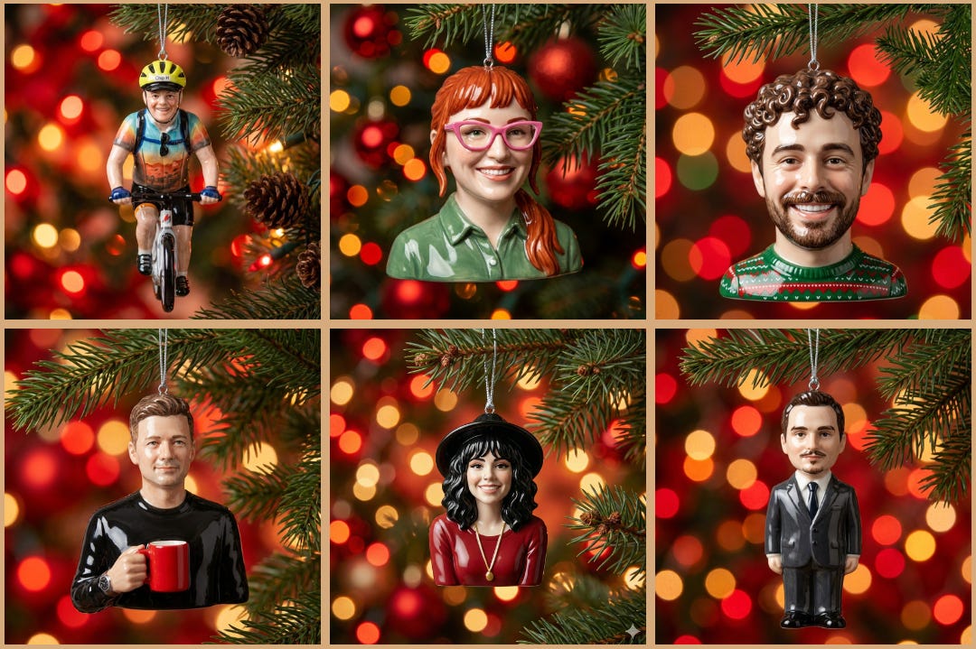
“This whole thing started as a small gesture of gratitude. In the very last moment before publishing, I almost didn't… I felt embarrassed to show this corny side of myself. But I couldn't let all the work go to waste, and I really wanted to put a smile on people's faces. It was very well received, and all the buzz was a great bonus for my initial intention to just say thank you." — Daria Cupareanu, AI Blew My Mind
Two things made it spread. First: everyone got a beautiful personalised ornament of themselves — sharing it became effortless. People posted their ornaments on Substack and LinkedIn. Second: she gave away the prompt and built a feature where you could add yourself to the tree. There was real FOMO if you weren't on it. She even received bug reports.
JHong turned a throwaway joke in the feed into the 2026 Substack Awards — "The Stackies." It started when Kyle Ryan made a joke about "Substack Awards" in the comments. JHong replied with an AI-generated image of him tearfully accepting an award. Then decided to blow it out into a full ceremony. Personalised categories. Custom Dior gowns. If you’d mentioned a writing goal anywhere on your page, that became your award. Goal attained.
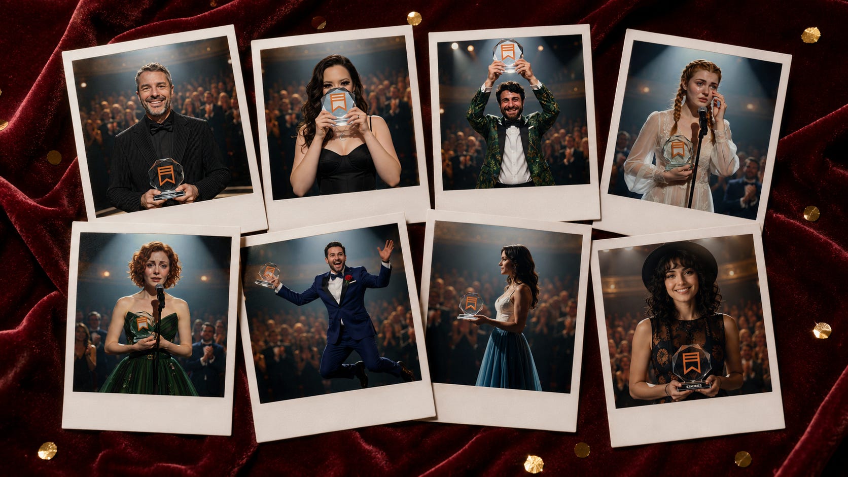
"It wasn't until recently that someone told me these create a sense of community. So I'm going to keep going. Also, Mia Kiraki wanted in but her time zone worked against her. She didn't see the call in time. I still feel bad about that one." — JHong, Natural Intelligence
If you look closer at the image above, I generated Mia Kiraki 🎭 with her Stackie Award, because she obviously deserves a seat at the table.
Anita Babic created brand voice cards — a quiz that sorted creators into types. The Storyteller. The Guide. The Provocateur. The Dreamer. You read it and thought: that’s me.

“It became a conversation I didn’t have to moderate — and that’s when I knew it hit something real.” — Anita Babic, Babica Designs
Within three days people were sharing their results, tagging friends, and uploading AI portraits of themselves into the gallery.
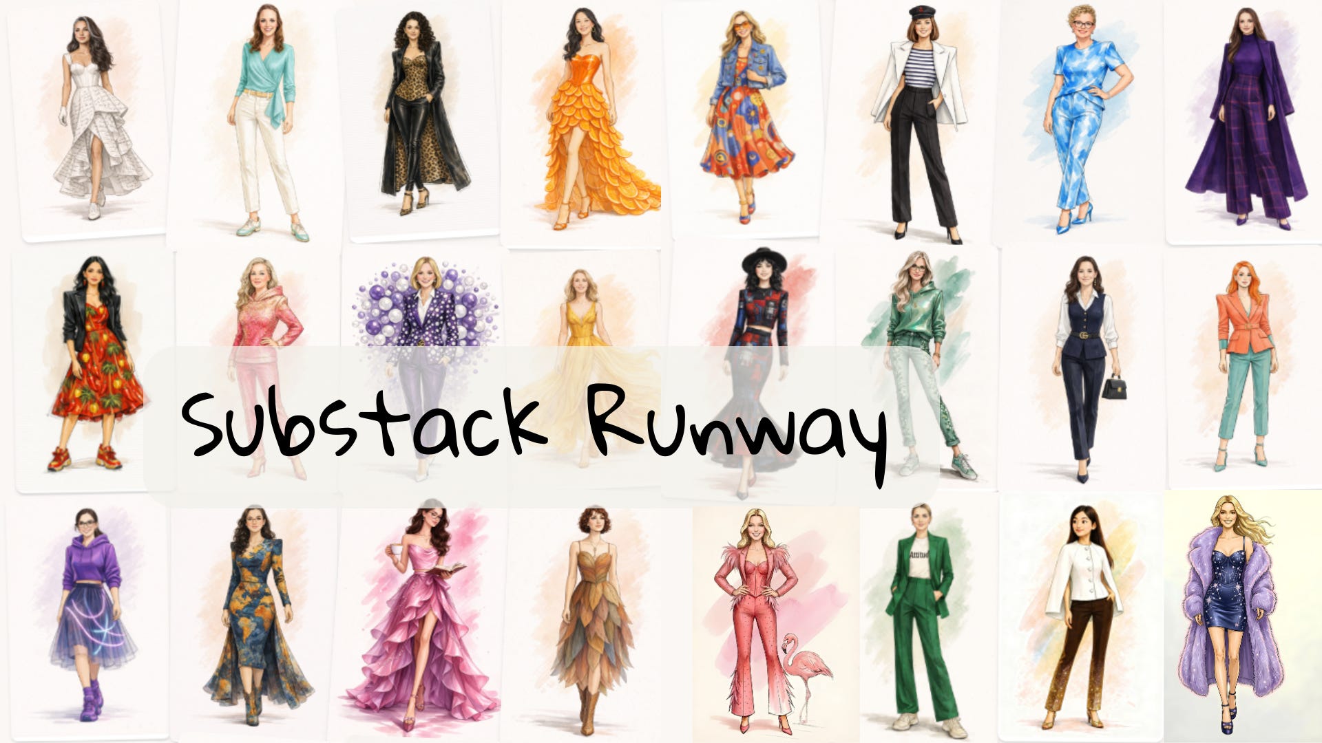
And then there’s mine. The AI Meets Girlboss Sketchbook — first for Women’s Day, then as a sequel with Monica Goh celebrating the diversity of our community. Fashion illustrations. Real creators. Each one recognizable to themselves.
None of these were complicated. All of them spread.
The pattern is the same every time: people join in when they feel seen. When the content creates a space where they can picture themselves inside it. When participation feels like the obvious next move.
I decided to conduct an experiment in my notes. It started as a Prompt Tuesday note — every Tuesday I share a quick visual branding experiment in my Notes. Simple, low stakes, usually one prompt. This time I shared a Forbes double-page feature of myself and a couple of other Substackers using ChatGPT Images 2.0 and dropped the prompt.
Seven people made their own Forbes spreads and tagged me. Within the same day. If you missed that one, the prompt is here:
Then Chad Thiele, today’s co-author, showed up in the comments. Chad is a USAF veteran, 27-year DoD career, AI engineer now based in Tokyo, and the person behind Unbothered by AI on Substack. He suggested we try something with more edge, so I thought: a celebrity gossip magazine. Same structure, completely different energy.
Sixteen people made celebrity gossip spreads of themselves. Several tagged each other. The comments were chaos. People were sending them to friends.
Then Chad Thiele said: Nintendo Power. So, I delivered a prompt for that and it resonated with a whole new crowd.
By the end of the week I had 21 new subscribers. Chad and I were DMing about doing this properly. The experiment had turned into a collab and a library of 22 publication styles. We’ll get there soon, hang tight.
Before we get to the prompts, here’s what I took from this — because these are the mechanics behind every piece of Substack content that builds real community, not just views.
1. You have to make participation feel effortless.
The Forbes prompt was one copy-paste. Attach your photo, swap your name, press go. Daria Cupareanu’s Christmas tree worked for the same reason — clicking “add yourself” took 30 seconds.
The harder it is to participate, the fewer people do. Design for the laziest version of your reader and you’ll be surprised who shows up.
2. The content has to make people feel like the main character.
JHong’s Stackies nailed this. Being nominated — or nominating someone — made people feel seen and chosen. A Forbes spread does the same thing, except you’re not waiting to be chosen. You’re generating your own cover. It’s participatory and self-affirming at the same time.
Content that puts the reader at the centre of the story travels differently than content that puts you there.
3. Specificity is what makes Substack content spread.
Forbes, celebrity gossip, and Nintendo Power all landed. But not with the same crowd. Forbes attracted the credibility-builders — people who wanted something for their media kit. Gossip attracted the community players — people whose audience already felt like a group chat. Nintendo attracted the niche enthusiasts — the ones whose readers would immediately get the joke.
Nobody generated all three. Even the most enthusiastic collaborators like Calder Quinn picked one or two that fit their brand and stopped there. That’s not a lack of engagement — that’s the format working correctly. The more specific the style, the more precisely it finds its person.
The more niche the style, the stronger the urge to show it to someone.
4. Social proof compounds in real time.
Once seven people made Forbes spreads and started tagging each other, the next person didn’t need convincing. They just needed the prompt. Notes turns this into a live social loop — you can watch the participation happen and join the thread. That’s something a newsletter alone can’t do.
5. Co-creation beats solo content on Substack every time.
The biggest surprise for me was Chad Thiele’s suggestions, that weren’t part of the original plot. His ideas came organically in the notes and they shaped the direction of the whole experiment. The collab gave him a reason to share it with his audience. It gave me a reason to write this post. It gave both our audiences access to a library neither of us would have built alone.
Find the people who make your ideas better and build things with them in public.
6. Images travel further than you think on Substack Notes.
Every spread in this experiment was designed to be screenshotted and reshared, and that’s exactly what happened. The image did the distribution work. On Substack Notes, image notes drive the most comments and restacks. When the visual is strong enough to stand alone, people don’t just like it — they take it somewhere.
Want someone to build your visual brand with you?
The Front Row is my 1:1 brand-building program — 30 days, your visual brand, done. We define your foundations, build your visual world, and set up a system that keeps you consistent long after we’re done.
If that sounds like what you need, DM me or apply below — I take a limited number of clients at a time.

Chad Thiele and I kept going after Nintendo Power. We ended up with 22 publication styles, some absurd, some authoritative, some genuinely strange, all of them prompts you can copy and run in ChatGPT Images 2.0.
Here’s how it works:
You need ChatGPT Plus (for Images 2.0 with Thinking mode). This also works in other image generation models, but I just prefer ChatGPT’s excellent text rendering powers.
Open ChatGPT Images 2.0, select Thinking mode
Paste the prompt, swap in your name and Substack URL
Attach a clean portrait photo
Let it research your page and generate the spread
We’ve picked the 7 most shareable styles to feature here that we think have the highest chance of getting tagged, reshared, and turned into a community moment.
Full red border. Your name on the cover. Instant authority, zero effort.
I'm testing this one on Phil Powis ❤️⚡️ from the Sacred Business Flow, online sales and marketing expert making the case for building a business that feels as good on the inside as it looks on the outside. The headline ChatGPT landed on: "The Anti-Hustle Growth Strategist." It researched his page, wrote the profile, and styled the photography. We didn't touch a thing.
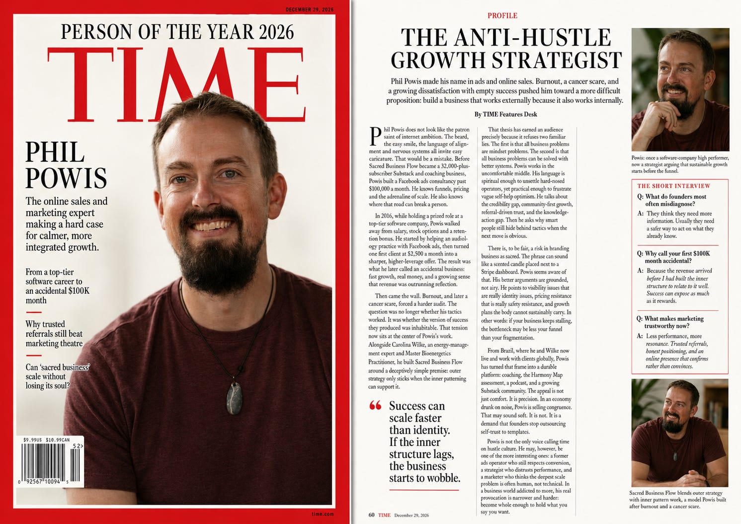
For you if: you want to mark a milestone, celebrate a launch, or just send something to your mum that makes her cry.
Prompt:
Generate a single wide image of a double-page magazine spread. Research [NAME] on [PLATFORM + URL] and use the attached photo as identity reference. Left page: a TIME Magazine Person of the Year cover — iconic red border, bold white TIME logo, full-bleed portrait, the subject's name in large type, and 3 cover lines summarising her impact. Right page: an interior profile feature with a large pull quote, a long-form article, a short Q&A interview section, and a secondary portrait with caption. Career-defining editorial feel, not a puff piece. [ATTACH YOUR PORTRAIT PHOTO]Two pages of quiet authority. Research-backed headline, strategic profile, data callouts, short Q&A. The kind of feature that makes a corporate buyer sit up.
I’m testing this one on Dr Sam Illingworth using his profile photo and an image from the Zero-Budget Photoshoot post. Sam is a professor, poet, and author of GenAI in Higher Education (Bloomsbury, 2026). If anyone deserves an HBR spread, it’s the man building the Slow AI Curriculum.
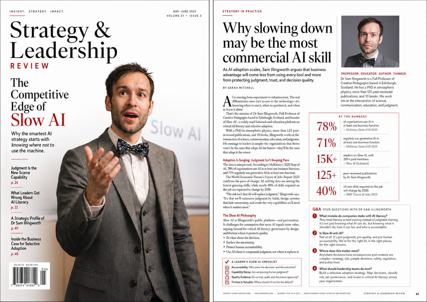
For you if: your audience is academic, corporate, or B2B or you’re pitching yourself somewhere that requires credibility before personality.
Prompt:
Generate a single wide image of a double-page magazine spread. Research [NAME] on [PLATFORM + URL] and use the attached photo as identity reference. Left page: an HBR-style magazine cover — clean white design, bold serif logo, a strong research-backed headline, a full-bleed or half-page editorial portrait, and 2–3 article teasers. Right page: an interior feature with a large editorial portrait, a strategic profile article with data callouts and a sidebar, a short Q&A, and pull quote. Bold graphic design with strong photography — this is a visual magazine, not a text document. [ATTACH YOUR PORTRAIT PHOTO]Documentary-style portrait. Field notes sidebar. Exploration narrative. One powerful pull quote. The format turns any creator into someone worth following to the ends of the earth.
I tested this on MrComputerScience, Mike D, who writes Pithy Cyborg, a 5-minute AI briefing in plain English, and also tends pollinators and designs backyard ecosystems in Greater Boston. ChatGPT couldn’t use the National Geographic logo for copyright reasons — so it invented its own magazine: Field / Signal. Stories at the intersection of curiosity, science and place.
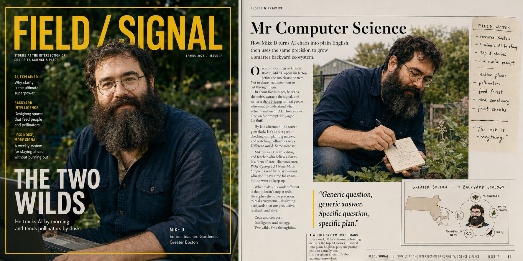
For you if: your content takes readers somewhere — education, research, niche expertise, exploration of any kind.
Prompt:
Generate a single wide image of a double-page magazine spread. Research [NAME] on [PLATFORM + URL] and use the attached photo as identity reference. Left page: a National Geographic-inspired cover — iconic yellow border frame, one powerful documentary-style portrait dominating the page, bold yellow National Geographic logo, and a short dramatic cover headline. Right page: an interior photo essay feature with a large exploration portrait, field notes, a profile article with narrative journalism tone, map or infographic inset, and a pull quote. World-class documentary photography aesthetic. [ATTACH YOUR PORTRAIT PHOTO]Your content topics turned into a sequential comic strip. Ben-Day ink dots. Thick outlines. Hand-drawn speech bubbles. Your face as a recurring pop-art character.
I tested this on Nick Quick from Co-Write with AI, based on his post The Human-Clanker-Human Sandwich. His framework turned into a visual story.
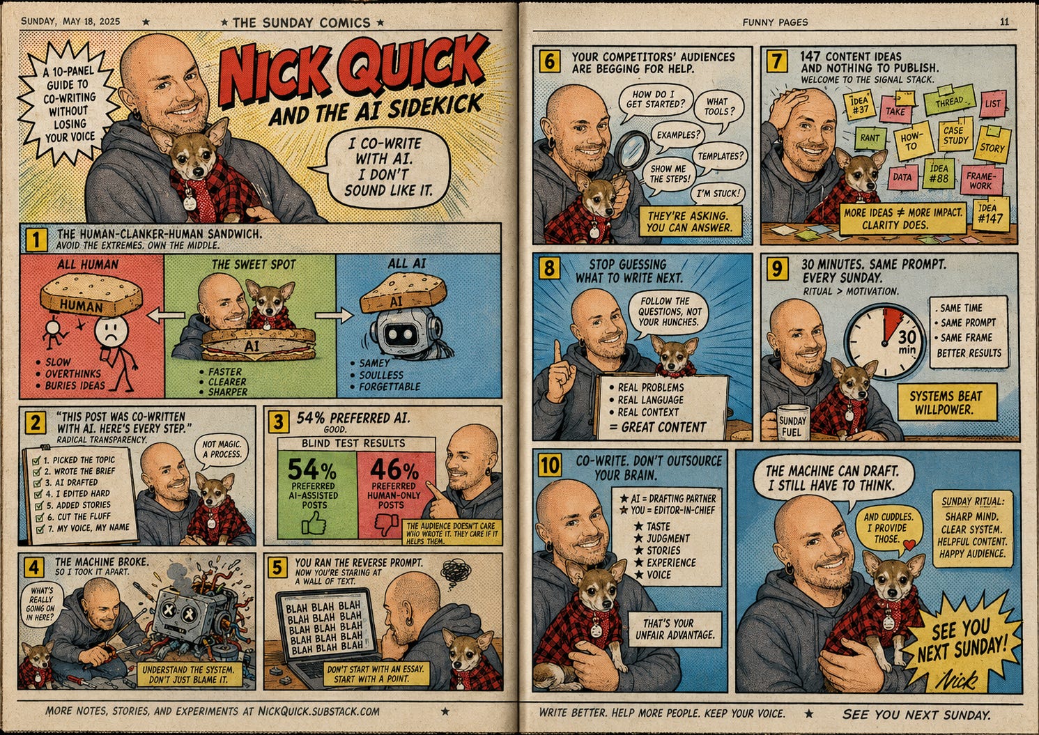
For you if: your content has a recurring point of view — a "you" that shows up every week with a take.
Prompt:
Research [NAME] on [PLATFORM] and using the attached image, create a double-page Sunday morning newspaper comic strip spread. Convert her likeness into a pop-art illustration style using visible Ben-Day ink dots for shading and thick ink outlines. Adapt her recent content topics into a sequential multi-panel storyline, featuring hand-drawn speech bubbles, comedic pacing, and a faded, off-white newsprint paper texture.Share in your Notes…
Try one of the magazine cover prompts and share it in your notes or as a comments. Tag me and Chad Thiele, we want to see your cover and reshare it!
Surreal Photoshop-manipulated imagery. Heavy layer effects. Lens flares. Vibrant saturated palette. The format that turns a creator into a visual art piece.
I tested this on Dheeraj Sharma from GenAI Unplugged, AI engineer, educator, and the technical builder behind SubflowAI. What makes Dheeraj unusual in the AI space is that everything he builds actually works, looks good, and makes sense to a normal human being.
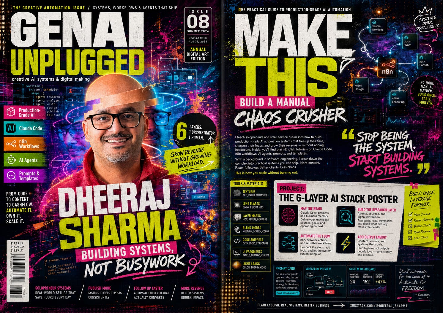
For you if: your brand is built on making complex things look effortless — and your audience expects both the substance and the aesthetic to deliver.
Prompt:
Generate a single wide image of a double-page magazine spread. Research [NAME] on [PLATFORM + URL] and use the attached photo as identity reference. Left page: a Computer Arts-style magazine cover — Photoshop-manipulated surreal portrait with heavy layer effects, lens flares, and vibrant saturated palette, bold experimental logo and typography. Right page: an interior digital art annual feature styled as a full-bleed creative tutorial spread — texture overlays, a "Make This" project section adapting her content themes into a hands-on creative challenge, and a bold pull quote. Maximum visual maximalism throughout. [ATTACH YOUR PORTRAIT PHOTO]I tested this on Joel Salinas from Leadership in Change is writing for leaders who want to apply human-centered AI strategy. 6,000+ leaders read him before Monday morning. ChatGPT landed his philosophy without being told it: “Culture over code. Clarity over hype. Stay human and move fast.” It even spotted the mug.
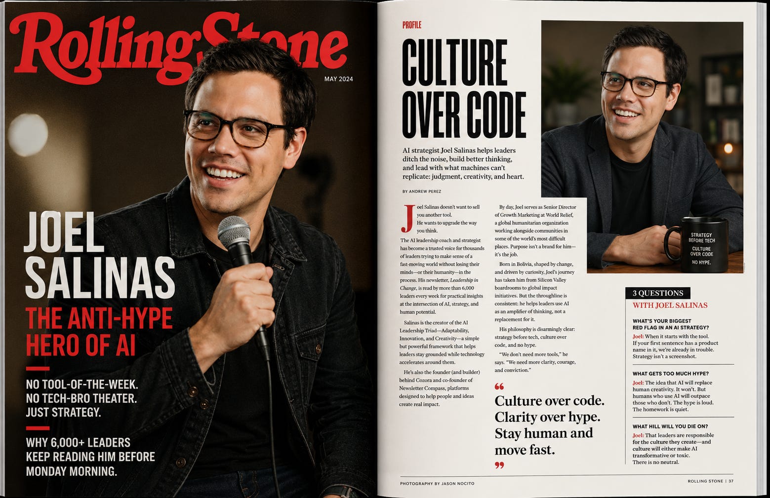
For you if: you’re building an audience that follows you, not just your topic.
Why it spreads: The “main character” framing is irresistible. Every creator secretly wants to be the lead. This gives them the cover for it.
Prompt:
Generate a single wide image of a double-page magazine spread. Research [NAME] on [PLATFORM + URL] and use the attached photo as identity reference. Left page: a Rolling Stone-style magazine cover — bold cultural headline, full-bleed candid-feeling portrait, Rolling Stone logo, and 2 cover lines with attitude. Right page: an interior long-form profile feature with a large secondary portrait, a personality-driven profile article, a short interview with irreverent questions, and a pull quote that sounds like something a cult following would tattoo. Cultural icon energy throughout. [ATTACH YOUR PORTRAIT PHOTO]Electric palette. Cyberpunk maximalism. Bold distorted type. The format that makes technical credibility look dangerous.
I tested this on Chris from ToxSec, M.S. Cybersecurity, CISSP, former NSA and government defense contractor, now red-teaming AI systems on Substack so the bad actors don’t get there first.
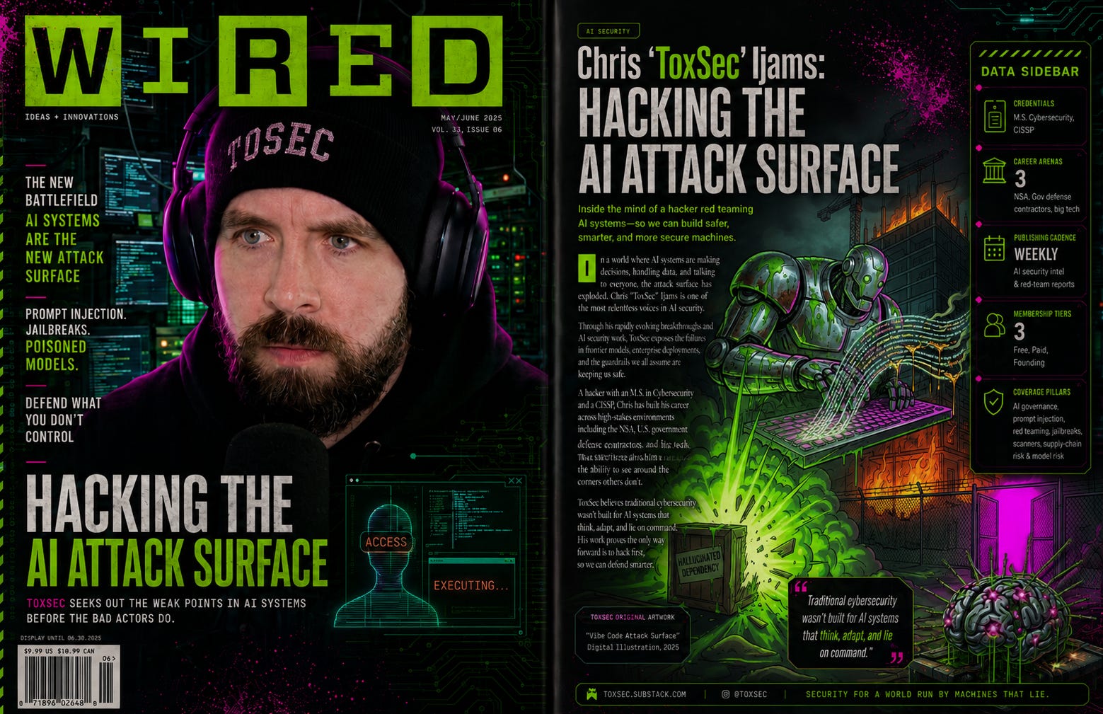
For you if: you’re an AI, tech, or founder creator whose audience respects analytical authority.
Prompt:
Generate a single wide image of a double-page magazine spread. Research [NAME] on [PLATFORM + URL] and use the attached photo as identity reference. Left page: a Wired-style magazine cover — electric palette, bold custom typography, full-bleed portrait with graphic overlay, the Wired logo, a punchy headline, and 2–3 cover lines. Right page: an interior tech feature with a large portrait, a technology-forward profile article, a data sidebar with stats about her work, and a pull quote. Sharp, cyberpunk-adjacent design energy. Future-focused tone. [ATTACH YOUR PORTRAIT PHOTO]In the comments...
Which one are you trying? And if you make one tag me and Chad Thiele in Notes. We’ll restack the best ones. 🩷🦩
Every style in this post, plus 15 more. Organised by category. Copy-paste ready. Formatted as a branded Word document you can keep, share, and come back to every time you need a cover.
Have fun with your magazine covers, Flamingos!
Pinkie 🩷🦩
If today’s post made you think about your own visual brand, I am launching The Branding Flock, a 12-month visual brand program for Substack creators who are done guessing.
Full breakdown posts, real prompts, real outputs. Your color palette, your logo, your brand character, your content system — built step by step alongside the flock.
33% off closes June 10th. First 100 seats. The discount lives inside your quiz result.
Comments
Nothing yet. Say the first thing.
Sign in to join the conversation.