
You probably open something like this with a specific question already in mind. Who should I be learning from in this corner of the field? If I want my work in front of a community I am not part of, who is the way in? Who is worth collaborating with, and who is about to matter before everyone else notices?
Those are good questions, and a list of names ranked by follower count answers none of them well.
It can tell you who is big. It cannot tell you who connects worlds, who only shouts inside one, or who is quietly about to climb. Those are different things, and they matter most.
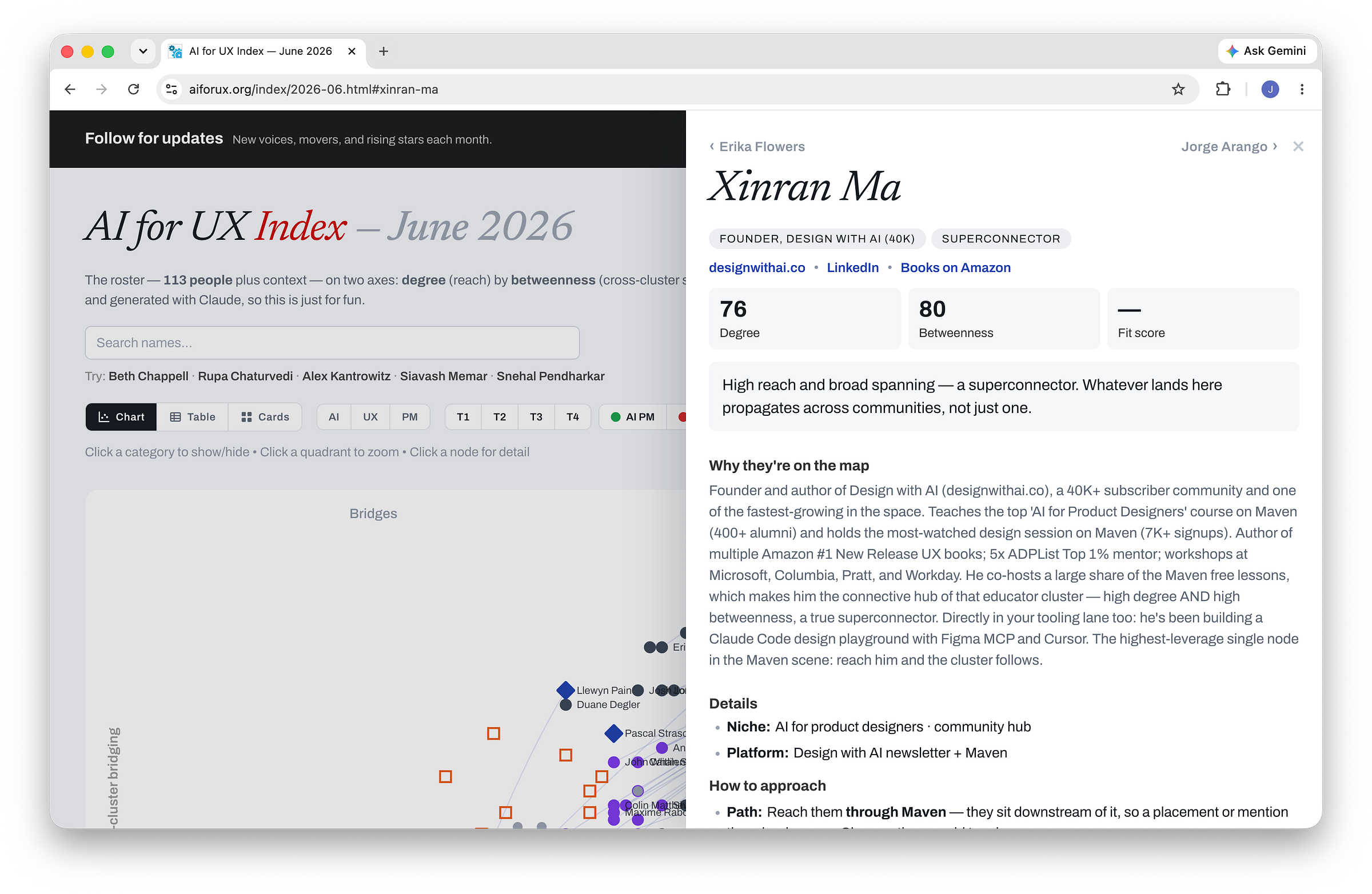
That gap is why the AI for UX Index is a map and not a ranking: every month it plots the people and institutions shaping how artificial intelligence shows up in design and product work, positioned by what they actually do in the network rather than how loud they are so readers can get the most value.
This piece is about how to read it and why it is built the way it is, starting with what it is actually good for, because the structure only matters once you know what you came to find.
What the map is for
The map answers the questions you came in with, because it positions every voice by two things at once:
How far they reach
How many separate communities they connect
Hold those loosely; the next section makes it more precise.
Figure out who to learn from. Filter to your lane with the AI / UX / PM lens and the tier and category toggles, read the people clustered there, and open any profile for the short note on why they’re on the map.
Find the way into a community. Look to the voices on the seam between two clusters, and to the institutions that feed a cluster from upstream. Those are the warm paths, the routes your work travels to reach an audience it otherwise never would, the map of the front doors.
Decide who to collaborate with. The highest-leverage collaborators are the ones who bridge into a community your own cluster cannot reach: one connection through them carries your work somewhere it could not have gone on its own. Reach is nice; adjacency compounds.
Catch who is rising. The climbers, moving from quiet specialist toward a connecting role, are where the next wave forms. That is the point of a monthly edition: any one snapshot is the field today, the movement between them is where it is heading, and following risers early is cheaper than discovering them late.
Place yourself, honestly. Find your dot and sit with where it lands. The useful question is rarely “how do I get more reach,” but “do I connect different worlds, or mostly reach a lot of people inside one, and is that the role I want?” That functionality will be added at some point.
How the map works: two axes, not one number
A ranking cannot answer those questions because of how it is built: it collapses each person into a single number, almost always a proxy for reach, and sorts. A single number can only measure size. It cannot represent the gap between someone who reaches a hundred thousand people inside one bubble and someone who quietly connects two fields that never speak.
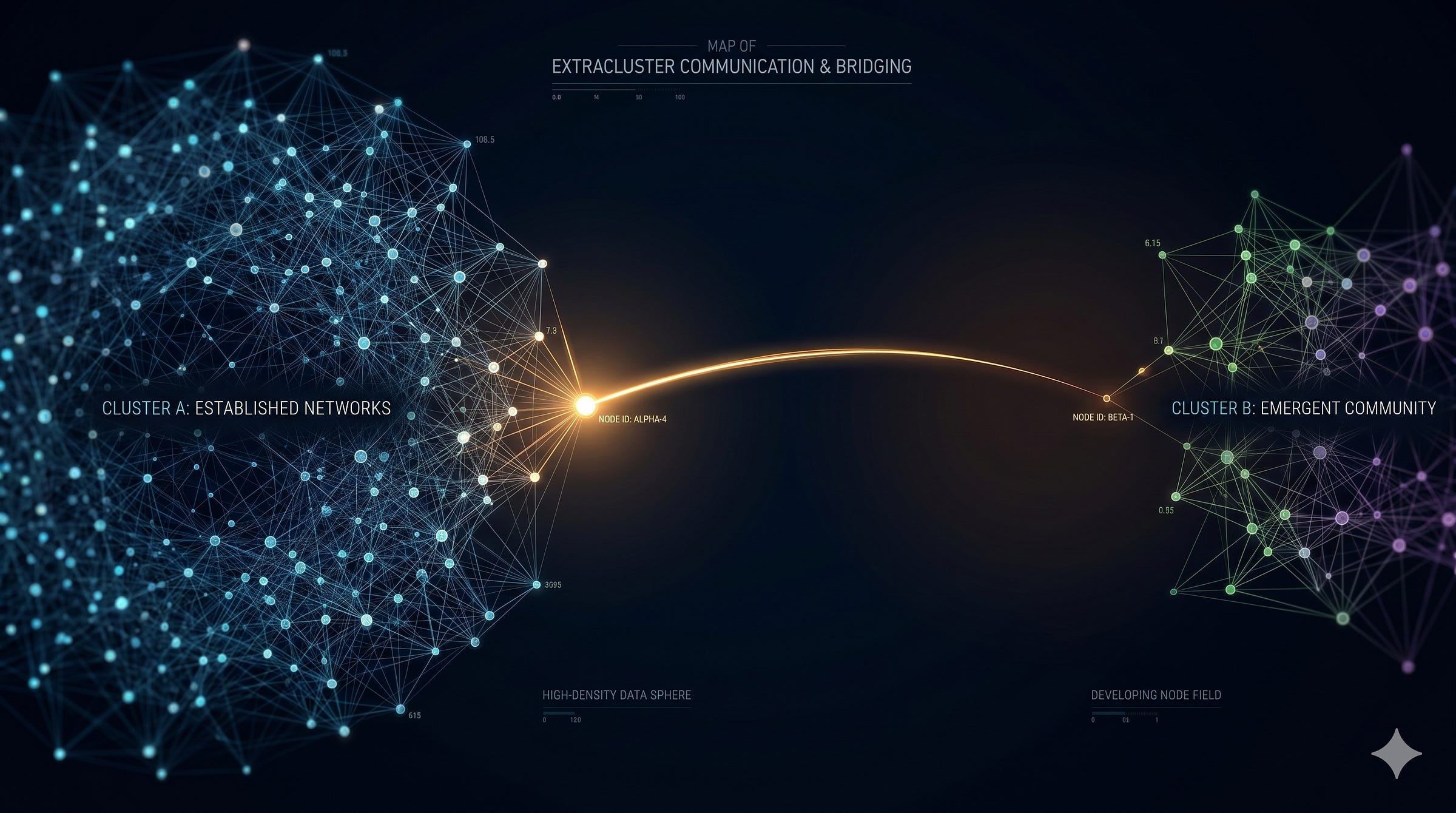
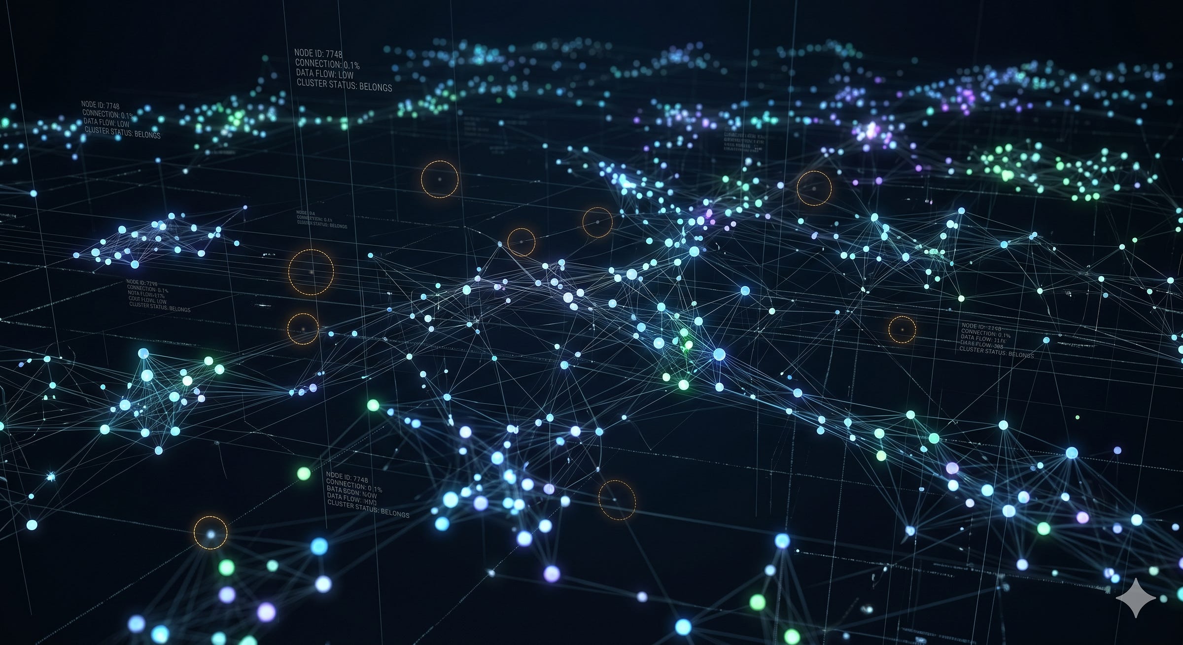
So the Index refuses the single number; it borrows the way of seeing that network science made popular, most of all in Albert-László Barabási’s Linked: picture the field not as a ranked column of names but as a social graph, people and institutions as dots (nodes), relationships as lines (edges).
Reddit is the cleanest everyday version of this: thousands of subreddits, each a dense community, with the occasional user or crosspost carrying an idea from one to the next. The corner of the field this map covers runs the same way, only its communities are Substack newsletters, Medium publications, and conference circuits rather than subreddits, and its bridges are the people who show up across several of them.
Influence stops being one quantity and becomes a question of where a node sits, and the Index plots every voice on the two measurements that capture it.
What degree measures: raw reach
Degree is the simple one: how many connections a node has, here roughly how many people a voice directly touches. It is the axis a follower count already captures, big audience, high degree, and the obvious half of influence, the only half a leaderboard ever sees.
Reach is real, and degree is a fair proxy for it.
What degree cannot tell you is where those connections point, whether they cluster inside one community or fan out across many separate ones, which is exactly the question the second axis exists to answer.
What betweenness measures: bridging power
Betweenness almost never gets measured, and that’s the one that makes the map worth building. Network scientists have used betweenness since Linton Freeman gave it a formal definition in 1977: of all the shortest paths an idea could travel, how many pass through you?
Picture two voices with the same follower count, one whose connections sit inside a single tight community, the other’s across four that don’t overlap.
On a leaderboard they are tied; in the network the first is an echo, the second a junction, the path two separate worlds would lose if it vanished, invisible to degree.
Betweenness addresses this with this concept: Measure how many worlds the user if in. If they are in a lot of rooms, that’s bridging power. Otherwise they’re shouting in a single room.
Why both work together
Neither axis is enough on its own. Degree answers how many people hear you. Betweenness answers how many different worlds you let talk to each other. The two move independently: a voice can sit high on one and low on the other, and that gap is where the interesting value lives.
A huge audience sealed inside a single community is a different thing from a small audience that is the only path between two fields, even though a follower count would file them side by side.
Plotting both instead of collapsing them into one number is the whole method.
It is what turns a flat list into a plane with four corners, and it is why the most interesting voices are the ones whose two scores disagree, the ones a single number would rank next to people they have nothing in common with.
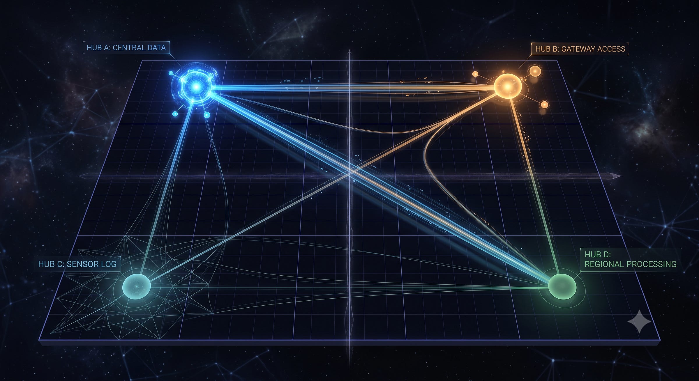
What the four quadrants mean: four roles, not a ranking
Plot degree across and betweenness up, and the plane splits into four corners. Each is a role, not a rank.
Superconnectors: high degree, high betweenness
Big reach and heavy bridging at once: the audience of a Megaphone and the cross-cluster position of a Bridge. Network science calls this a hub, a node whose degree far outruns the average and whose links reach across many communities at once.
Most major institutions land here, the publications, course platforms, and community hubs that command large audiences and sit at the crossroads of several sub-communities.
When a Superconnector picks up an idea it reaches not just a lot of people but a lot of different people; the idea becomes common knowledge across the field rather than one pocket of it.
A single one of them can carry a small voice across the whole field at once.
Examples
Bridges: low degree, high betweenness
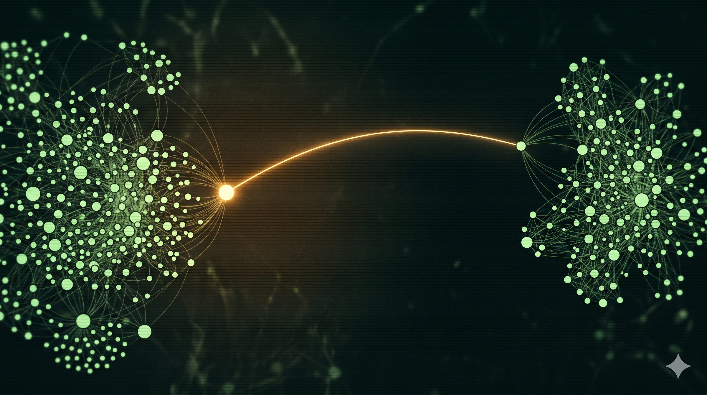
The punch-above-their-weight quadrant, and the one most invisible to a follower count. A Bridge does not have the biggest audience; what it has is position. It sits on the seam between two communities that don’t otherwise talk, academic human-computer interaction research and shipping product teams, and carries ideas across the gap.
This is the position Mark Granovetter named in 1973 called weak ties: a tie that bridges two densely knit groups carries information neither could produce alone. LinkedIn makes it bread and butter off of it.
Their value is not in volume, it is in adjacency.
Remove a Megaphone and its cluster still hears the same ideas from someone else; remove a Bridge and two communities quietly stop exchanging. They are load-bearing in a way their numbers never show: where the next idea enters your community, and your highest-leverage collaborators.
Examples
Specialists and cite-only: low degree, low betweenness
Low on both axes, which is not a basement but a label: “not yet a distribution engine.” In network terms they sit in the periphery, sparsely linked nodes loosely tied to a dense core, a position that measures how little their work travels, not how good it is.
Specialists are the deep practitioners and researchers whose work gets cited and built on without them broadcasting it, the one solving the hard problem inside an organization, the researcher everyone references who never does the podcast rounds.
They are the foundation; the ideas Bridges carry and Superconnectors amplify often originate here.
A low position usually measures distribution behavior, not substance, and many could move toward Bridge the moment they connect their work outward.
Examples
Megaphones: high degree, low betweenness
Large audiences, concentrated inside one cluster. Brain-network researchers call this a provincial hub: a node with high degree whose links stay almost entirely inside its own community, the mirror image of the connector hub that reaches across them.
The volume is real; it just runs deep in one community, so the ideas land hard at home and rarely jump the fence. This is the quadrant a follower count most overrates, because audience size is exactly what the single number measures.
Influence that does not cross clusters is local: it moves its own community and stops at the edge.
That is not a knock; speaking powerfully to one audience is real work, a different job than bridging, the two the map exists to keep apart.
Examples
Why the quadrants matter
The point is not to crown the top-right corner. It is to show that influence is at least two independent things, and that a Bridge and a Megaphone, identical on a follower-count leaderboard, do completely different work: one moves ideas between worlds, the other within one.
A list flattens that into a single column; the quadrants are the whole reason to use a map instead.
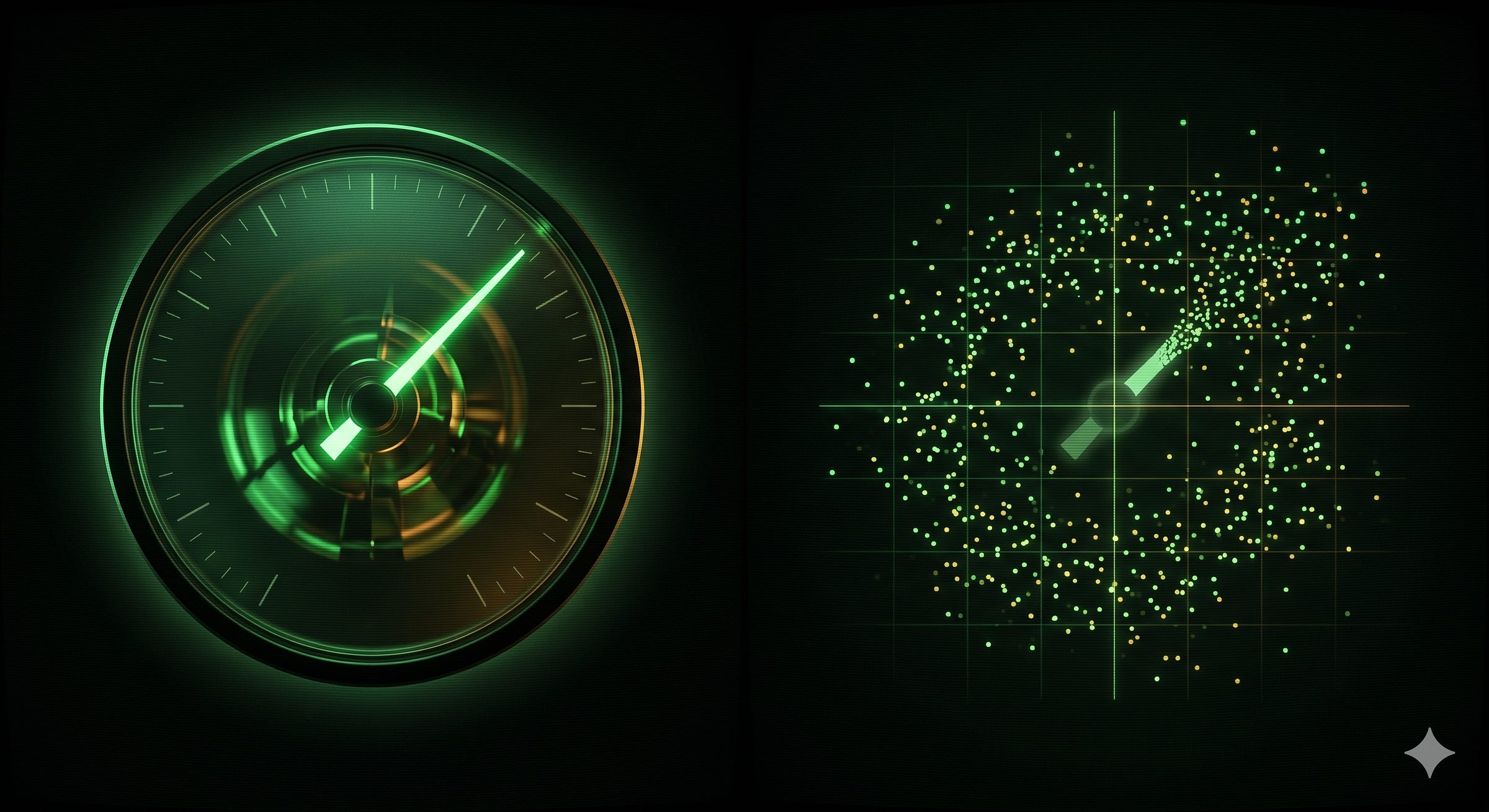
How this refines Gladwell and improves on Klout
Naming the people who carry ideas is an old instinct, and two famous attempts at it show what the map keeps and what it throws away.
Malcolm Gladwell got the roles half right. In The Tipping Point, his 2000 book, he sorted influential people into Connectors who seem to know everyone, Mavens who gather and share expertise, and Salesmen who persuade. The Maven is close to the Specialist corner, the trusted expert others cite without much broadcasting of their own.
Gladwell’s Connector fuses two jobs the map insists on separating. The person with a huge audience inside one world and the person who is the only door between two worlds are both Connectors to him, and they are nothing alike; degree and betweenness are what pull them apart.
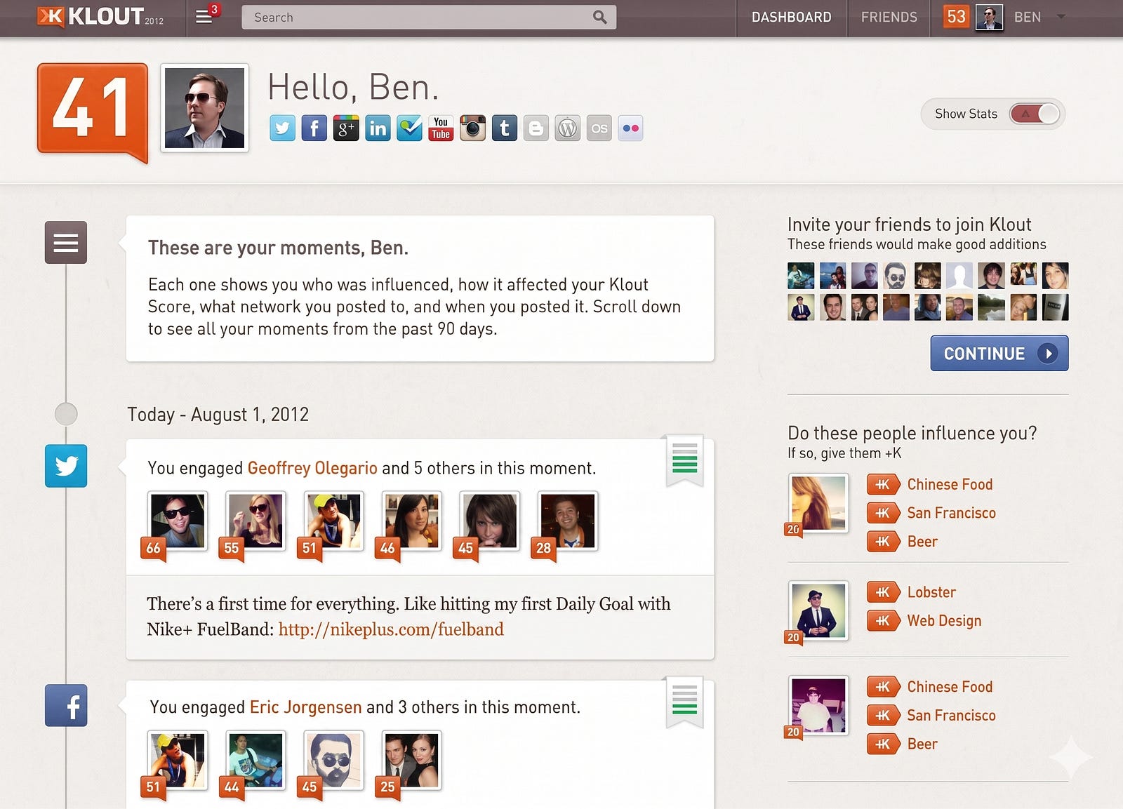
Klout made the opposite mistake. From 2008 until it shut down in 2018, it scored your online influence on a single number from 1 to 100 and let brands sort people by it, the purest version of the thing this map refuses.
One independent analysis found that the logarithm of your follower count alone explained about 95 percent of a Klout score, which is to say the number measured reach and dressed it up as influence. It had no context of community.
The score drifted from anything real, and the company folded.
The lesson is not that influence cannot be read. It is that flattening a position into a rank throws away the only information worth having.
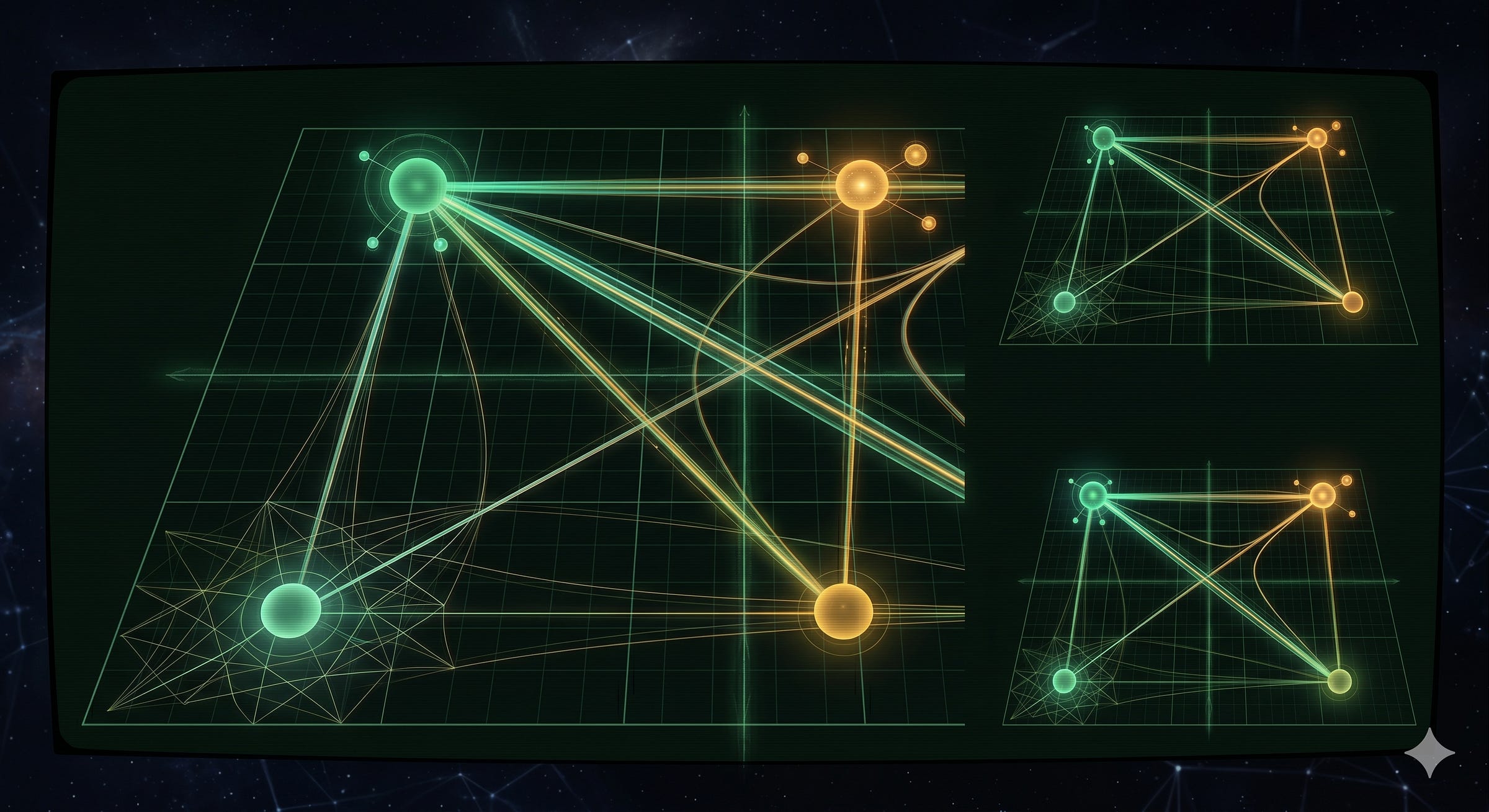
Where the two axes come from, and where else they are used
None of this machinery is invented for the occasion. Degree and betweenness are standard centrality measures in social network analysis, a field that has spent decades asking what makes a node important. Reading a node’s role off more than one of them at once is an established method, not a flourish.
The cleanest precedent is a 2005 paper in Nature by Roger Guimerà and Luís Amaral, “Functional cartography of complex metabolic networks,” which sorts nodes into “universal roles” by placing each in the same kind of two-axis space, one axis for how strong a hub it is, the other for how much it reaches across communities.
Swap the labels and you have Superconnectors, Megaphones, and Bridges.
The measures are not identical to the Index’s, but the move is the same, and it has been reused to map roles in brain networks, ecosystems, and protein interactions.
Closer to most readers’ work, the same two axes drive organizational network analysis: Rob Cross, who has run it across hundreds of organizations, finds leaders only about 30 percent accurate at spotting the brokers who bridge gaps, against roughly 50 percent for the high-degree connectors.
A single number hides the bridging role in a company exactly as it does on this map.
The same idea names what the map does with institutions, the publications, course platforms, and newsletters that sit upstream of audiences and decide what reaches them. Network sociologists call the gaps they span structural holes and call those who span them brokers, who gain an advantage from the gap.
The map draws them as edges into clusters, because a single broker can hand a small voice an enormous amount of borrowed reach.
So the framework is borrowed from settled science even though the placements are not. The axes are real measures and the role classification a real method, drawn in fields with far more data than an influence map for our corner of design ever will.
What stays editorial is where each dot lands.
How people get selected
Selection is curation, not a threshold: no follower minimum, no automated cut line, just Claude and other data added to a prompt for analysis, for fun.
People can ask to be added3.5k3.5k3.5k3.5k3.5k, and I add them, and the number of sources will grow.
The map began as a seed roster I already tracked in the AI-for-UX conversation and grew to take in the ecosystem around it, the institutions, the educators, and the adjacent AI and applied-AI voices that design people actually read.
The test is not whether someone is famous, it is whether they are a node in this discourse, and whether including them helps explain the structure of the field. A quiet researcher everyone cites can matter more than someone with ten times the audience, because the map is about position, not volume.
Why the coordinates are editorial estimates
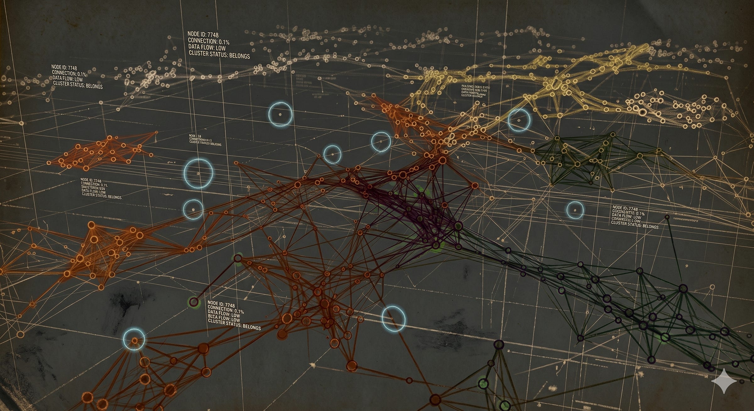
Here is the lede I will not bury, because it makes the whole thing honest. The degree and betweenness coordinates are qualitative judgment calls, not measured follower counts and not a centrality score computed from real interaction data.
Each position is Claude’s informed read of where a voice sits, from watching who cites whom, who shows up across communities, whose ideas travel. So treat it as a model, not a measurement: an opinionated argument about the shape of the field, not analytics you could reproduce by querying a platform.
And treat it as falsifiable on purpose.
If you think someone is misplaced, you are disagreeing with my judgment, which is exactly the conversation the map is meant to start.
Say you think a researcher I parked deep in Specialists belongs in Bridges, because her papers are what three communities keep citing even though she never posts. That is a claim that her betweenness is higher than I drew it, the kind of correction that moves a dot.
Make the case and I’ll consider it.
I would rather ship an explicit, arguable model than a “data-driven” ranking whose objectivity is mostly costume. The numbers in most influence lists are real; the meaning attached to them usually is not.

How to read it
A ranking answers one question: who is ahead. It is a satisfying question and almost always the wrong one, because being ahead on reach tells you nothing about whether a voice moves ideas between worlds or only shouts inside one.
That is the question the map is built to answer, and it is why the map is worth more than the list it could have been.
So read it as a map. Where someone sits says more than how high.
The dot near the edge with one long thread into another cluster is doing work the loudest node in the field cannot do, and the two should never be confused for each other, whatever their follower counts say. The coordinates that place them are my judgment, set down in the open, which means you can disagree with them out loud. Disagreement is the point, not a defect.
What you get from all of this is not a verdict on who matters most. It is a sense of how the field is wired, where its seams run, and which way it is moving this month. That is the more useful thing to carry. Find the seams, and do not keep score.

Why this matters beyond the map
Strip away the specifics and this is an argument about how to read influence anywhere: every field has its leaderboards and its follower counts, its single numbers that promise to settle who matters.
Those numbers are seductive because they are simple.
A single number is simple because it has thrown almost everything away. It can rank, and ranking feels like knowledge, but it cannot tell you whether the person it puts on top moves ideas between worlds or only repeats them loudly inside one.
Klout learned that the expensive way, and its descendants are still everywhere. Substack, Medium, X, BlueSky, Threads, Instagram, TikTok. A single number.
So the next time someone hands you a ranked list of people, the useful instinct is not to ask who is on top. It is to ask what the list flattened to produce that order: whether the name at number three reaches a different world than the name at number one, or merely shouts louder inside the same one.
A map cannot answer every question, and this one is an argument you can dispute. It keeps that question open, where a ranking quietly closes it; that is the whole case for drawing one instead of counting.
Comments
Nothing yet. Say the first thing.
Sign in to join the conversation.