
This post walks through how I rebuilt my entire personal brand using AI; including the style guide framework you can download free below.
Editor’s Note: This post is Part 2 of a short series on building a personal brand with AI. Not from a place of expertise or polish, but from the middle of the process. It’s a reflection on feedback, identity, and the moment I realized the real work had very little to do with tools. (Part 1: When AI Told Me to Go Touch Grass)
It took a moment, if you will, to recover from reading that my original AI Flight Plan brand assessment resulted with a 5/5 for credibility but only a 2/5 for “emotional” and “unexpected.” What sent me into “fix this now” mode was the written commentary that left some serious internal scarring, “what’s holding you back is that everything looks like it belongs on a corporate blog.”
After all that work and months of writing, my discombobulated images that accompanied my articles created an unintentional brand. One that I did not purposely create, nor want to identify with now.
That’s okay, I thought as I quickly rallied, because in my head I can still hear the mantra from my days during corporate annual reviews, “feedback is a gift…feedback is a gift.” This certainly appeared to be a fixable problem, and it lit a fire that took me down a truly fun, creative, and quite informative path.
I write about AI adoption and how to build a proper foundation of systems before you purchase tools. I hadn’t intended to chase the “image creation” tool rabbit down the hole, yet here we are.
Down the Rabbit Hole I Go
Once I had a vision of what my brand could be, nothing was going to stop me from figuring out how to make it happen.
In Part 1, I shared my branding experience through the analogy that I was “caterpillar soup” in the chrysalis stage of metamorphosis and I spent many hours during a four-day spiral completely obsessed with creating a “unique” look. I tested over 15 tools and then ran into the ultimate surprise where my chatbot staged an intervention…on it’s own. This is the part of the story with the “how” I rebuilt my brand and its rise from the ashes.
All of this mayhem started from a branding quiz from , The Visual Brand Distinctiveness Test, that I casually took for fun.
The results I received from the quiz said that my brand looked “corporate” (gasp, faint), so I decided to burn it all down and rebuild. Who doesn’t like a good phoenix story?
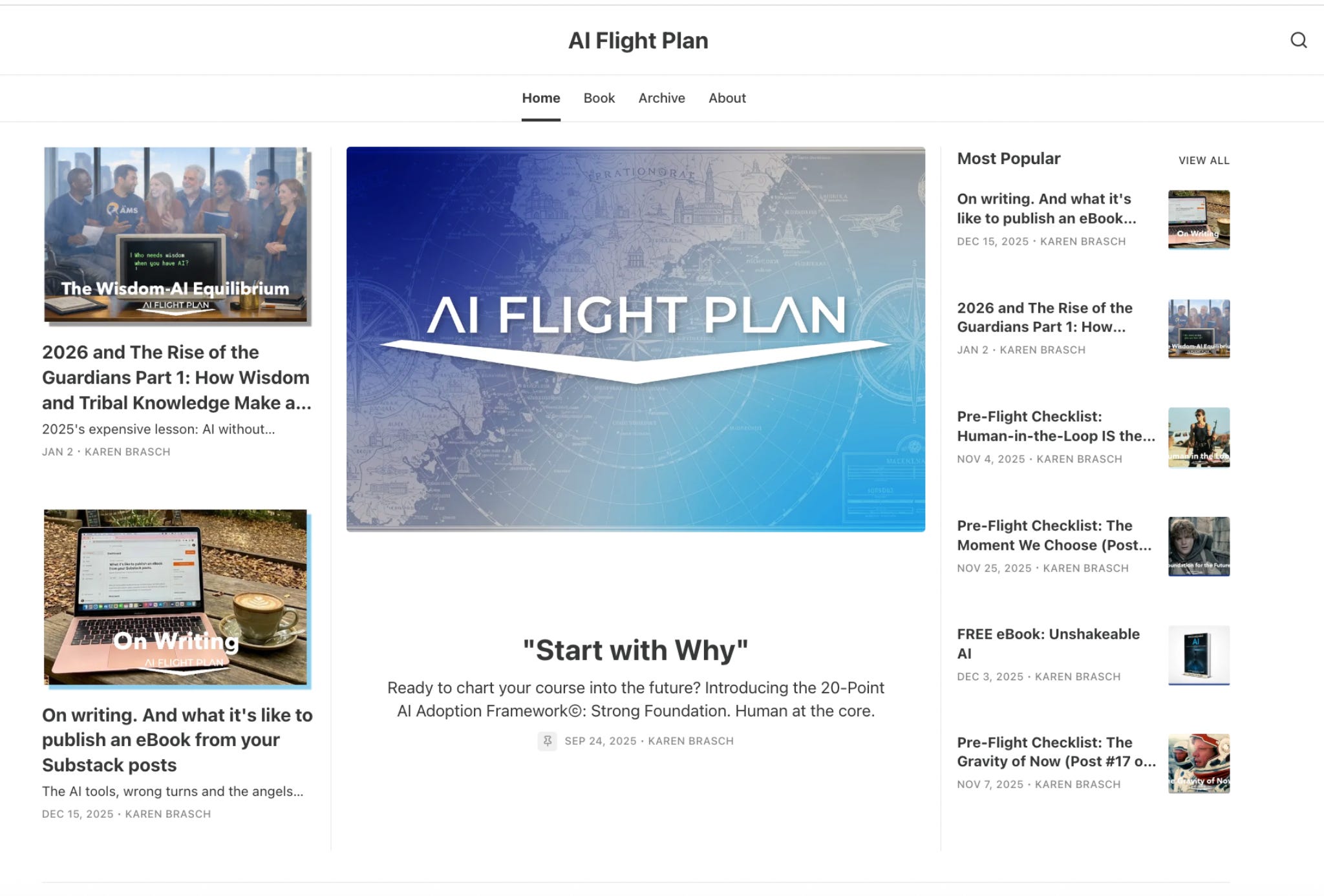
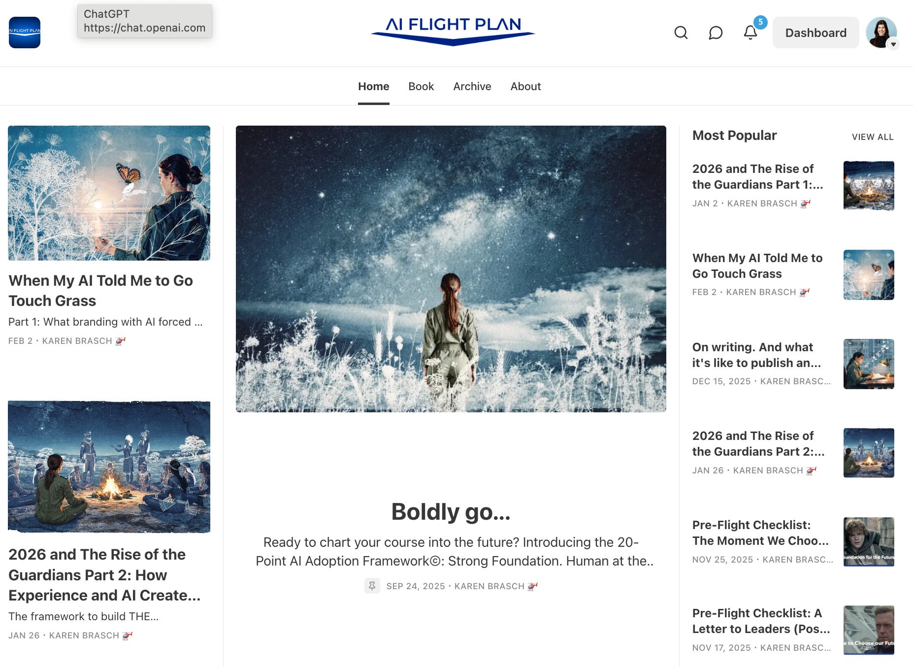
This is what my Substack webpage looked like when I took the test. My “before.” My first 20 post-series included movie references and clips, so I couldn’t not have those. I was experimenting with branding elements around aviation, but for all of my follow on posts after those first 20 movie-related articles, I was trying to figure out how to use realistic photos within AI amongst a crisp white magazine-style background.
After reading the results from that test, along with her posts, it became clear that I needed a style sheet because the logo and color palette weren’t enough. I needed to get clear on my audience, their pain points, my principles, my visuals and my voice. The style sheet needed to govern everything, not just the pretty parts.
It wasn’t just the visuals that were different, although they had changed quite dramatically. I ended up revising and clarifying exactly what AI Flight Plan stands for, who it serves, what it refuses to do, and how it shows up to help.
Identity is the brand.
The brand style sheet I created governs every post, every image and every client conversation. It’s the system underneath the aesthetics.
It’s not a plan to deviate from. It’s the principle to everything I create for AI Flight Plan. This isn’t just about pretty pictures or pictures that “stop the scroll.” I’m sharing because I think most people, including myself, skip this step. We pick colors and fonts, maybe hire someone to create a logo, and then we call it a brand. That’s not a brand, but just a mask. A brand is the answer to a much harder question.
What do you actually believe, and are you willing to let that belief cost you something?
Your brand isn’t what you just say you believe. It’s what you’re willing to lose by believing in it.
Brands are worthless with no boundaries if they say, “we value integrity” but the actual brand doesn’t actually require the owner to say no to anything. What makes the branding principles real are that they define the constraints you’ve chosen to live inside, and some of them will have a price. But that’s what makes it real. A belief that costs nothing shows up as a preference with questionable principles behind it.
Creating a “sticky” brand is more than just being recognized. It involves the trust part of really thinking about your message and getting crystal clear on the part of you that you want to share. That intentional connection point becomes your brand.
My Philosophy
The strongest foundations are built on belief. It took me a while to articulate mine. Then I got it. Instead of writing for everyone, write for the “one.”
Write for the one person whose pain point you are solving.
The AI industry has a chaos and disruption strategy where everyone’s selling hype, panic and speed. (Does it make you wonder what is happening behind the scenes, away from the distractions and noise?) They’re making millions, or billions, off of vendors creating anxiety that you’re falling behind. Unfortunately, doom and gloom sells. Consultants want you to think this is so complex that you can’t do it without them and the echo chamber is rewarding hot takes and fear-mongering. Yet, somewhere outside of the swirl, the majority of people in the world are still going about their lives. Somewhere, there’s a nonprofit director with 15 people and no clear data strategy, trying to figure out how AI can actually help, and if it should help. But every piece of advice they find is either incomprehensible or trying to sell a solution for the wrong problem.
That’s my person. My “one.” That’s who AI Flight plan exists for.
I’m intentionally not focusing on the “move fast, break things” startups or Fortune 500 companies with seven-figure AI budgets and dedicated ML teams. My target audience are the overwhelmed, the unsure and the afraid. The leaders who want to do AI right, not just fast, in order to triple their revenue in three years. They want to make their moonshots, and they’re the organizations with the clarity that their people are their competitive advantage. And my audience is not willing to sacrifice their people for a productivity metric.
Strong foundation. Human at the Core.
Foundations over fads. Craft over Speed.
Tools don’t build the cultures that scale your company. People do.
My target audience isn’t just a role in an organization. It’s represented by that “one” person I write for, as well as the people I’m not writing for.
Who is your one person? Who are you not writing for?
Step 1 was just getting really clear about that.
The Visual Identity
Once I knew what I believed and who I was writing for, the visual question stopped being about what looked good and started being about what was true. This is where it got interesting and amongst some fire and ash, I produced something worth keeping.
Then there’s my actual prompt that launched 1000 minutes of tool tunneling:
What are the different types of artistic styles I could use for my branding and consistent images? Something no on else is doing. I’ve seen a lot of cartoon, water color, oil paint, Pixar and graphic novel.
It was January 16, 2026. An new year and a new brand. I had become quite smitten with my fellow Substack writers and the brands they began creating through various AI art mediums. I decided to give it a try and quickly realized it felt like I was just copying everyone else.
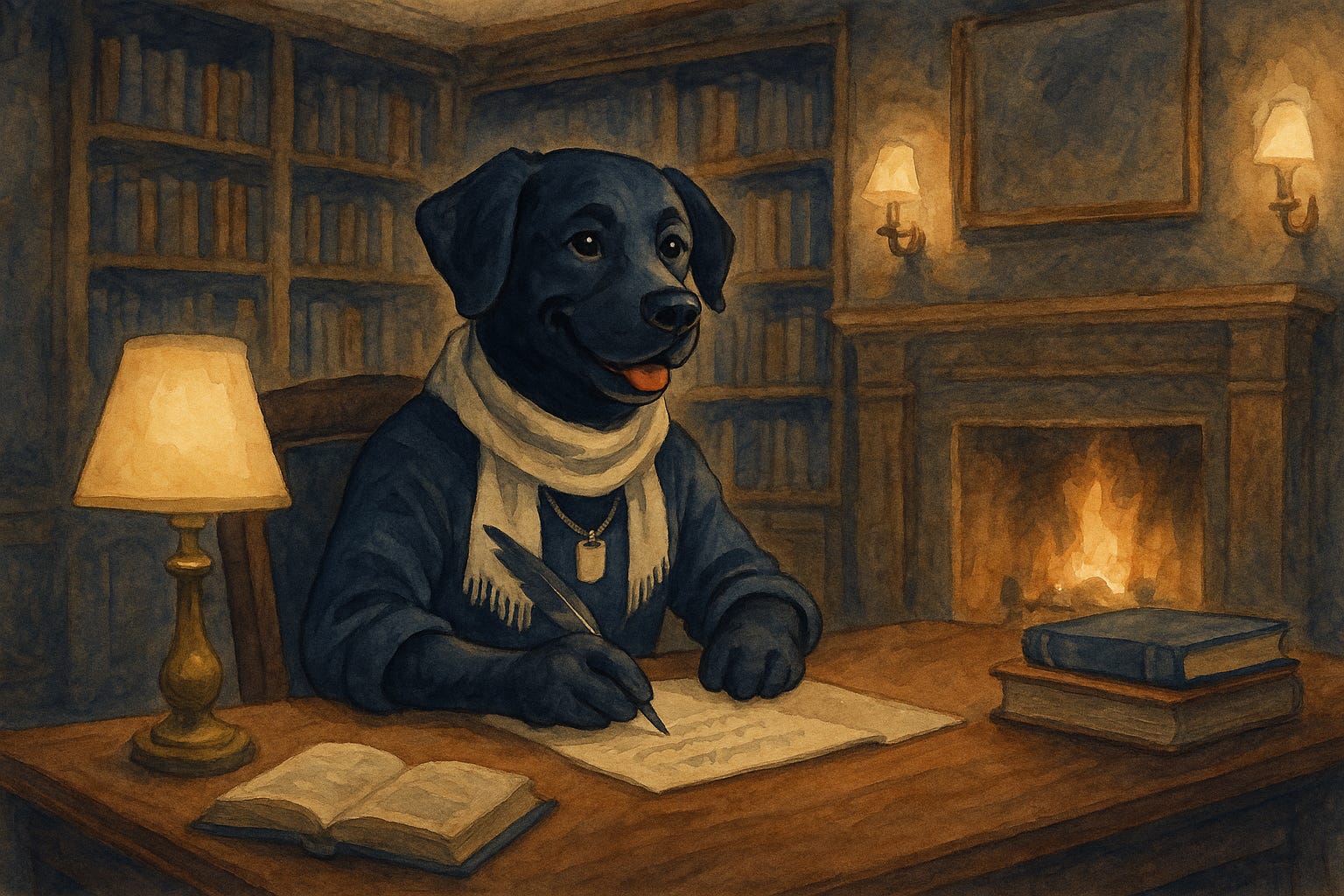
What I already had when this project started was a logo, an initial color palette, an aviation theme and the random addition of my love of Victorian doors and architecture. Before I had done the work to discover my actual brand identity (which unfolded out of necessity), I experimented with different images or ideas just based on things I liked. I had seen ’s doggo in one of her images and thought maybe that’s what I should use.
That didn’t seem sustainable. Then came winter break with the grandparents and some much needed downtime. As I was sharing my conundrum with my amazing mother-in-law, simply talking out loud about what I was trying to do, and immediately “the problem I was trying to solve” became clearer. I had showed her some of my favorite inspirations on Substack and asked her what resonated and what didn’t…just to get some perspective.
Standing in her kitchen over coffee, I started breaking down what made the brands I admired so compelling, with their returning characters, seasonal variation, and the consistent palette across shifting moods.1 She asked a simple question that should have been obvious, “Shouldn’t your recurring character be a female pilot?”
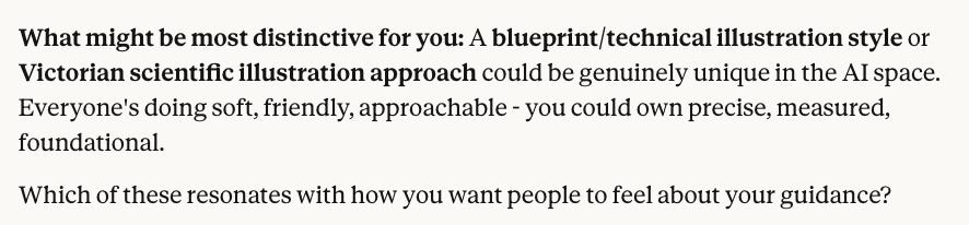
I’ll be honest, I had many “WTH” moments with my results for trying to use a female pilot as a repeating character (see Part 3 for blooper reel). I realized that I needed to also get clear on consistency while figuring out an art medium, since it felt like all of them had been created used already. It’s hard to believe it was barely a month ago that I had prompted Claude Sonnet 4.5. This was its first response:
But I didn’t want to be too precise or measured. So, I added ’s picture that inspired my quest for a better art medium that hadn’t been used.
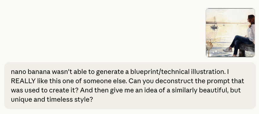
Claude came back, post deconstruction, with this (based on an original branding guide and colors that I’d created for my website):
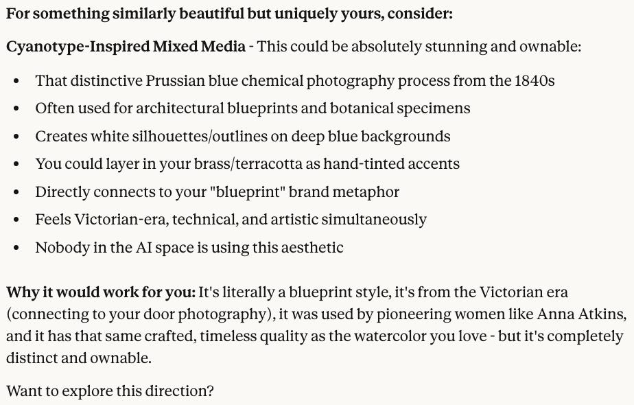
Well, we had more discussion about how it was not watercolor at all, but an early form of photography. That’s for a different post and time.
This was the beginning of an entire new obsession for me. Just like that. Because of ’s branding quiz and ’s watercolor, I became a cyanotype devotee and Anna Atkins fangirl. So much so, that in a couple of months, I have an appointment at London’s Victoria & Albert museum’s private viewing room to see and hold original Anna Atkin’s cyanotype photographs. I’m even taking the massive bound collection from Peter Walther that I just purchased to compare details. And if that’s not enough obsessiveness, I’m attending a class in London where I can actually learn to MAKE cyanotypes.
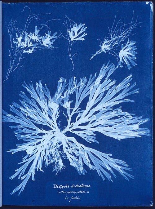
That’s what a real obsession looks like. And that’s what it took to find a visual identity worth keeping.
What I Actually Built
Branding allows YOU to define the connection point that you make with others rather than leaving it to chance. It’s intentional. AI should amplify your brand vision, not replace it with algorithmic and mathematical vector defaults.
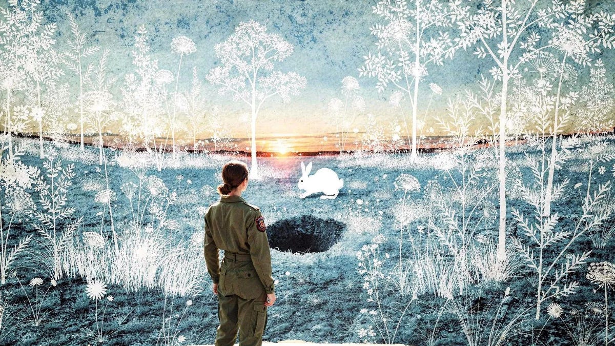
Here’s what came out of it.
This is the image I created to go with my post today. I always create the image from something that emerges as a theme from my writing that day. It took me 10 attempts to generate this. You should have seen the size of the other rabbit holes!
It’s not just that every image costs tokens or credits, but I have learned that working with my art medium is also a great way to procrastinate from my writing. If I don’t put an attempt limit on it, I will remain in that rabbit hole indefinitely.
Coming full circle, my resulting brand identity document is 23 pages. Instead of sharing all of it, I built a prompt guide for you to create your own branding style guide.
If you end up using it to build out your own brand, we’d all love to hear about it.
Quiz Time
I bet you didn’t know there’d be a test at the end! There’s only two questions and it’s pass/fail. Because, if you’ve read this far, you too may want to develop your brand identity.
Without thinking more than three seconds, can you answer these two questions?
Who is your “one” person you’re writing for?
Who are you not writing for?
Bonus question: WHY?
Feel free to do it in silence, or what we all really want, share it with the rest of us in comments below!
If you can’t answer, you might have some new things to think about.
Stay tuned for Part 3 where I share my tech stack, the two-layer prompt system that produces every cyanotype image, and some hilarious thumbnail art prompt fails.
Thanks for reading AI Flight Plan! If something here resonated with you, please feel free to share the love.
, , , , ,
Comments
Nothing yet. Say the first thing.
Sign in to join the conversation.