
This style belongs to a design tradition older than the console it looks like it came from. Japanese kawaii illustration took shape in the 1950s with artists like Rune Naito, whose big-headed cartoon animals and doll-like girls ran in girls’ magazines long before anyone had drawn a sprite. Sanrio picked up the same logic when it started selling character goods in 1960, and Hello Kitty arrived in 1974 with Yuko Shimizu’s design reduced to almost nothing. There’s no mouth, a head twice the width of the body and a single bow to break the symmetry. The rule underneath all of it is that a mascot has to be readable at the size of a coin purse.
Sprite artists reached the same place from a different direction. When Nintendo drew Mario for the arcade in 1981, the cap existed because hair wouldn’t read at that resolution, and the moustache existed because a mouth wouldn’t. Character design under those limits becomes silhouette design, and the test is whether you can fill the shape with solid black and still name it. My rabbit passes on the ears alone. Everything else about it is negotiable.
What separates convincing 8-bit work from the imitation is colour count. Midjourney’s default instinct is to give you modern indie pixel art, which means dithering, soft gradients baked into the sky and a palette of forty greens where the era would have had four. Asking for a limited flat palette pulls it back. Asking for no anti-aliasing pulls it back much further, because that soft edge blending is the specific artefact that makes a pixel image look like it was drawn in 2019 rather than 1989.
Three scenes, same rendering rules.
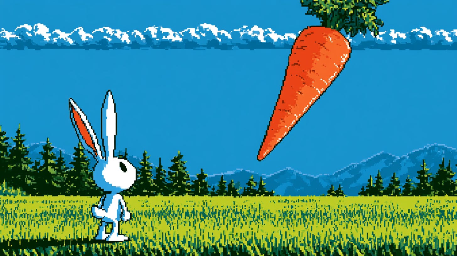
retro pixel art video game scene, small white rabbit character standing on bright green grass facing right, long upright ears with orange inner lining, colossal orange carrot with leafy green top floating high in a solid blue sky, row of dark green pine trees along the horizon, layered blue mountain range behind them, single band of blocky white clouds across the top, grass field with fine vertical pixel texture, limited flat color palette, hard pixel edges, no anti-aliasing, side-scrolling platformer composition --ar 16:9
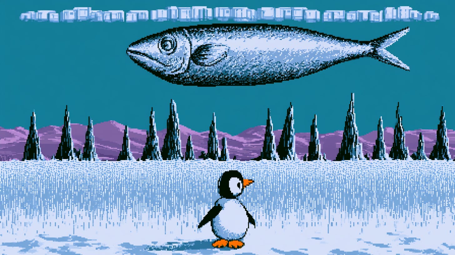
retro pixel art video game scene, small round penguin character standing on pale blue snow facing right, orange beak and orange feet, colossal silver fish floating high in a solid teal sky, row of dark ice spires along the horizon, layered purple mountain range behind them, single band of blocky white clouds across the top, snow field with fine vertical pixel texture, limited flat color palette, hard pixel edges, no anti-aliasing, side-scrolling platformer composition --ar 16:9
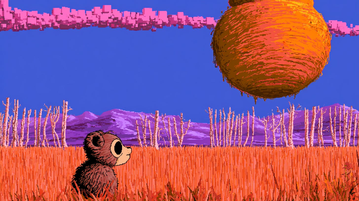
retro pixel art video game scene, small brown bear cub standing on burnt orange autumn grass facing right, cream muzzle and round dark eye, colossal amber honey pot floating high in a solid indigo sky, row of pale birch trunks along the horizon, layered violet mountain range behind them, single band of blocky pink clouds across the top, grass field with fine vertical pixel texture, limited flat color palette, hard pixel edges, no anti-aliasing, side-scrolling platformer composition --ar 16:9
“no anti-aliasing”
This is the phrase that decides whether the image looks like 1989 or last Tuesday. Anti-aliasing is the soft blending along a diagonal edge, and modern pixel art uses it constantly. Without this phrase I got clean, tasteful sprites with feathered outlines that would sit comfortably in a Steam store page. With it, the edges go blocky and honest.
“limited flat color palette”
Colour count does more retro work than any other single instruction. The word flat is the part that matters, because a limited palette on its own still lets the model dither and blend within it. Dropping “flat” gave me speckled gradients in the sky, which is technically period accurate for some hardware and looks wrong for this kind of scene.
“fine vertical pixel texture”
The word fine is load bearing. Asking for vertical pixel texture alone turned the grass into dense green static that pulled the eye away from the character. Fine keeps the strokes sparse and thin. I also tried “sparse vertical pixel lines” and got a similar result, so either works.
“side-scrolling platformer composition”
This does the layout for you. It puts the character on the left third facing right, sets the ground plane low and stacks the background in horizontal bands. Without it the model tends toward a centred portrait crop of the animal, which throws away the sky and kills the floating object entirely.
For the rabbit, swapping “colossal” for “impossibly large” pushed the carrot bigger again, and adding “carrot casts a shadow on the grass” grounds the joke by making the rabbit look like it’s actually underneath something. If you want the character to feel smaller, add “wide open field” and the model pulls the camera back.
For the penguin, changing the sky from teal to pale pink turns the whole thing into a sunset scene without touching anything else, and it’s the fastest mood change available. Adding “small ice floes on the ground” fills the empty foreground, though it does start to crowd the character.
For the bear, “burnt orange” is worth swapping around. Deep red gives you something closer to a late Mega Drive forest level, and swapping the birch trunks for “row of dark conifers” makes it read colder. The honey pot handles colour changes badly, so leave the amber alone.
Across all three, adding “16 bit” instead of leaving the era unstated gives you more colours and finer detail while keeping the hard edges, which suits the bear scene best. And if the character comes out too detailed, add “simple two color character” and the silhouette tightens up immediately.
Run the first prompt, then strip out one phrase at a time and watch which one the image can’t survive without.
Comments
Nothing yet. Say the first thing.
Sign in to join the conversation.