
An owl with orange eyes that big shouldn’t look gentle. White feathers fading into green, scattered with darker green and blue speckles like something a pond left behind, do most of the work in making an intensely focused gaze feel calm instead of alarming.
I ran this prompt expecting the colour transition to look like a gradient filter, green sliding into white the way a sunset photo fades at the edges. It didn’t read that way at all. The green deepened toward the bottom of the body and stayed lighter near the head, with the speckling doing more to suggest actual feather structure than the colour shift did on its own. The silver beak picked up just enough cool tone to keep the warm orange eyes from dominating the whole face, which surprised me. I expected the eyes to win that fight outright.
Kacho-e, the bird and flower prints that flourished in Japanese woodblock printmaking from the Edo period onward, treated individual birds as worthy subjects on their own, isolated against plain or minimal backgrounds rather than placed inside a busy scene. A single crane, a single sparrow, a single owl, rendered with enough specificity that you could identify the species, sat at the centre of the composition with nothing competing for attention. That isolation is exactly what a solid white background does here. Nothing about the setting matters. The bird is the entire argument.
The black tufts above the eyes are doing more compositional work than I expected from something so small. Without them, the face reads as round and slightly featureless, an owl shape rather than a specific owl. Curved outward the way they are here, they frame the eyes the way eyebrows frame a human expression, giving the whole face a readable point of focus before you even get to the colour. Small details like that often carry more identity than the dominant colour palette does.
I tested the prompt without the word “speckles” once, just to see what the spots would do without that specific vocabulary attached to them. The marks came back larger and more like patches than speckles, closer to a different kind of pattern entirely. The word itself was carrying size information as much as texture information, which isn’t always obvious until you remove it and watch the model default to something else.
What I keep coming back to is the legs. Slender and pale against the deep green underside, they’re almost an afterthought in the original description, but they do a lot to keep the bird looking proportionate rather than top heavy. A bulkier leg would have grounded the image differently, made the owl read as sturdier and less precise. The thin legs and black talons give it a kind of poised stillness instead, the visual opposite of the wide alert eyes above them.
The deeper green at the bottom of the body, fading upward into lighter tones near the head, inverts the usual logic of how light tends to fall on a standing bird. Most natural lighting would darken the legs and underside in shadow, not deepen the colour saturation there on purpose. The effect has little to do with light. It’s a deliberate colour structure, more decorative than naturalistic, which fits the kacho-e tradition’s interest in pattern and clarity over strict biological accuracy.
Three prompts, three birds, same speckled colour transition. Here’s what I ran.
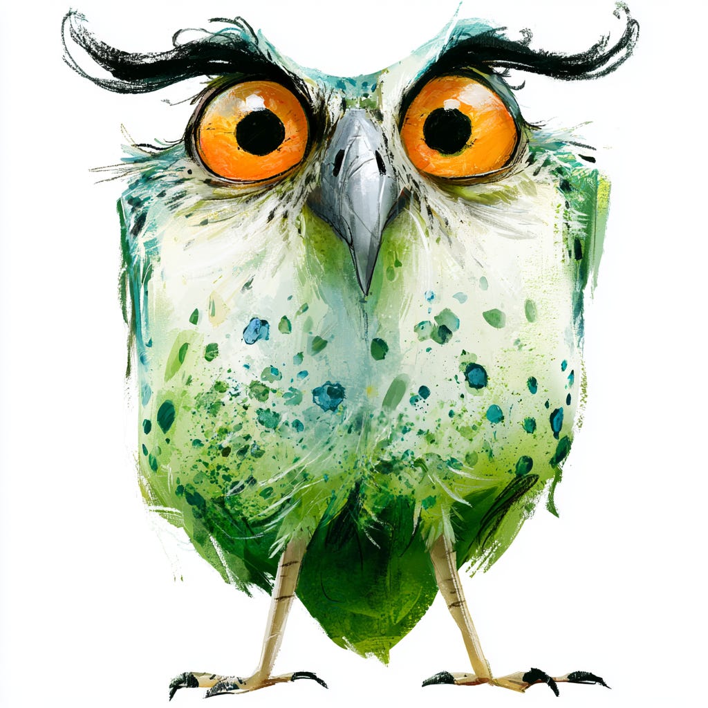
Full body illustration of an owl, large orange eyes with black pupils, body predominantly white transitioning to light green with darker green and blue spots and speckles scattered across the chest and sides, prominent black tufts above the eyes curving outwards, silver grey beak, deeper green at the base of the body, two slender light brown legs with black talons, solid white background --ar 1:1 --q 2
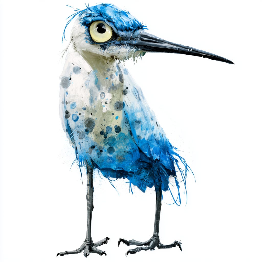
Full body illustration of a heron, large pale yellow eyes with black pupils, body predominantly white transitioning to soft blue with darker blue and grey spots and speckles scattered across the chest and sides, a long slender black beak, deeper blue at the base of the body, two slender dark grey legs with black talons, solid white background --ar 1:1 --q 2
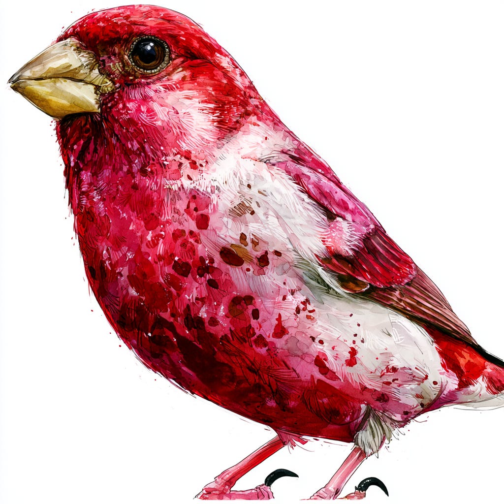
Full body illustration of a finch, large dark brown eyes with black pupils, body predominantly white transitioning to deep crimson with darker red and brown spots and speckles scattered across the chest and sides, a short stout pale yellow beak, deeper crimson at the base of the body, two slender pink legs with black talons, solid white background --ar 1:1 --q 2
“transitioning to [colour] with darker [colour] and [colour] spots and speckles”
This is the phrase doing the bulk of the work across all three birds, and the order of operations inside it matters. Naming the base transition first, then layering the spots on top, kept the speckling reading as surface texture rather than competing with the underlying colour shift for attention. I tried reversing the order once, leading with the spots before the transition, and got a result where the speckling looked closer to camouflage patterning than decorative marking.
“prominent black tufts above the eyes curving outwards” (owl only)
This phrase is specific to the owl version and worth calling out because it doesn’t transfer cleanly to the heron or finch. Tufts read as an owl-specific feature, and trying to force them onto a different species risks the model defaulting back to an owl shape regardless of what species name you used elsewhere in the prompt. Species-specific anatomical details like this should stay attached to the species they actually belong to.
“deeper [colour] at the base of the body”
This phrase is controlling the vertical colour logic of the entire bird, and it’s worth testing in isolation if a result feels flat. Without it, the colour transition tends to apply more evenly across the whole body rather than concentrating at the base, which loses the sense of weight and grounding that the deeper tone provides. It’s a small phrase carrying a fairly large compositional job.
“solid white background”
Same lesson as the protest poster piece a few issues back. The word “solid” matters more than naming the colour. Without it, Midjourney occasionally adds a faint vignette or soft shadow beneath the bird, which undercuts the isolated, specimen-like presentation that the kacho-e tradition depends on. Flat, uninterrupted white is what makes the bird read as the entire subject rather than a figure in a scene.
On the owl, try shifting the eye colour from orange to amber if the current version feels too intense against the green. A slightly warmer, less saturated eye colour can soften the gaze without losing the alertness the wide eyes are built to convey.
On the heron, push the beak length further with “elongated slender black beak” if the silhouette feels too compact. Herons read as more recognisably heron-shaped the longer and thinner the beak becomes relative to the head.
On the finch, try swapping the pale yellow beak for a deep orange one if the palette feels too cool overall. A warmer beak tone against the crimson body adds a second point of contrast besides the eyes, which the owl and heron versions get for free from their cooler palettes.
Across all three, if the speckling looks too uniform or evenly spaced, add “irregular” directly before “spots and speckles.” Midjourney has a tendency to default toward a regular polka dot arrangement unless told explicitly not to.
Pick a bird, pick a palette, and see how far a single colour transition can carry a whole illustration.
Comments
Nothing yet. Say the first thing.
Sign in to join the conversation.