
When I start out developing a new training course, a presentation for a conference, putting together a mentoring session or starting on content for a new “an Agile Data Guide” I like to think about the core problem I am trying to help solve.
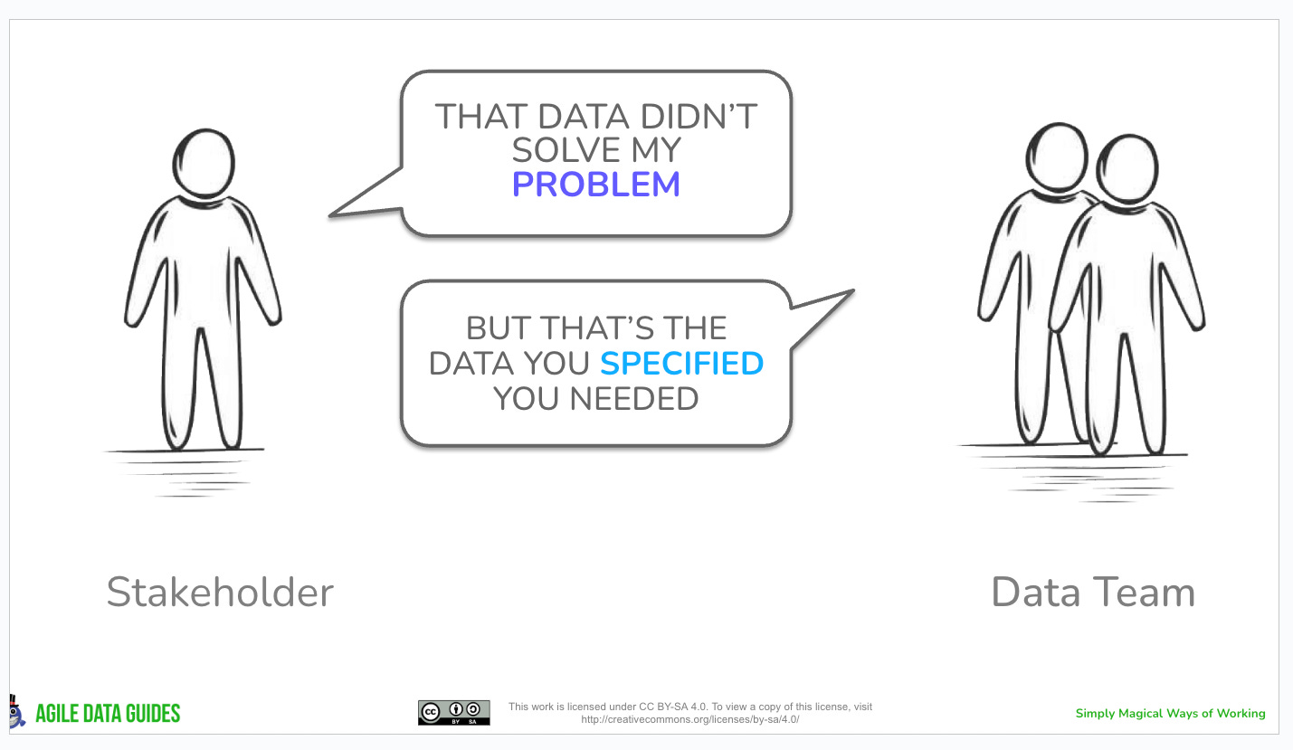
Many years ago the talented team I was working with created a slide for a course we were developing that was in the format that I now call “Problem People”.
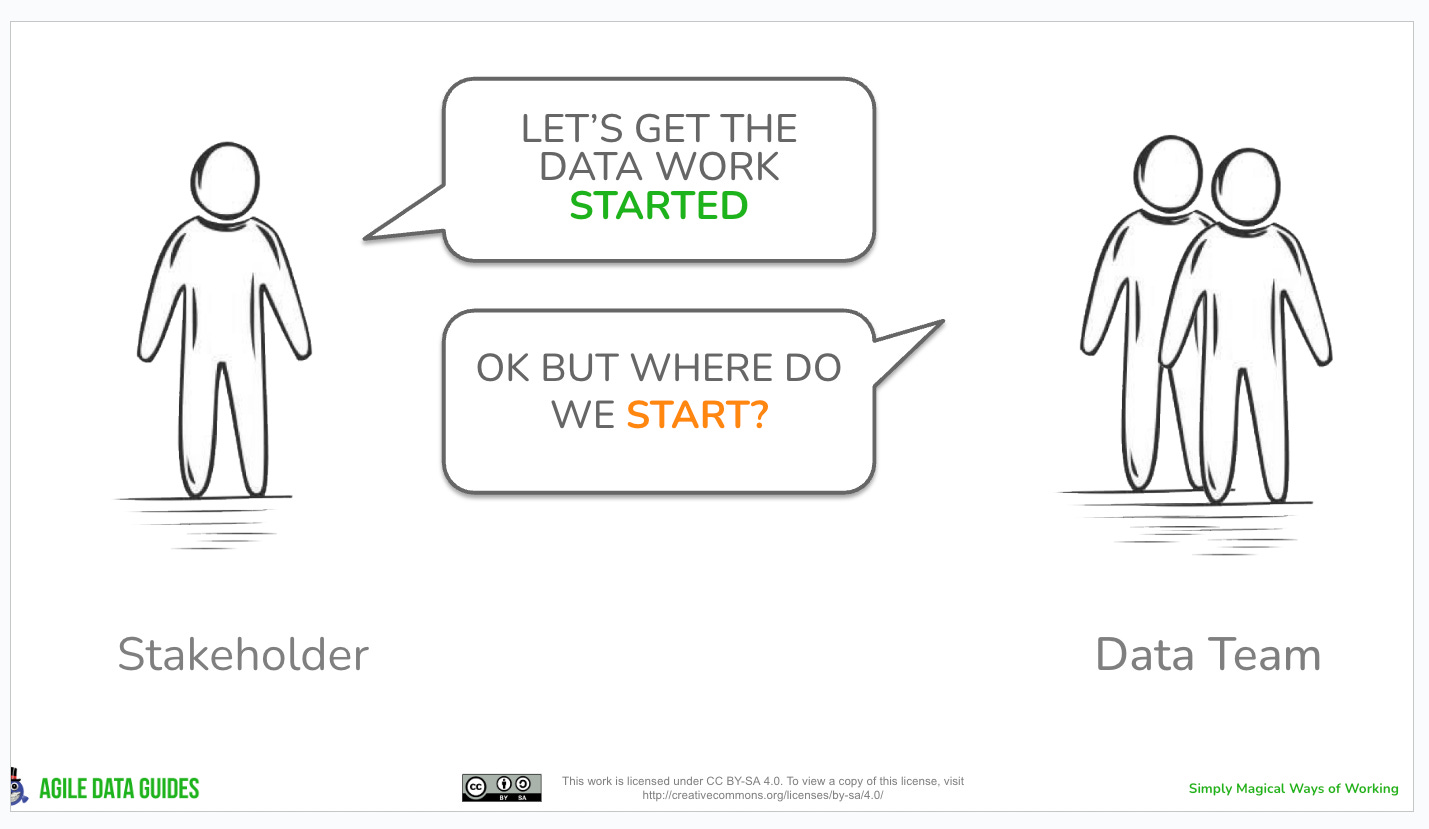
It is a simple slide that has two groups of people and a simple conversation between them that highlights a particular problem I see repeatably in the data domain.
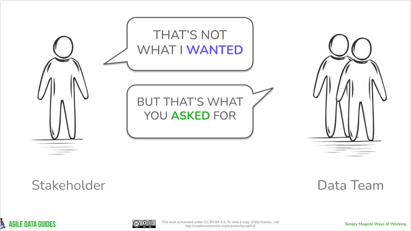
Here is an example that I used in “An Agile Data Guide to Information Product Canvas” aka the Green Book.
Three interesting patterns within this pattern
There are a few interesting things about this pattern template.
Focus on the outcome not the data task
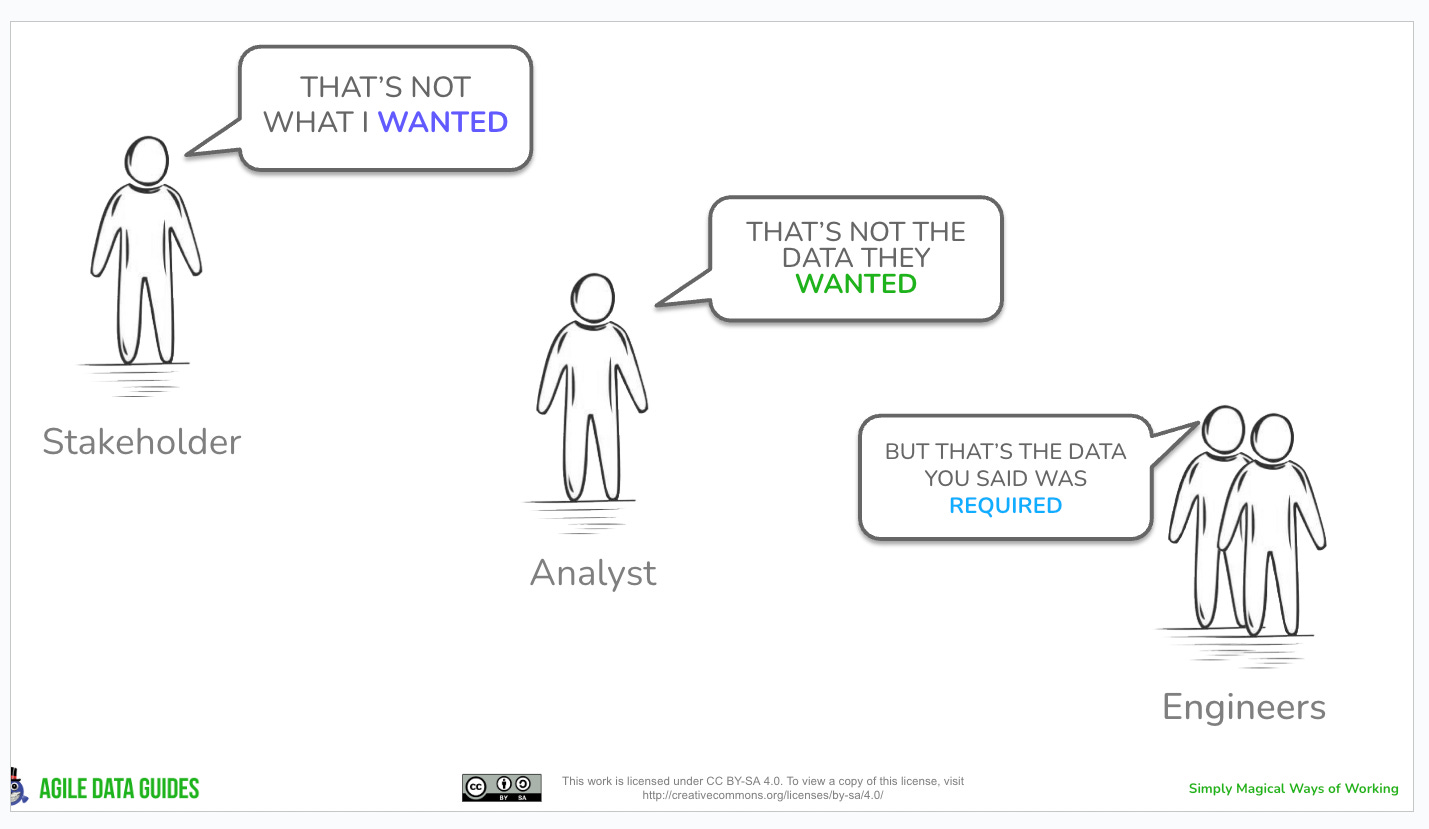
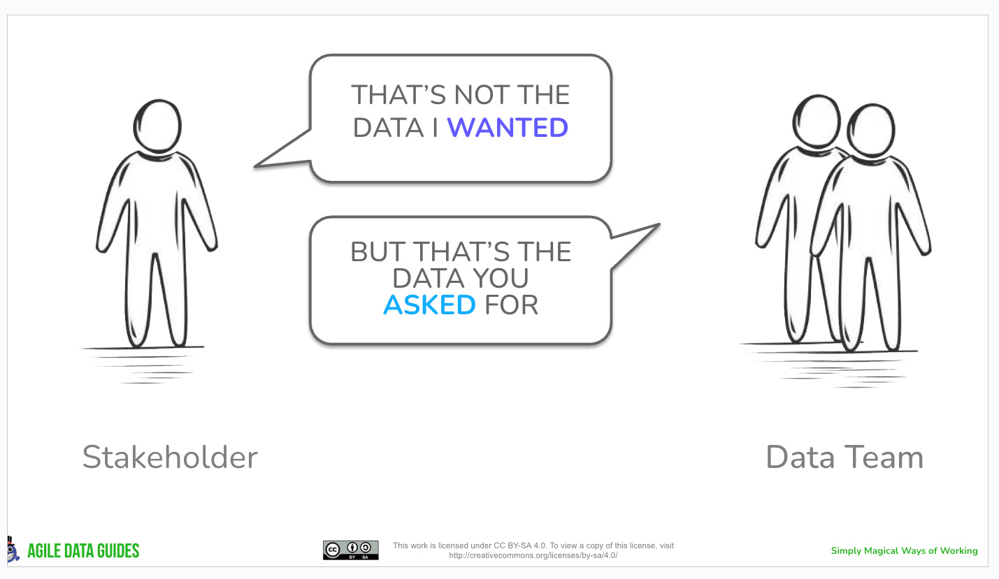
If you look at the example above it doesn’t talk about the problem of gathering data requirements that the Green Book and the Information Product Canvas aims to help data teams solve.
Gathering data requirements is the data task that needs to happen.
But good requirements result in Stakeholders receiving the information that they need to solve their business problem.
So the “Problem People” focusses on this, the outcome the Stakeholder wanted not the process to get there.
In hindsight as I write this I think I should probably update the statement on the left to be “what you gave me didn’t solve my problem”.
Simple diagrams help people map their understanding
The second thing is the “Problem People” diagram is simple, it ideally has two groups of people on it, one on the left and one on the right.
As a kid I was an avid reader of Mad magazines (as well as Viz) and one of my favourite cartoons in it was Spy vs Spy.

I have found over the decades I have worked in the data domain that the simple pattern of left vs right is a great way to explain complex concepts with simplicity.
Or a great way to explain choices stakeholders can make and the trade offs that come with those choices. For example “would you like the capability to upload a file manually and start using the data right now, or would you like us to automate it which would mean the data would be available in about two weeks?”
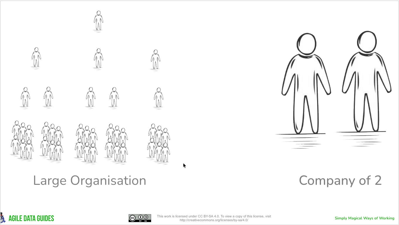
Once I end up with a draft “Problem People” diagram with more than two groups, more than a left and right, I know I am trying to help solve more than one problem in one go, and I need to iterate it into multiple diagrams.
Constraints make things clearer
The third thing is by using a speech bubble in the diagrams I have natural constraints pattern that stops me writing large volumes of text.
For me this is the hardest part of creating these diagrams, getting the words short enough that they fit a speech bubble but rich enough that they help describe the problem.
I tend to end up writing verbose text first and then iterating it multiple times, each time reducing the number of words used until I get something that is short enough to fit, but still provides the insight needed to describe the problem.
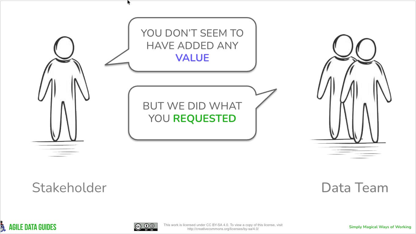
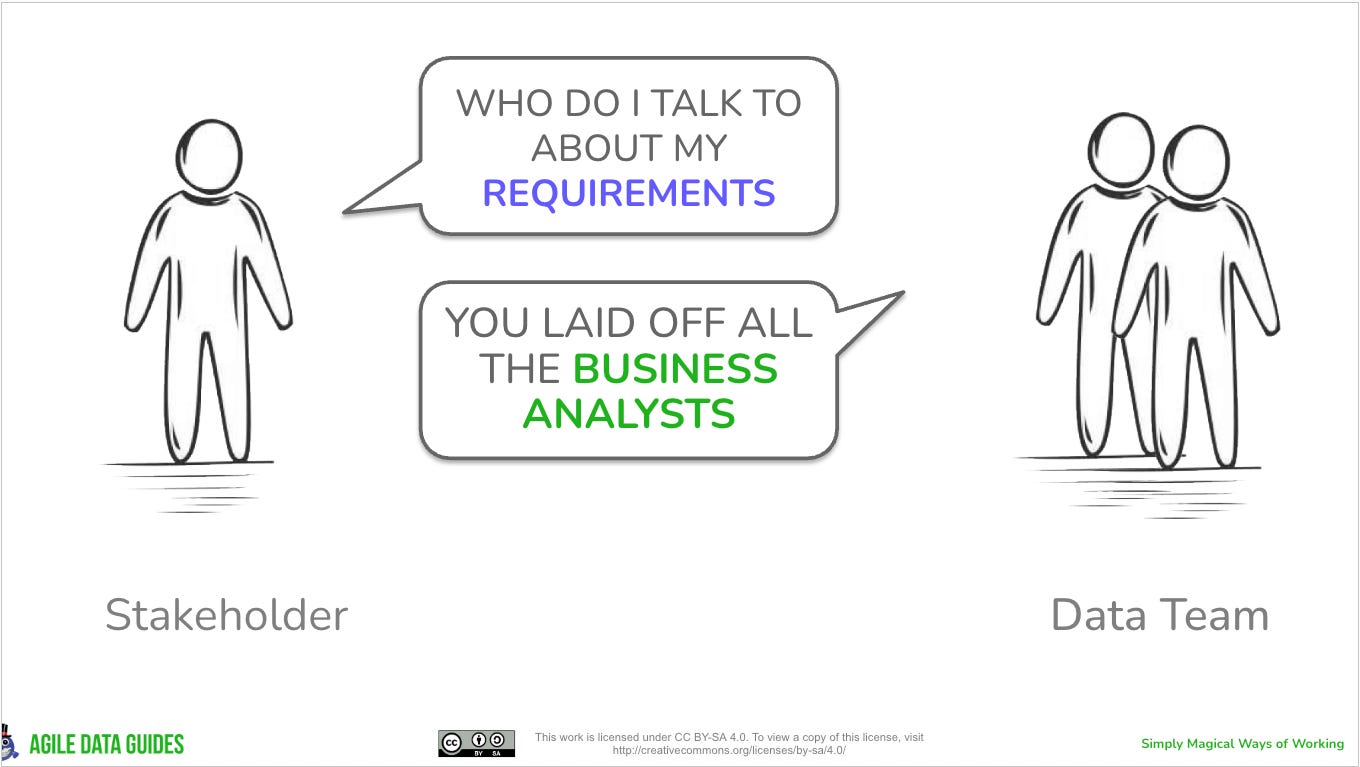
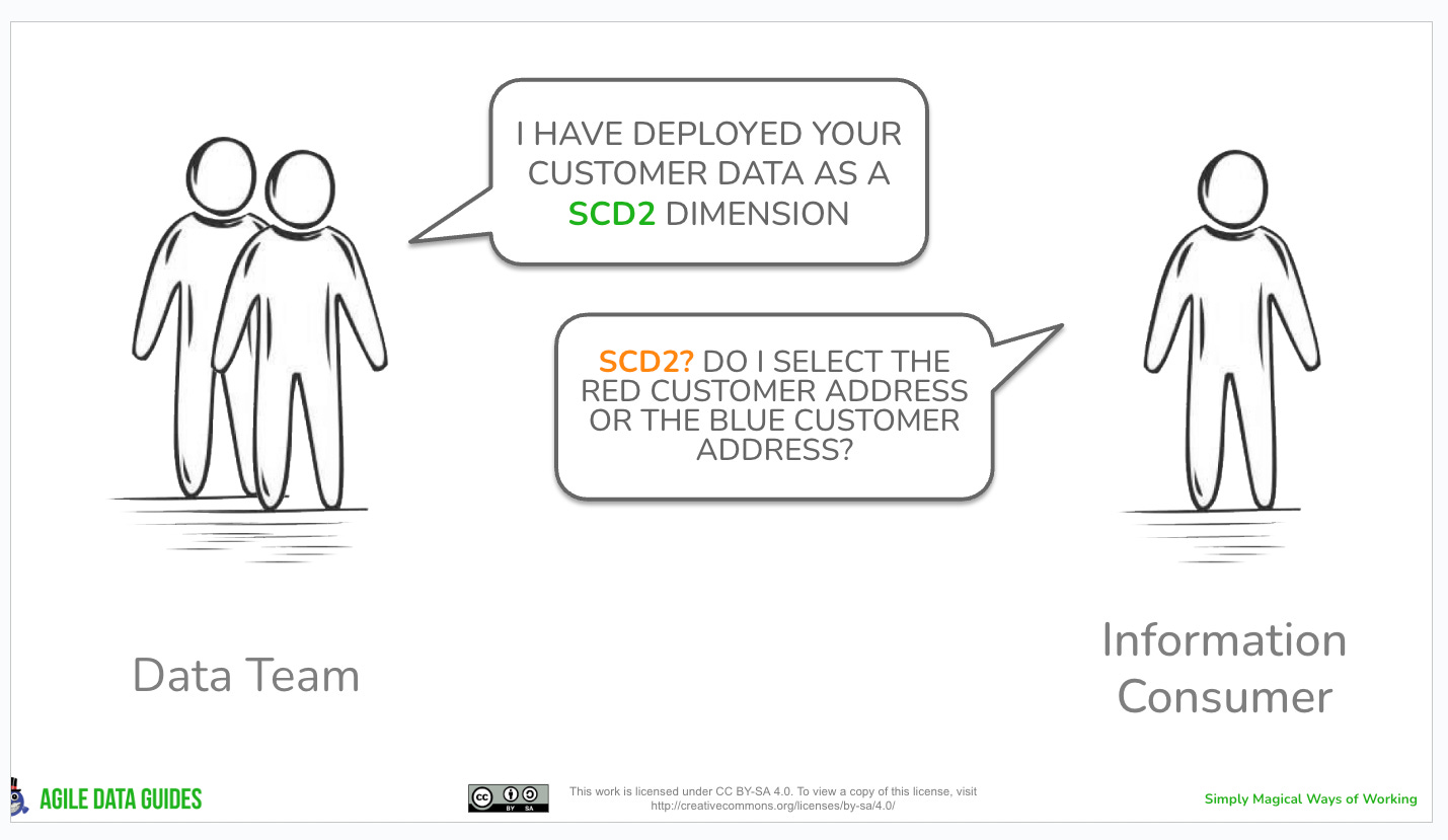
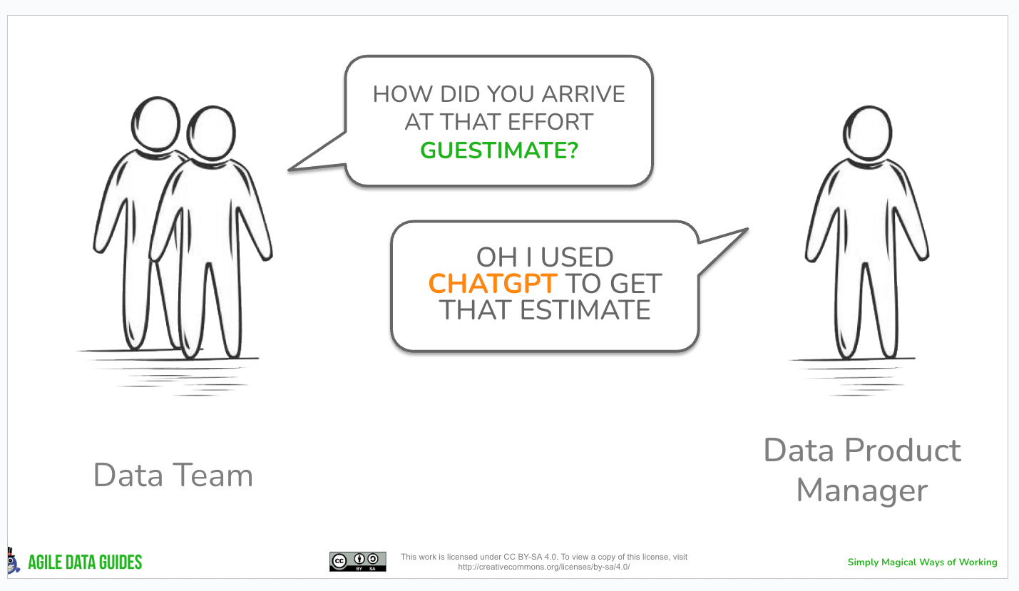
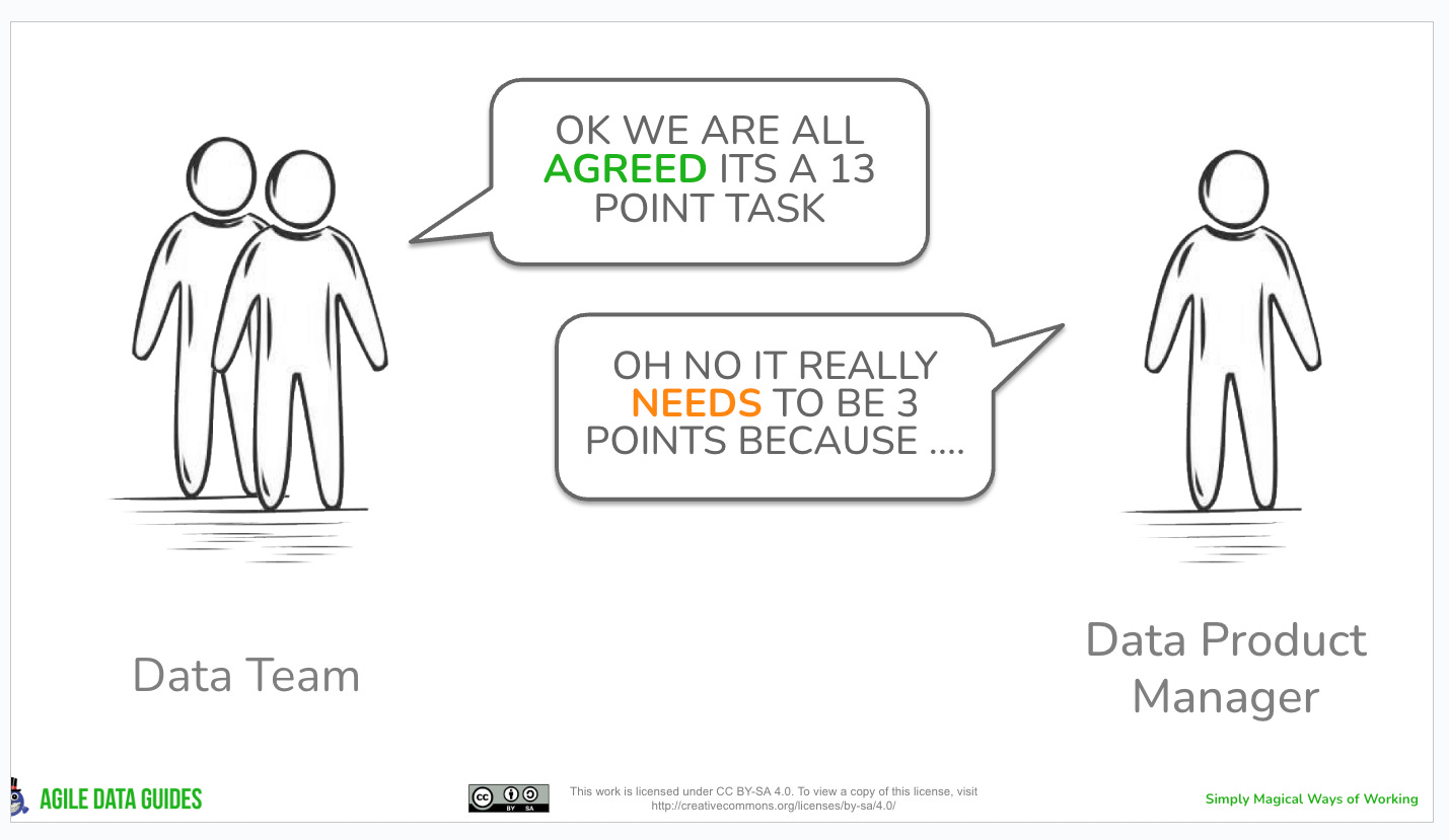
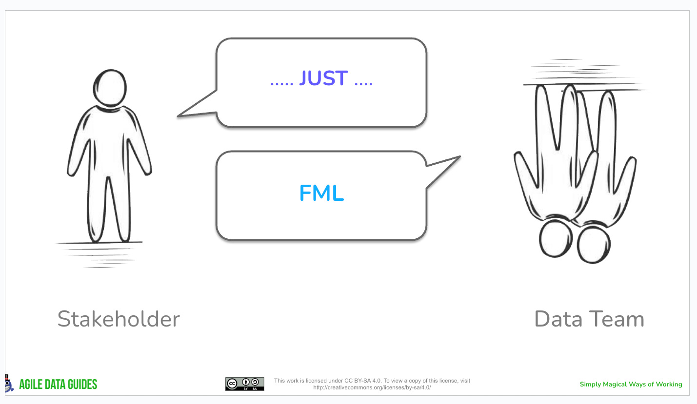
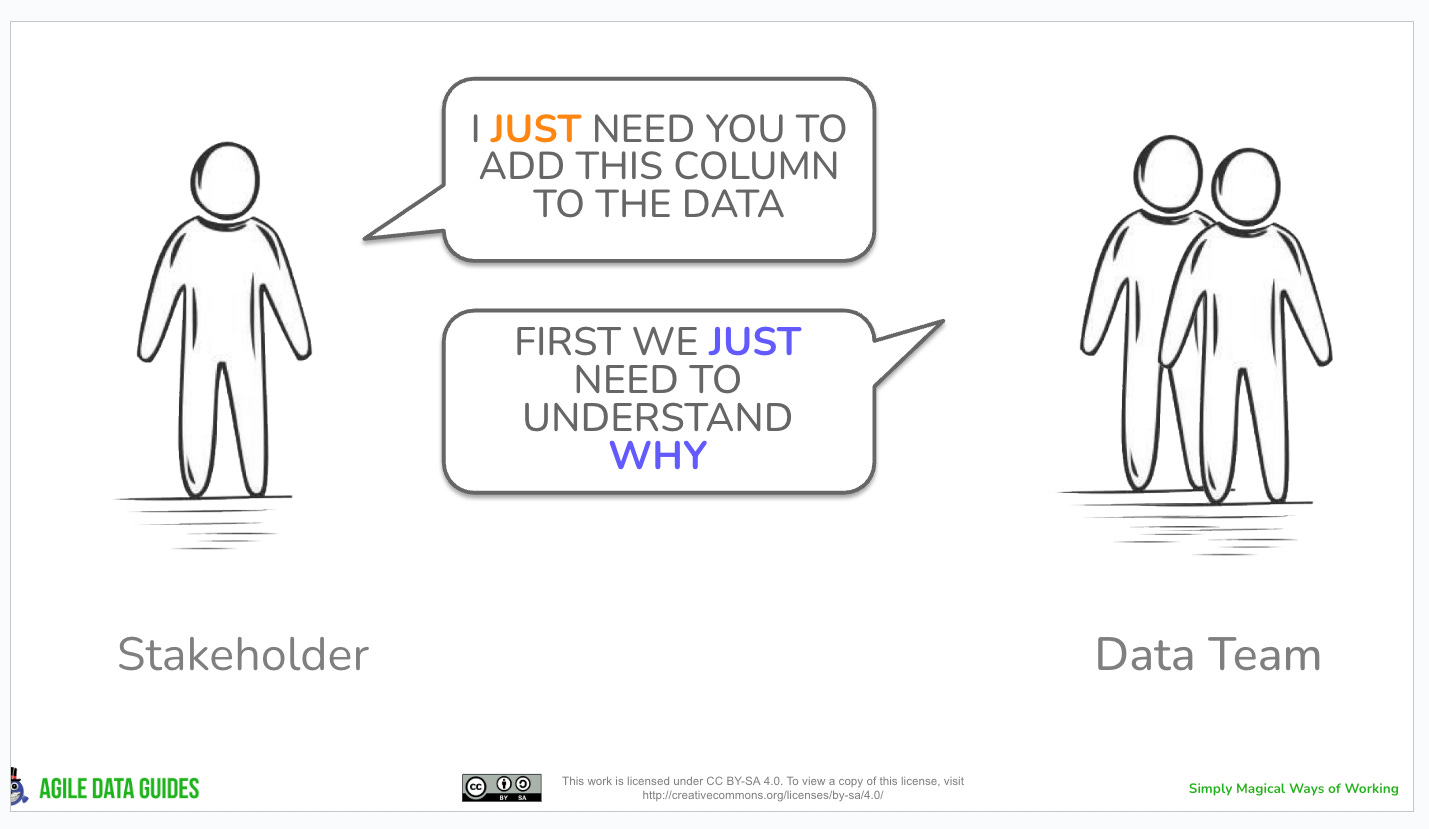
Draft “Problem People” Diagrams
I try and remember to add a copy of each “Problem People: diagram to a Google Slide deck I have so I can find them and reuse them again later.
I will try and remember to update this article with them going forward as well.
They are all open source so feel feee to reuse at will, and reach out if you want the Google Slide version so you can edit it to match you Context.
Some of these are more Done than Done Done so keep that in mind.
Patterns that help Solve the problems
If you are intersted in some of the patterns that help solve these problems, reach out, I am also happy to share them, Sharing is Caring!
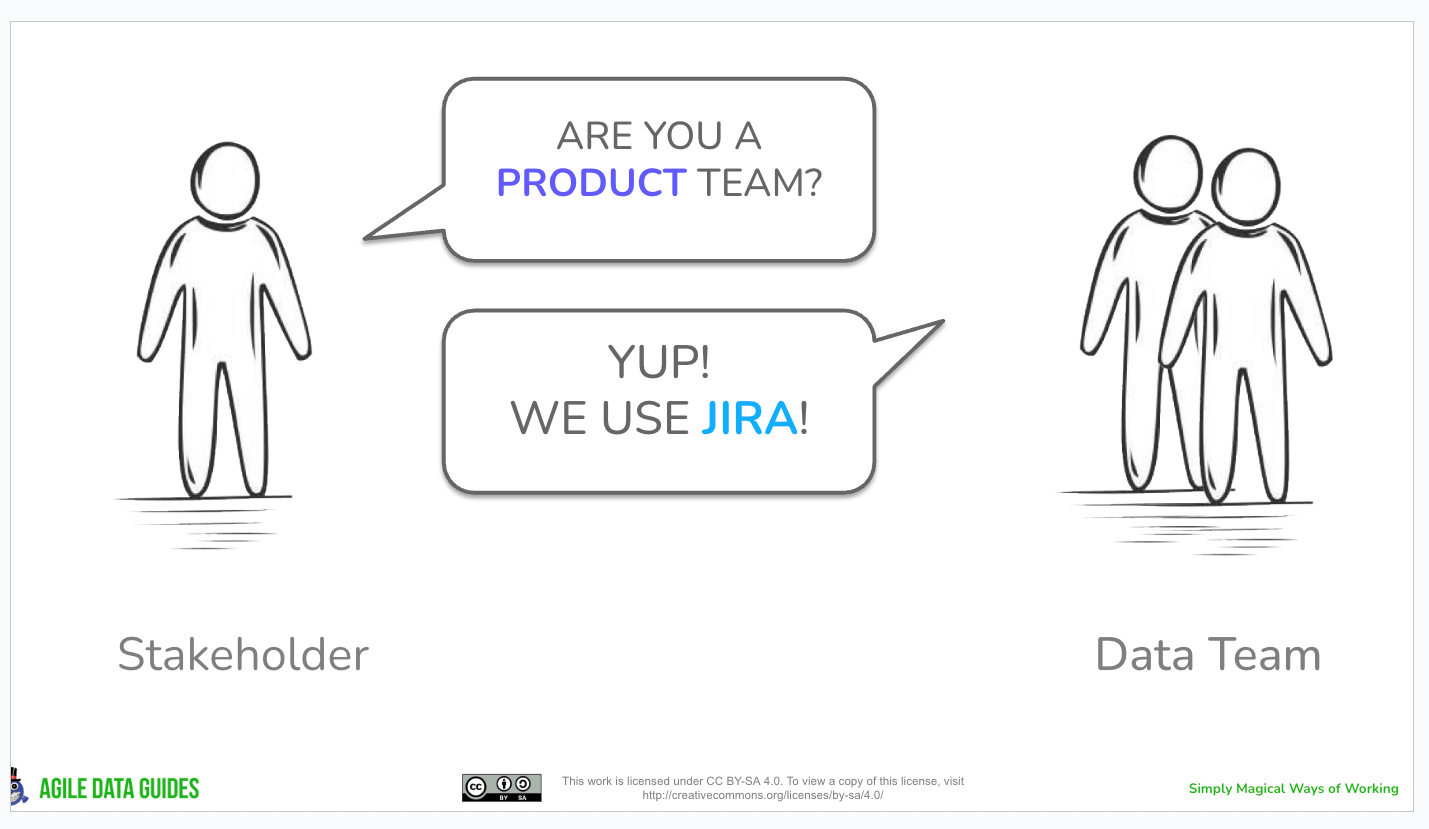
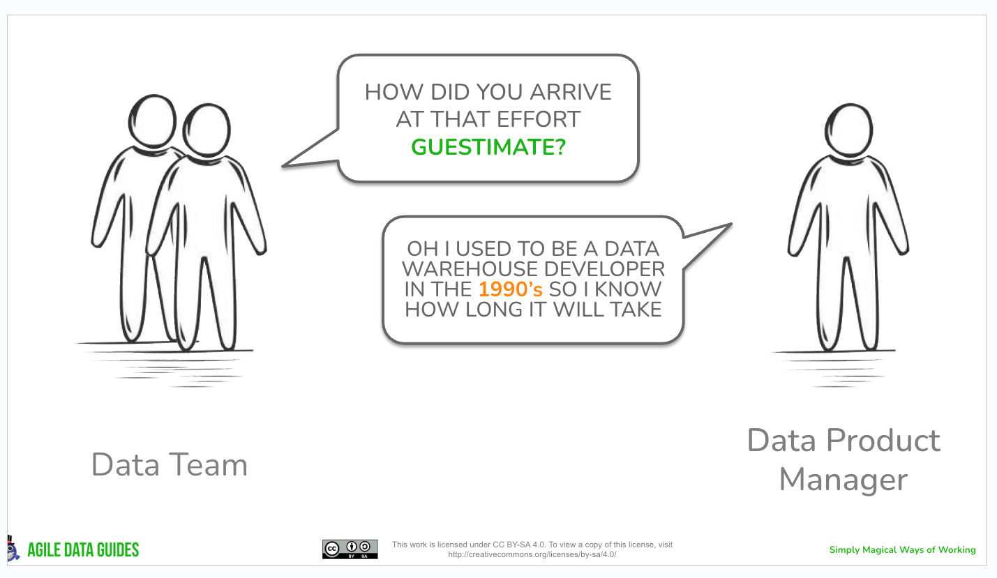
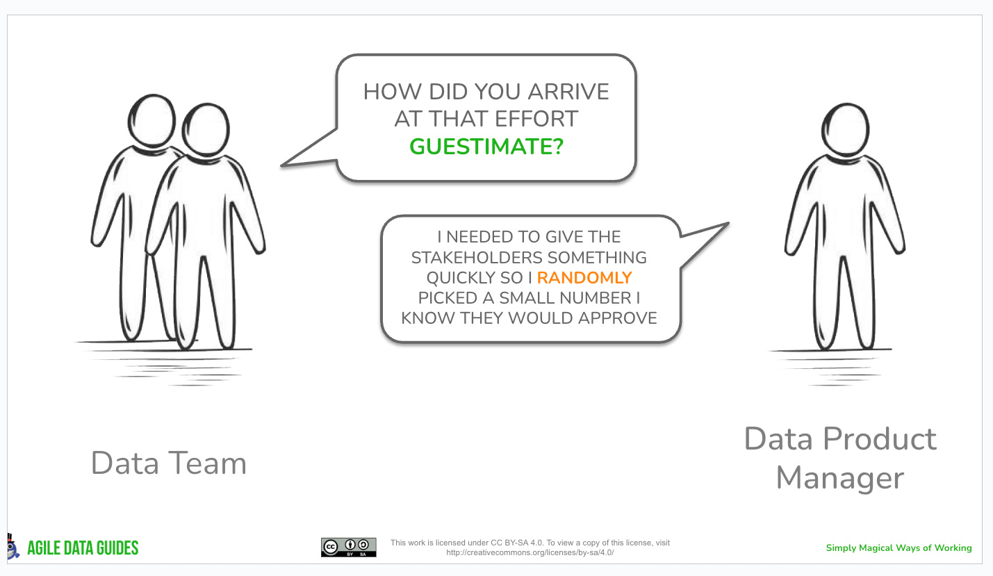
Some additional problem from suggestions by the Practical Data Community (you can join the community for free here: https://discord.gg/a34H7hMYpA), they are slightly unhinged, as is the PDC.
Comments
Nothing yet. Say the first thing.
Sign in to join the conversation.