
Hey there! This is a ✨ free edition of AI First Designer ✨, to help designers transition into successful AI-First designers. Members get access to proven strategies, frameworks, and playbooks.
More resources: Unlock your career as an AI-First Designer | Get free 1:1 mentorship | Claim Perplexity Pro for 1 month free | Get AI Design eBook (free)
I went viral on Twitter (X)’s design feed last week.
For applauding a copied design.
The post I made about? Perplexity’s AI browser, Comet.
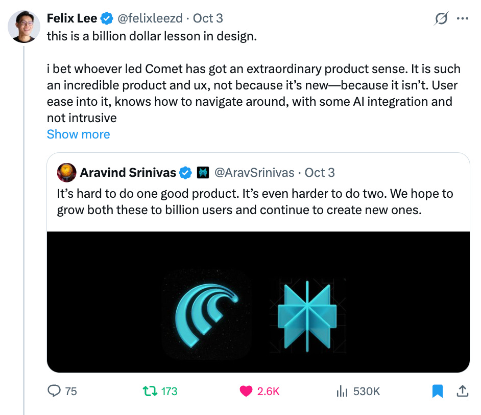
Even Aravind, Perplexity’s CEO, retweeted this.
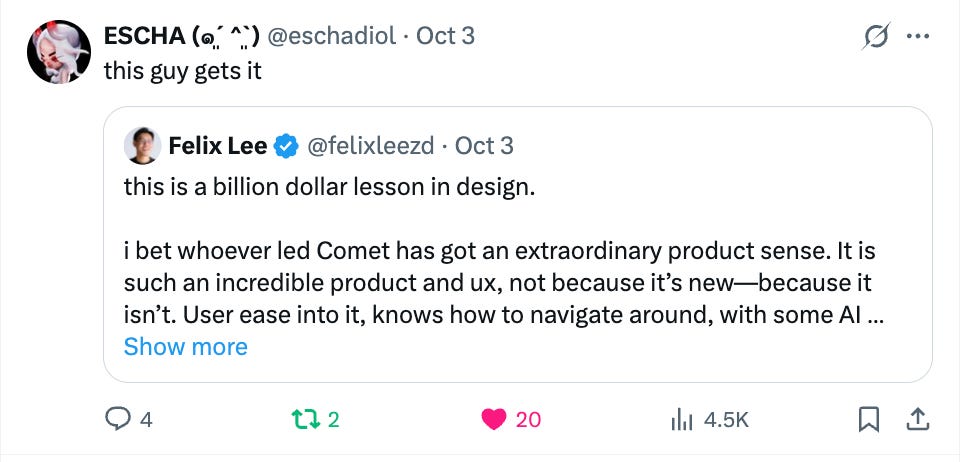
In July, Perplexity first launched its AI browser, Comet. Thousands of tech people from San Francisco, New York, to New Delhi and Singapore were raving for it, while it is an invite-only browser.
Everyone wanted to try it.
Their design? It was eerily similar to Chrome, if not 99% same. Except for their AI agent on the side nav.
This stolen design interface may seem different from new browsers like Arc and Dia at first.
But it’s actually genius to just copy Chrome’s design.
Ironically, Arc and Dia’s design decision to innovate on a new UX was absolutely terrible.
One year ago, when I saw Arc’s launch and all its Twitter (X) hype, the designer in me couldn’t stand it.
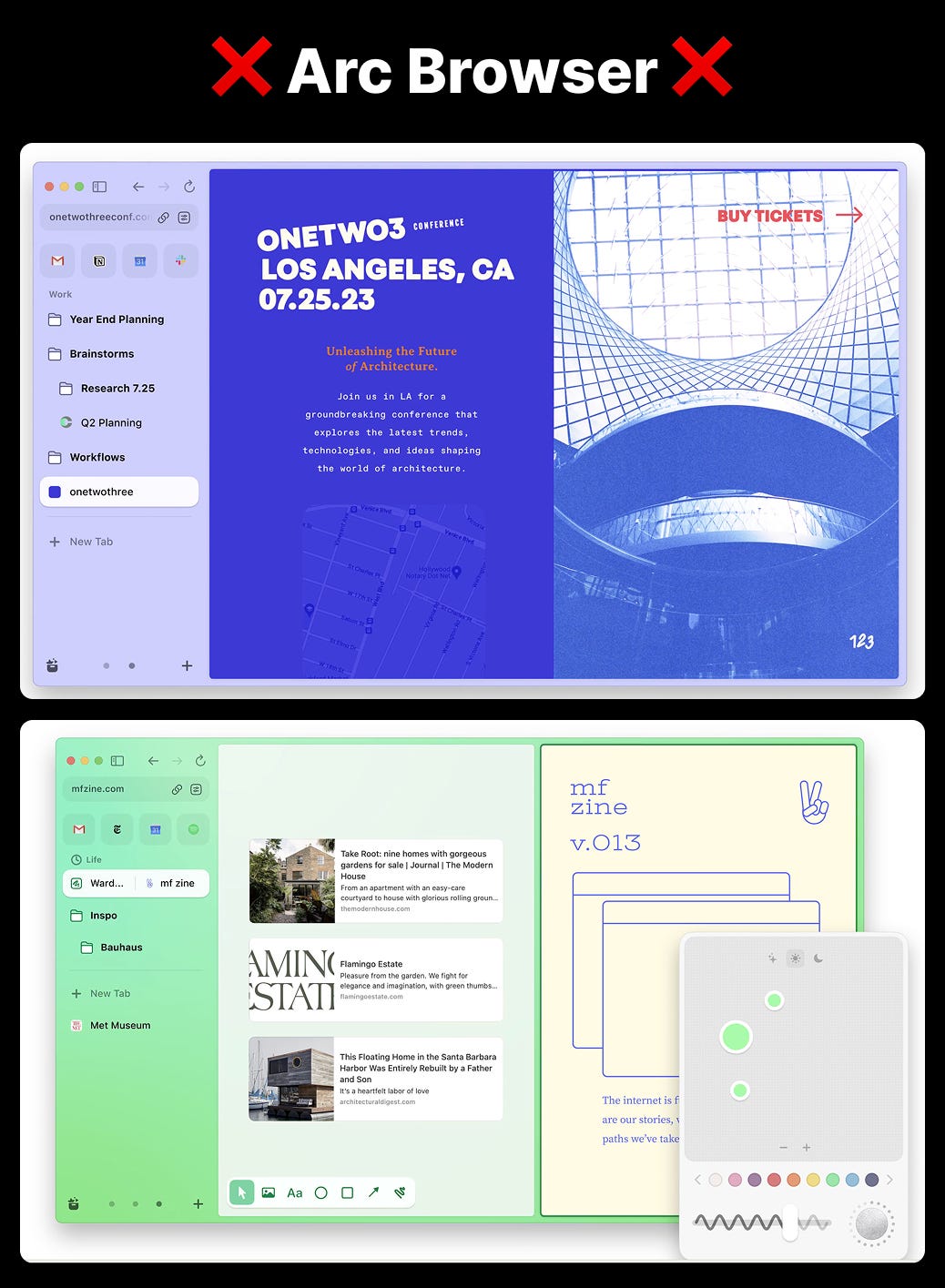
I remember looking at it and thinking, “Why would busy professionals who want to get things done quickly, abandon their work to pick up a new browser AND learn all new interactions?”
Then, in 2025, Arc browser announced they’d no longer be continuing its development.
And yes, the designer in me felt, “Knew it. Jakob’s Law is right.”
The Jakob Law of Design states:
Users prefer digital products (like websites and apps) to work the same way as the other sites and apps they already know.
When Perplexity launched its browser, Comet, I felt this was going to be it—people will adopt it.
Purely from a design standpoint.
Look, you can literally smell the similarity with Chrome:
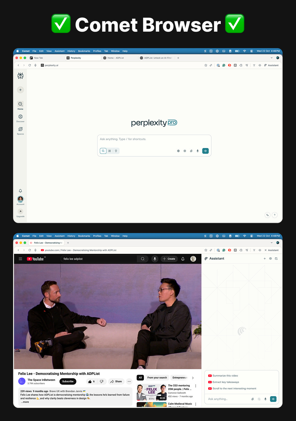
I’m going to show you exactly why they did and how because you can copy this for your own product.
Here’s a masterclass in product sense you need to know.
“This is a billion dollar lesson in design.
I bet whoever led Comet has got an extraordinary product sense. It is such an incredible product and ux, not because it’s new—because it isn’t. User ease into it, knows how to navigate around, with some AI integration and not intrusive or forceful to learn. and unlike any other new browser say arc/dia where they want to be all new… comet puts the best experience by not letting users think.
Imo, best product of 2025 hands down.”
- Felix Lee (source)
Comet isn’t obsessed with “new.” It’s obsessed with invisible ease.
You switch from Chrome, you don’t even notice.
No onboarding PDF. No “watch this 5-minute demo.” Just browsing.
AI is there, not shouting in your face. It helps when you need it, but never gets uppity.
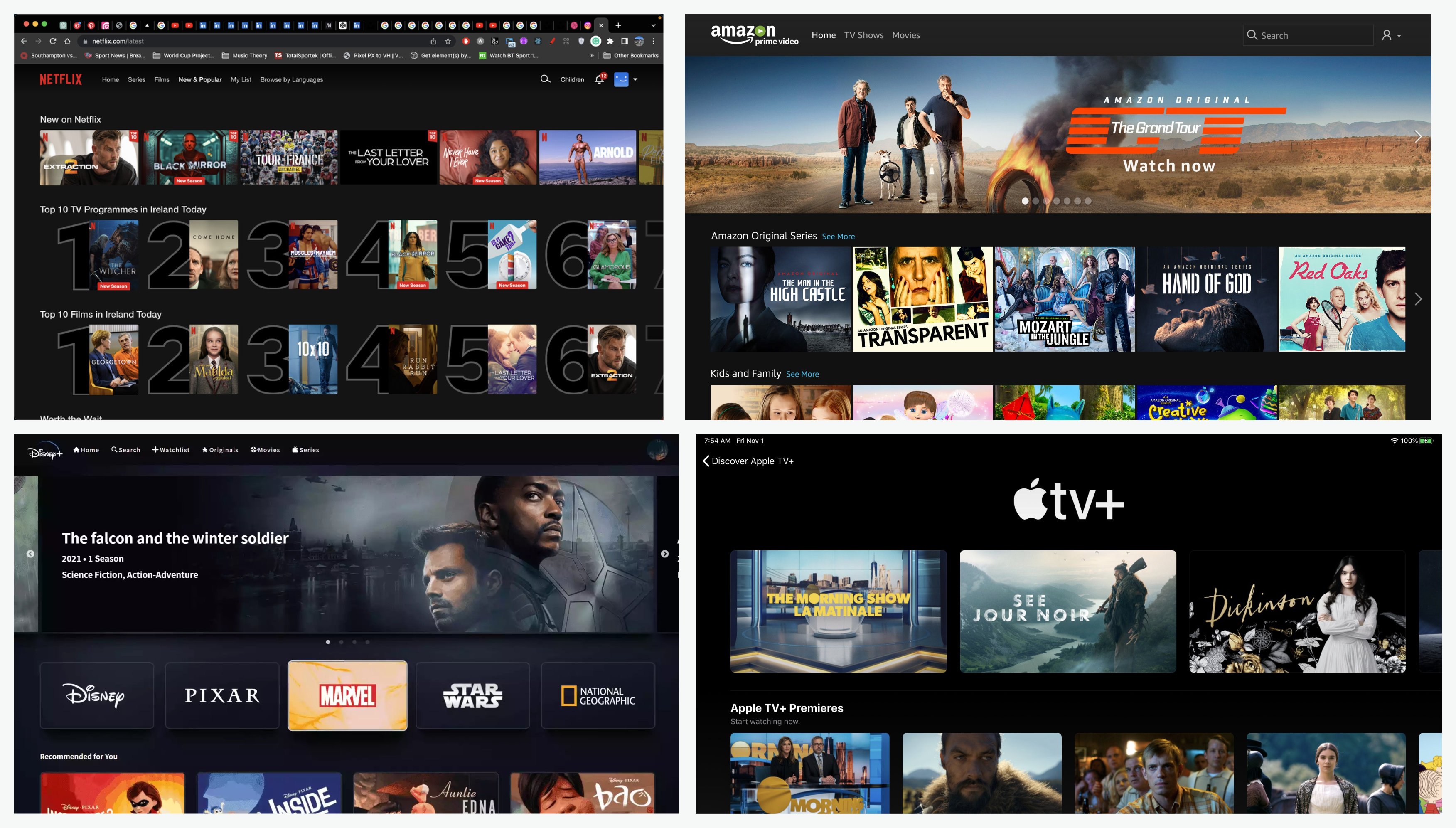
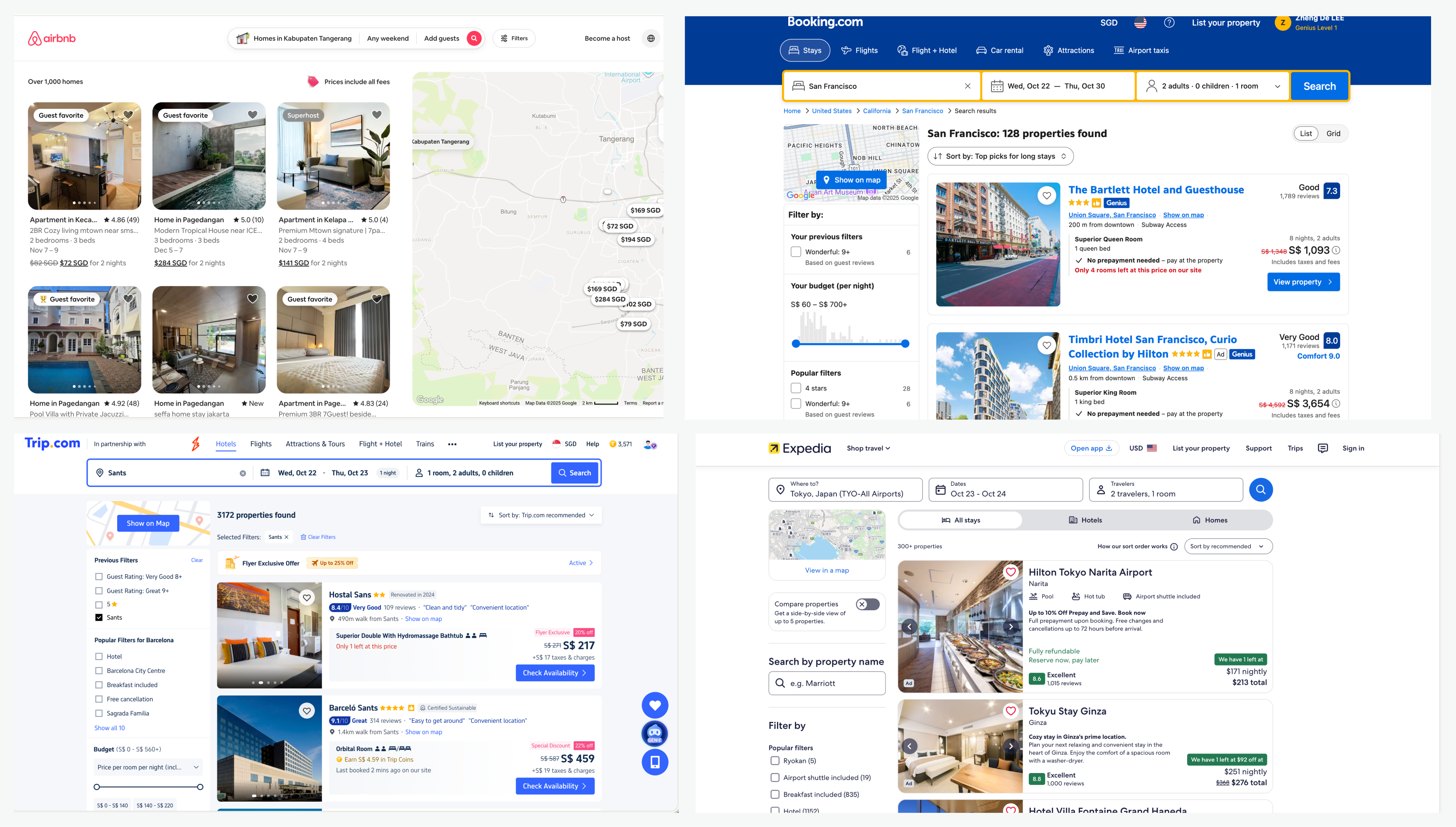
Let me give you a test.
You’re designing a next-gen browser in 2025.
Your mission: make the web feel intelligent — not static.
How do you design it?
Be honest. What’s the first thing you’d build?
Most designers would start with surface polish:
“Redesign the tab system.”
“Add a sidebar for AI.”
“Give it fancy gradients and playful animations.”
Sounds cool. But it’s wrong. ❌
You just made it look like every other “smart” browser: visual flair on top of old logic.
A coat of paint on a filing cabinet.
Perplexity did something way smarter.
They didn’t design a prettier browser.
They designed a thinking companion. ✅
In Comet, the user doesn’t browse — they ask.
Arc redesigned the house; Comet introduced a browser.

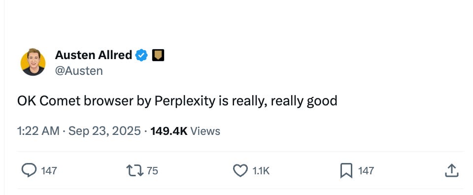
What others say:

If you want to get your hands to try out the design—the invite is on me ✉️ (not sponsored) → explore and experience their design:
Claim your 1-month free Pro and Comet
(a.k.a. how to ship design people actually use — not just admire)
You don’t need another “original” UI. You need a useful one.
Here’s the step-by-step to escape novelty traps and build design that moves work forward.
1) Screenshot the sameness: Open a doc. Paste 10 screenshots from your category (home, core flow, settings). Circle every pattern you see repeated (modal stacks, clever tabs, new nav metaphors). Label them “industry costume”.
2) Run the 3 real tasks: Pick the top 3 outcomes users actually want (buy, book, send, file, compare). Time each in your product vs. rivals. Count clicks, modes, and dead ends. The slowest step is your design debt. Fix that first.
3) Replace “views” with “verbs”: Rewrite your primary UI objects as actions: From: “Search” → To: “Find & Decide” From: “Results” → To: “Do the next step” (add to cart, schedule, draft). Every screen must answer: What gets finished here?
4) Design the mistake path first: List the 5 most likely failures (wrong item, auth fail, bad data, network). For each, design undo, inspect, retry. Ship those affordances before polish.
5) Kill “interesting”; keep “inevitable”: Flag every element added to feel clever (novel navs, rotating metaphors, ritual clicks). Ask: Would a tired user at 11:57pm thank me for this? If no, delete. If maybe, hide behind “Advanced”.
6) Write your anti-original stance. Two bullets only: What your product does shockingly well (be blunt). What the category’s users are exhausted by (be blunter).
7) Choose one “Done Flow” and overbuild it: Pick the single workflow that defines value. Make it absurdly good. Budget: latency, shortcuts, previews, inline edit, 0-to-done in one surface. Everything else may be “good enough”. This one must be legendary.
8) Name the creed, not the feature: Finish this: “People who use [your product] are the kind who ________.”
9) Keep a weekly “Friction Kill” ritual: Every week: one metric, one user clip, one removal. Ask: “What did we delete that made finishing faster?” Deleting is a design output.
This is a billion-dollar design lesson.
Don’t try to be clever, be clear.
Pick your design to “steal”. Make enemies, make friends. Give people a clear reason to adopt—don’t overwhelm. Comet went from beta to the fatest growing browser.
The “originals” are often ignored.
See you next week. Thank you 🙌 (want an invite to Comet? claim here)
Felix
Comments
Nothing yet. Say the first thing.
Sign in to join the conversation.