

I’ve been using MidJourney to create icons for my apps and the results have been very pleasing…
The biggest mistake I see people make is trying to describe the icon subject in too much detail. This seems to confuse MidJourney
Instead, the prompt should mostly be used to define the shape and style. Only use a few words to describe the subject itself
And most of all: keep asking MidJourney to redraw new icons until you get the desired result…
“rounded edges square mobile app logo design, flat vector, minimalistic, icon of <enter keywords here>”
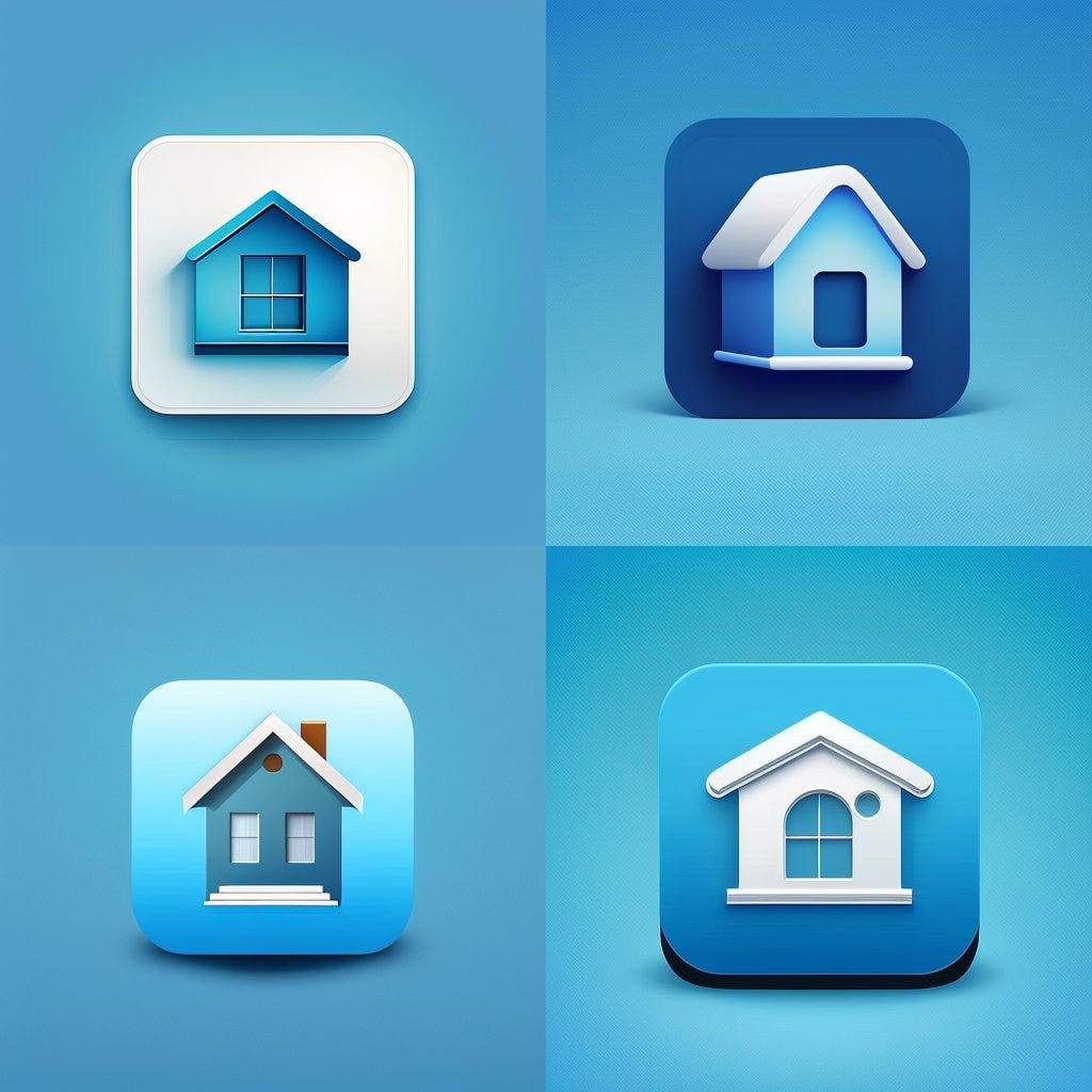
Prompt: rounded edges square mobile app logo design, flat vector, icon of house, minimalistic blue background
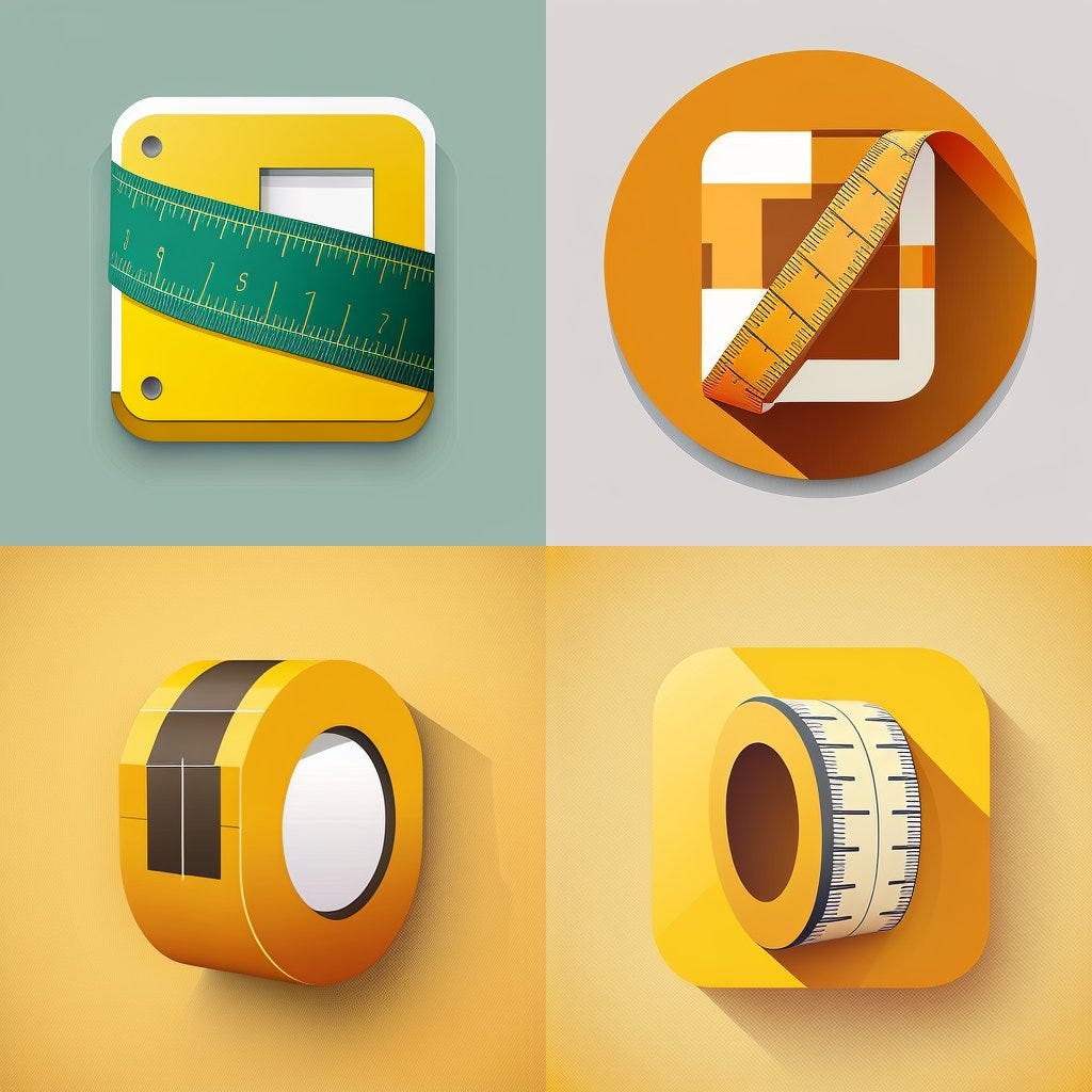
Prompt: rounded edges square mobile app logo design, flat vector, minimalistic, icon of rolled up Flexible Measurement Tape
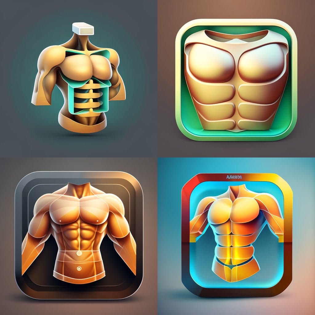
Prompt: rounded edges square mobile app logo design, flat vector, minimalistic, icon of abs torso
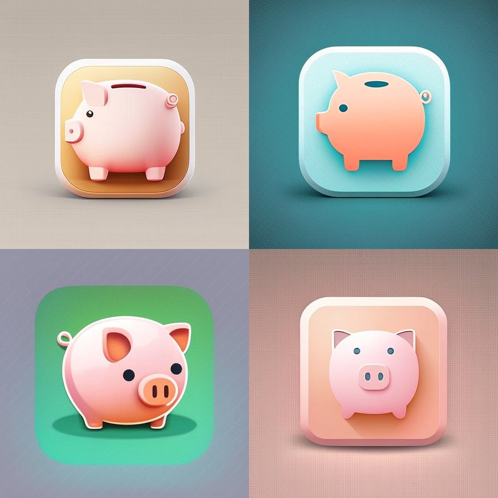
Prompt: rounded edges square mobile app logo design, flat vector, minimalistic, icon of piggy bank
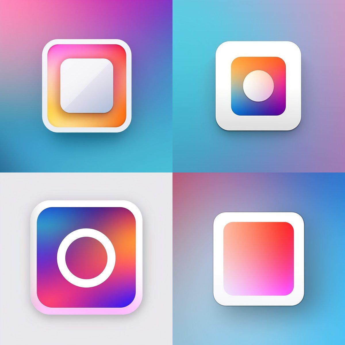
Prompt: rounded edges square mobile app logo design, flat vector, minimalistic, icon of white gradient
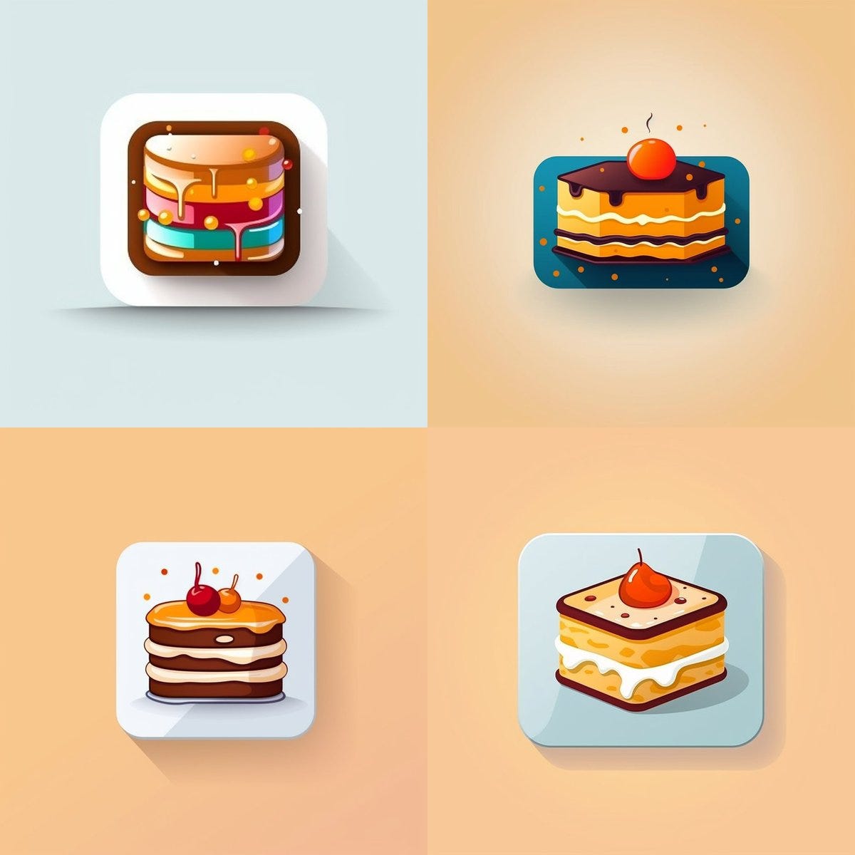
Prompt: rounded edges square mobile app logo design, flat vector, minimalistic, icon of cake
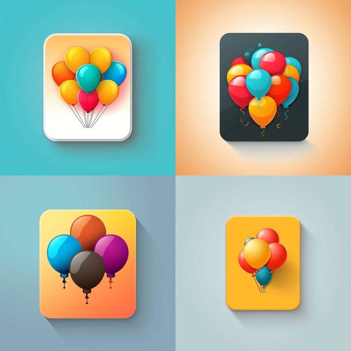
Prompt: rounded edges square mobile app logo design, flat vector, minimalistic, icon of balloons
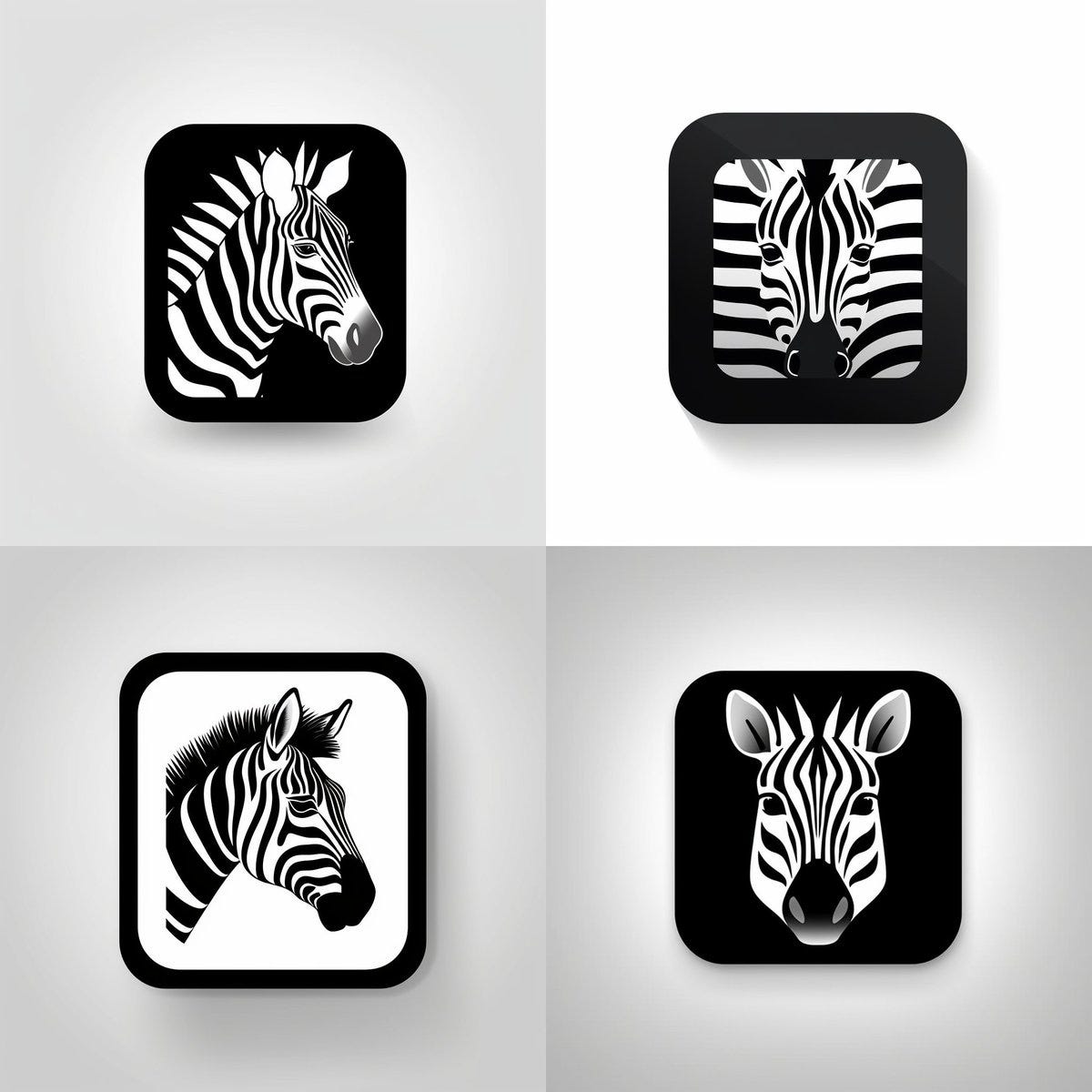
Prompt: rounded edges square mobile app logo design, flat vector, minimalistic, icon of zebra
No posts
Comments
Nothing yet. Say the first thing.
Sign in to join the conversation.