
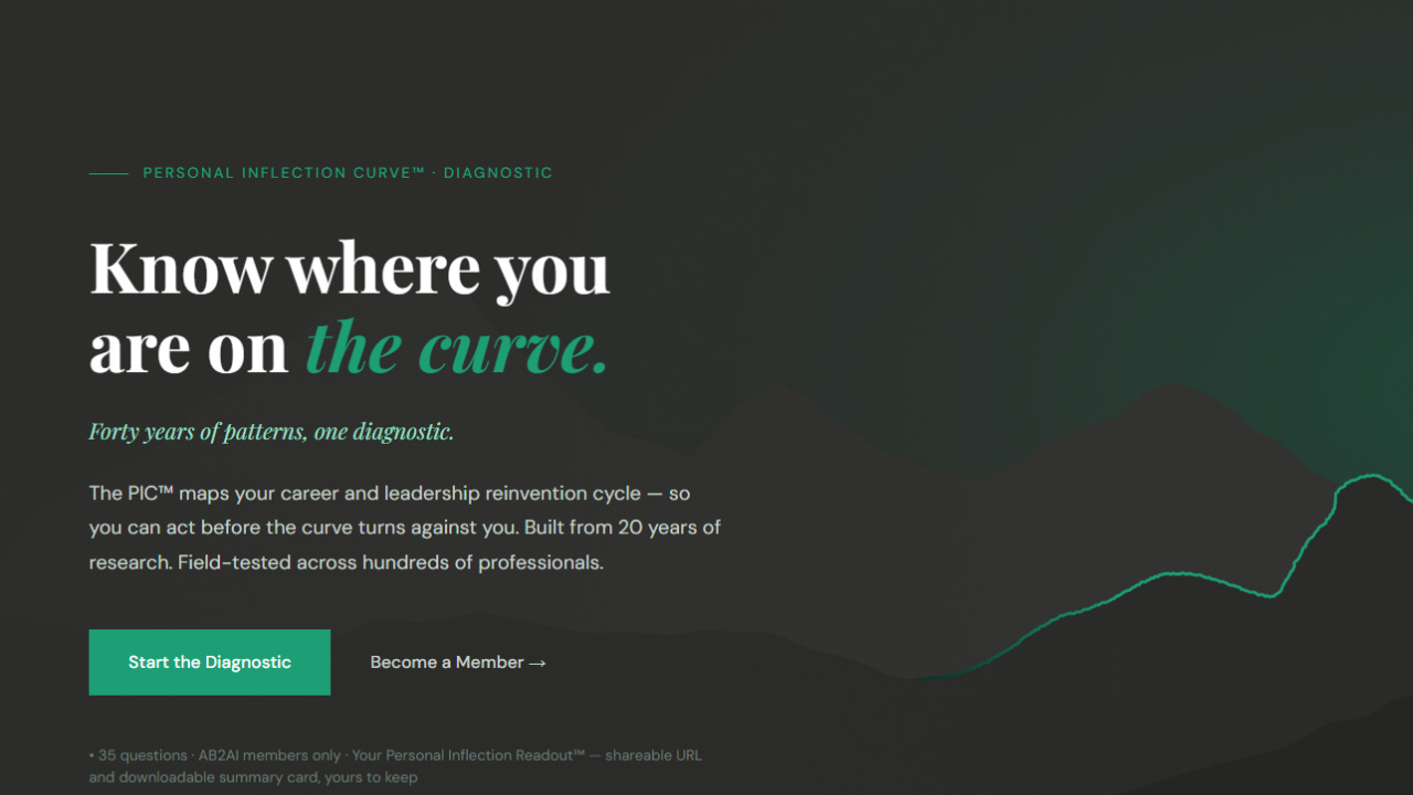
The PIC™ Diagnostic is live.
It went live quietly. No fanfare. No countdown. No launch day confetti. Just the tool, a small circle of intentional testers, and the work of making sure it does what it’s supposed to do before I opened the door.
That’s how I build. Surgical before scale.
Why small by design.
I’ve spent decades watching organizations launch things before they’re ready. The enterprise playbook is seductive: build broad, test fast, iterate in public, move on. Ship it and see what breaks.
I’ve also spent a good portion of those years being called in after that playbook failed — leading the cleanup crews when transformations went off the rails because someone skipped the part where you actually test whether the thing works before you scale it.
This isn’t a startup idea.
In 2010, following my talk on Collaborative Risktaking™, I took 600 participants through the first version of this framework — manually — at the Anita Borg Institute’s annual Grace Hopper Celebration. Two hours. Handouts. Real-time pattern mapping. Hundreds of people finding their inflection curve in one room.
That was the field test. What you’re looking at now is what fifteen years of refinement, a six-month research sprint of 60+ one-on-one sessions with laid-off professionals, and a full diagnostic build looks like when it finally becomes a tool that takes 20 minutes to complete instead of a 2-hour workshop.
The PIC™ Diagnostic beta process honored that.
Who I was looking for.
The PIC™ Diagnostic maps three dimensions — Change Rhythm, Risk Appetite, and your Personal Inflection Point™ — across individual, manager, and organizational layers. Thirty-five questions. Results that surface friction zones, recommended pathways, your PIP™ position, and access to the Alliance Scan™.
That’s not a quiz. That’s a mirror.
When you’re handing someone a mirror, you make sure it’s accurate before you hand it over. You don’t crowd-test a diagnostic this personal. You test it with people you trust to tell you the truth — about what landed, what confused, what hit harder than expected, and what needed to be sharper.
I wasn’t looking for cheerleaders. I was looking for domain experts — people with deep, lived experience in change management, product development, and program management. People who’ve felt organizational friction from the inside and have the language to describe exactly where it lives.
I needed testers who would push on the results, not just complete the questions. People who would tell me when something landed wrong — not because it was hard to hear, but because getting it right mattered more than getting it done.
That’s a specific kind of person. And I was deliberate about finding them.
Two groups. Two jobs to be done.
I ran the beta in two stages — not because one group was more important than the other, but because they had different jobs to do.
My inner core — Tier 1 — worked closely with me throughout the build. They moved through the full diagnostic, saw the methodology, and sat with the results. A subset participated in live interpretation sessions. All of them gave me the kind of feedback you can only get from people who understand what you're trying to build at a structural level. They helped me build.
A broader group — Tier 2 — came in later, self-served through the diagnostic without a guided interpretation, and gave me signals on the experience itself. Did the questions make sense without explanation? Did the results land without a guide? They helped me validate.
Different inputs. Different timing. Equal value.
What testing actually changed.
Beta testing isn’t valuable because it confirms what you already believe. It’s valuable because it doesn’t.
Here’s what came directly out of the process:
The Alliance Scan™ didn’t exist before testing. The feedback on the relationship layer — specifically the need to map lateral relationships, not just vertical ones — made it clear that the org chart doesn’t show what actually accelerates or blocks your next move. The Alliance Scan™ now sits alongside your PIC™ results as an optional but powerful companion. Five blocks: Sponsor Presence, Friction Sources, Alliance Gaps, AI and Your Alliance Landscape, Mentorship. It surfaces what the org chart hides.
AI friction questions got sharper. Testers working inside organizations navigating AI adoption pushed on the questions about keeping up with AI and automation developments while managing day-to-day responsibilities. That tension — between learning what’s new and doing what’s now — is real, and it shows up in your results.
The user experience tightened. Progress visibility was added so users know where they are in the diagnostic. For testers, a backend feedback submission replaced an email client that was quietly blocking people from sending feedback. Small fixes. Real impact.
These weren’t nice-to-haves. They were the difference between a diagnostic that works and one that doesn’t.
The people who made this real.
This was a small, intentional group — former colleagues, clients, and practitioners with the domain expertise to stress-test something this layered. This diagnostic wouldn’t be what it is without them.
Four members of this group came from the Substack community — and I want to acknowledge them here, on the platform where we found each other:
Iwette Rapoport writes Ghost Logic | Governing AI in the Wild. Iwette and I met a year ago and collaborated on a piece earlier this year. Her governance lens was invaluable for a diagnostic designed to surface friction that’s invisible on the org chart but felt everywhere — the kind of tension that lives in the undercurrent of organizations navigating AI adoption. The PIC™ makes that tension visible. And actionable.
Patricia Juarez is the creator of WonderLead in Tech. I first met Patricia when I volunteered to beta test her RePLAN app while participating in ’s Build to Launch community. She brought the same rigor to testing PIC™ that she applies to her own building.
Anna Jibgashvili volunteered when I posted an open call in the community. Anna reinforced the need for the lateral relationship layer that became the Alliance Scan™. Sometimes the most important feedback comes from someone who raises their hand because the work resonates — not because they were specifically recruited.
Karo Zieminski of wasn’t a PIC™ tester — but she was in the room. Her insights and ethical approach to building in the age of vibe coding have been foundational from the start.
If you’re an Annual Member or Bridge Architect.
Go to personalinflectioncurve.com and take it now.
A privacy policy specific to the PIC™ Diagnostic is currently in review and will be published at personalinflectioncurve.com.
Your results will be waiting for you when you finish. Bridge Architects — look for your Interpretation Workshop invite. That’s where we work through what your results actually mean for your next move. Not in the abstract. For you, specifically, right now.
If you’re not yet a member.
The PIC™ Diagnostic is exclusive to Annual and Bridge Architect members. This isn’t a paywall for its own sake — it’s about context. The diagnostic is most powerful when results come with interpretation, not just a score. A result without context is just a number.
What you get: your position on the curve, Change Rhythm and Risk Appetite scores across all three layers, your PIP™ window — visualized. Plus a 2-page Summary Card, a shareable URL, and your Inflection Moment readout. Retake anytime — your PIP™ may be fixed, but your position on The Curve shifts based on your actions. Track your alignments and gaps over time.
Bridge Architects go deeper — with monthly live readouts where we work through what your results mean for your next move, in real time.
Not yet a member? → The door is open.
Go find your curve. 🌊
The Personal Inflection Curve™ Diagnostic is live at personalinflectioncurve.com. Access is included with Annual and Bridge Architect memberships on AB2AI.
Comments
Nothing yet. Say the first thing.
Sign in to join the conversation.