
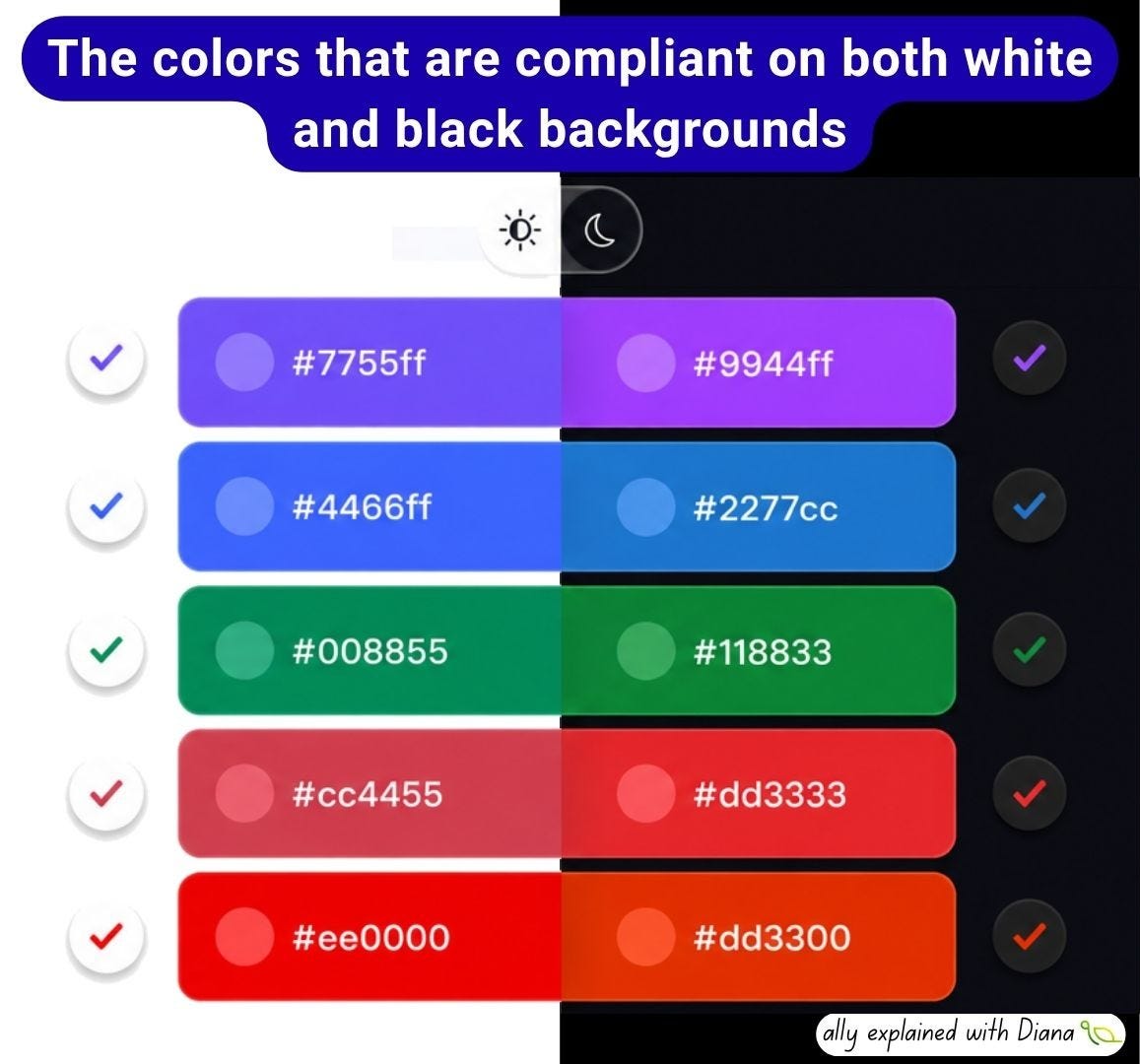
When designing for both light and dark mode, many teams create separate color palettes to maintain sufficient contrast. But there are actually some colors that achieve the minimum WCAG AA contrast ratio of 4.5:1 against both a white (#FFFFFF) and a black (#000000) background. For example:
🟣 #7755ff and #9944ff
🔵 #4466ff and #2277cc
🟢 #008855 and #118833
🟠 #cc4455 and #dd3333
🔴 #ee0000 and #dd3300
Behind the scenes, it’s all about relative luminance: to achieve a contrast ratio of 4.5:1 against both white (L = 1) and black (L = 0), a color’s relative luminance must fall between 0.175 and 0.183. That’s an incredibly small range, which explains why there are only a handful of colors that work well on both backgrounds.
Choosing colors that are compliant on both white and black backgrounds can make it much easier to build components that work consistently in both light and dark themes without sacrificing readability. It can also reduce the number of color variations that need to be designed, tested and maintained.
Here are a few interesting facts:
💡 The theoretical maximum contrast a single color can achieve against both black and white is only about 4.58:1, barely above the WCAG AA requirement of 4.5:1.
💡 Two colors that look almost identical can have completely different contrast ratios because accessibility is based on relative luminance, not on how bright a color appears to our eyes.
💡 Passing the 4.5:1 ratio doesn’t automatically make a design accessible. Font size, font weight, spacing, surrounding colors and focus indicators all play an important role.
💡 Color should never be the only way to communicate information. Error messages, required fields, selected items and status indicators should always have another visual cue in addition to color.
Practical checklist for color contrast:
✅ Check text contrast before implementation.
✅ Test your colors on both light and dark backgrounds.
✅ Don’t rely on visual judgment; use a contrast checker.
✅ Don’t use color alone to convey meaning.
✅ Verify hover, focus, disabled and visited states, not just the default state.
✅ Test your interface with real users if possible.
One final thought: 4.5:1 is the minimum required by WCAG, not the ideal target. Whenever possible, aim for higher contrast. Real-world conditions such as screen brightness, sunlight, font rendering, font weight or overlays can all reduce perceived contrast, so designing with a margin helps create a more accessible experience.
A11y explained with Diana is a reader-supported publication. To receive new posts and support my work, consider becoming a free or paid subscriber.
Thanks for reading A11y explained with Diana! This post is public so feel free to share it.
Comments
Nothing yet. Say the first thing.
Sign in to join the conversation.