
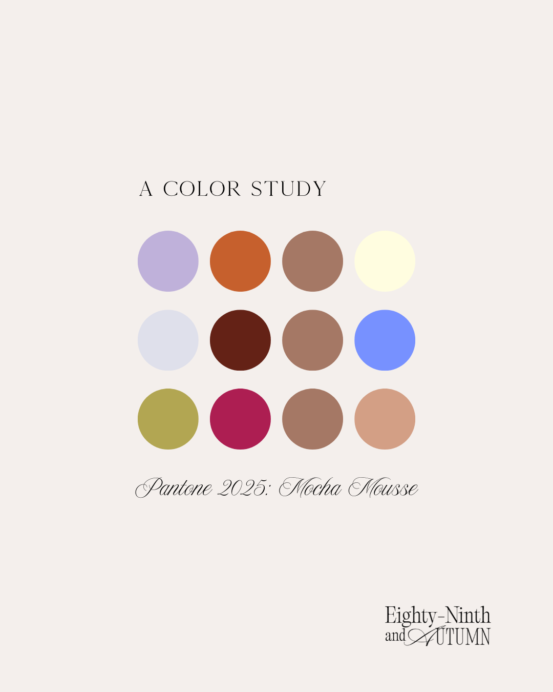
At first, I was actually unsure what my thoughts were on this color. “Mocha Mousse” from Pantone, just did not seem to suit our palettes and how we like to design with florals. It felt dated a bit and overdone in floral design, but as I examined the color more and the dimension that it had and paired it with our designs, I realized that we actually do tend towards this “Mocha” as a pretty consistent undertone in our designs. This is a color that can be a major statement or it can be a subtle backdrop that allows other colors to shine. Here is our take on this Mocha Mousse color of the Year.
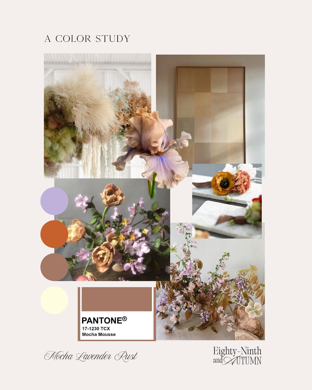
COLOR STUDY: MOCHA, LAVENDER, RUST
This beautiful combination brings together multiple seasons of colors and creates space for this palette to shine through out the year. In the height of spring this is the way I would create a warmer and more “minimalist” approach. Pairing a rosey brown smoke bush with vibrant bearded iris. and Belle Époque tulips. the touches of a creamy grasses that haven’t yet shed their decay for the bright growth of summer, would be a beautiful addition to our flower arrangements and mimic the softness in the smoke bush. The lilac and lavender would be beautiful coming from early foxglove and wintery pansy. I brought in the rust to mimic the central colors found in spring daffodils and stunning ranunculus.
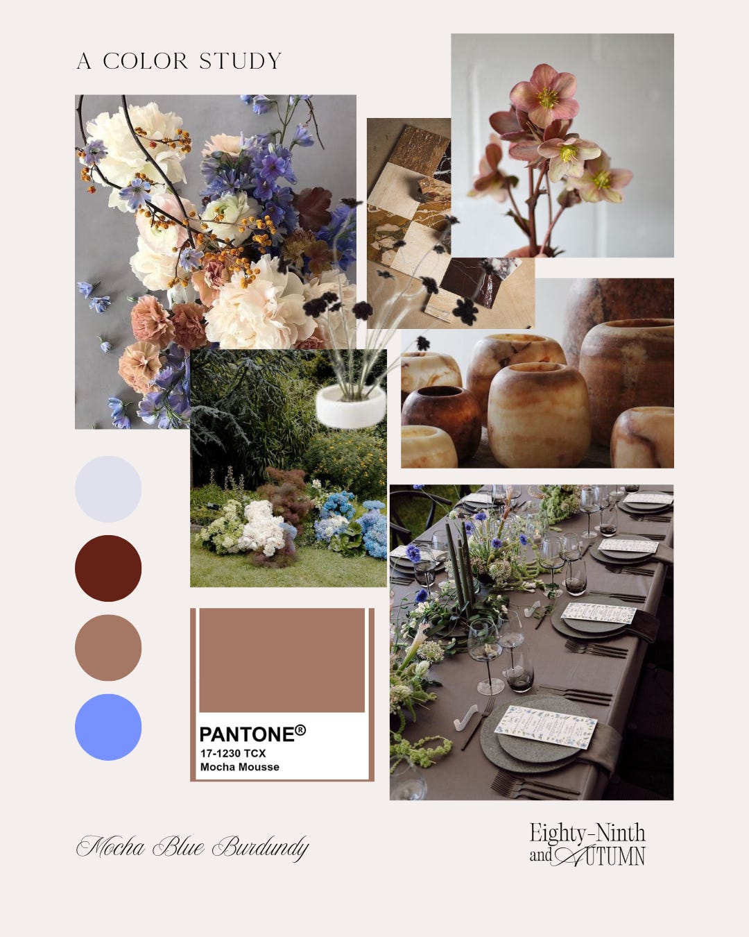
COLOR STUDY: MOCHA, BLUE AND BURGUNDY
An unexpected punch of color is what drew me to this combination. Mocha and Burgundy can be very dark, gloomy and a bit melancholy on their own, but adding a bright punch of blue seemed to bring the others to life! In our designs, we are not just considering the flower choices, but also the vessels and candles that will hold and pair well within the palette. A beautiful onyx vessel could be the key to embracing this Mocha tone and allow the bright blues to shine. Blue flowers make such a statement when used on their own and in large quantity. Blue flowers are often paired with pinks and creamy oranges and this Mocha Mousse color has such a beautiful pinkish undertone to it and pairs beautifully with the bright cerulean and sky blues.
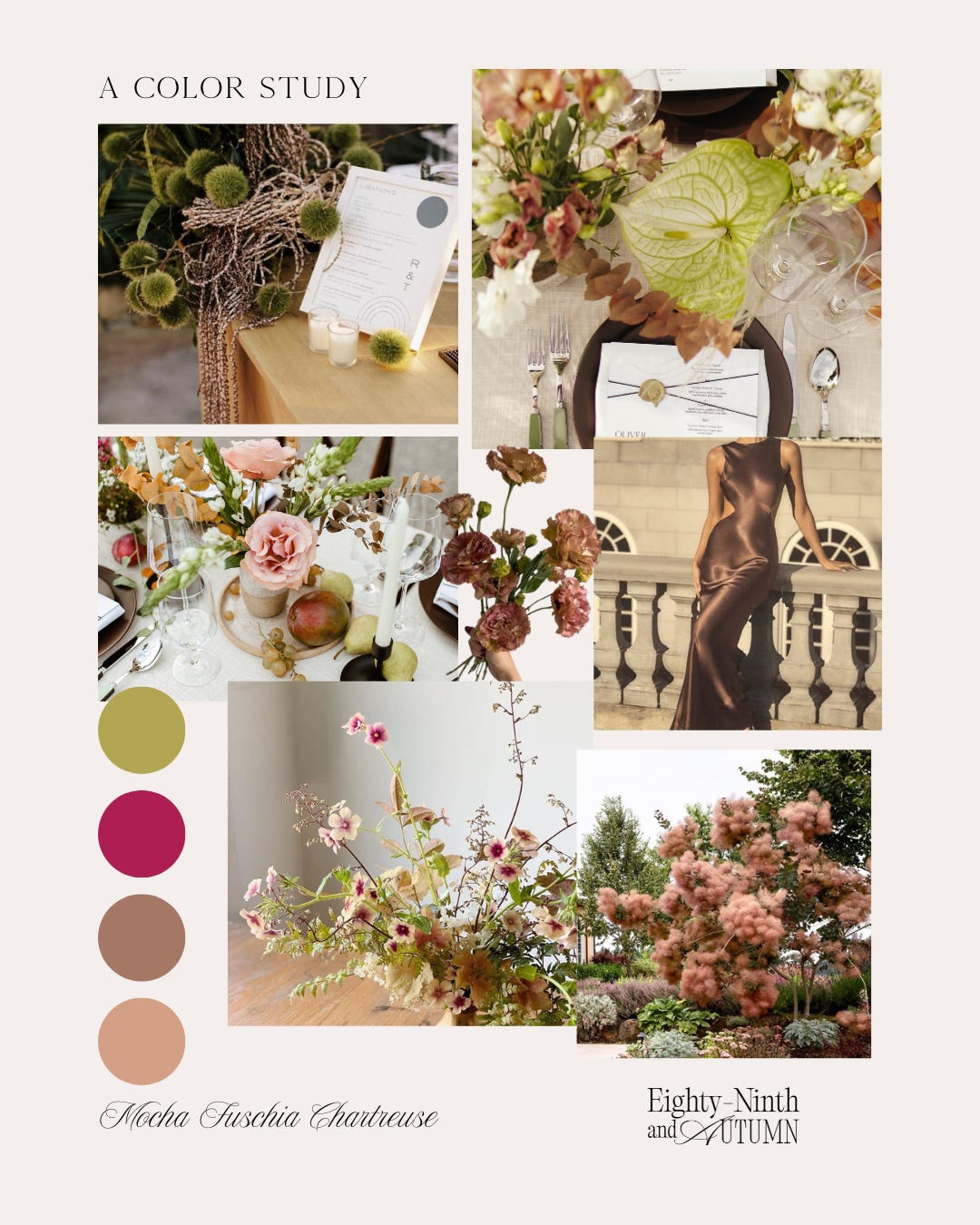
COLOR STUDY: MOCHA, FUSCHIA AND CHARTREUSE
Our last collection for our color study, we brought together a beautiful layered palette. The Brown lisanthus, the caramel phlox and the beautiful Moab roses carry a stunning ombre of cream, tan and an undertone of warm blush. The Mocha mousse color finds a perfect landing place between the two bright tones of fuschia and chartreuse. This collection of colors could pair well for a wedding or event any time of year! Summer and fall especially beautiful and bring an unexpected twist to designs.
Thanks for coming along for our Color Study with Mocha Mousse.
Follow along our Pinterest for more and subscribe to our Substack for all the floral inspiration to come!
Talk soon,
Michaela from 89th and Autumn
No posts
Comments
Nothing yet. Say the first thing.
Sign in to join the conversation.