
Hello, you! 🍒
Many new readers have joined this Substack—welcome! Starting at the end of January, I’ll be resending some of my posts to everyone because they’re essential and genuinely helpful. No fluff here, just the real stuff that helps you understand and get started on Substack.
For those of you who’ve been here a while, you can always skim this text and the following posts again.

Let’s be honest:
Design is the part most people think they can ignore — until they see a Substack that looks like a small art gallery and suddenly feel underdressed.
Design is not decoration. It is a direction. It is clarity.
It’s the subtle (but powerful) moment where your publication whispers:
➔ “Welcome. You’re in the right place.”

On Substack, visuals speak before your words do. They set the tone, shape the atmosphere, and create that quiet sense of “Oh, I like it here” long before a reader knows why.
I will take you through the eleven visual elements that define how your publication feels — the tiny details that make everything look intentional instead of accidental. You’ll see where each graphic appears, how readers subconsciously interact with it, and how you can create a polished look using nothing more than Canva.
Think of this as your gentle-but-firm upgrade — the kind that makes readers assume you totally know what you’re doing, even on days when you don’t.

You don’t need to be a designer to create a Substack that feels intentional, recognizable, and unmistakably yours.
👉 Start: anytime
By the end of these six weeks, you won’t just “have a brand.” You’ll become the creator who knows how to show up boldly, clearly, and confidently — with visuals that work for you, not against you.
Below you’ll find every visual element Substack offers — described clearly, lightly, and with ideas that help your publication feel like you curated it with intention, not by accident.
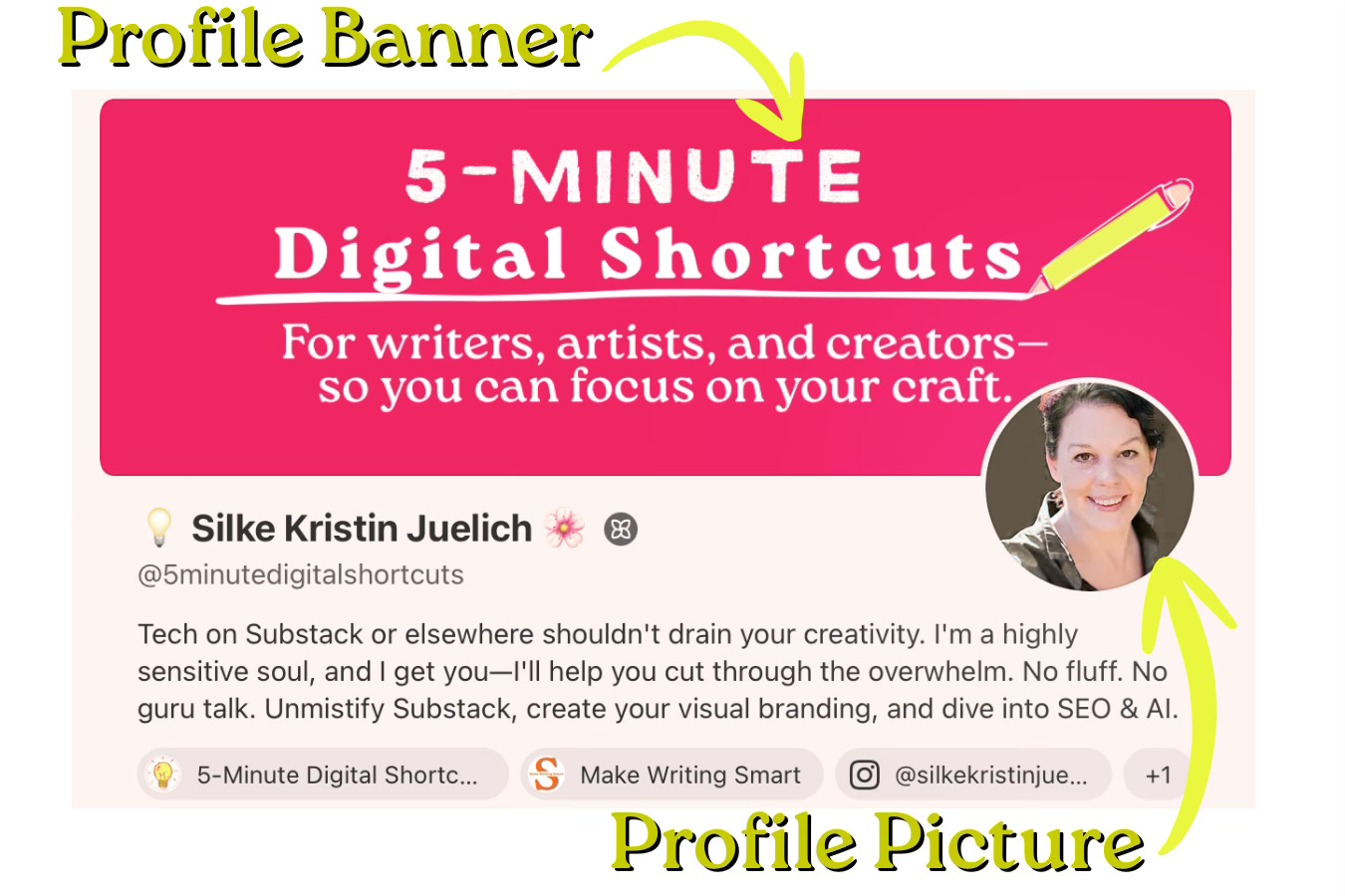
Your Profile Picture is your visual handshake. It follows you everywhere — homepage, posts, Notes, emails, notifications. If Substack were a party, this is the face you bring to every conversation.
Choose a photo of yourself that you genuinely feel comfortable with. A selfie can work, too — but if you don’t have a perfect image, it’s worth considering getting a few professional portraits taken.
Making professional portraits applies to anyone who’s not only active here on Substack but also runs a business, works as a writer, or plans to publish a book.
Of course, this only makes sense if you decide you want to take your online presence to the next level. I also see many people using photos that have been enhanced or retouched with AI — that’s an option, too.
Ultimately, it depends on what feels right for you.
You can upload your photo to Canva, remove the background, and replace it with any color you like.
Video created in Canva Pro, including music (How to Tango, Arthur Benson).
Your Banner is the room people walk into when they enter your world.
It doesn’t need fireworks. It just needs to feel like home — or be an invitation to visit the homepage.
Think colors, textures, and mood. You might want to place your Wordmark inside your Profile Banner. You might also put a photo that tells your story - or is your portrait. It’s a simple way to strengthen your visual identity without adding any extra noise.
(Click on the first picture to open the gallery.)
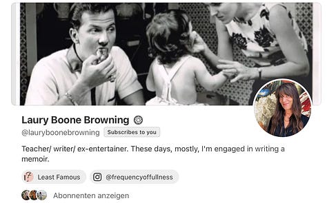
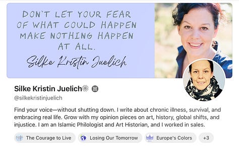
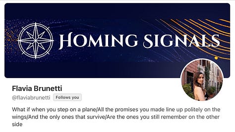
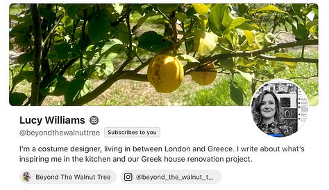
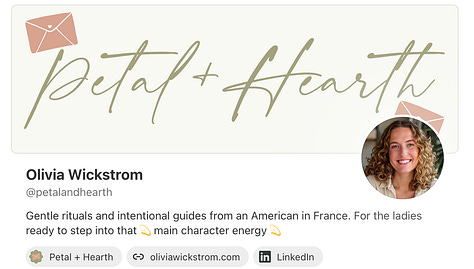
Every email lands with a thump in someone’s inbox — your Banner is the moment that says: “Don’t worry, it’s me.”
A simple shape, a subtle color, one thoughtful graphic… suddenly your emails feel like a place, not an accident.
You can use the same Banner you use for your Profile — nothing wrong with that.
If you want to be truly strategic, use your Email Banner to highlight what matters most right now.
That means updating your Banner whenever there’s something your readers should see instantly: Your new book, its release date, a free PDF you’re offering, or a course you’re running.
Your email is prime real estate. Treat it like a gentle spotlight — not pushy, just purposeful.
Video created in Canva Pro, including music (Habanera Cruise, Tiki Tiki).
At the end of your emails, a small visual goodbye can work miracles. It doesn’t have to “sell.” It just has to say:
Thanks for spending a moment with me. Here’s a little visual bow on top.
Minimalist symbols, soft lines, or a color that whispers your name — that’s enough—or even just a lovely image.


Your Wordmark is your name with intention. Not a logo — a personality in typographic form.
It appears in social previews, trailers, launch posts, anywhere you want your identity to be unmistakably present.
Choose a font that says:
“This is me. I write, I think, I create — and yes, I look good while doing it.”
Video created in Canva Pro, including music (Epic, Splasher!).
You can read more about Wordmarks here.
I can also help you generate a larger, Substack-optimized Wordmark.
Let’s talk about the tiniest piece of your branding — the avicon.
On Substack, it’s called your “Logo,” but functionally, it behaves more like your publication’s little signature in the corner of the room. Small, quiet, but impossible to ignore once you know what it does.
A Favicon (or Icon) is the microscopic image that appears in the browser tab, in bookmarks, in mobile lists, and anywhere your publication is reduced to the digital equivalent of a postage stamp. And here’s the surprising part: this tiny image often works harder than all the others.
When readers have several tabs open — which, let’s be honest, we all have — it’s your Favicon that helps them find you again. One glance, one tiny symbol, and they know:
“Ah, that’s the one I meant to read.”









You don’t want details. You don’t wish to gradients. You don’t want your entire Wordmark squeezed down to a pixelated tragedy. You want something simple, bold, recognizable.
Think: one initial in a strong typeface, a reduced version of your Logo, or a minimal graphic that represents your overall visual world.
High contrast works best.
Black on white. White on color. Anything that pops at 32 × 32 pixels without demanding a magnifying glass.
Here’s the part many overlook: your Favicon shapes the feeling of professionalism. When it’s done well, it communicates — without a single word — that your publication is intentional, considered, and visually coherent. It’s one of those design moments readers don’t consciously notice… but they absolutely feel.
Don’t underestimate it. A strong Favicon makes your Substack instantly identifiable, even in a sea of open tabs and endless distractions.
Small image, significant impact. And yes — absolutely worth getting right.
Substack uses this Favicon in two additional places as well (at least right now, in December 2025): it appears in your chat and above your publication in the app version. And this is where things get… a little awkward. (I’m sorry, but there’s no softer way to say it.)
I find it incredibly important that your Favicon appears clearly in the browser tab on desktop — that part works beautifully.
But for chat? Wouldn’t it make far more sense for your Profile Picture to appear there instead? Absolutely. Yet that’s not how Substack handles it at the moment, which makes the choice of Favicon more complicated than it should be.
Choose a Favicon that still feels like “you,” but remains simple enough to work everywhere Substack forces it to appear.
Please keep it clean, high-contrast, recognizable at the tiniest size, and aligned with your broader look.
Until Substack updates this system (and I hope they do), your Favicon has to carry more responsibility than usual — so pick one that can handle the job gracefully.
It is the big one: the image people see when your Substack is shared.
A surprising amount of click-or-don’t-click decisions happen right here.
Strong composition. Minimal text. One visual idea with confidence.
If your Preview Image makes someone pause for half a second, you’ve already won.
Video created in Canva Pro, including music (Misty Valley, Jerry Lacey).
Instead of using tired stock photos, create simple graphics that support your voice — soft gradients, textured backgrounds, small illustrations, typographic statements. Post Images are not decoration; they’re tone-setting.
The Post Image at the beginning of your article is automatically used as the Social Preview Image. That’s why the two usually match—unless you actively change it. It can actually be a great option if you want to deliberately invite readers to open the post, while slightly shifting the tone inside the article itself.
When you share your post in Notes, it’s the Social Preview Image that gets seen. So it’s not just an element you use on your homepage or in the app under your account—it’s an image you send out into the Substack universe with your Note.
Video created in Canva Pro, including music (Canon in D (Instrumental), Adi Goldstein).
Dividers are the quiet heroes of readability. They give breathing room, rhythm, and pacing — like punctuation you can see.
A thin line, a small shape, a soft motif repeated throughout your publication…Suddenly, your writing feels curated instead of crowded.
There are endless ways to create a Divider. Substack offers a simple built-in line, of course, but I prefer using custom dividers.
They let you add extra white space so the text doesn’t feel like a single block, making the sections easier for the eye to follow.




A little movement goes a long way. An Animated Preview can lift a Note or Social post without turning your feed into Times Square.
A gentle zoom, a shifting line, a glowing highlight — just enough motion to whisper:
”Hey, look at this one.”
Do you know where you can upload an Animated Preview? You can upload it to the exact spot where the Social Preview Image is placed. It will then appear on your homepage and also when you share the post in Notes.
And how do you create an Animated Preview in Canva? You edit your image, text, and any graphic elements with animations, and then download the whole thing as a GIF.
If you want to — and if you enjoy it — you can also create different kinds of videos. One could be a video that explains where your readers can find everything and what you write about. You can easily make this with a screen recording program.
Video created in Canva Pro, including music (Puzzle Of Complexity, Jo Wandrini).
You also have the option to create a trailer. Just like movie trailers, you can create one for your Substack or your topic.
Substack actually does something similar — the Substack team creates videos of people who have already found their way here. Of course, they have a whole camera crew filming, cutting, and editing the video.
But you can create something similar yourself using your own clips and Canva templates.
Video created in Canva Pro, including music (Come On Get Ready (drums) (Instrumental), Salme Dahlström)
And you can create a video for a book or course launch. Anything really. It can also be a beautiful way to invite people to take a closer look at your work.
This part is, of course, suitable for you when your Substack is already more or less set up, things come easily to you, you have a good flow, and you can say:
“Okay, this is the next step. I’ll do this now.”
Video created in Canva Pro, including music (Waltz in A Minor B.150 Op. Posth., Birraj)
“Every Image Size You’ll Ever Need on Substack”
The link takes you to the flipbook, where you can browse through all the sizes at a glance — and, of course, download the full PDF if you want to keep it on hand.
Click here to open my Flipbook.
With warmth and creativity,
💡5-MINUTE DIGITAL SHORTCUTS
Helping writers, creators, and artists simplify tech, connect through co-working, and grow through shared challenges.
✨ Let’s make tech feel easy again.
I’ve included your profiles here:
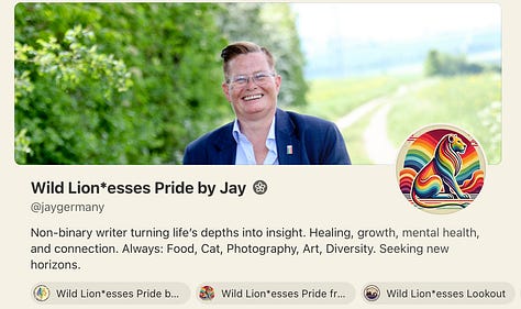
Flavia Brunetti Wild Lion*esses Pride by Jay Laury Boone Browning Lucy Williams Olivia Wickstrom - Thank you.
Comments
Nothing yet. Say the first thing.
Sign in to join the conversation.